Facebook Rolling Out Featured Posts Atop Newsfeed

I always have to preface Facebook product updates by saying that it is an update to me! Facebook is continually rolling out new features and tests... and with 800m+ users, we all see different things. So this is new to me! For months now, the Facebook newsfeed has a sort features for Top Stories and Most Recent posts. Today, I noticed a story locked atop the feed that looked nearly identical to the others stories - except for: - a faint line separating it from the other feeds - small text that reads "featured"

When the 'featured' text is hovered over, it expands to explain that this is a sponsored story.... just appearing in a new format (see normal here) and arguably in the most prominent place of any prior Facebook ad.

This is reminiscent of Google AdWords - where top paying / converting ads appear atop the search results and the others appear on the right column. The interesting part to me is how blended and integrated (too much?) it is into the core experience.

Spotify's Valentines Day Email Promotion: Reminder of Timeliness & Segmentation

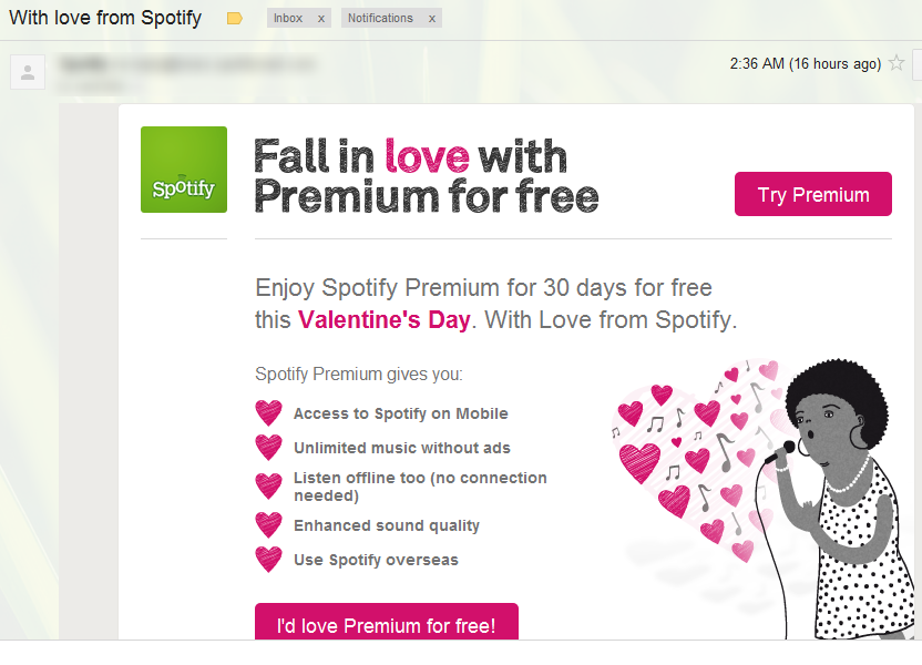
A good reminder here from Spotify about the:- power of timely marketing campaigns, and the - importance of user segmentation / relevant messaging

The good: this is a clever email merchandised nicely for Valentines Day (timely) and creatively (just really well designed and done - I like it). It is also actionable and tempting: a free 30 days of Spotify Premium? That is a strong offer and Spotify knows that the switching cost once you've tasted their mobile offering is high.

The bad: I am already a subscriber. So I shouldn't receive this. It isn't relevant and frankly a little off-putting since I didn't receive this offer =)

While that is not a real problem: it is a reminder that user segmenation of marketing, messaging, offers, etc is really important. For instance, if I had received this a day or two after initially subscribing - it would have been more uncomfortable.

Amazon Super Bowl Ad - A Week Later

Leading up to the Super Bowl, Amazon ran some clever sponsored story ads on Facebook asking fans to engage around the Super Bowl (will you be watching?). That of course leads to indirect transactions (clicking through takes users to a Super Bowl merchandising page)... but that is a different message than merely displaying product. And it leads to interactions:- 12,000 Facebook users liked the ad - 1,200 commented (10%) - 150 reshared it (1%)

That's unique and rather compelling. But: the ad is still running - a week later. So it's no longer relevant or even logical ("like this post if you'll be watching the game next Sunday"). I love the concept of ad timliness - but just as it's effective to promote current events (ie the Grammys are tonight!) it becomes ineffective and stale when creative isn't rotated.

6 Reasons to Be Bullish on Facebook

I am late to the game on publicly dissecting Facebook's S-1 filing and the business data they shared. There are many good reviews (two here: Dan Fromer and Bill Gurley). I wanted to throw my bullish opinions in from a very high business level, rather than from a valuation / financial / data perspective... sure it's a simplistic way to view it, but I think it is helpful. 1. They have a real business and they aren't even trying.

Simply put: Facebook is a great business today... and they haven't really focused on it. Examples of that are in the below bullets, but even onsite monetization efforts are far from optimized and efficient. And that's not a knock on Facebook in any way: their focus has rightly been on growth and engagement ahead of revenue optimization. That will change over time and the business will become more efficient - both on and off Facebook.

2. Facebook Connect is a huge threat to Google AdSense.

Google AdSense is a meaningful part of their business (ie $2.48 billion, or 28% of total revenues, in Q2 2011). Facebook's convoy is Facebook Connect and the Facebook Like buttons - already integrated directly onto 1,000,000+ of websites. You think publishers won't gladly swap out some javascript for a better integrated product and consequently better ad performance? Most publishers are already frustrated with Adsense's performance (inventory, monetization, etc) and I believe advertisers will gladly adopt Facebook Offiste Ads because they will be more relevant, less susceptible to fraud, will be social / personal and therefore will perform better.

3. Facebook = identity more than Facebook = social network. and

4. High switching cost.

Facebook has become more about personal identity than it has about social networking. Even if you choose never to share photos or post status updates - you would struggle to navigate the web without Facebook. This is a powerful position for Facebook from a publisher and product perspective. For instance, it means that publishers are more reliant on Facebook and more inclined to adopt new features (ie the offsite ads example above). And for consumers, it means that Facebook has terrifically high switching costs. From a social network perspective: this *is* where your friends and your data already is. And from a non-networking perspective: Facebook holds your web identity that that has a profound impact on your entire web experience. Leaving Facebook would dramatically change your online experience, behavior, etc. Hypothetically - as an example - I could imagine giving up on Facebook.com - but could not imagine deleting my account.

5. Facebook credits & payments.

Identity is the root of payments... and Facebook has an opportunity to be my wallet. People already fund Facebook to play games - but the opportunity is bigger. I be able to transfer money to friends, subscription services, etc. Not unlike PayPal, Apple, and other payment platforms... but Facebook again in a great position because: developers are already aboard (imagine a buy with Facebook button), identity is already solved (and thus a large portion of fraud), everyone has Facebook mobile (mobile will be key to payments), and people have already shown a willingness to carry Facebook balances. Now to move beyond virtual goods and gaming, Facebook needs to shift their 30% take rate (ie it simply doens't work for e-commerce) - but the opportunity is big enough that they can and should think through that.

6. Mobile.

Mobile is arguably one of Facebook's biggest strengths (425m actives in December from an overall base of 845m) despite arguably their worst product. Their mobile products will improve and the massive adoption has implications for new revenues (currently no mobile ads), new opportunities (ie payments) and new businesses (a Facebook phone does indeed make sense!).

Disclosure: I have a personal investment / position in Facebook.

Amazon Prime Instant Video Catalog Grows

Such is the online video content war: catalogs grow, compete and find their way into the homes / devices of as many eyeballs as possible.... after all, content wants to be seen and ultimately the economics for all are dictated on content being seen by as many eyeballs as possible. It's why I believe that over time libraries will exist and overlap on Netflix, Hulu, Amazon, web, app stores, etc. It's inevitable... And here is:- continued proof of that trend - and yet another reason to be bullish on Amazon, Amazon Prime and Amazon Instant Video

And most importantly: Yo Gabba Gabba is now available with unlimited streaming from Amazon. Attention parents - this alone is reason enough to buy the Kindle Fire!!

Vacationist & Facebook: Great Progressive Registration Example

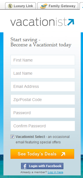
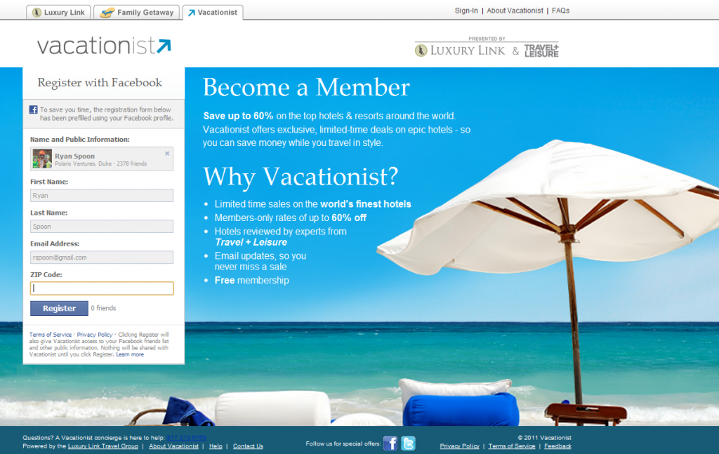
I write a lot about Facebook as more than an acquisition tool - it's a conversions tool, particularly through registration and activation. I bill it the "progressive registration" (read more here). Here is a terrific example from Vacationist. First, the registration box is done in a visually clever way: it hangs atop the background image and has six key fields (First Name, Last Name, etc). When the Facebook Connect button is clicked, the fields change, are all prepopulated except for zip code and the title changes from "Become a Vacationist today" to "Register with Facebook". All that is required to do is enter a zip code and press Register.

One other interesting piece: if I had any Facebook friends on Vacationist, they would appear directly next to the register button. Right now it just says "0 friends" (probably better to hide that!).

Designing for Mobile: 7 Guidelines for Mobile Apps & Mobile Web

Note: this article originally appeared on TechCrunch: Designing for Mobile: 7 Guidelines for Startups to Follow As an investor, I’ve seen hundreds of mobile application pitches. And as a consumer, I’ve downloaded hundreds more – some out of curiosity and others in the hope that I’ll find something so useful and exciting that I’ll make room for it on my iPhone’s home screen. From both perspectives, I am rarely excited by download numbers. What gets my attention is engagement: how frequently an application is used and how engaged those users are. This ultimately is the barometer for an application’s utility and/or strength of community. And if either of those two factors are strong, growth will certainly come. Just ask Instagram, Evernote, LogMeIn and others.

Creating great mobile experiences requires dedication to building product specifically for mobile. It sounds obvious, but it’s so often overlooked. Mobile users have different needs, desires and environments; and as the application creator, you have different opportunities to create utility and engagement. With that in mind – and with the help of my former eBay colleague and Dogpatch Labs resident, Rob Abbott (founder of EGG HAUS and Critiq), we’ve put together 7 design guidelines to consider when building for mobile.

Just like the presentations on leveraging Facebook (both on-Facebook.com and off-Facebook) and Twitter, success comes from building meaningful experiences that are honest to the native environments.

Read all of the startup presentations: - Leveraging Facebook for Startups: Part II, On-Facebook - How to Leverage Facebook for Startups: Part I, Off-Facebook - 14 SEO Tips for Startups - How to Grow Your Brand on Twitter. 5 Overarching Guidelines. Tons of Examples. - How to Create an Early-Stage Pitch Deck

7 Guidelines to Great Mobile Design

Make Your Content Accessible on Mobile - All Devices, All Formats. ESPN's Gamecast as Example.

I write a lot about tailoring your web experience for the environments where it is (and can) be used. That is particularly important for mobile which has its own UI needs, requirements, opportunities and challenges. Here is the latest example.

ESPN has done a good job creating product & content for specific environments and devices. Example here. While that is an effective treatment - this is not. When 'watching' an ESPN Gamecast on the iPad (which is an excellent product) - it requires you to watch it in landscape mode. There is literally no content and no experience otherwise. Even if ESPN believes that landscape is the best way to view Gamecast, you would think that they would either create a light version or showcase some other content? Very strange.

Amazon Applies Intelligence to the App Store. You Should Too.

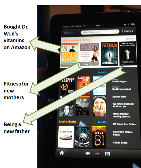
I've long argued that Apple's iTunes and the app store are woefully unintelligent. They are akin to merchandising in a storefront... when there is data available to make the store experience more compelling and better converting. Here's an example of that argument beginning in 2009 (!). After a week with the Amazon Kindle Fire (more to come - hint: I love it), they get the storefront concept and execute it well.... as we have come to expect from Amazon. Rather than using Facebook data, Amazon uses your purchase and search data. Below is an example of the Kidle Bookstore and notice that it's not just a compilation of bestsellers. Theses are items specifically tailored to me based on what I've bought, what I've searched for, and what they consequently think I like (sports, health, tech, young families, etc).

What's this mean for you? You likely won't have Amazon's breadth of data and users profiling... but platforms like Twitter and Facebook do - and you can leverage them to personalize your experience specifically for your users. It's more compelling. It's differentiated. And it's therefore converts.