Very slick Twitter integration inside Wordpress 3.4Simply paste a Tweet's URL, and it embeds. In this example, that includes the expanded image, etc. Very cool:
https://twitter.com/ryanspoon/status/214002430654947328
Very slick Twitter integration inside Wordpress 3.4Simply paste a Tweet's URL, and it embeds. In this example, that includes the expanded image, etc. Very cool:
https://twitter.com/ryanspoon/status/214002430654947328
In honor of this week's US Open - and in connection with last week's post on Google's evolving search pages - here are some interesting screen shots related to both.
The first is a results page for the query "PGA". As yo will see, there are only two search results on my visible screen: PGA.com and PGAtour.com (brand URLs). The bulk are algorithmic results (which are very useful): 2012 FedExCup standings and the three most relevant (ie popular) stars (Tiger Woods, Rory McIllroy, Phil Mickelson). Two things worth noting: 1. there are no ad units 2. there is no Google+ integration here. And this is one area that Google+ makes a lot of sense. I should be able to follow each player, learn more, etc. Today, it is entirely informational.
Change the query to one of the player names (in this case "Tiger Woods") and it looks similar: standings, information, news, and the brand link. In fact, only one natural result is above the fold: TigerWoods.com.
Again, two notes: 1. still no Google+ integration. 2. still no ads (high volume query too!) 3. related people include non-golfers: Elin Nordegren and Rachel Uchitel (both interesting and ironic)
Dig in on the right column's bio page and there is a "please report a problem" unit. This is Google's Wikipedia-like effort to control content. For several reasons, it is a very interesting approach: 1. this is such a dramatic change to search results and this unit comes at the expense of ad real estate 2. to fill it with content Google does not entirely trust is bold / scary 3. this information is far more compelling if tied to Google+ - in this setting it looks like no different than a mini-Wikipedia (or Knoll!)

I have been sitting on this post for weeks and weeks: I tend to write posts, or the skeleton of posts, ahead of time and publish them later on. In some cases enough time passes - or enough happens and changes - that it makes those posts irrelevant. This one is pretty close. I had the below screenshot surrounded by blurbs outlining three primary points: 1. We all talk about curation as the balance to search in finding. Apple does a good job with it in Movies and in app themes (Fitness: Get in Shape below). This experience is far better than searching a basic category. And they do a better job with it in Movies (actors, categories, etc).
2. Curation of some sort is necessary as content scales. Findability was a constant focus for eBay and for anyone with great inventory: Apple, iTunes, Netflix, Amazon, etc. It is probably best as a balance of editorial and algorithmic curation.
3. Curation is powerful by Apple. But it doesn't scale. Curation by friends (hello Facebook, data!) is arguably more powerful and does indeed scale.
This of course is all rather out of date (good!) with Apple's WWDC and iOS 6 announcement on Monday. Coming in iOS 6 are Facebook recommendations to the app store (terrific news - years late, but great... and it looks similar to Facebook's own App Store effort). Furthermore, they are remodeling the Appe Store, iTunes and the iBookstore. Those mock ups (small one below) look like a great effort will be placed on visuals, findability and some form of curation (again: algorithmic + editorial).
From Apple's iOS 6 intro page:

So much has already been written about Apple's WWDC and their iOS 6 announcement... and I too will pile on a couple short (and late) reactions. This one really has nothing to do with the hardware or the software... but rather the store page Apple created to showcase iOS 6. I tweeted about it last night:

Having reflected a little more on it - and the many discussions I have had over great product / merchandising pages (from eBay to portfolio to here on the blog) - I think it is worth showcasing this page once more.
A couple quick notes, which will essentially just expand on my 100 character tweet:
1. The page is entirely on-brand for Apple. Familiar.
2. It's a single page. Yet it is very easy to navigate. The icons atop the page move you throughout.
3. It is content heavy... but you wouldn't know it. Secondary elements are tucked away within each feature - for instance, the Facebook section has three sub-bullets which navigate horizontally - meanwhile, the core features navigate vertically.
4. It reads like a newspaper. The headlines are atop. The supporting content is ordered by importance. And the tertiary content (smaller features, developer kits, compatibility) are tucked at the bottom and formatted differently.
5. It's visual. Great looking and easy to consume.
And it's applicable beyond products. This page (it's layout, characteristics, etc) is relevant for merchandise (ie physical product), services (ie subscriptions, SaaS), about-us (ie informational content) and beyond.

Over the last week, I have been using the Facebook Camera application as my default mobile camera - in part as a test and in part because I love the ability to upload multiple pictures / create albums (that feature alone is a time saver). Here are two small features I like and noticed... and note: this is my last Facebook Camera post!:
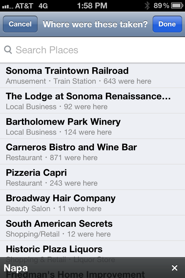
1. When you upload an album, Facebook inherits the location from the iPhone geo-tag. Seems like a small and relatively obvious aspect - but it is strangely not done by other photo-heavy apps like Path. And it is particularly useful when uploading albums - which often happens after the event and therefore offsite. As an example, the below screenshot remembers the location of the photos (even when I am physically away) - in the core Facebook App, location is determined by proximity - meaning that tagging has to happen when on / near premise.
Big time-saver. Very smart.
2. When you like a photo from within the app, Facebook illuminates the like button and gives it color. It's the first time I've seen Facebook do this and, although it is a very small UI tweak, it signifies that an interaction has been done (a current problem for Facebook's core mobile app) and it adds some color & some fun.

Two weeks ago, Facebook launched their Facebook Pages iOS app. And last week, Facebook launched their Facebook Camera app.
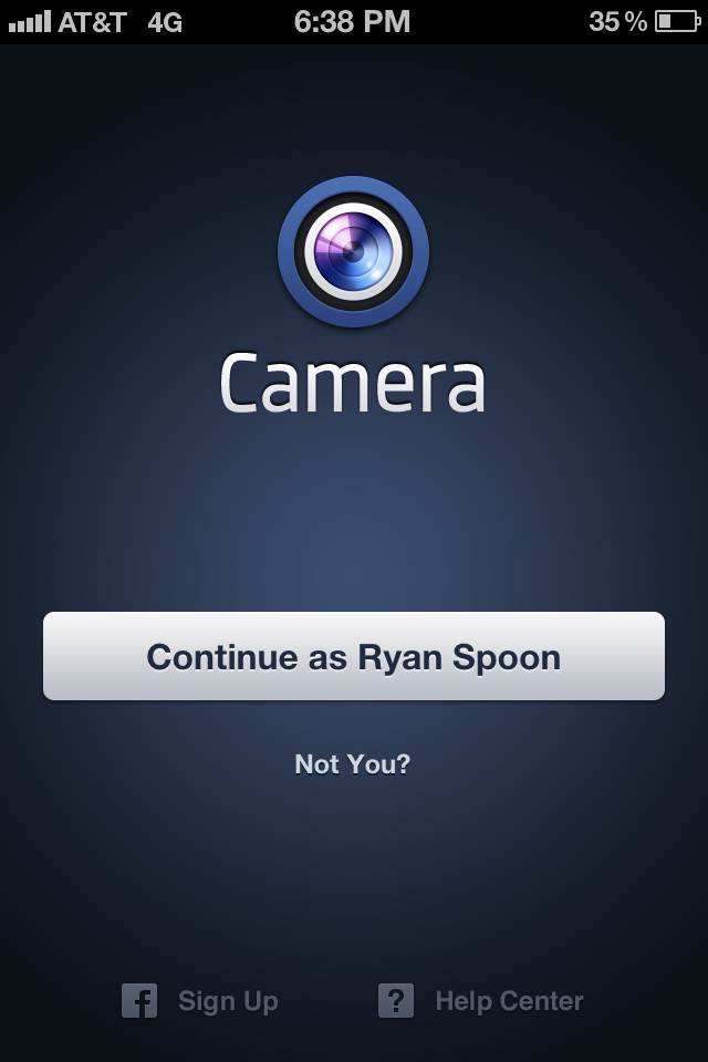
One of the interesting aspects of the two applications is that their welcome screens greet you with the following pages: blue screen, big get started button, and (in the Facebook Camera example) a greeting specifically for me ("Continue as Ryan Spoon").
 |
 |
The Pages example is easy to explain: press "log in" and Facebook authenticates the user via the core Facebook Application already installed on the device. Easy. And of course an user of the Pages app will already have the Facebook app... it's easy to be presumptuous when you have Facebook's reach / scale.
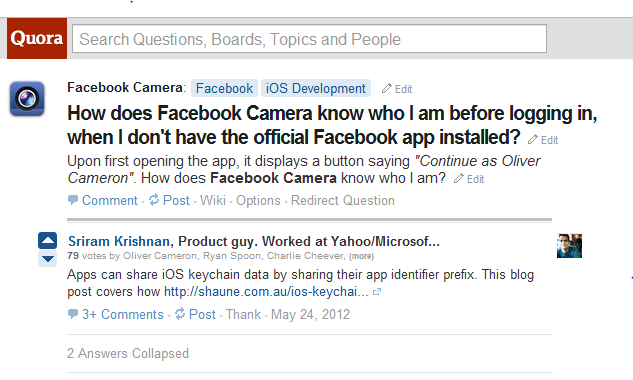
The Camera app is more interesting - and the first time I have seen an example like this. It is also something only someone like Facebook can do (few others have that reach). It is remarkably fast, efficient, cool.... and effective - no worry about conversions, funnels, etc.
How do they do it? Here's a Quora post explaining:
For specific queries, Google's search results pages are looking less and less like traditional Google pages and more and more like Facebook. The below example for the query "starbucks" promotes Starbucks, local maps and news results in the core results. On the right column, there is a Google+ follow button (in 550,000+ circles) and recent Google+ posts by Starbucks. This is strikingly different than the traditional AdWords unit - and a tie in between search, AdWords, and Google+.
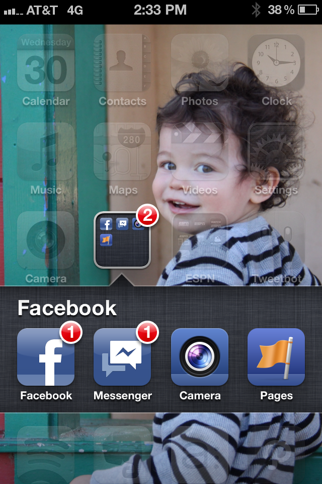
Much has been made of the rumored Facebook Phone.... specifically around the hardware component (see the Techmeme stream here). Regardless of whether or not a Facebook branded device will soon exist, the Facebook Phone already exists as an OS of sorts.... comprised of core applications. Here is my iPhone's homescreen. There is a folder dedicated to Facebook with the core Facebook Application, Facebook Messages, Facebook Camera, and Facebook Pages. It is not hard to imagine standalone apps for contacts, calendar, places, etc. Said differently, if you think about the phone's core applications, Facebook can replicate many of them:- Contacts :: FB Graph - Calendar :: FB Events - SMS :: FB Messages - Email :: FB Messages or blown out email product - Maps :: FB Places - Camera :: FB Camera - Media :: Open Graph / Facebook App Platform?
Last week we announced an investment in Spindle. Today, I am excited to an investment in another seed-stage, Dogpatch Labs, social media company: PostRocket. PostRocket optimizes Facebook content for brand and page owners. It's a problem those users know too well: 1,000s of fans - often $1,000s of dollars spent - and yet only a small percentage are reached. PostRocket looks at the content, fans, and engagement habits to help brand / page owners create better content, publish more effectively, and ultimately drive deeper engagement. It's also a problem this team knows well: they are smarter about Facebook's EdgeRank algorithm / logic than any non-Facebook employee I know.
It's a big, important idea because it's a big, important question for the majority of Facebook brands and advertisers. I have eaten my own dog food and tested PostRocket with the DogpatchLabs Facebook page. The early results are really outstanding: over a 2.5x improvement in fan engagement.
PostRocket is opening their doors soon. You can register for the beta here. And follow them on Facebook and Twitter. More on TechCrunch.
