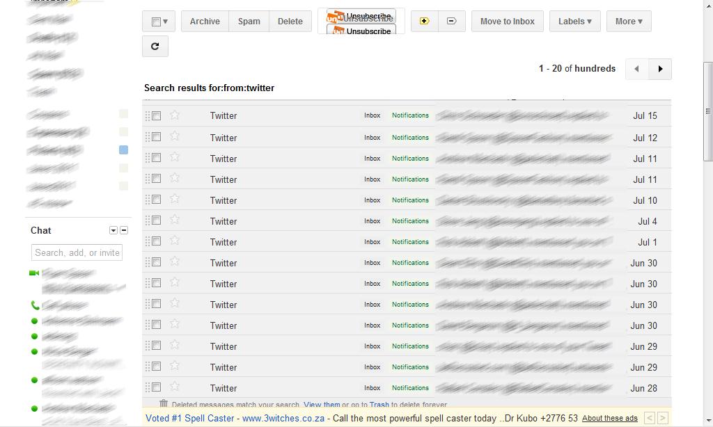
Persistent headers / footers have become common, hip design treatments. It of course makes sense: actionable links / content follow you throughout the page... so better navigation is always nearby & easy. If you're unfamiliar with persistent headers / footers (what I refer to them as) - they are 'toolbars' that stick to the page as you scroll. So when you begin moving down, the header sticks and usually has key navigational links and/or content on it. As an example, check out ESPN's scoreboards (here) - ESPN launched it early on and I raved about it.
Google is now applying the persistent header and footer to GMail. It's an interesting way to implement it because they have moved the core functions for the inbox and the individual message to the persistent header (archive, reply, forward, etc). And they have moved a new horizontal ad unit to the persistent footer (again, both inbox and message).

