Bitly + Twitter Has Driven 350,000 views to Youtube's JK Wedding

In less than a week, Youtube's hit video "JK Wedding Entrance Dance" has been viewed over seven million times (and nearly 1.5m times in the last 24 hours). So what does that look like on the real-time web? And how much traffic have Bit.ly and Twitter sent?

One of the reasons I love Bit.ly is because of its transparency and ability to deliver meaningful analytics. For a given URL, you can see a page's real time traffic, referrals and geographic usage (all of which originated with a Bitly URL).

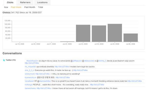
350,000 of the JK Wedding's 7m views arrived from Bitly alone. That is 5% of the video's views.

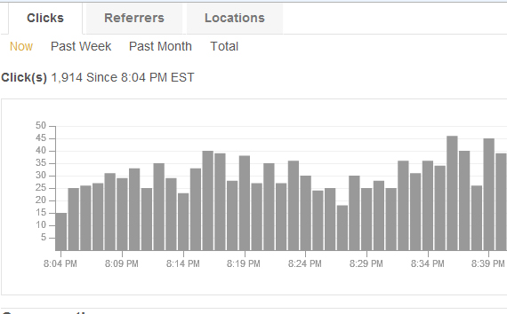
jk-wedding-youtube Even as the video's virality slows down, that is still 25-50 clicks per minute:

jk-wedding-clicks-per-minute

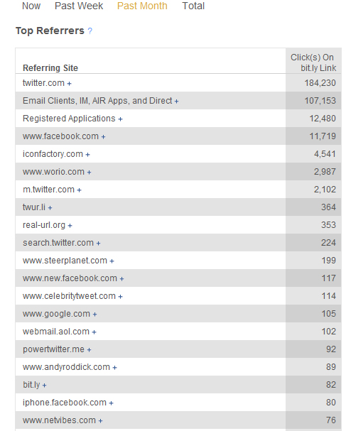
And Twitter.com represented over half of the traffic. Facebook was only 20,000 visits (but the video of course can be embedded directly into Facebook - Bitly's normal use case on Facebook is through the Twitter app integration):

jk-wedding-referrals

Proof enough that this video was a viral hit: it collected 5,000+ Diggs and over 800 retweets on Tweetmeme... and that is from a Youtube embed off Youtube.com (outspokenmedia.com).

jk-wedding-digg

Bit.ly, Real-Time Analytics & Twitter as a Traffic Referral

Over a year ago, I wrote about the need for analytics for the real-time web (and the potential business model surrounding it): "Twitter and Friendfeed: Understanding Referral Traffic; Arriving at a Business Model".

Since then, the real-time web has exploded (thank you Facebook, Twitter, Google, etc)... and the need for deep data, filtering and search has only become more glaring (a notion made very clear in Twitter's internal documents and memos).

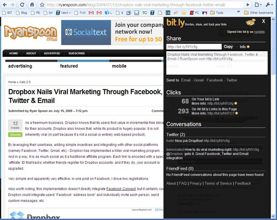
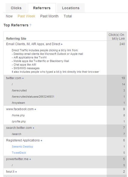
I have also written about Bitly and the role it can play in this ecosystem. Recently, I have started using Bitly's sidebar and data more actively (Clicks, Referrers, Locations and retweets). I love it. It's a glimpse of: - what discussions and posts are active and engaging - where the traffic and discussion is beginning (email, IM and desktop clients like Twitterific are primary drivers) - where the discussion is occurring (for the most active topics, it is more off my site than on it... fascinating) - Twitter's ecosystem (in the below example, Twitter.com accounts for only 6.5% of the direct clicks)

bitly-sidebar

bitly-data-analysis

Google Analytics New Front Door... Is Broken.

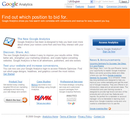
Google Analytics seems to have launched a rebranded, new front door. And it seems not to be working.

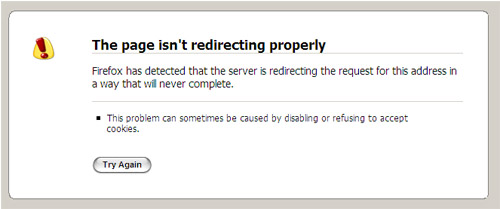
Clicking on the new "Access Analytics" button starts a several second process that results in a redirection error. Clicking on the "News" section links off to the Google Analytics Blog... which also doesn't work and results in an error: "The connection has timed out. The server at analytics.blogspot.com is taking too long to respond."

For a free product, downtime can (and should) be expected - but this going on 30 minutes now (at least). Maybe I should add to my list of 20 ways to fix Google Analytics?

Google's new homepage:

Google Analytics

... and what happens when you try to login:

Google Analytics Down

Update According to TechCrunch, GMail also is experiencing an outage... so this could very well be related and bigger than just Analytics.

Using Compete.com to 'Understand' Techmeme and Its Audience

If you’ve read this blog often enough, you’re aware that I’m a big fan of Quantcast. I’m also a fan of analytics software / providers and was excited to try out Compete’s new pay-per-usage analytics program. Compete now offers detailed data about websites or verticals – providing:

- Top Keywords, ranked by volume. - Site Share, percentage of all search referrals to a site via that keyword. - Keyword Engagement, index representing average amount of time spent after entering the site via that keyword. 100 represents that term resulted in the most time spent on the site. - Keyword Effectiveness, index that combines the total number of people referred by the keyword and the amount of time those people spent on the site. 100 represents the most effective term.

Conceptually, I love Compete’s model and would be willing to pay for usage… of course assuming that the data is accurate. I was skeptical at first considering that, unlike Quantcast and Google Analytics, Compete doesn’t have the most accurate form of data: embedded tracking on my site.

… My hypothesis was right. I pulled data on Techmeme and the results appeared fishy:

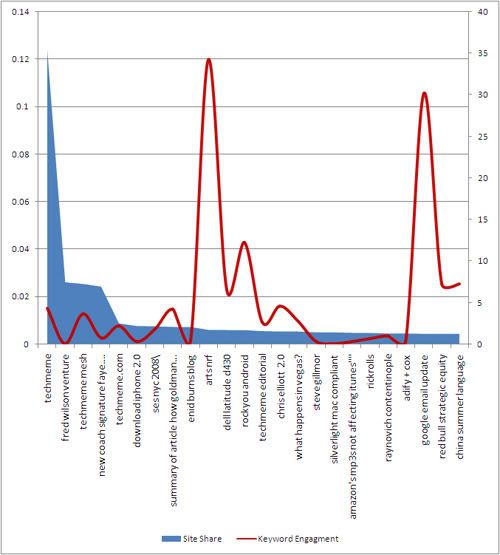
#1. Techmeme (12.4% site share, 100% keyword effectiveness)… obviously #2. Fred Wilson Venture (2.6%, 0.14%) #3. Techmeme Mesh (2.5%, 17.5%)… obvious again #4. New coach signature faye wedge shoes slides sandals (2.4%, 3.4%)… wtf? #5. Techmeme.com (0.9%, 3.8%)

Would you pay for data that accurately suggests that your branded keywords are effective? Even more problematic is that the unbranded keywords (what you really want) are clearly way off. Fred Wilson is thematically relevant, but shouldn’t be the #2 keyword by volume (or any other measure) - if it really is a blog, it would be TechCrunch (which represents 8% of Techmeme headlines). The below chart not only shows the bizarre variety of keywords, it shows the problem with including brand-related keywords within such data sets: they represent such a large portion of traffic that the it becomes impossible to compare the remaining data:

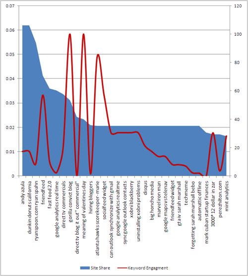
I obviously don’t have access to Techmeme’s logs, so just to validate that this data is troublesome, I ran the same report on my blog. The results were better (probably because I have less traffic and data to work with) – but still raised some serious questions. I’ve charted out the top queries below and, for the most part, am impressed with the keyword portfolio (except for bizarre entries like “Ryan Spahn” and “gorilla convict blog”, #3 and #8) - but the keyword volumes are way off.

I applaud Compete for pushing metrics into new, potentially powerful fronts. Unfortunately though, I’m not sure the data supports it yet. Additionally, Quantcast provides the same sort of keyword, audience and demographic data … which better accuracy… and for free. The first rule of thumb with analytics is accuracy is critical. And if you’re charging for that data - it really needs to be accurate.

Google Analytics - 20 Ways to Fix Analytics. Please Hurry?

I’ve written a lot about web analytics and the importance of understanding and measuring your traffic. The resounding feedback I’ve gotten - and I wholeheartedly concur - is that Google Analytics remains the top used service but is far from satisfactory. Google Analytics is a fascinating product. Google acquired Urchin in 2005 and it remains one of the great, most overlooked internet acquisitions. They reportedly paid $30 million for Urchin.

Now Analytics is installed on nearly every website, gives Google insight into traffic patterns and integrates with AdWords and AdSense… thus enabling Google to upsell products through optimization and unified accounts. Brilliant.

But it also is a classic example of a product that really hasn’t changed because Google doesn’t have a great incentive to do so. It’s a free product, adoption seems to growing (at least from what I can tell) and the revenue association is around data and AdWords upselling (not enhancing the product).

Here are 20 ways to fix Google Analytics - taken from my frustrations and those I've heard / received from other users:

1. Provide an API. This turns Analytics into a platform, enables developers and allows me to define what I want to see.

2. Make it Real Time. I don’t care if this comes at a cost or how precisely real-time it is… but it’s a necessity. Right now, the only way to use Analytics is the day after - and the internet is increasingly about the now.

3. Enable Off-.com Tracking. This is huge. I’d like to be able to measure my ‘network’ data like Quantcast does. I could embed that code across my network’s content, widgets, and so on.

4. Bring Back Hourly Charts. I want to see in-day trends and data. Is my peak time at 12 noon or 5pm? This is important stuff that simply isn’t available.

5. Enable Exporting of the Entire Dashboard. I spent lots of time setting up my dashboard. Export the whole thing in a excel doc with tabs.... not just the pageviews.

6. Enable Multi-User Access to the Dashboard. I spent an hour customizing my dashboard. Why does everyone else in my company need to spend an hour as well?

7. Charting Customization. Seems simple right? I’d like to configure what the charts look like. What the scales are. The list goes on. The default charts are so distorted that you simply can’t figure out trends.

8. Add Dates to the CSV Export. Why do I have to add dates EVERY time I export data?!

9. Data Comparison With Other Websites. I have dozens of websites on Analytics. I’d like to compare them on basic stats like pageviews, visits, bounce rates, etc.

10. Add Trendlines. Trendlines are useful… particularly when graphs of overly distorted. A perfect use case: when the charts are moved from daily to weekly, the current week’s data should show a trendline / forecast rather than simply die.
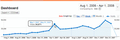
11. Add Day-Over-Day, Week-Over-Week, Month-Over-Month. When I hover over a data point, I should be able to compare it to the previous day, week or month. Maybe I can also customize which that is?

12. Associate Referrals, SEO with Content Pages. When I drill down to top content or directories, I’d like to know more than traffic numbers. Give me the top referrals to this page, SEO keywords, etc. Otherwise I have to spend 10 more clicks and wait a minute for each page load. Speaking of which:

13. Improve Site Speed. The site is getting slower by the week.

14. Improve the Dashboard. I’d like to name the 12 modules I have on my Dashboard. I’d like to also add links to my other regularly-used queries. Perhaps a light-iGoogle integration here?

15. Make it Social. Analytics is regularly used across companies. It would be terrific if the company could communicate on Analytics about trends, data, etc…. much like Google Docs. The comments can be RSS enabled and results can be emailed to the DL.

16. Email / Mobile Compatibility. I’d like scheduled reports that provide the basic information via email: pageviews, visits, etc (very different than current emailed exports). I’d like them via email so that I can access at scheduled times and on the go.

17. More Goals. More Goals. Goals are currently limited to three. More! If it’s costly, charge. People will pay.

18. Session Information. There isn't much depth around user / session pathing. What are the most common exit pages? How does that change when users arrive through SEO? Registered vs. unregistered users?

19. Metric Comparisons. Analytics allows charting of very high level information, like page views vs. visits. I'd like to be able to chart any two data points on a two-axis graph and compare different metric sets. For instance, I'd like to chart page x, y, and z against each other using page views / visit and bounce rate. That currently is entirely manual - finding, charting, and exporting.

20. Make Data Public (On Opt-In Basis). This is larger than a feature enhancement and is more strategic: allow websites to make their data public as a medium to promote themselves, gain new users and understand where they rank within their vertical. To have your data shared, you'd be hooked into Google Analytics and a richer ecosystem would exist (with new revenue opportunities). This enables the start of some major ideas:

Think Google Hot Trends + Yahoo Buzz + Quantcast + Blogger.