Fandango, iPhone App & Push Notifications

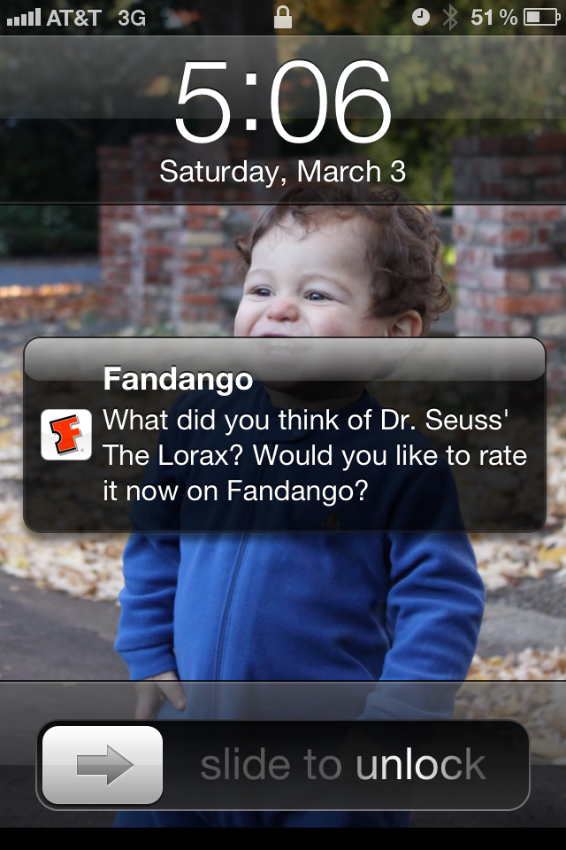
This is a terrific example of how to use Push Notifications for mobile Apps. Below is a screen shot from Fandango's iPhone App - from which we bought tickets to see The Lorax. Fandango obviously knows when the movie is - and when it ends. Almost immediately after it ended, I got the following push notification. Obviously highly relevant - and because there is no better time to deliver it, I don't find it spammy or unwelcome.

Very smart. Very simple. But not commonly done!
Facebook, Spotify, Sonos and the Power of Relevance in Ads

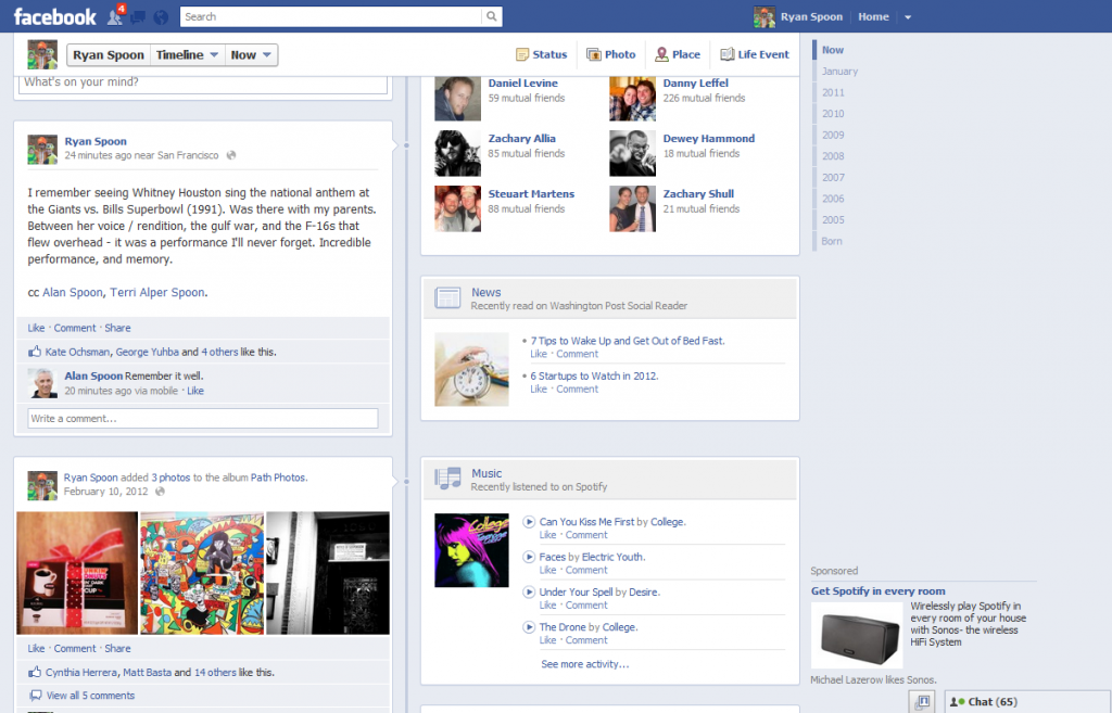
This is among the best example of great advertising on Facebook I can find. Really is.I've seen more engaging ads. I've seen more creative or visually effective. But this is as relevant as it gets - and at the end of the day, I believe relevancy drives success. So what is it: an ad for Sonos, a product that allows me to "wirelessly play Spotify in every room of my house"

Of course it is not a coincidence that an ad for a Spotify related product appears on my Facebook timeline: I am a Spotify user. They know this and they are advertising against it. This ad is directly relevant to me and really the only reason I care to pay attention to it. It also sits beside the Spotify / Music portion of my timeline. That is equally powerful.

Note: the first screenshot is my Facebook profile page. The second screenshot is just an upclose of the Sonos ad sitting beside my Spotify unit.

Facebook Sparks Offer Virality with Sponsored Offers, Anchor Promotion

Just last week I wrote about the new Facebook Feature Posts that are being anchored atop the newsfeed (and are very lightly marked as ads). Well here is another example of the anchored ad unit but using a new format: Offers. The example is from Macy's and includes an in-line offer.

Visually it is very clearly separated, includes a big visual and a unique border (you really cannot miss this).

The ad appears both in anchor format (top screenshot) and in the actual feed. Obviously, the anchoring / promotion causes more visibility and thus virality - the examples here move from "5 friends" of 7,200 Facebook users claiming an offer to 22 friends of 26,000 users within a matter of hours.

Porsche + Facebook + Pinterest

So much is great about this: Porsche takes to Facebook to alert fans that the Macan is on Pinterest.... that drives 2,500 likes and 200 shares within 6 hours. That alone is interesting and somewhat ironic. Then go to Pinterest. Despite 10,000s of impressions of their Pinterest post on Facebook (are you following?) there are only 700 followers on Pinterest, 2 pins, and 150 Facebook Likes.

So many potential comments including: - kudos to Porsche for adopting Pinterest - the concept of driving traffic circularly across networks is far from simple - I'm not entirely sure Porsche's Facebook fans understand what Pinterest is - Which might be because Porsche's fans are male (?) or because they Like things without context (?), etc

Quirky & Cordies Demonstrates Great Packaging and the Power of Crowdsourcing

In January, I wrote a Klout-inspired piece on the impact of great packaging. I was reminded of that message when I bought this Cordies cable organizer by Quirky. Simple product that is great because of the simplicity. And while the product's design is great - the packaging is every bit as good, from the box to the booklet. It is also a testament to the why crowd sourcing efforts like KickStarter are so popular - buying products 'created' by the masses is fun and uplifting. The back of the box and the booklet describe creator (Stephen Stewart), the number of "influencers" (562 others), and their 'ownership' (it outlines how much revenue goes to each community member).

It always feels good to buy great products (strange to admit, but true). Quirky has made it feel extra special.

Grantland, HBO & Kenny Powers Team Up: Great Integrated Marketing

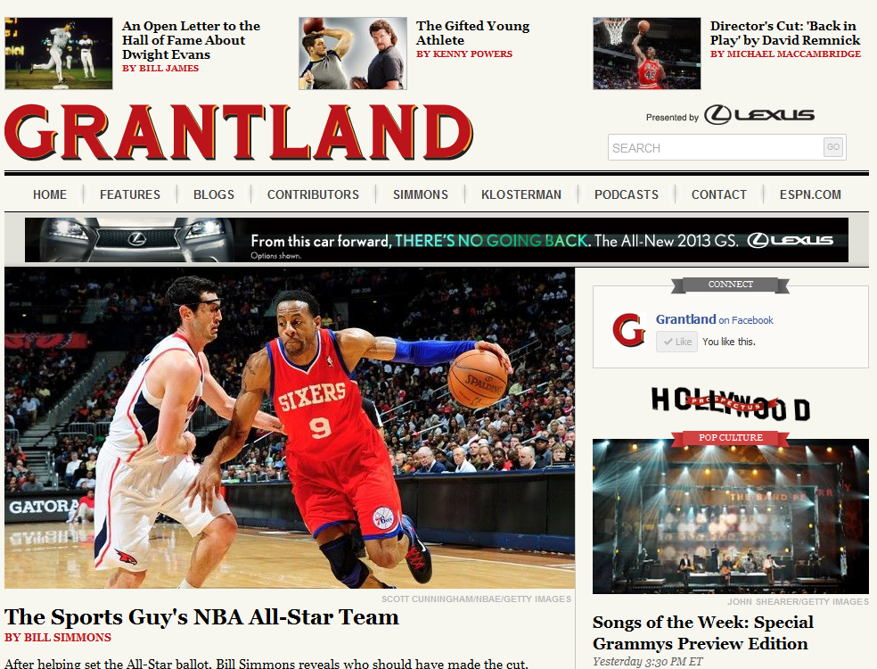
This is a fun, effective example of integrated / co-marketing done right. Grantland is ESPN's new sports and pop-culture media hub (led by Bill Simmons). To simply sum up Grantland: it is a robust blog with great daily content and it is ad-supported - but the ads are premium (1-2 per page and from just a handful of key sponsors).

This is a little different though. Grantland's header usually features key articles... and one of those is currently an article written by "Kenny Powers" (a fictional star of HBO's popular sports show Eastward Bound and Down). - It of course is eye catching: the Grantland audience will recognize Kenny Powers and be interested in the article - It is relevant: the Grantland audience is an HBO / Kenny Powers audience - It's integrated & clever: Kenny Powers wrote something on Grantland? Much more interesting than an 250x250 ad unit - It's timely: the new season starts next week

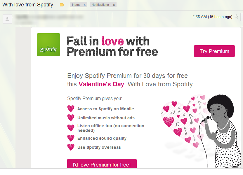
Spotify's Valentines Day Email Promotion: Reminder of Timeliness & Segmentation

A good reminder here from Spotify about the:- power of timely marketing campaigns, and the - importance of user segmentation / relevant messaging

The good: this is a clever email merchandised nicely for Valentines Day (timely) and creatively (just really well designed and done - I like it). It is also actionable and tempting: a free 30 days of Spotify Premium? That is a strong offer and Spotify knows that the switching cost once you've tasted their mobile offering is high.

The bad: I am already a subscriber. So I shouldn't receive this. It isn't relevant and frankly a little off-putting since I didn't receive this offer =)

While that is not a real problem: it is a reminder that user segmenation of marketing, messaging, offers, etc is really important. For instance, if I had received this a day or two after initially subscribing - it would have been more uncomfortable.

Vacationist & Facebook: Great Progressive Registration Example

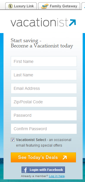
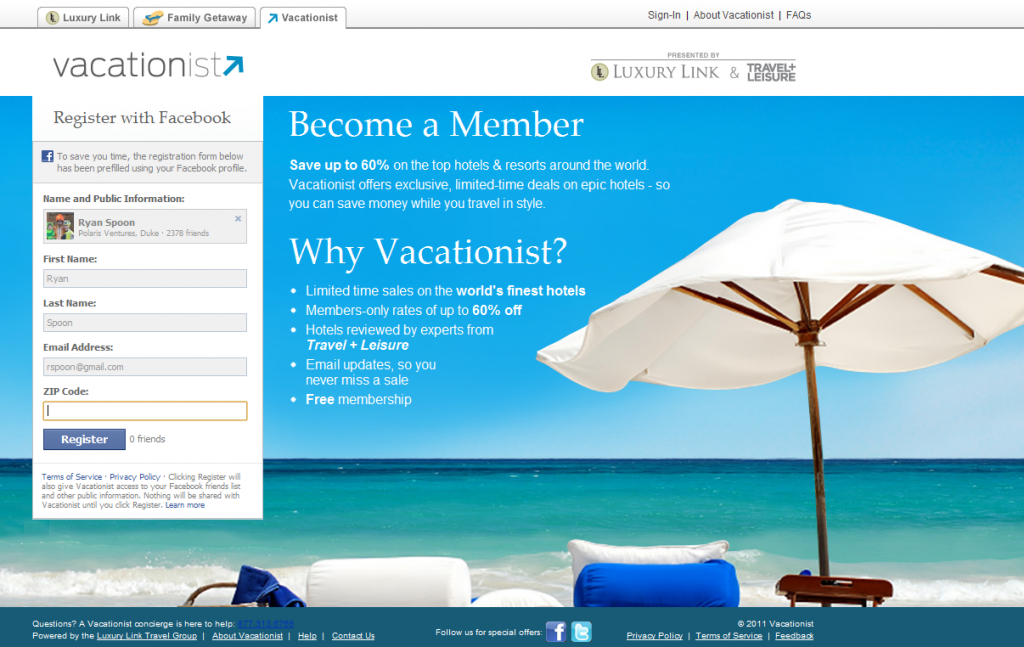
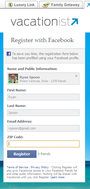
I write a lot about Facebook as more than an acquisition tool - it's a conversions tool, particularly through registration and activation. I bill it the "progressive registration" (read more here). Here is a terrific example from Vacationist. First, the registration box is done in a visually clever way: it hangs atop the background image and has six key fields (First Name, Last Name, etc). When the Facebook Connect button is clicked, the fields change, are all prepopulated except for zip code and the title changes from "Become a Vacationist today" to "Register with Facebook". All that is required to do is enter a zip code and press Register.

One other interesting piece: if I had any Facebook friends on Vacationist, they would appear directly next to the register button. Right now it just says "0 friends" (probably better to hide that!).