Facebook Camera iOS App Knows Who You Are On Install

Two weeks ago, Facebook launched their Facebook Pages iOS app. And last week, Facebook launched their Facebook Camera app.

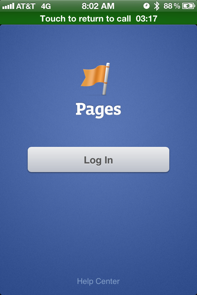
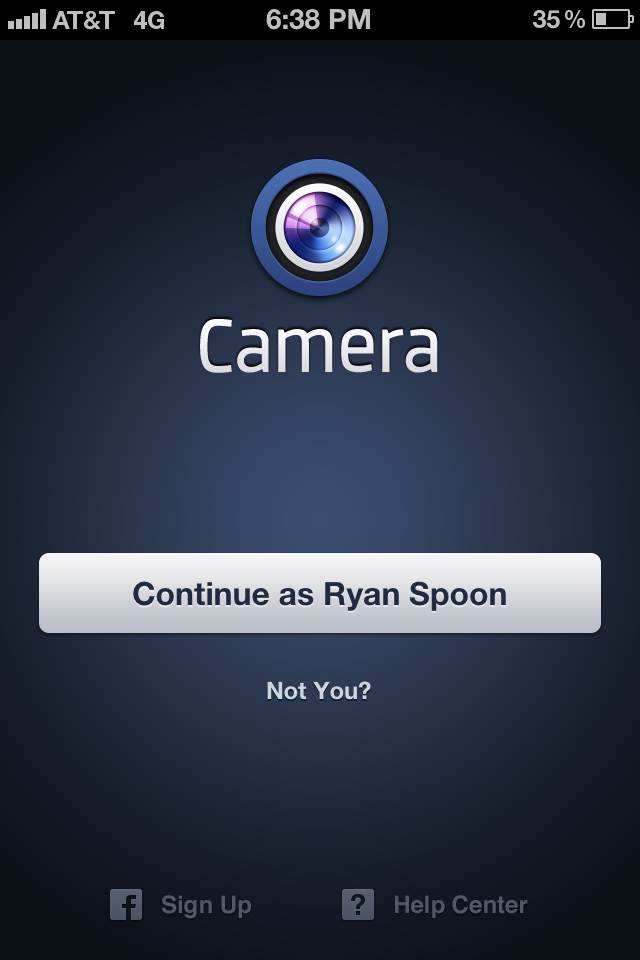
One of the interesting aspects of the two applications is that their welcome screens greet you with the following pages: blue screen, big get started button, and (in the Facebook Camera example) a greeting specifically for me ("Continue as Ryan Spoon").
The Pages example is easy to explain: press "log in" and Facebook authenticates the user via the core Facebook Application already installed on the device. Easy. And of course an user of the Pages app will already have the Facebook app... it's easy to be presumptuous when you have Facebook's reach / scale.

The Camera app is more interesting - and the first time I have seen an example like this. It is also something only someone like Facebook can do (few others have that reach). It is remarkably fast, efficient, cool.... and effective - no worry about conversions, funnels, etc.

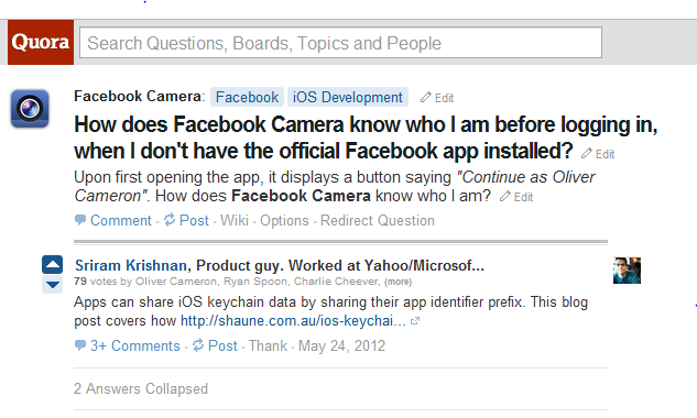
How do they do it? Here's a Quora post explaining:
Google Search Results Looking More Like Facebook: Layout and Ad Units. Starbucks Example.

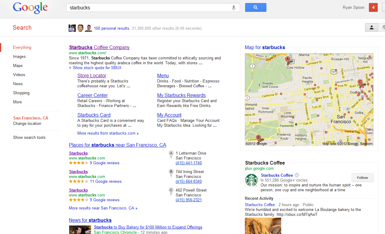
For specific queries, Google's search results pages are looking less and less like traditional Google pages and more and more like Facebook. The below example for the query "starbucks" promotes Starbucks, local maps and news results in the core results. On the right column, there is a Google+ follow button (in 550,000+ circles) and recent Google+ posts by Starbucks. This is strikingly different than the traditional AdWords unit - and a tie in between search, AdWords, and Google+.

Announcing PostRocket.

Last week we announced an investment in Spindle. Today, I am excited to an investment in another seed-stage, Dogpatch Labs, social media company: PostRocket. PostRocket optimizes Facebook content for brand and page owners. It's a problem those users know too well: 1,000s of fans - often $1,000s of dollars spent - and yet only a small percentage are reached. PostRocket looks at the content, fans, and engagement habits to help brand / page owners create better content, publish more effectively, and ultimately drive deeper engagement. It's also a problem this team knows well: they are smarter about Facebook's EdgeRank algorithm / logic than any non-Facebook employee I know.

It's a big, important idea because it's a big, important question for the majority of Facebook brands and advertisers. I have eaten my own dog food and tested PostRocket with the DogpatchLabs Facebook page. The early results are really outstanding: over a 2.5x improvement in fan engagement.

PostRocket is opening their doors soon. You can register for the beta here. And follow them on Facebook and Twitter. More on TechCrunch.

Amazon's New, Expanding Navigational Menu

I have covered Amazon's navigational menus before (here, here, here and here). This is yet another update to Amazon's navigational menu: The Shop by Department still exists - and is still ordered the same way (preferencing digital over physical). But instead of being simple links, everything expands on the hover to showcase different product & merchandise depending on the category. Below you see two examples: Kindle (which highlights each model and Kindle related products / services) and Cloud Drive (which is a large promotion).

The plus is that there is more real estate and opportunity to merchandise and promote (for instance, the Cloud Drive unit is far more interesting and explanatory than a hyperlink). The negative is that this is a heavy series of interactions and can be a slow user experience.

Amazon is the king of conversions and monitoring pixels... interesting to watch what happens with this experiment.

Next Generation NikeID Goes Beyond Colors: Patterns & Logos

I spend a lot of time writing about next generation commerce... and we invest in compelling companies and models like ShoeDazzle and Wantful (as examples). For years, people have pointed towards NikeID as an example of true product customization atop a great web interface. I believe I bought my first pair of custom Nike's in 2003 (Nike Air Max 95's). You can even create, buy and share your sneakers from their iPhone app.

It continues to evolve and the newest iteration is interesting for two reasons:

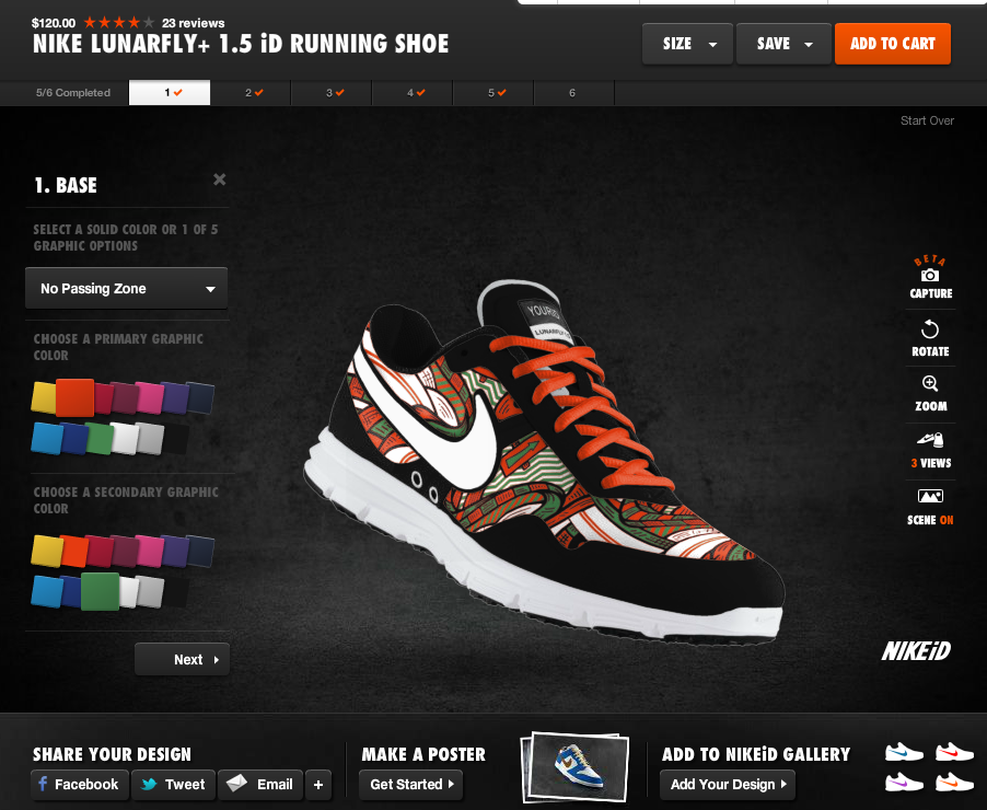
1. It goes beyond 5-10 color choices. You can now choose different patterns (like the one below) and then customize each component of the pattern with various colors... meaning that shoes can look entirely different from one another (beyond colorways). A single shoe model has endless looks.

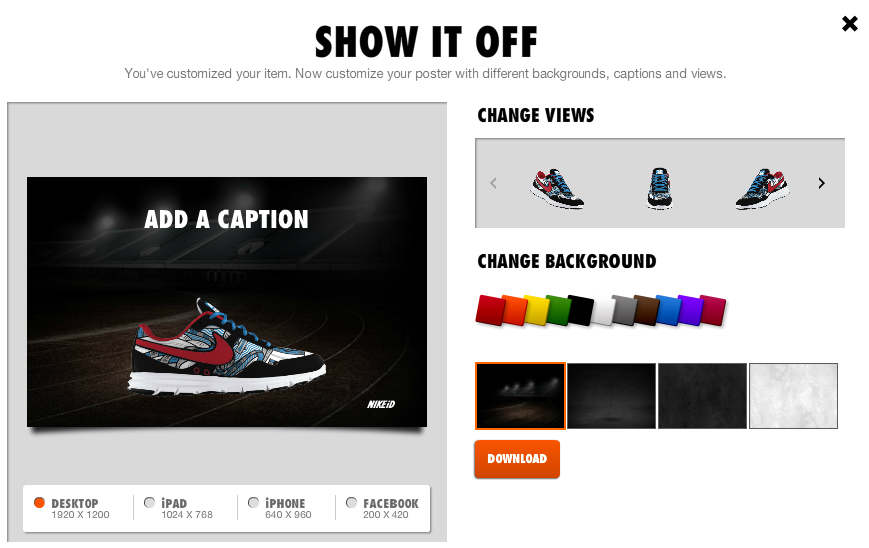
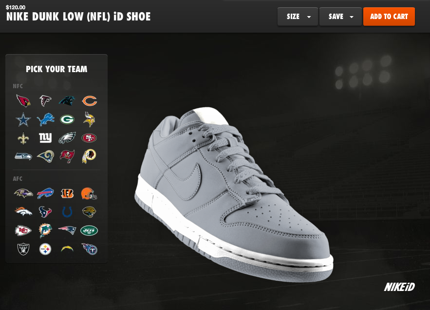
2. Nike just won the NFL contract from Reebok. The obvious launch was the release of their NFL jerseys. But notice in the bottom screenshots that you can now apply NFL logos and colorways to Nike sneakers.... this is a brilliant extension line as there is no cost to Nike, it increases the shoe's value / price, it allows Nike to sell packaged outfits, and Reebok didn't do it.... so it's unique and special.

Facebook Launches Mobile Friend Finder, Overtakes Mobile App

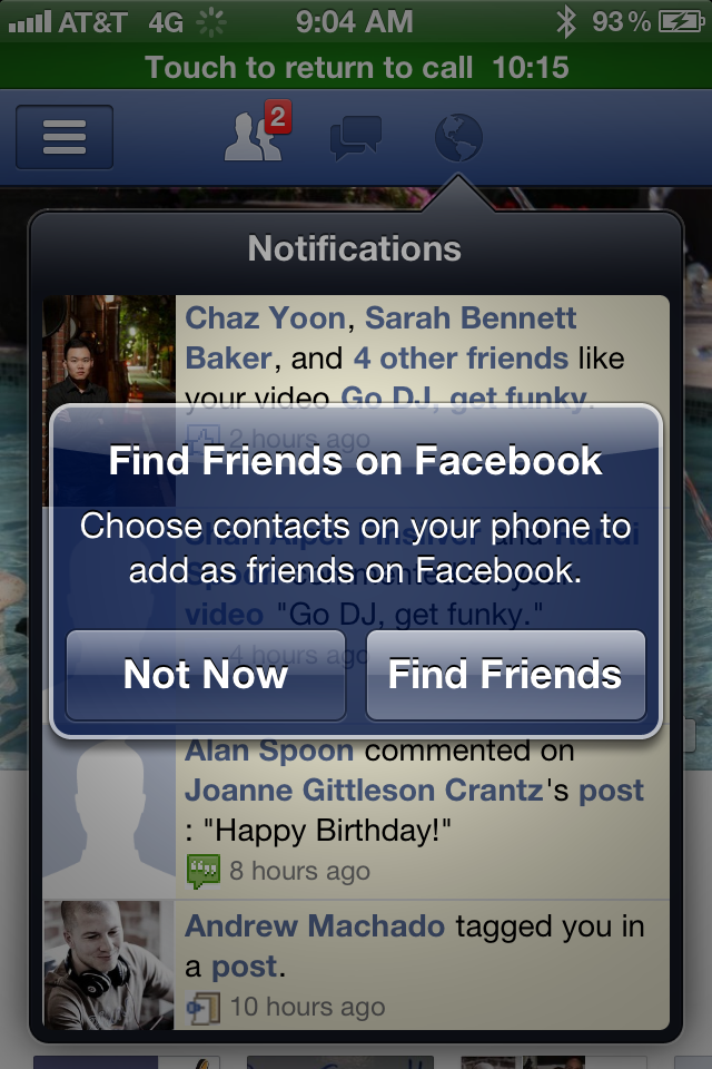
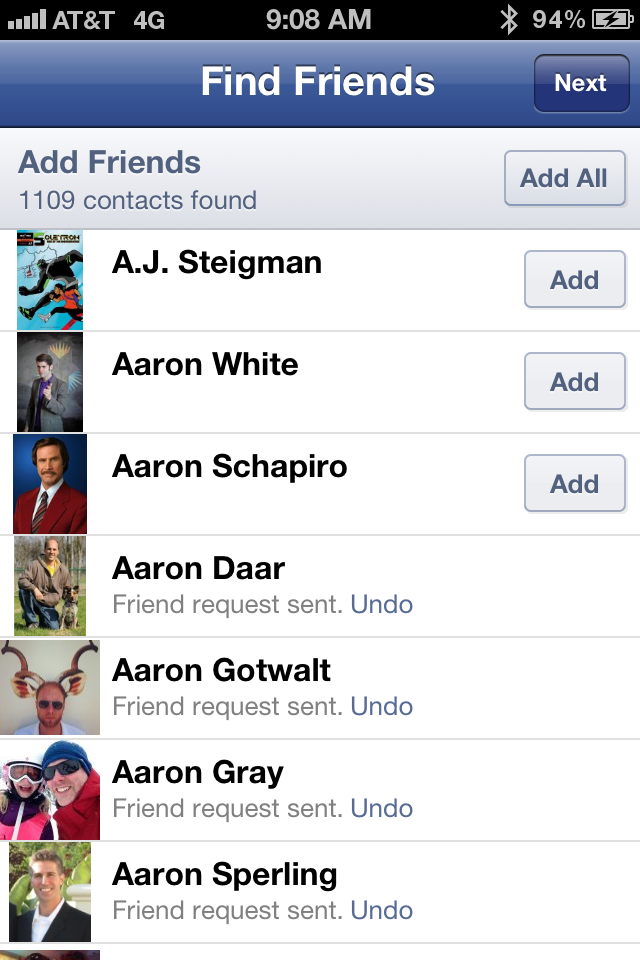
Below is a series of screenshots from within the Facebook iOS app that allows users to match their Facebook friends against their iPhone Contacts: "Find Friends on Facebook: Choose contacts on your phone to add as friends on Facebook." It's a basic concept - but it's tremendously powerful since your mobile contact list is really your tightest, most significant network.... and those users are surely also Facebook users. Of course Apple performs the matching by uploading contacts from the device and then sorting them on Facebook's servers. You may remember this practice was critiqued publicly - but Facebook is very clear about how they are using the contacts.

It is also worth noting that Facebook is clearly aware of the potential growth here (in one click I can add 1,109 new friends!) but wants to balance some quality control: "Please send invites only to friends who will be glad to get them."

Nike Basketball's Beautiful Facebook Timeline In Time for NBA Playoffs

Just a terrific, creative and well-timed use of the Facebook Timeline by Nike Basketball. Coinciding with the NBA Playoffs - and a handful of new sneakers for top stars like Lebron James, Kobe Bryant and Kevin Durant - Nike Basketball is releasing a series of basketball rules: "Every EPIC moment has a story. And every story has a lesson. Lesson No. 1: The deeper the bench. The stronger the squad." Each rule is placed atop a basketball poster that ties into the playoffs and relevant players. Two or three rules are posted a day (so far, 38 rules and posters have been loaded). Nike also mixes in other timely promos like a congratulations to Lebron James for his MVP award and this graphic for the evening's Lakers / Thunder game:

It's clever, fun, on brand and highly visual - which means it is highly engaging on Facebook. It is also something that only Nike can do (the talent, the imagery and the production) and something that really can only be done on Facebook and with Facebook Timeline (no offense to Twitter, but this would be neither as effective nor engaging).

Facebook Offers In The River Promotion

Two trends within Facebook that I have written frequently about: - Facebook Offers: which has morphed from a Groupon-like platform to an extension of their sponsored ad format - In the River Marketing: which is particularly important for large products / platforms like Facebook (examples here: New Facebook Photos and Facebook Places)

Combine those and you have the following series of screenshots: Facebook's In the River promotion of their new Facebook Offers product. When you visit your Facebook page, you are prompted with a takeover atop the status box:

"Welcome to Facebook Offers: Drive people to your busienss with an offer that people can share with their friends." Various examples are cycled through - starting with Red Robin in this case ($5 off).

You can then "take the tour" and Facebook walks you through the various components and how to set up a campaign. Notably, its placed in-line next to the Status and Photo box.... that is prime real estate.

The walkthrough itself is not exactly noteworthy (write a strong headline! Choose a great thumbnail!) - however, the presentation of the tour and the location of the product is important. Furthermore, the final step of the tour is very interesting because it demonstrates the friction of online to offline content and commerce:

"Prepare your staff: Let your staff know about the offer so they're ready to accept it from people who show it from a mobile phone, or in printer form." Easier said than done as this is a far bigger problem than a one-line reminder to tell your staff about the coupon.

Amazon Brings All 7 Harry Potter Books to Kindle Lending Club

This is pretty significant news out of Amazon: all seven Harry Potter books are now available in the Kindle Lending Club. It is the all-time bestselling book series and is a testament to Amazon's willingness to put marketing muscle behind Kindle and the Lending Club. And considering the reach and popularity of the Harry Potter franchise - it is a win for Kindle owners, Harry Potter fans, and Amazon users. It is also worth noting that it is a couple days from Mother's Day and Amazon's merchandising exists (upper right corner) but is far smaller than the Harry Potter announcement or the Amazon Local promotion. I would have assumed that the week would be dedicated to Mother's Day preparation - particularly highlighting one-day shipping, etc.