Twitter's Surprising iPhone App UI
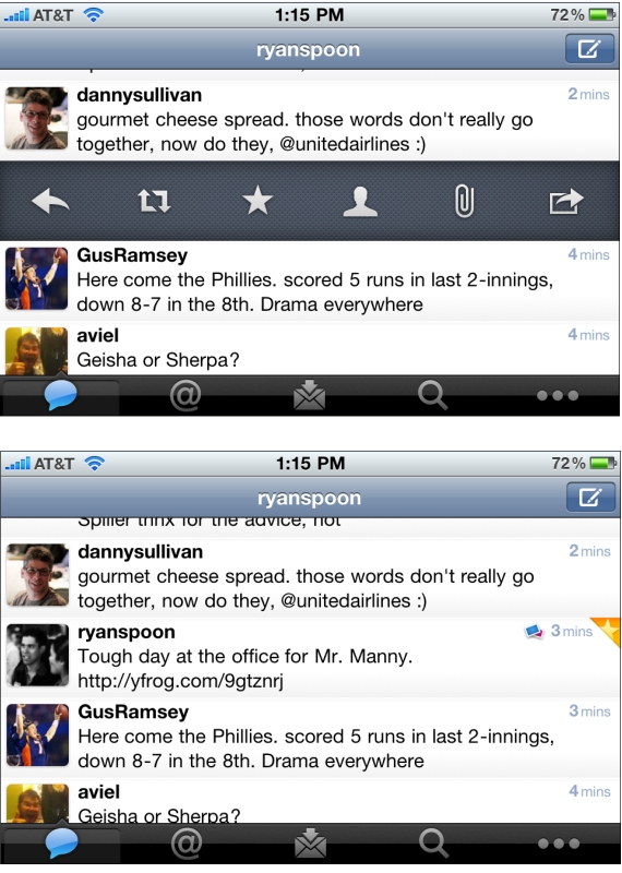
Not previously known as a leading designer, Twitter has been on a roll with their latest iPhone app, iPad app, and New Twitter. Here is a good example of why - but with some learnings / advice on how to design features. Twitter has to accommodate for lots of functionality: reply, retweet, search, favorite, quote, etc. You can easily imagine an application overwhelmed with buttons. Twitter solves this by having the core functions available via footer buttons, a "more" ('...') button and a surprising single tweet pane.
I call it surprising because it was not clear to me that this functionality existed... but if you swipe a tweet to the right, a pane appears that allows for quick functions of that tweet: reply, retweet, favorite, email, user info, etc. It is super useful... but is also surprising because I only discovered it accidentally. And this is a complaint I hear a lot from products trying to solve numerous tasks (no matter how elegant the solution may be). A consequence of simplifying complexity is often having to hide functionality... and that itself can lead to confusion.
It is difficult to boil down layers of options into a simple interface. It is equally difficult to make the interface intuitive and the functionality easy to uncover. That's why it's an art!
One other note: I love the small interactions that Twitter layers in... in the second screenshot, notice the small star that appears is uncovered in the upper right corner. That appears when a tweet is favorited.
The Power of Statistics & Dashboards (About.me as an example)
In May of 2008 I wrote that statistics - specifically around referrals and influencers - could be a sizeable business model for Twitter. Last week, About.me launched publicly. It's a gorgeous site creator that allows very simple page creation and automatically pulls in content from your social presences: ie Facebook, Twitter, Foursquare, Wordpress, etc. You can view mine at About.me/rspoon

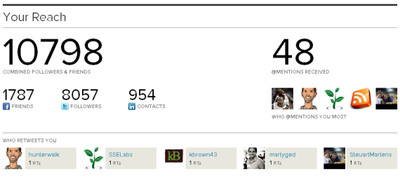
Much can be written about this - SEO, self-branding, social aggregators, etc. But I want to return to the premise that my 2008 article about Twitter and statistics... because one of the great features of About.me is their "dashboard":
First, the dashboard gets users to return to the site... making it "sticky" in an environment that might not otherwise encourage daily usage (after all, the service automatically updates all of your presences!).
Second, it is addictive... in the same way that game mechanics make other sites sticky and why Twitter's follow count can be credited with some of their early growth.
Third, it encourages promotion. Want more views and visitors? Promote your About.me page via Twitter, Facebook and email (of course About.me makes that easy).
Fourth, it is really useful and interesting... and unique. There are statistics on visits, views, etc - but more interesting, there are stats on the number of status updates pulled in, your total reach, the @replies, etc. Powerful ways to unite the data around "influencers" and your About.me page will emerge over time.
So how can you apply similar mechanics and a "Dashboard" mentality to your experience?
Twitter by the Numbers - 6B API Calls / Day; 70,000 Calls / Sec
Great Twitter presentation by Raffi Krikorian of Twitter's API team. The talk is from a presentation at UC Berkeley and he talks about Twitter's platform, scale, etc.

Fascinating to think about the scale of Twitter's ecosystem (users, messages, platform, developers) and how complex 140 characters can become... after billions of deliveries:
Twitter Launches Tweet Button; Publishers to Allocate Pixel Real Estate
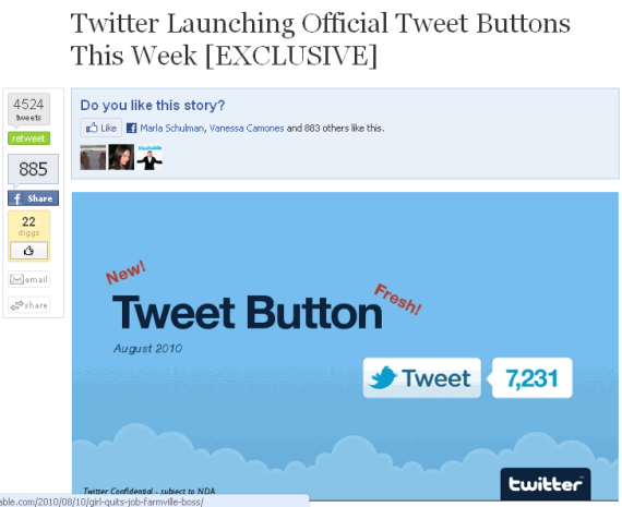
Twitter has officially launched their Tweet Button - a natural move which will place them beside Facebook's like buttons... and across millions of pages on the web (soon to be on this blog!). The question is what happens to everything else? There is only so much space on each page and ultimately publishers will only devote real estate to those buttons that deliver the most traffic / engagement. Twitter and Facebook will clearly qualify - but who else? My favorite example is this post from Mashable which leaked the Tweet Button a couple days ago. The Tweet Button screenshot sits below the Facebook Like graph and beside Tweetmeme, Digg, and Facebook Share. Of course there are others: For instance, I use Apture and Disqus. And more will come - like Facebook's long rumored social bar.
Carl's Jr Launches Viral Ad Campaign on Facebook. It's Great.
Remember Burger King's 2005 Subservient Chicken ad campaign? It is listed on Wikipedia as a notable example of "viral marketing campaigns" and was cited by Wired Magazine as one of the most successful viral ads to date. But while those campaigns can be very successful, they are tremendously difficult to emulate / predict / promote. Today - thanks to platforms like Facebook - viral means something different... and it is easier to create and foster. Here is Carl's Jr current viral ad campaign running on Facebook. Alongside screenshots, I will walk through the campaigns various components... which together are:
- a very compelling mix of advertising, product development and viral mechanics (feels as much 'Zynga' as it does advertisement)
- an effective mix of advertising and viral growth. Carl's Jr. is kickstarting the campaign with premium Facebook Ads and then relying on user-generated growth
- rewarding. We know from Facebook and their sampling platform that users love free stuff. Carl's Jr. provides that and rewards users for sharing.

Here is the Carl's Jr. premium ad running on Facebook. Any advertiser knows that creative is critical - particularly on Facebook. This combines a great call to action: "Fan Up for Free Food" and a racy photo.

Click and arrive at the Carl's Jr. Facebook Fan Page. It has a large Facebook Login button - as this is essentially an application within their fan page. Also notice the focus on creative again: "Click for Awesome" and the big "Spin Credits" which stand at "0".

Proof again that this is basically an application within their fan page: once you click the Facebook icon, you have to give the app permissions for profile access and graph data.

Once you allow permissions, you are granted a free spin from the Carl's Jr. wheel of free stuff. Everyone wins something - some prizes are big and others are not (like my free coffee and hash rounds with a breakfast burger purchase).

People love rewards and free stuff - and because everyone is a winner, everyone is incented to share with their friends. Here is your opportunity. Carl's Jr. does a good job with the creative here - which is a critical component for feed promotion - for instance, the image is unique to the prize.

Want more spins on the wheel of free stuff? Invite Facebook friends and, when they take a spin, you earn more credits: "every friend you get to spin the wheel of awesome wins you an extra spin!"
These invites are another opportunity for Carl's Jr. to drive awareness. So the flow and touch points are: - advertisement (where you can see which friends 'like' it) - fan page (becoming a fan appears in news feed) - promotion of your prize (via your news feed / wall post) - viral invites

Polaris is Excited to Back Formspring.me
Yesterday, Formspring (http://www.formspring.me) announced a $2.5m Series A investment that was led by Baseline Ventures and FreeStyle Capital. Polaris is excited to also participate alongside a slew of terrific angel investors: Ron Conway’s SV Angels, Maples Investments, Chris Sacca’s Lowercase Capital, Kevin Rose, Travis Kalanick, Dave Morin and Scott Dorsey.
 Formspring is a social Q&A platform that makes it very simple to ask questions and receive answers from targeted users. Through Facebook Connect and Twitter , answers arrive almost instantly; and thanks to Formspring's large network, users and answers are highly targeted. The combination of:
- a simple user-experience - a clear consumer impulse (questions / answers) - that delivers immediate gratification - in a viral and social way
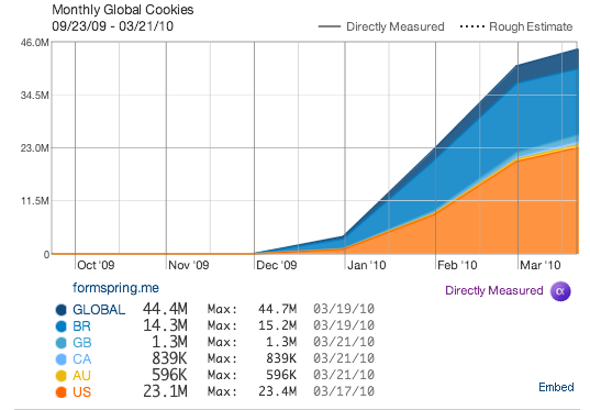
... has translated into significant growth. Since their November 25th launch, Formspring now reaches over 44m users and had over 300m questions answered. For a taste of their size, search for Formpsring.me on Twitter ... you will notice 100s of posts each minute:
Whether you are looking for creative direction or seeking input on a specific topic, I encourage you to give Formspring a spin.
More reading: VCMike: Why Polaris is Backing Formspring
Foursquare Traffic Sources: Facebook 33%, Google 22%
As you can tell from recent blog posts, I have been spending time looking at traffic sources for various sites (Facebook, Huffington Post, Perez Hilton, etc). New data from Hitwise reveals that one-third of Foursquare's traffic comes from Facebook:
Top traffic sources for Foursquare 1. 33% Facebook 2. 22% Google 3. 08% Twitter In total, nearly two-thirds of Foursquare's traffic arrives from three sources (one search and two social).

A few things pop out:
- Facebook's referral traffic has steadily grown on a relative basis... and considering that Foursquare's SEO 'juice' has most likely strengthened over time, that means the relative growth has overcome success on Google.
- Twitter as a traffic source is relatively volatile: large peaks around 30% and lows around 7%. It is likely an outcome of power Twitter users and large events (like SXSW - though not reflected here).
- I imagine the visits differ dramatically between Google and Facebook + Twitter. SEO likely sends more branded (foursquare.com) and deep visits (directly to locations - ie a specific venue's name); whereas Facebook and Twitter are more social and circular (driven by the individual rather than the location).
Brizzly Launches iPhone App & Brizzly Guide
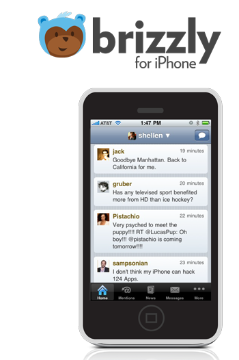
A big, exciting day for Brizzly (whom I have written about more than a few times!). Today they announce two major product launches: 1. Brizzly for the iPhone It is a free iPhone App (download here) and has the same functionality and feel that Brizzly.com has. If you are an avid Brizzly or Twitter user - it's a must:
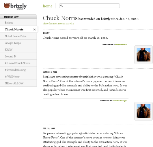
Brizzly has always included Twitter trends with crowdsourced definitions and color. In fact, they also have made it widely available with the Lets Be Trends API. Trending topics each get their own guide pages - which are archived - and feature relevant content from the community, Twitter, relevant sources, etc. You can also access historical information about topics. For instance, Chuck Norris is the #2 trend today (it is his 70th birthday) but you can also see that first appeared as a trend on Jan 16, 2010. In fact, Chuck has quite the robust Brizzly timeline:
You can now read more on TechCrunch: "Brizzly’s Been Busy — Buying Apps, Creating Guides, And Going On Picnics."
