DogpatchLabs.com Update: Locations, Roster & RSS

A couple updates on the new DogpatchLabs.com: - First, we have added headers for each of the three Dogpatch Labs locations: Cambridge, New York and San Francisco. You can access all Dogpatch posts directly on DogpatchLabs.com, or follow news from your specific locale. - You can see a list of all Dogpatch residents by location... its a large and impressive list. I encourage you to take a look at the 'roster' and their various companies / websites!

- We have added a 'sidebar' with quick links to follow Dogpatch on Facebook, Twitter and via RSS.

More updates are coming soon. Again, thanks to Wordpress and Egghaus (a Dogpatch Labs resident!)

Apple's iPod Nano Takes Over ESPN Homepage

There are a handful of websites that push the edge on rich ad units: the New York Times, Gizmodo, Yahoo and ESPN (to name a few). There are also a handful of brands that create great rich ad units... Apple is clearly one of them. For instance, Apple has taken over ESPN and Yahoo to promote iPhone gaming.

Apple and ESPN teamed up once again - but this time to promote the iPod Nano... its a tie to the television campaign that is currently running - but it is also the first time I have seen a major online campaign for the Nano (particularly when the iPhone and iPod Touch are so hot / important).

The movement in the ad expands beyond the unit's traditional size (which is already quite big) and the Nano / dancers move fluidly into ESPN's header. It is quite attractive and, any time large / slick movement occurs, it is certainly eye-popping.

Also notable: large ads like this can load slowly and cause usability issues - this was done quite well and usability was not affected. In fact, the ad (and it's noise and movement) can be easily avoided.

Happy New Years from JibJab: Never a Year Like '09

Another great job by JibJab with their end-of-year celebration video: Never a Year Like '09.

Try JibJab Sendables® eCards today!

Worth noting, JibJab released the video first on Facebook via the JibJab Page to their ~90,000 fans:

"In 2009, Facebook enabled us to connect with fans in ways never possible before. As a thank you for being a JibJab fan, we want to offer you the first look at our 5th annual year in review video: "Never a Year Like '09". Thanks for all the support in 2009 and best wishes for a 2010 full of laughs!"

It is a nice reward (and incentive) for Facebook fans and it fosters great conversation (fans are dissecting interesting, hard-to-spot scenes in the video).

Facebook Increasing Awareness of 'Notes' in News Feed?

This is my last short Facebook post of the day... and it is also speculative as it is based on the fact that this is the first time I have seen behavior like this on my account. Facebook was the most visited site in the US over Christmas, and that size enables them to test different formats and features to various segments. Below is a screen shot of a Facebook "Note" from Alex Schultz. You will notice that the image is full size and fully integrated into the Facebook Feed. Normally, at least in my experience, notes appear with similar formatting as normal links: a small image on the left and the content blurb to the right. Here, the image is very large and the blurb is beneath. This could suggest that Facebook is working to put more effort and promotion behind the Notes product - either as an on-Facebook blogging-like tool and/or deeper integration for page owners. Either way, it certainly stands out and warrants attention for 'publishers'... who will race to get attention of their users. As an active Facebook user, Notes user and blogger, I certainly noticed it!

Facebook Promoting Public URLs and Sharing?

Facebook continues their push towards public content - both for personal and brand / page accounts - and, as we all know, it is a tight, challenging line to walk between private and public content... particularly considering:

1. Facebook started as an entirely closed, private network 2. Migrating from private to public is both technically and organizationally challenging: how to do share and find specific content in a commingled world? 3. Twitter has found success in an entirely public world I am not sure if this is a new feature, but it is the first time I have seen it: below a recently posted photograph, I have the following message and option:

The URL goes directly to the public page (see here) and the "share" functionality goes to an email. If this gains traction, or Facebook gets comfortable with it, you can imagine other activities like posting to Twitter.

You can tell that this is an early step in the direction: the formatting is not very bold and it is placed towards the bottom of the page (below comments). But it is a clear step in the public direction and is more prominent than including it with the share button (which you might not have otherwise noticed).

Living Proof Uses Facebook to Distribute 15,000 No Frizz Samples

This will be the first of a few short Facebook related posts - my apologies!

InsideFacebook has a nice write up the recent Living Proof sampling campaign they ran on Facebook.

Using Facebook's sampling ad unit and their Fan Page, Living Proof was able to distribute 15,000 samples of their No Frizz hair product in under 48 hours. During that same period, their Facebook fan base rose from 1,000 to over 7,000.

In addition to successfully pushing distribution and driving fans / discussion, Facebook enabled Living Proof to successful target a quality audience - both for the sampling and the fan base. 93% of Living Proof's Facebook audience is female and 88% are their fans are between 18-54:
"By not requiring Facebook users to become fans of the page to get the sample, they potentially hurt their overall numbers. But it seems that Living Proof was after quality over quantity in this instance, which is reflected in the extremely specific demographic targeted through Facebook ads — 88% of those exposed to the ads were females between 18 and 54 years old. Read more..."

Facebook: #1 Visited US Site on Christmas & Christmas Eve

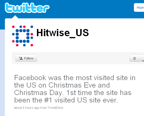
According to Hitwise (ironically via their Twitter feed), Facebook was the #1 visited site in US on Christmas Eve and Christmas Day. This is the first time Facebook has been the most visited page.

Facebook's growth and audience diversity are obvious - but this is a telling sign that Facebook has matured beyond college audiences (who seasonally are not on-campus during late December) and into ubiquity. Over Christmas, my Facebook feed - like all others - featured best wishes, vacation photos, food updates, football analysis, etc.

A thank you to Facebook's Alex Schultz who posted this on his Facebook feed (where I found the tip!):

ESPN's Mobile Application Strategy (and Ad Campaign to Match)

ESPN's Scorecenter iPhone App is the top sports application in iTunes, alongside several other successful ESPN apps: ESPN Radio ($2.99), ESPN Fantasy Football ($2.99), ESPN Zoom ($2.99), ESPN Streak for the Cash, ESPN 2010 World Cup, and so on.

Paid mobile apps are a key part of ESPN's digital strategy:

“I think we are evolving into a mobile applications world, which offers much more personalization, and we’re moving towards more paid content in mobile,” said John Kosner, senior vice president and general manager of digital media at ESPN, Bristol, CT. “We take it for granted that content is free on Web sites, but I think you’ll see something different evolve on mobile. “We’re committed to multiple revenue streams, and Apple’s iTunes billing and carrier billing makes it easier to do paid mobile content,” he said. “Advertisers want scale, and we’re able to provide that by delivering want fans want.

“It’s all about value—fans will pay for content that they value and they can’t find other places, and we’ve also been able to reach scale and have enough of an audience mobile so it interests advertisers.”

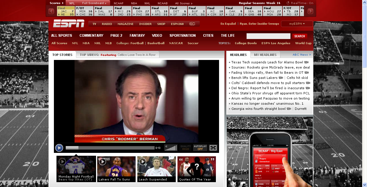
The focus on mobile applications is evident from the advertising and cross-promotion online, on-radio, in-print, and even on-air. Listen to an ESPN radio broadcast and you will hear several personality-driven promotions of the new ESPN Radio App... and, if you visited ESPN.com yesterday, you surely noticed that the homepage was taken over to promote ESPN's Scorecenter application:

Traditionally, ESPN saves the homepage for high CPM, rich ad units; here, they are promoting a free application for mobile users. That app is then used to promote ESPN's paid applications (average of $2.99 per download) through overlays, interstitials, etc. It is an interesting move considering that the holiday shopping season just concluded and that iTunes is seeing record traffic post-Christmas.

The ad unit is terrific: it takes over the entire background of the page and features a 'swiping' finger. As the finger swipes between iPhone screens, ESPN's background synchronously shifts. It is great looking and does an excellent job showcasing the slick UI on the iPhone.

click to see each 'stage' in full size

Facebook Friends and Twitter Followers

Mike Hirshland today has a blog post, "Friends or Followers", which describes the frequent conversation / debate around Facebook and Twitter:

In the course of our meeting [at Facebook] the Twitter question came up, and we divulged our bipolar personal usage patterns: Ryan is a total Facebook bigot and never uses Twitter, while I am an avid Twitter user, though I have been spending increasingly more time on Facebook. We spent a bunch of time discussing why this was so. For me the answer is simple: with the exception of a couple dozen folks who I follow because we are friends, for the most part I follow people on Twitter expressly because they have interesting updates and/or link to interesting content. As such, Twitter has entirely replaced my usage of Google Reader.

While the highest level discussion is whether you find yourself using Twitter or Facebook more often (there are few people who split time evenly between), there are several contributing factors that lead you into either Twitter or Facebook:

- What is your motive? for instance, brands, thinkers and socialites have totally different wants and experiences on each.

- What is your 'experience' on each? I would argue that Twitter is kinder to new users because of the one-way relationship; whereas Facebook can be a lonely place if your newsfeed is not vibrant. For more 'experienced' users, I would argue that Facebook is less noisy, easier to navigate and therefore more efficient from a consumption standpoint.

- Who are you following? This is Mike's point exactly: his feed is a mixture of peers, colleagues and friends... some of which are not "friends" (by the original Facebook definition). Again, Twitter's one-way relationship format allows for a mixture of personal and impersonal followings. That is more difficult on Facebook - though it is changing as user habits change (more public, network driven) and as Facebook enables the change.

Ultimately, as Mike puts it, I am "a total Facebook bigot and never uses Twitter" because: - my network is there (for the most part) - the network is generally easier to mange (I can 'handle' 1,250 friends but only 300 followings) - the experience is cleaner - the content from my feed is generally of higher quality - the conversations (comments, likes, emails) are as rich as the content... following a thread is easy and important - it is within a larger platform that provides other key values: email (I get a ton of email through Facebook), photos, search, etc

Not to say I do not think Twitter is important or powerful (it certainly is) ... just to say that, while Mike live on Twitter, I live on Facebook.