Learning from Quora's Mobile Site

Two of the core tenets of web design is "don't make users think" and "manage to focus users' attention" (see great list at Smashing Magazine). In short - this means that every pixel should be aimed at conveying what is most important and driving users to the right behaviors. This is a difficult task that some excel at... and it is made even more difficult by the mobile web - which provides far less real estate and different user interactions. Below is a screenshot of Quora's iPhone site (*not* an application despite looking like one). It is notable because it perfectly embodies Quora's core components and user interactions:

1. Notifications: the Quora logo dynamically displays the number of notifications you have. For a web component, this is very nifty - but it is very useful and displays the speed at which Quora's content is growing / moving.

2. Search box: Big search box with grayed out call to action. On the core web site, this is the major call to action.

3. User ID using Facebook Connect - which is the registration mechanism.

4. A series of major buttons that are the primary calls to action: ask a question, notifications and inbox. All revolve around the core question & answer premise.

5. Rather than view on your notifications, you can view Quora's entire log of changes (questions, answers, tags, edits, etc).

6. Invitations: Quora is still invite-only and invitations are an important role in user growth and virality.

Nike Uses Facebook to Showcase Golfers' US Open Outfits

In advance of the US Open at Pebble Beach this Thursday - Sunday, Nike has taken to Facebook to reveal their sponsored golfer's daily outfits. Each golfer has a page within their "Athlete Apparel: 2010 US OPEN" photo album. it features outfits with specific information and product IDs (hat, shirt and pants) for each day of the open. Facebook fans are then able to comment, like and share. It is an interesting campaign by Nike - who rarely previews their player's gear so specifically and in such a social setting. It also strikes me a test to gauge fan interest on Facebook - if users indeed interact around the players and their outfits, Nike could build a Facebook application to enable in-app purchasing, exploration, etc of each product / outfit. Fans could share specific products and ensembles - and even outfit their favorite players and share with their networks.

Even if a test, it seems that users are actively engaging (despite relatively moderate volume). Tiger Woods' outfit, for example, has ~100 comments and 'likes' that are a mix of product feedback and interest:

Tiger Woods' US Open Outfits: Day by Day

All Nike Golfers US Open Outfits

Facebook Promoting Sneak Peeks, Advertising for Beta Testers

Facebook recently started taking applications for beta testers of their new questions products (TechCrunch coverage here). The application itself is interesting in that it is far more thorough than the standard name & email process. Facebook outlines the vision of the product and then asks for three sample questions and answers... and promises a response within 24 hours. They include guidelines and a sample question / answer: Also notable is that promotional 'ads' for applicants are now appearing in the right column of the Facebook homepage.
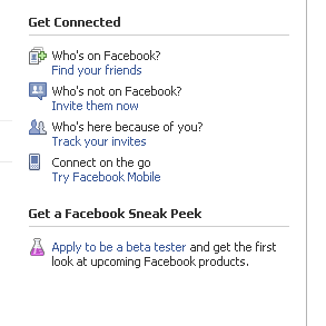
The ad encourages users to apply to become beta testers... and while the landing page is specifically geared towards the Q&A product, the ad creative doesn't mention it. Rather, the ad speaks of beta testing future "Facebook products". Considering the value of the ad's real estate (typically reserved for high impact activities: ads, birthdays, invites, requests, etc), you can expect that other products are in the works and beta testing plays a key role.

Frontierville.com: A Strange Redirect to Facebook App

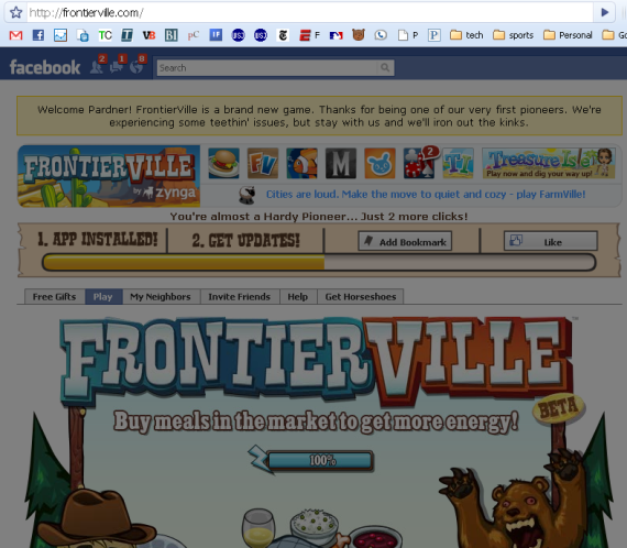
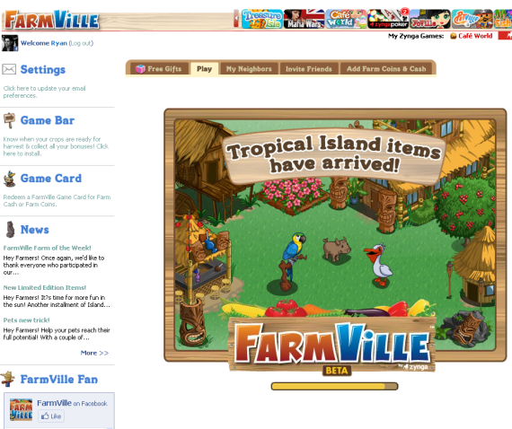
Earlier this week Zynga launched their newest game Frontierville - it already has 1.3m monthly actives and 450k fans. While Frontierville's gameplay inherits many of the best practices of its siblings, its domain behavior doesn't. Zynga has made an effort to instill their own branding across the properties and place games at their own domain - like Farmville.com (screenshot at bottom). Frontierville.com however behaves differently. Rather than its own domain and embedded gameplay, it uses a frame to display the Facebook application page while maintaining the frontierville.com domain. The page itself is grayed out - but still active (showing your Facebook data and playing the Frontierville music). The page isn't actionable... but when clicked (anywhere) you are directed to the actual game and application page: http://apps.facebook.com/frontierville/

Here is Farmville.com:

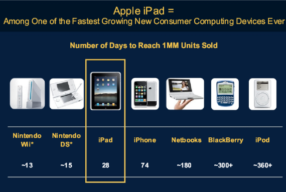
Apple iPad: 3rd Fastest Selling Device (Behind Nintendo Wii & DS)

If there is a voice for mobile growth, Mary Meeker is it. And she has 50+ slides of charts and data to prove her bullishness.

Below is the latest version of her Internet Trends deck (updated June 7 for the CM Summit in NY). I have included screenshots of three particularly interesting slides which are relevant to previous posts on this blog. The entire deck is embedded below via Scribd: Other than Nintendo's Wii and DS, the iPad is the fastest growing device - taking just 28 days to sell 1,000,000 units. That is more than 2x as fast as the iPhone and 1/2 as fast as either Nintendo device (which is impressive):

Android's growth is impressive... and ramping significantly. The wild card will be the new iPhone 4 (how many units will it move?) and whether rumors of a non-AT&T iPhone come true by year's end:

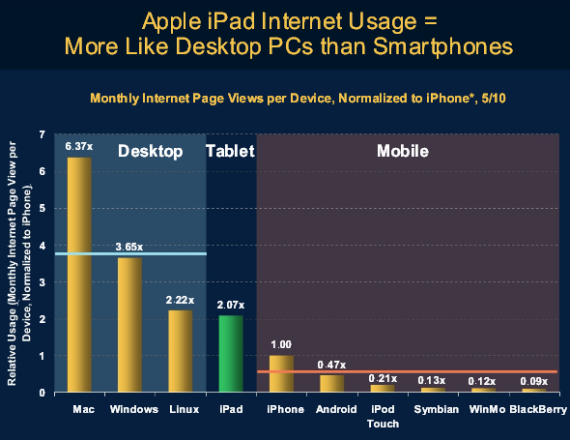
Normalized to the iPhone, iPad usage is more alike desktop PCs than smart phone usage. This is conceptually straightforward - but clear proof that these tablet devices are effective ways to surf the web and accomplish other 'desktop' activities:

MS Internet Trends 060710

Google.com Certainly Looks Different

Google's new homepage looks much different than their old, clean and simple homepage. The difference and opportunities for customization are a bit shocking and: ... dare I say Bing-like? ... or Picasa with a Google search box?

Quick Hits: Dogpatch Labs, Living Proof, JibJab & StickyBits

A few Dogpatch Labs / Polaris related updates - which I typically try to bundle together!

1. Dogpatch Labs New York featured on CNN

CNN's recent piece "The next Silicon Valley? It may be New York" looks at the growing tech scene in New York and features Dogpatch Labs and our focus on "open-source entrepreneurship."

2. Living Proof unveils unique referral program

Living Proof, who just won three CEW Beauty Awards, launched a referral program that: 1. rewards recipients 20% of their purchase 2. and gives successful referrers a $48 gift card

3. StickBits 1.5 Launches

StickyBits has released a new version of their application and it features "official bits", threading, voting and more. iPhone users can download the newest app here and Android users can go here.

4. JibJab Launches World Cup themed videos

Personalize funny videos and birthday eCards at JibJab!

Lightweight Product Progression - Facebook Events as an Example

User acquisition and customer lifecycle / progression is often measured with funnels and segmentation studies (interested in more? take a look at KissMetrics - a Polaris company). It is not a big stretch - but it is valuable to think about product similarly. A user's first interaction with a product (application, registration, form, etc) is critical... and one frequent failing is overload of information, interactions, requests, etc. There are several great examples of web products that progress as each user graduates through various steps / actions. For instance, registration commonly occurs with a big form: name, user ID, contact information, etc. Progressive registration can occur with just a user ID or Facebook Connect login. Additional information can collected as the user advances in the product's cycle.

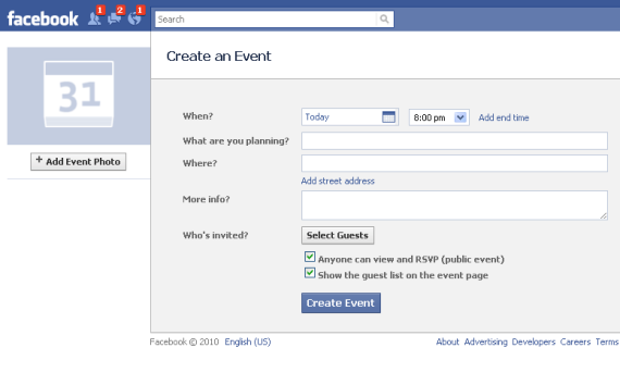
Below is a good example from Facebook. Their events product is powerful and relatively complex as it has several fields, components of customization, friend invitations, etc. When Facebook moved event notifications to the upper right portion of the homepage, they created a mini-application and effectively created a progressive product flow:

It starts with a simple box and question: "what are you planning?"

Click into the box and only the most important fields expand: name, date, friends and location. This is an important lesson for user registration or profile building - collect only the essentials up front and enable expansion later.

Want to further customize your event? You can supplement what you already created: