With Facebook Deals, Facebook Focuses on Friends

Last night, TechCrunch reported that Facebook announced the forthcoming launch of Facebook Deals. Facebook's clear push is around finding activities and local businesses that can be enjoyed among friends... which is a very different value proposition than 'big savings!': "Deals on Facebook. Now Better With Friends. Find fun things to do with your friends.". That positioning is obvious in all of Facebook's marketing thus far: landing page, announcement, and notifications (email, wall posts, viral loop, etc):

In a very competitive space with a couple dominant players, Facebook recognizes that their differentiator is also their launch strategy: their massive audience and each users' social graph.

- Facebook announced their Deals platform yesterday (Coming soon!) - Users were prompted to 'subscribe' to Deals (before Deals are provided) - Once you subscribe, two things happen:

1. Your Facebook wall is updated with the announcement - encouraging others to learn, subscribe and share ('tell friends')

2. You are prompted to directly invite friends to Facebook Deals (the Subscribe Now button becomes a Tell Friends button and you are encouraged to select friends to invite

Zappos Marketing: Surprises & Delights

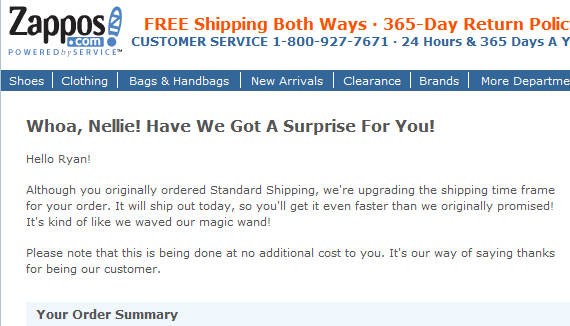
It's no surprise that Zappos:1) pays attention to customer service 2) markets to and communicates with customers well Below is a great example of both... it's also an example of "surprising and delighting" customers - a core mission that I believe should be baked into product and marketing strategies. When designing experiences, products and messages, the goal should be to delight your users, who in turn, become engaged brand advocates.

After a recent purchase (in which I did not opt for expedited shipping), Zappos "surprised and delighted" upgraded shipping in a clever, cute note. Few brands deliver upgraded service (surprise) and fewer communicate with fun, on-brand messaging (delight):

Mashable's SXSW Potential Breakout Apps: 3/13 are Dogpatch Labs Companies

As South by Southwest approaches, start-ups are polishing their applications and planning their launch parties. And today Mashable listed the "13 Potential Breakout Apps to Watch at SXSW 2011". Of the thirteen companies to watch, three are Dogpatchers: Also - a reminder that we will have Dogpatch Labs SXSW Sunday and Monday. If interested, click here to learn more or email me directly for more information. Several of us will be present!

- Yobongo (Dogpatch SF)

- Fast Society (Dogpatch NYC)

Fast Society Version 2 Launch from Fast Society on Vimeo.

- Instagram (Dogpatch SF)

Overstock Rebrands As O.co

The .co domain is hot... at least from a marketing perspective. GoDaddy and others have run large television campaigns (including during the Super Bowl) to promote the new domain. I have no data to suggest that the .co domains are gaining traction (although I suspect that is not the case). The first major .co move? Overstock.com which is rebranding themselves as O.co. It will be interesting to watch whether they gain branding / marketing traction with the move (again, I suspect that will not be the case). It is an interesting / bizarre move considering that Overstock is already a prominent brand and advertising efforts around a rebrand are challenging... no matter how short or clever the new domain is.

This ad, which is currently running in prim time television, is proof: the spot is focused on explaining the rebrand while reinforcing the core brand qualities.... tough, confusing and probably not worthwhile.

Eightbit.me Requires iPhone "Add to Homescreen". Aggressive & Clever.

In July, I raved about YouTube's innovative mobile "Add to Homescreen" promotion. Eightbit.me has gone a step further and actually requires users to "add eightbit to [iPhone] homescreen". In fact, each time you visit Eightbit.me, you have to add the icon to your phone's homescreen. In other words, if you visit http://eightbit.me on your iPhone, you see the following screen. You cannot advance through the site without adding it to your homescreen.

It's aggressive.

It's also clever.

And, while dangerous as part of the core site experience, it has interesting applications. For instance, it is well served as part of unique flows. Perhaps a promotional campaign or special reward / unlock is only accessed after adding to homescreen. If measured properly, marketers have the opportunity to incent behaviors measured through downstream efforts (ie Facebook Likes : viral sharing; Tweets : retweets & visits; add to homescreen : repeat engagement).

Of course, the experience itself has to be rewarding enough that users will choose to click on the icon and reengage. Thanks to notifications and increased functionality, applications have easier times driving reengagement... as HTML5 improves and mobile developers innovate, perhaps that changes.

This is a step (albeit not perfect) in that direction.

What mobile apps have been successful without a web component?

Continuing to post select Quora answers on my blogyou can view them here.

A few obvious themes and a couple apps associated with them:

- Gaming. Games make up the majority of the most successful paid applications. Examples: Angry Birds, Cut The Rope, Electronic Arts, etc. - Photos. There are numerous successful apps around photos - either as a network (Path (company), Instagram, etc) or around functionality (Hipstamatic, etc). They are improving a core utility around the device itself. Neither Path nor Instagram launched with web components. And Hipstamatic and others are entirely on the phone.

- Local & Device-Related Companies. Applications where location and/or the device are required components. Examples like FlightTrack, Uber (formerly UberCab), Shazam, etc.

- Messaging & Communication. Kik, Beluga, GroupMe, Tango, etc

Hiring: I am Guessing It's a Familiar Topic / Pain

I apologize for this not being a full blog post - but Twitter's 140 characters weren't enough. I need just a little more =) Businessweek's recent article, Techdom's Talent Poaching Epidemic, is an important and under-discussed topic. Here is the quick takeaway and my short-hand comments: "Despite the appeal of startups to some job seekers, new companies often must do lengthy hunts and sharply increase salaries to snare talent. Vitrue, an Atlanta company that does corporate marketing on Facebook and other social media, now pays starting salaries of up to $90,000 for engineers with one year of experience, compared with $70,000 six months ago. "

Why is this important?

- hiring is a problem for everyone... from newfound start-ups to the big boys (Google, Facebook, etc)

- as Google, Facebook and others compete for talent, they are driving up prices for start-ups (the above example is a ~30% increase in a 6 month period. And it's a company based in Atlanta.)

- and the big boys are putting big price tags on talent (new and retained) in part because there is an influx of early stage / seed capital (in other words, entrepreneurs have the option to pursue their own project and raise capital). And in part because it is hyper competitive.

- this in turn affects start-ups which struggle to compete with the paycheck of a bigger company and the ownership opportunities of founding a company. And while salaries and equity grants are rising, start-ups need to compete on different terms: upside, culture, ability to make an impact, etc.

There are other downstream effects of the tangled hiring issue. For instance, talent acquisitions have become relatively prominent strategies at larger companies (Zynga, Facebook, Twitter, etc).

ShoeDazzle a Facebook Commerce, Comments Launch Partner

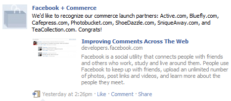
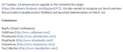
Earlier in the week, I explained why Facebook Comments are important. Clearly others agree as Facebook announced launch partners for three verticals: commerce, media and sports. I am excited that ShoeDazzle (a Polaris portfolio company) is part of the launch. Considering ShoeDazzle's strong, active community and deep Facebook ties (725,000 Facebook fans!), Facebook Comments is a powerful two-way publishing platform.

Also worth noting: Facebook's specific call-out to the commerce category is strategically and directionally revealing. You can follow Facebook + Commerce at Facebook.com/commerce.

Facebook's Comment System is Important. Here's why.

Facebook rolled out their long-awaited commenting system today. Like other publishers, I immediately installed it on my blog (just scroll down a little and try it out)... here's why it's important: 1. Identity. Plain and simple: Facebook's authenticated login reduces spam and therefore increases quality. Say goodbye to SEO spam, trolling, etc. I am sure Cialis comments will come over time ... but Facebook social graph highlights relevant comments and friends.

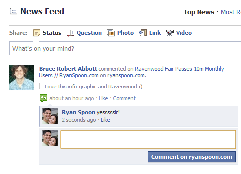
2. Traffic. Facebook's comments publish both ways, integrates into the notification systems and will equate to increased publisher traffic. Whether comments occur on the publisher site or on Facebook - the content moves in both directions. That's a big win:

A comment ocurring on Facebook.com - notice the page title and URL are pulled into the feed:

I replied on Facebook and that content also appears on the blog. win-win: