Facebook Deals: An Ad Unit with the Buy Button Integrated.

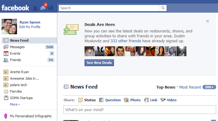
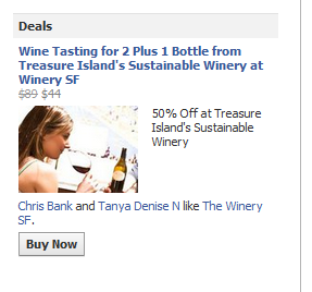
I am still unsure about Facebook Deals: - just how fully baked the idea / effort is. - how Deals are suggested to me and dispersed throughout the Facebook experience / flow. - what Facebook Deals becomes? Is it an extension of Facebook Places + Pages? Is it effectively a new Facebook Ad Format? (by the way - this is my strong feeling of what it should be) And although many Facebook users share my ambivalence / confusion / lack of passion about the Deals product... it is profoundly important for the reason mentioned above: this is effectively a new ad format and a new way to buy.

Think about it: there are ads are appearing on Facebook where the only action item is to purchase... and that purchases occurs in-line because Facebook can tie your account and Credits together. That is powerful. The fact that it is a "Deal" is really irrelevant - it is an ad with familiar, compelling copy (ie 10% off or Free Shipping).

And for advertisers, it is one more reason why advertising on Facebook is powerful: there are ad units that support traffic, media consumption, fan acquisition, sampling distribution and now purchasing. It now represents the entire funnel: acquisition, conversion and engagement / retention.


Why Don't Mobile Apps do a Better Job with Push Notifications? CNN, ESPN, Bin Laden & Andre Ethier.

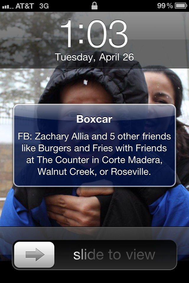
One of the most powerful elements of mobile applications is ability to push notifications. Meanwhile, push notifications are rarely integrated / integrated well... and misuse is quite dangerous because it leads to consumer fatigue and removal. I've thought and written about this before (see here and here). But a couple unrelated things occurred this past week that got me rethinking about push notifications: 1. I was alerted almost instantly of Bin Laden's death by CNN's push alert (which was followed by tons of SMSes).

The CNN app sensibly sends notifications for important breaking news. They do a good job. It would could be improved significantly if it learned more about me and sent more than national / very mainstream news... but it's effective and not overwhelming. There are multiple ways this could be achieved. For instance, a deeper notification control panel (I'd instantly opt in for business, local, sports). Another option is to use Facebook Connect and my personal activity to target the news.

2. There were two no-hitters this week and three or four more games that took no-hit bids into late innings. Meanwhile, Andre Ethier's historic 30 game hit streak was broken. And millions of viewers suffered through 2.5 hours of boring telecast to see a 2minute horse race this weekend.

Point #2 is obviously centered around sports - but it is applicable to any field / interest.... so let's go down the sports example you can extract how this is meaningful for your audience / application.

I am a clearly a big sports fan. I have several ESPN applications and an MLB app that I paid ~$15.00. I would have appreciated being alerted that I might want to tune in and watch the 9th inning of a no-hit bid. Or that Ethier has one more at-bat to extend his streak to 31. Or that the Kentucky Derby horses are FINALLY approaching the gates. All three are examples of the applications being lazy: they are relying on me to proactively open the application and seek out information. Well guess what? I have given you permissions and invited you to do more.... and that's a powerful opportunity. So take advantage of it.

Just as CNN decides what is important enough to message their millions of mobile subscribers - other app providers (in this case ESPN and MLB) can do the same. As active consumers of your application, we defer to you to tell us what is breaking and newsworthy. If you do it right, you can instantly engage with your users (and engagement is the key to mobile).

Facebook Enables Photo Tagging For Pages. Some Marketing Opportunities.

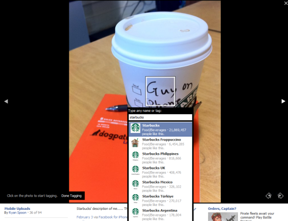
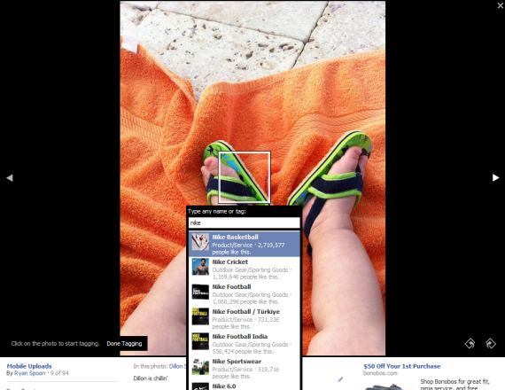
Facebook quietly released an important product update for marketers and page-owners: the ability to tag images with pages (in addition to people). It's a simple update / change - but very meaningful and, in the short term, probably introduces an immediate first-mover opportunity for marketers. This is another opportunity to engage with your community and make existing content more visible / viral on Facebook (ie more traffic).

Here are a couple ideas / opportunities.

Tag products.

For instance, what is the celebrity wearing? What is the athlete using?

(related) Alter the way you think about Photos and Feed Posts.

This is a new opportunity for brands to engage via the newsfeed. Similarly, brands can feature photos from the community (yet another way to engage and reward).

Create contests.

Dunkin Donuts has run a daily contest on where fans drink their Iced Coffees. Entrants should be forced to tag the brand. That would be significantly more effective.

Combine tagging of places and pages.

Currently Facebook does not allow places to be tagged... but it should come and that will make the act of checking-in more robust. Photos from a place can be accessed via Places... but with tags, a user's friends will be able to happen upon the location from the feed and from photos.

The Web as One Big App Store.

There is nothing groundbreaking about what I am about to say... but: it is easy to overlook how simple and powerful making purchases with a single-click is. You can download music, movies and rentals with a single click. No credit card number.

No lengthy registration / shipping addresses.

Nearly every book title is available via Amazon or iTunes through a single click. The content is delivered wirelessly in seconds.

The same holds true for video games and, now, an entire world of software.

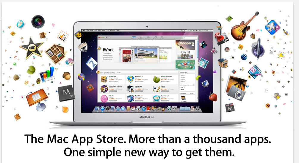
In fact, Mac's App Store is what hit this point home for me: downloading software applications for your desktop / browser is really a powerful experience. You can now buy software with the same one-click, light-weight process that music, books and mobile apps are purchased. And it is delivered over the web and instantly.

It is hard to describe why this is a unique / 'cool' feeling... after all, I've purchased software online before. But, until the Mac App Store, it had not been so effortless, painless and fun. And it's thanks to both Apple and the developers / cloud movement, which allows us to access myriads of content (much being lightweight) so rapidly.

And it's just the beginning. Other major app stores will emerge (ie Chrome, Amazon) and Facebook Credits will play an enormous role as it will enable all websites to become their own one-click storefront.

Amazon's MyHabit Launches with "Exclusive Membership" Gimmick. Except for Amazon Users (eg everyone).

Remember when Gilt Group and Rue La La first launched and you had to be "invited"? It was a genius marketing effort that established a brand of high-end exclusivity. It also was important in jump-starting the early viral channels (referrals and rewards). Of course, if you didn't know a registered user, you could "request membership" and, within a day or two, your invite would arrive. It was great positioning and marketing. This week Amazon entered the flash sale space with MyHabit. It is very much like Gilt and Rue La La, etc (and, for what it's worth, is very much unlike how I think they should play in the space).

To position themselves as Gilt and Rue did at launch, they too ask users to register and "request membership". The word "request" obviously suggests membership is selective and not instant (despite the headline "become a member instantly"). There is your exclusive, premium positioning.

But that is entirely pointless because anyone with an Amazon account already has an account: "hint: if you already have an Amazon.com account, you may use that to sign in." And of course anyone visiting MyHabit has an Amazon account.

This makes the marketing / positioning effort insincere and beyond gimmicky (since its an extension of a proven gimmick). Just put a big sign-on button and optimize the hell out of it. Then focus on the products and the experience. That's worked for Groupon and LivingSocial. And with Amazon's brand and massive audience, it's the better way to launch / play.

ESPN Experiments with Facebook Ads for SportsNation.

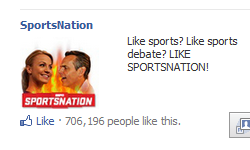
Between on-air promotion and daily feed interactions, ESPN is aggressively ramping their Facebook usage (perhaps they are watching the NBA's success?). As an example, hit ESPN2 show SportsNation is quickly approaching 750,000 fans (was 600,000 April 1st). In fact, they are now advertising for the page:

It is unclear how much growth is from the campaign - but it is interesting because the page itself is not directly monetized. Clearly this is an opportunity to ESPN to understand:

- the relationship between on & off-air consumption - the ability to incorporate social activity in live airings - the beginning values of online, off-ESPN.com users

And perhaps it is something bigger: the roll-out of deeper social integrations on ESPN.com.

Use Facebook Connect to Eliminate Mobile App Registration, Login

I have two mobile application pet peeves: 1. when the first thing I see is a registration flow. 2. and when the registration doesn't use Facebook's steamlined flow. The goal for app developers is to convert downloads into users - and then drive repeat usage. Obviously conversion efficiency is critical ... and each incremental step is an opportunity for drop-off.

Facebook's new mobile Connect flow is a huge improvement and significantly better than asking new users to enter account information. There are two important options:

First, Facebook allows users to connect by running Facebook as a background application. How this works: when a users Connects with Facebook, Facebook opens as a new background application and asks the users for publishing permissions. Importantly, the user never needs to enter / type information AND the application automatically toggles to and from Facebook for authentication.

Second, you can also login directly to Facebook... and in addition to the email address, users can login using their mobile number. This is effective because:

1. your 10 digit phone number is likely shorter than your email address 2. typos are far less likely on the number keypad

Here is an example of Groupon's iPhone app automatically toggling to Facebook for authentication:

The only action by the user is agreeing to the normal publishing requests (using Living Social as the example):

And login via email or phone number:

Three Reasons Why Facebook Deals is Important.

Three visual reason why Facebook Deals shouldn't be overlooked... despite being a day old and despite the large lead of Groupon and LivingSocial. 1. Facebook already has the distribution of consumers AND advertisers to kick-start the product. Raising awareness and driving adoption can be encouraged via promotion, feed virality, etc:

2. Advertisers are already on Facebook. And Facebook users are already used to interacting with brands and ads. In simplest terms, Deals is really just a different ad format... but rather than asking users to click or like, they can "buy" in-line. That's powerful. It has worked well for "liking" - which is both an in-line action and a social behavior... why shouldn't it work for purchases?

3. Facebook is the most used and downloaded mobile application. Mobile represents two important things for Deals: A) the ability to use location / proximity to deliver targeted deals B) a huge viral hook through push notifications and SMS (my phone buzzed all day as friends liked / bought related deals)

Having to Unlearn Twitter to Learn Tweetbot... A Designer's Dilemma

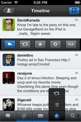
After reading the rave reviews, I traded in Twitter's iPhone App for Tweetbot. It's great - glossy, fast and customizable. And while I prefer Tweetbot to Twitter's client - it made me realize how challenging / uncomfortable unlearning and relearning certain behaviors are. After using Twitter's application for so long, I struggle each time I want to reply or favorite a tweet. It's different and therefore challenging.

I am not entirely sure what the lesson is for Tweetbot: If the interactions are too alike Twitter's, the value proposition lacks; but if it is too different, it becomes unusable. Ultimately, the burden is on the developers to:

1. create a uniquely compelling product such that it is worth exploring & learning

1A. this is more difficult when operating within an exisiting platform (ala Tweetbot :: Twitter)

2. focus on the first user experience and convey the product's functionality (and intricies) immediately

3. don't over complicate the product. This is the most difficult part: distinguishing the product while still keeping it simple.

... and, even for Twitter, that can be hard.