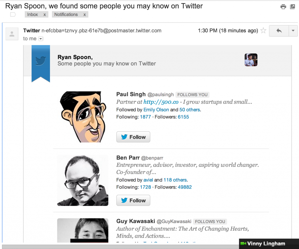
I have written glowingly about Quora and Twitter's weekly digest emails. Well here is another good one from Twitter that is beautifully put together: "Ryan Spoon, we found some people you may know". I love how it shares the same format as the "What's happening on Twitter" digest - and I love how it's very visual, beautifully branded, and actionable: big follow buttons. E-commerce companies have long been reliant on email to drive all stages of the funnel: user acquisition, user activation and user activity. For non-transactional companies, I believe email can be equally vital and - in some cases - more compelling for consumers precisely because it is not commercial. The trick of course is to make it relevant, timely and appropriate (content + frequency).
Install Now: Driving Installs in Addition to Likes
I have written about Facebook's AppCenter before and how it represents the focus on mobile and on Facebook's platform... and opens up a monetizable, interaction beyond "Like": "Install". (And by the way: you could easily argue that "install" is a more valuable action thank "like" or "follow"). Here's a screenshot within the mobile web promoting Fab with a sponsored unit that is visual, includes ratings, reveals friends who use the app and, most importantly, a big "install Now" button.

Google+ Interactive Ad Layer
I have written before about Google / Google Plus and their interactive, actionable ad units (here is a great example from Google Offers and one for Google's emailable ads here). Below is an example of Google Plus being integrated into an otherwise standard ad unit. Natural evolution and integration here - it sits atop the add and creates a social layer that:
1. The brands welcome. There is action and benefit beyond the click-through.
2. Google loves. They drive usage of Google Plus and give advertiser another medium to extract & measure value.
Should Facebook Ads move off-Facebook.com - these interactions will be really key (point 2 here).
Facebook Gifts Design Treatment
Below is a screenshot from Facebook's new Gifts product. It is not yet publicly usable - but gifts are appearing in the wild from early users (see below). Two interesting points per the feed graphic: 1. It is a clever use of naming layered atop the graphic (for Dan, from Justin). It really stands out and plays to Facebook's social strength.
2. Per ongoing "in the river" theme, the unit has a very prominent "Learn More" ribbon and button beneath the graphic. Interesting to see if this persists over time, as the product ages - or if it is an onboarding treatment.
Apple's Passbook, Dunkin Donuts & Facebook Offers
An example of the potential power of Apple's new Passbook for:Brands (here Dunkin Donuts) Platforms (here Facebook / Facebook Offers) Consumers (simplicity, speed)
Dunkin Donuts running a week-long promotion for their holiday bagel using Facebook Offers:
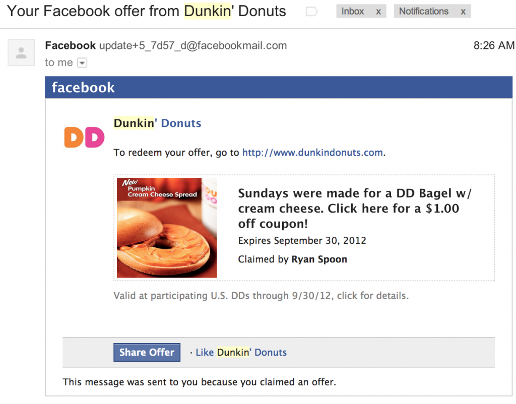
Upon acceptance, Facebook shares socially and then emails users steps for redemption:
Users then have to print the coupon (per below). But this could pass through to Passbook or into a Facebook Offers Book / application. Thus keeping everything mobile, eliminating friction, and adding tracking throughout the entire process:
Google Play Store vs. Apple's iTunes: The Little Things
I have been splitting time between my iOS and Android (iPhone and Samsung Galaxy III; iPad and Google Nexus 7). Having built up years of habits with the iPhone, it is a really fascinating experience to: 1) force myself to learn a new platform: chalk that up to laziness + 'switching costs'
2) uncover the intricacies of the different platforms & brands: very noticable in some cases, very minor in others
3) figure out what I particularly like about each (device and platform). There are absolutely things that each does better than the other
Really small example of an intricate difference between the two platforms and strategies. Within iTunes (iOS and desktop), the focus on movie and television content is purchase. Makes sense as it's a higher price point and promotes cross device usage (phone, tablet, Apple TV, desktop). Finding rentals is much harder - and in some cases available weeks after the release.
Within the Google Play Store, it is the opposite. Everything defaults to rentals ($1.99 - $3.99 usually). Very different approach which seems to focus on lowering cost and sharing strategy with YouTube and other Google properties.
So many of these little things which are seemingly obvious and/or unimportant... but fascinating both individually and when you combine them all. More to come...


Introducing ESPN's SportsCenter Feed
I am very excited to announce a new, beta product from ESPN: The SportsCenter Feed. It is all of your sports news personalized, real-time, and presented in a feed format. On a daily basis, there are 1,000s of pieces of ESPN content - articles, scores,videos, podcasts, Facebook & Twitter posts, etc. The SC Feed is a new way to deliver and consume that. I know it's powerful because - even as someone inside of ESPN - the Feed has introduced me to great, unique content I otherwise would have missed. Please give it a spin at http://espn.com/scfeed and send your feedback. Much more is coming... but this is a great, exciting first step!
Coverage: - GigaOM: ESPN builds a Twitter-style firehose for sports news - PandoDaily: ESPN Launches Personalized SportsCenter Feed Web App, Proves It Just Gets Digital - AllThingsD: ESPN Takes a Design Page From Twitter’s Playbook
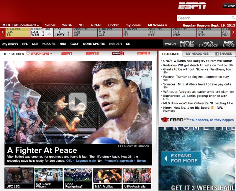
You can find a link to the feed on beneath the headlines module on the right side of the homepage:
And here is the SC Feed itself. It is designed to work responsively for mobile and tablet view as well. And don't forget to Add to Homescreen!
Pinterest's Clear Friendship Emails
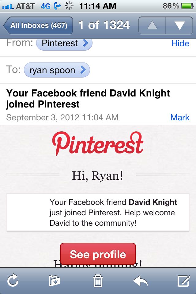
I am sure other companies do this as well... but since the email arrived from Pinterest and caught my attention, I will credit Pinterest here and realize other examples will be forwarded my way! Many socially-enabled sites (ie Facebook Connect, Twitter Oauth) send notifications when friends join the service. Sometimes those friends are not connected with you on the new service - but the notification is done to spark the connection. And in other cases, the connection is automatically forged (ie Quora - which was helpful with early virality). Depending on the relationship, language, etc - both can be confusing to new users. I give Pinterest credit with the below example because it very clearly defines a relationship: a "Facebook Friend" has joined Pinterest. That may seem like a minor point - but it is much clearer than directly creating an on-Pinterest friendship and/or only using his name.
I get daily emails from services alerting me of new friends, followers, etc. This is a very minor way to add context and clarity.
Expanded Facebook Ads: Like + Related Posts
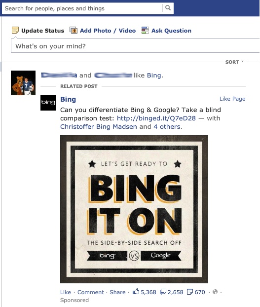
Below are two screenshots from Facebook ad units that I think are noteworthy. The screenshots combine two ordinary components: - friend X likes page / brand Y - a popular or most recent post from brand Y The interesting part is that these actions are combined into a single unit: "Ryan likes Bing" sits atop of Bing's most recent post. This of course makes the action more relevant - but it also makes the unit far more prominent... particularly for certain content types (like Bing's photo).
