Evernote's Clean Homepage. What to Learn.

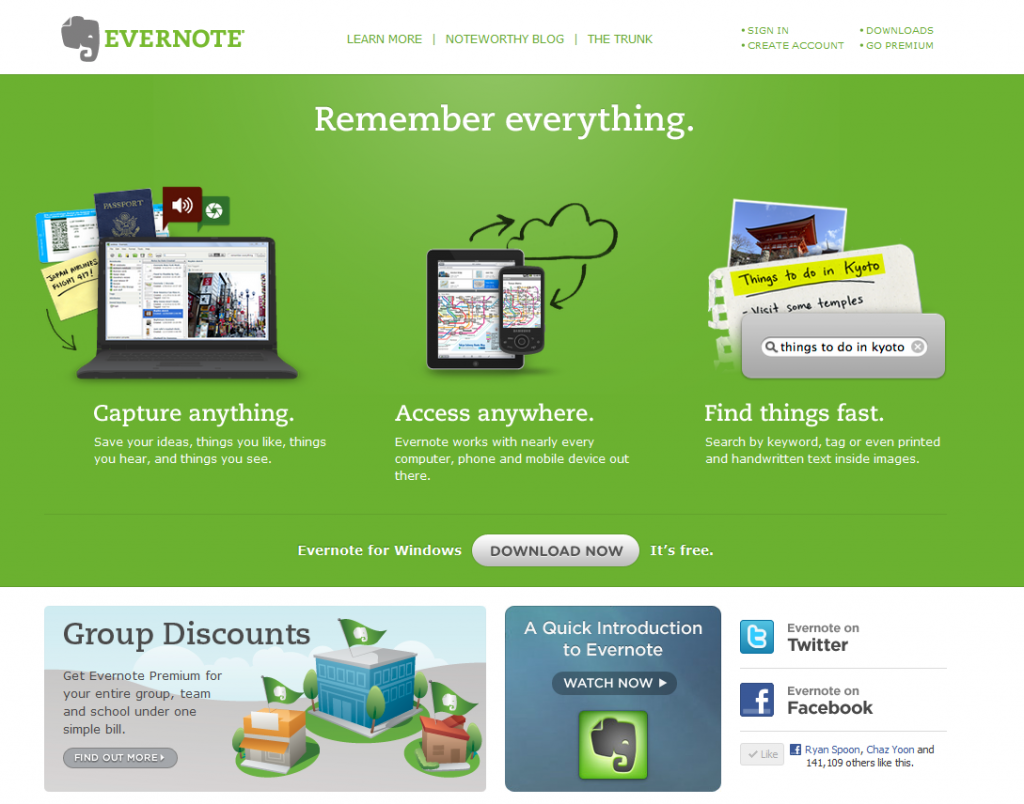
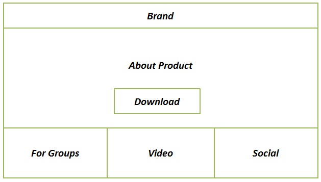
I love Evernote. It's one of the few products I use daily and on every device I own. I also love their homepage because it is super simple and focuses on two single actions: learn and download. Evernote's homepage is broken into four sections:

1. What is it. This has three simple parts: capture anything; access anywhere; find things fast. If you use Evernote, you'd agree that that's a great, simple overview.

1A. Download. The focus is the Download Evernote button which is front and center and the only actionable button on the page.

2. Group Pricing. The base is a suite of three modules that again promote learning. Here, Evernote wants to alert users that the product is both for consumers and businesses / teams.

3. Video Overview. More learning.

4. Social. This does a few things. First, it demonstrates that Evernote is massively popular - which enhances brand / familiarity / willingness to download. For instance, I am 1 / 150,000 Facebook fans. Second, it allows me to follow Evernote in-line (continuous marketing opportunity for Evernote).

Twitter's Activity Stream Speaks Specifically to Me

I give Twitter a lot of credit for rolling out their new Activity Stream.Sure, it's quite ugly... that can be fixed. And sure, it's a glorified newsfeed / timeline... but it's core to Twitter. A few thoughts:

1. Twitter, like many mass services, has a findability problem. In May 2008, I wrote that Twitter's problem was social findability. This helps.

2. The web is based on Ego and this certainly feeds to the ego. It answers in real-time what's happening around ME. That's powerful & addiction.

3. I can Twitter becoming two primary streams: tweets and activity. For publishers, activity could be a more powerful hub. For individuals, the normal stream probably is.

4. For publishers and brands, this could become the first step towards a publishing dashboard. The foundation is being laid.

5. It's ugly. Needs serious UI overhaul. Twitter is usually so elegant and simple... surprised by the visual experience here. Again, it's easily fixable.

NBA.com Demonstrates Common Oversight of Mobile E-Commerce / Promotion

If you read me regularly, you know that I have a major pet peeve around unoptimized (and often dysfunctional) mobile experiences. So often mobile is treated an extension of the web experience and that results in broken mobile experiences... and since so much of our content consumption is on mobile devices, the lack of attention to the mobile experience is both frustrating and foolish. Great example here from the NBA (who I have had lots of social advice for!):

The NBA has 3,000,000+ Twitter followers.

40% of Twitter's users access the service via mobile (not the web).

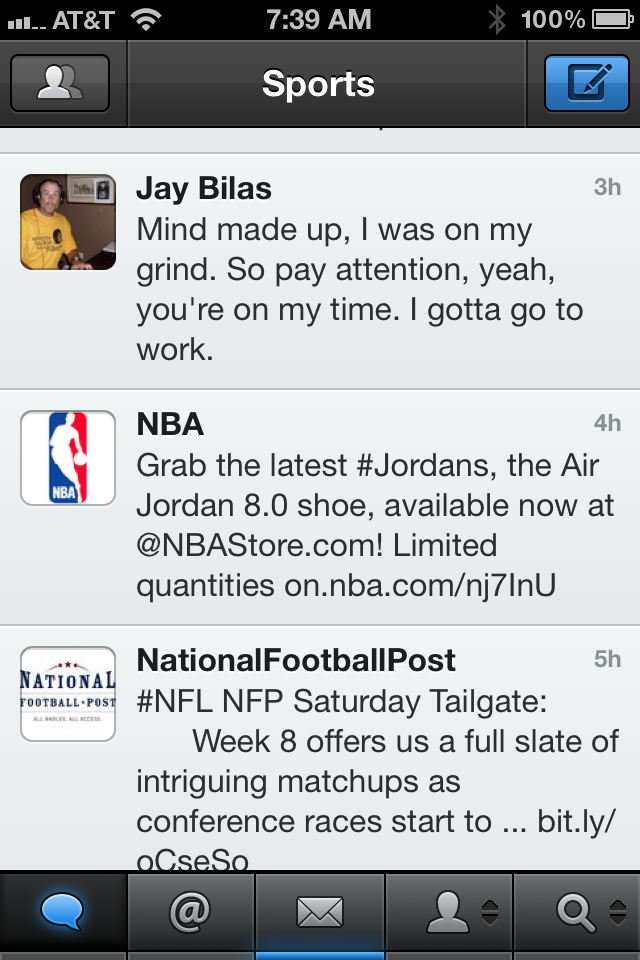
The NBA tweets a link to the newest pair of Nike Air Jordan 8.0 shoes:

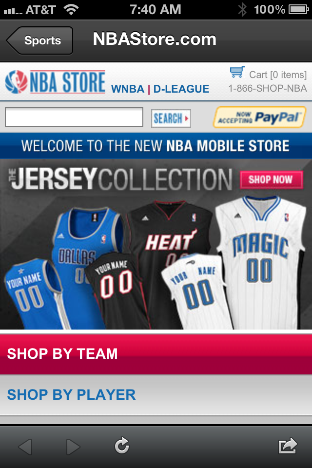
Great promotion right? When you click on the link, the NBA Store automatically redirects all mobile traffic to a defaulted storefront / homepage. And thus the frustration: 40% of those who clicked the URL, with the hope of arriving on a specific piece of content, had to give up and exit.

Also funny, when you go the URL from your browser, you get another frustrating experience: a totally untargetted promotion (hello Canadian users!):

Introducing Mixel

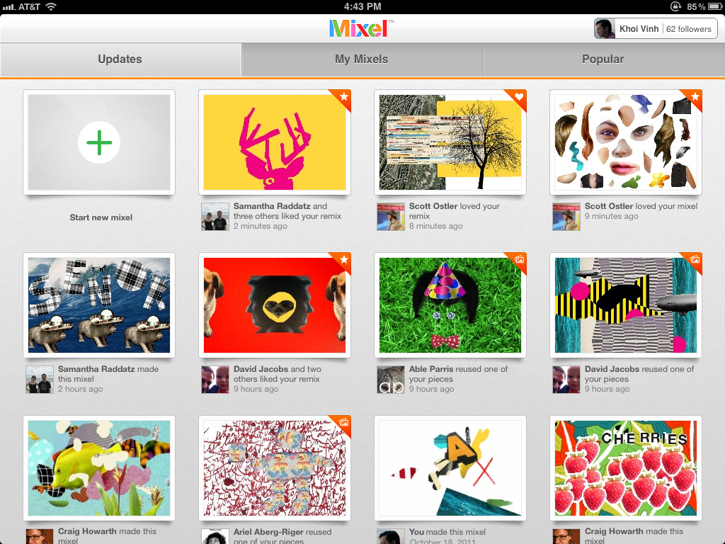
A Dogpatch Labs NYC and Polaris-backed startup, Mixel launched this morning. Using the iPad - Mixel lets you make, share and remix collages in a whole new way. You can download it in the app store here. Founded by former New York Times digital design director Khoi Vinh and Scott Ostler (dump.fm), Mixel is the first social art app for the iPad. With the free app, anyone can create and share fun digital collages, called mixels, using images from the web, Mixel’s library, or their own personal photos. Any image in Mixel can be quickly cropped, rotated, scaled or combined with other images using the simple, intuitive touch gestures familiar to iPad owners.

This excerpt from Sam Grobart's NYTimes piece ("Mixel Makes Art Social") does a great job conveying why I am excited about Mixel and the creative output that will pour from it: I watch my 1 year old son interact with the iPad the magic & delight that comes from it - Mixel has the opportunity to bring that same creativity and magic to adults who, like me, might not necessarily be artistic. That's powerful and fun:

"I tried Mixel, and it was fun and intriguing. I cannot draw to save my life, but collages? That I can do. You feel like you’re playing Art Director: Fisher-Price version. I mean that as a compliment — it’s fun to juxtapose images and text, and it’s worlds easier than, say, painting. That would’ve been enough to make a perfectly nice app, but adding the social features, where friends and others can create chains of meme-like images, turns Mixel into something more deeply compelling. It’s a conversation I’m looking forward to having."

You can read more here: - TechCrunch - NY Times - All Things D - VentureBeat - GigaOM

Introducing Mixel for iPad from Mixel App on Vimeo.

Facebook Rolls Out Subscribe to Comments. Improves Product and Promotes the Still-Hard-To-Find Subscribe Feature.

Facebook has begun integrating their new Subscribe functionality into Facebook Comments. It includes a small subscribe link next to each commenter's name / icon that allows in-line subscription. That does a few things: 1. It keep activity on the external site... so publishers love it. 2. It gives yet another incentive for users to comment... so readers love it. 3. And it provides more context for readers as Facebook helps sort content based on relationship, activity and 'following'.

And....

4. It is a great way for Facebook to promote the Subscribe feature which frankly is lost of Facebook.com.... findability, context and usefulness is better off-Facebook.com (just ask Twitter).

HBO Go: Delightful, Albeit Inefficient, Exploration. And That's Fine By Me.

Below is a screenshot of HBO Go's iPad App. It's gorgeous, fun and highly dynamic. It represents the shift of paid content to mobile: HBO Go, ESPN Watch, Netflix, Hulu, etc. And it represents the visual opportunity presented by the touch-based device (smaller screen, different format).

And lastly, it shows the design similarities with e-commerce iPad apps like Gilt and eBay. Why do the apps look similar? Sure there could be some flattering mimicking... but more importantly: e-commerce and digital media hubs often struggle with findability within huge universes of product / content. Big visuals and touch-based exploration are a good way to conquer.

Specifically within the HBO Go app: it is interesting that 95% of the screen is dedicated to dynamic, visual tiles. Buried at the bottom is a persistent navigation footer: category, title, etc. In a world of funnels and tools to drive efficiency, HBO has made the clear choice to value exploration and engagement.

The Facebook Ticker: Take Advantage of It

This is how I have been finding news articles (Facebook + Washington Post Social Reader).And this is how I have been finding new music albums (Facebook + Spotify). The screenshot below is of a particular article that appeared in my Facebook Ticker twice within a 30 second span.... this isn't rare. In fact, it's common. And it is a demonstration of why you should be taking advantage of the Ticker... today, before others do. It is a huge opportunity to:

- increase awareness among a social graph - improve findability (articles, artists, time sensitive content, etc) - cluster popular content / topics within the core feed - drive traffic from the Ticker / Feed to Canvas Apps - take advantage of the first mover advantage that Washington Post and Spotify are seeing... get in the Ticker before it gets too crowded!

More reading:

8 Quick Thoughts on Facebook’s Big Week. September 25, 2011 – 7:37 am | 25 Reactions

Ahead of Facebook’s F8, Changes Galore Roll Out September 21, 2011 – 8:18 am | 5 Reactions

“So Far Facebook Has the Best Follower to Click Ratio”, Kevin Rose September 20, 2011 – 2:47 pm | 11 Reactions

Facebook Subscribe: Opportunity for Publishers & Online Voices September 15, 2011 – 7:57 am | 9 Reactions

Most Important Feature of Facebook for iPad, iPhone: "Apps"

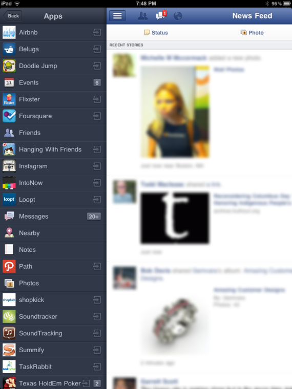
The most important part about Facebook's new iOS apps that they unveiled yesterday? For starters, the app actually works and I had given up using Facebook for iPhone (which failed 90+% of the time. But other than the obvious... the below screenshot is the most impactful aspect of the new mobile suite. It gives users the ability to access and use applications directly from within Facebook Mobile. That is convenient for users and represents future opportunities for deeper developer & Facebook integrations (think 'canvas apps' within the Facebook apps). And to developers / publishers, this is remarkably valuable real estate that drives engagement and mobile usage / downloading: for instance, when I clicked on Instagram, it took me directly to iTunes to download the application (I have it on iPhone but not iPad).

Also interesting: Facebook clusters their own products within "Apps" - and it is done alphabetically (I would think they would mark their products atop the list): Events, Messages, Photos, etc.

As the Web Gets Busier, Designs Leverage In-Line 'Blooms' (Facebook As Example)

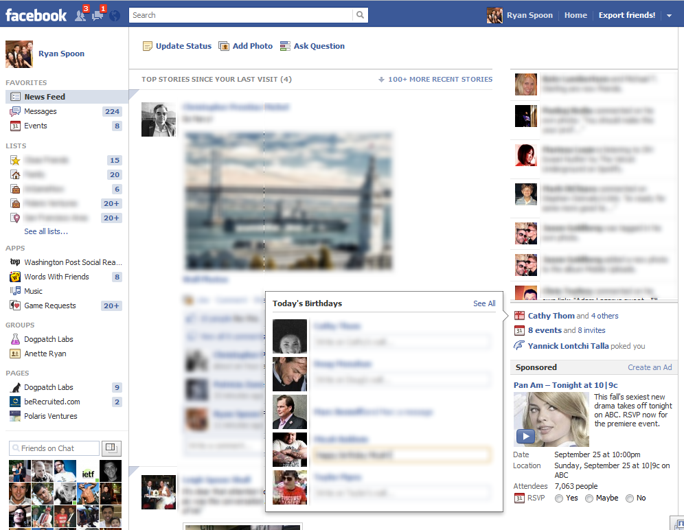
If you've spent time with the new Facebook layout, you will notice how much the interface now leverages in-line expansions (I like to call them 'blooms'). Blooms are when a click prompts an in-line, expanded unit rather than a new pageview. I attribute this trend to two things: 1. Increased complexity in functionality(s): I am not suggesting that Facebook's features are more complex -but the number of features creates complexity. Blooms are an effort to solve that. This is true across other busy sites and apps: Google Plus, GMail, Chrome extensions, etc.

2. The "Chrome-ification" of the web: using apps, buttons, etc as a layer atop the core pageview.

The example here is Facebook's new Birthday unit. With the introduction of the Ticker, Facebook has pushed the birthday and events box down the page. With real estate tighter, Facebook has stopped showing the name of each Birthday boy / girl. So now, when you click the birthday link, it pops up a "Today's Birthday" unit that also allows in-line commenting. Slick.