Next Generation NikeID Goes Beyond Colors: Patterns & Logos

I spend a lot of time writing about next generation commerce... and we invest in compelling companies and models like ShoeDazzle and Wantful (as examples). For years, people have pointed towards NikeID as an example of true product customization atop a great web interface. I believe I bought my first pair of custom Nike's in 2003 (Nike Air Max 95's). You can even create, buy and share your sneakers from their iPhone app.

It continues to evolve and the newest iteration is interesting for two reasons:

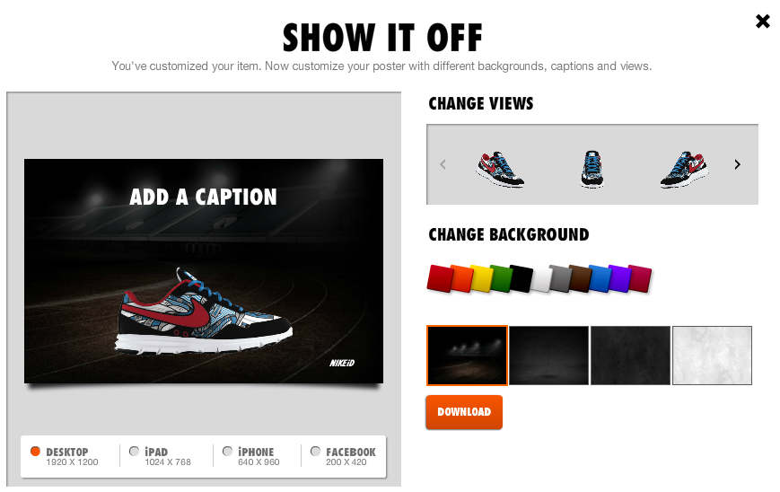
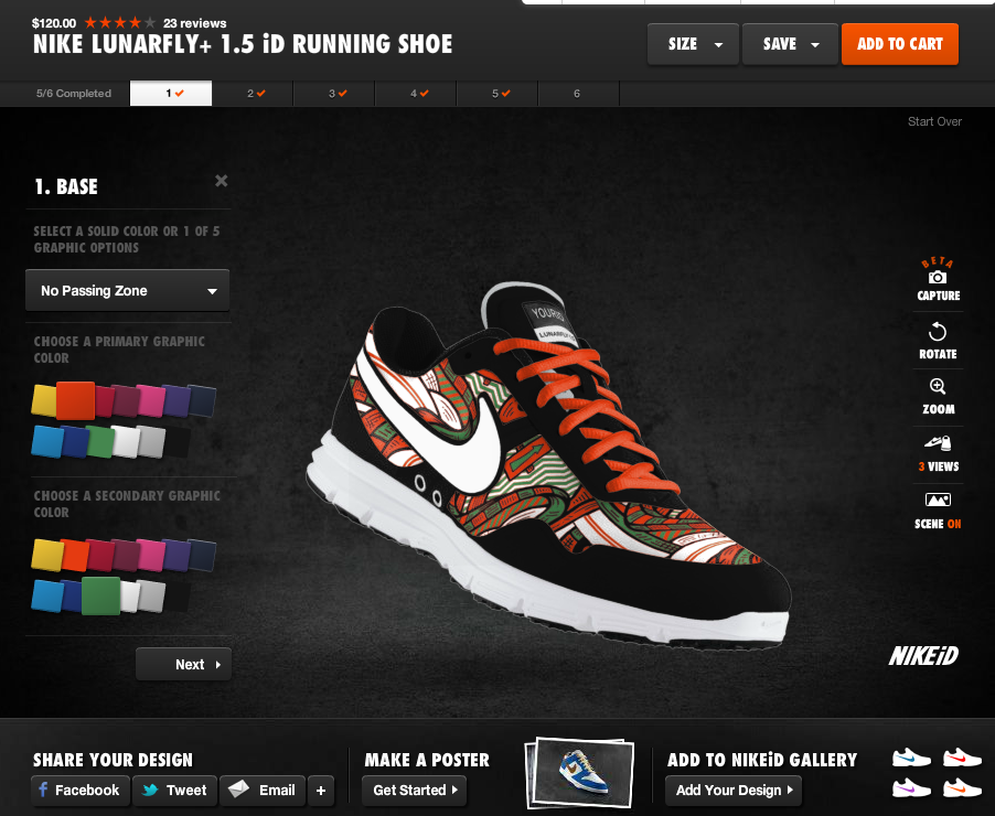
1. It goes beyond 5-10 color choices. You can now choose different patterns (like the one below) and then customize each component of the pattern with various colors... meaning that shoes can look entirely different from one another (beyond colorways). A single shoe model has endless looks.

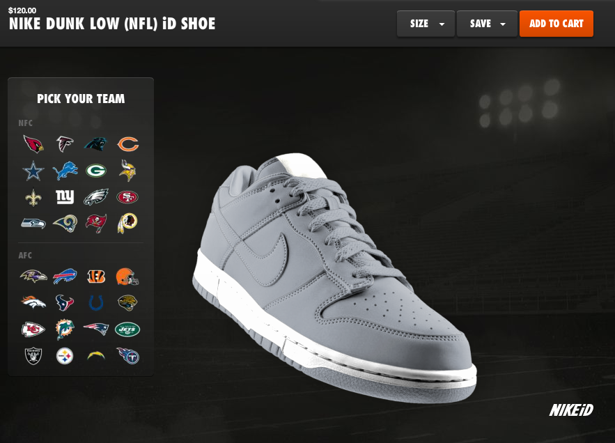
2. Nike just won the NFL contract from Reebok. The obvious launch was the release of their NFL jerseys. But notice in the bottom screenshots that you can now apply NFL logos and colorways to Nike sneakers.... this is a brilliant extension line as there is no cost to Nike, it increases the shoe's value / price, it allows Nike to sell packaged outfits, and Reebok didn't do it.... so it's unique and special.

Nike Basketball's Beautiful Facebook Timeline In Time for NBA Playoffs

Just a terrific, creative and well-timed use of the Facebook Timeline by Nike Basketball. Coinciding with the NBA Playoffs - and a handful of new sneakers for top stars like Lebron James, Kobe Bryant and Kevin Durant - Nike Basketball is releasing a series of basketball rules: "Every EPIC moment has a story. And every story has a lesson. Lesson No. 1: The deeper the bench. The stronger the squad." Each rule is placed atop a basketball poster that ties into the playoffs and relevant players. Two or three rules are posted a day (so far, 38 rules and posters have been loaded). Nike also mixes in other timely promos like a congratulations to Lebron James for his MVP award and this graphic for the evening's Lakers / Thunder game:

It's clever, fun, on brand and highly visual - which means it is highly engaging on Facebook. It is also something that only Nike can do (the talent, the imagery and the production) and something that really can only be done on Facebook and with Facebook Timeline (no offense to Twitter, but this would be neither as effective nor engaging).

NYTimes Mobile Paywall

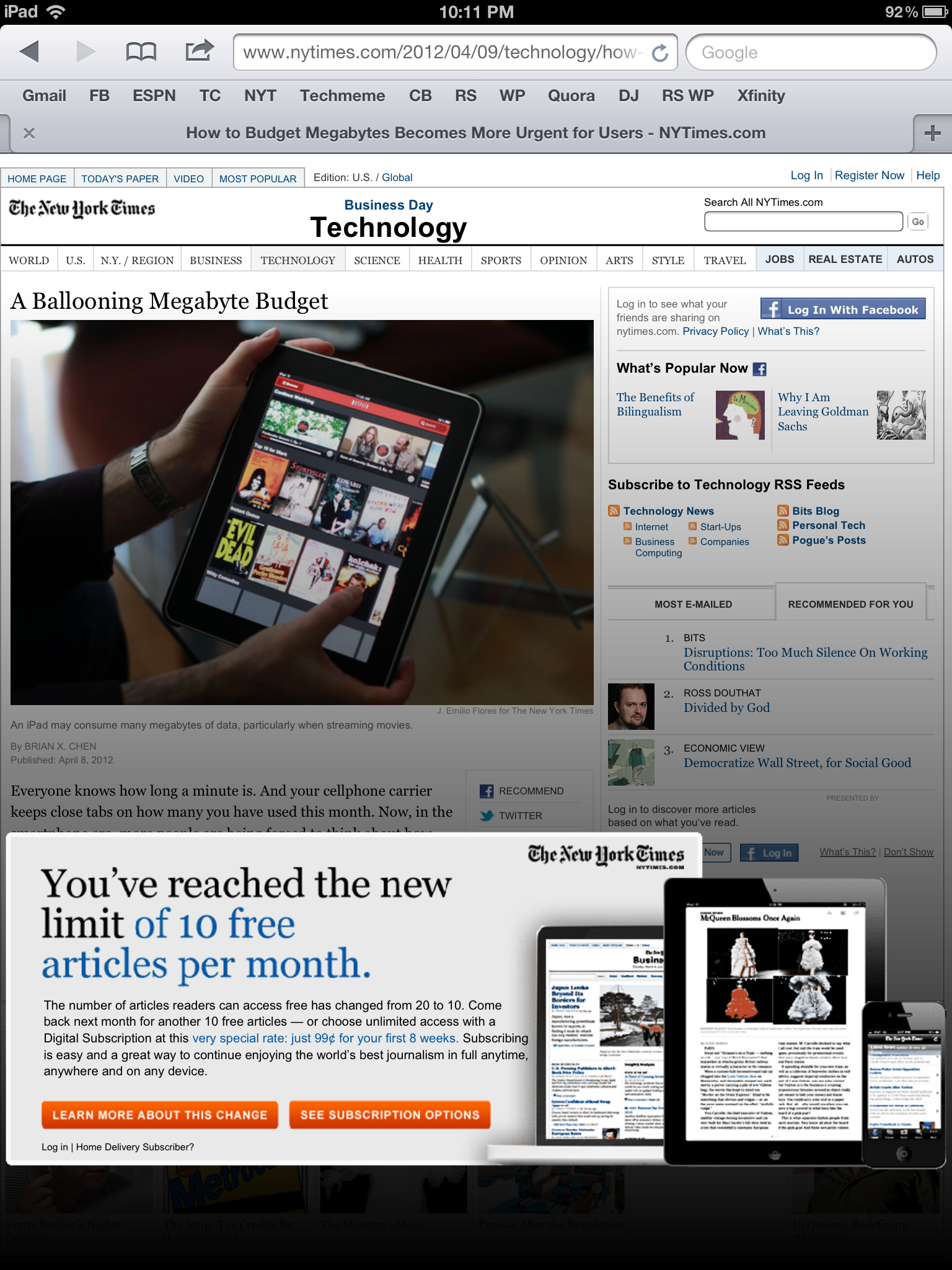
Not a ton to say here except that: - I reached the New York Times paywall - And it is visually very bold / intrusive - But while it is disruptive - and that's the goal of course - it is really not very actionable: The only part of the entire screen that is clickable are the two orange buttons.That is <5% of the screen's real estate and a wasted opportunity to users right into an upgrade flow. As it currently stands, I need to read the promotional box, click the orange button, land on an educational page and then choose an upgrade package. Too many steps and too much effort.

(Lastly, I am not entirely sure what constitutes exceeding the paywall... it says after 10 free articles but it appears intermittently)

#TrendingOnGoogle+

I haven't logged into Google Plus in a little, so I cannot tell if this is a new feature or a result of my infrequent usage - nevertheless, I was taken aback by Google's new Trending on Google+ module... which looks exactly like Twitter's. While it is interesting to see that the topics are related (ie Junior Seau, NFL), I was most interested by the use of hashtags on Google. Within my Google+ network, I have not seen hashtags used with any regularity (whereas they obviously are part of the Twitter culture) - I also would have assumed they would relied on real-time search and trends to populate the list.

Jetsetter's Email Preference Flow

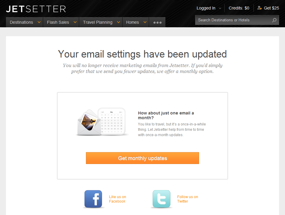
Email unsubscribe flows are typically binary: either super simple to unsubscribe (how it should be) or super convoluted (having to uncheck preferences, confirm email addresses, etc). This is a clever flow by Jetsetter because it is in fact super simple (just one click)... but it gently 'upsells' users: "How about just one email a month?" First, that's such a gentler, kinder way to ask for email access than having me check a slew of boxes.

Second, it comes after they have unsubscribed me - so there is established trust. When they say "just one email a month", I believe it.

Lastly, Jetsetter promotes their Facebook and Twitter pages. If you are going to lose an access point to your customers - might as well push other avenues to communicate and interact with them.

The Verge's Mobile Navigation Sidebar

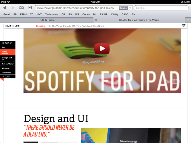
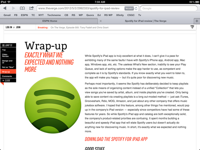
I admire how much The Verge (by Vox Media) has bushed the boundaries on content presentation / visualization. For a blog-like content hub, The Verge looks entirely unlike it's peers: TechCrunch, VentureBeat, Engadget, etc. It's one part traditional blog, one part Pinterest, and one part Flipboard. Where it really shines is mobile - specifically iPad. The screenshots below show my favorite treatment - which I personally have not seen elsewhere:

- There is a navigation bar on the left column (actually more like a table of contents) - As you scroll through the page, the corresponding section highlights (ie Video Review) - But the bar is also clickable - so that you can easily jump from section to section - I imagine over time, you also include small Facebook and Twitter buttons

Of course this is in addition to the persistent header that sits atop the browser. The Verge uses that real estate to promote breaking news, hot articles and membership (Login / Join).

Klout's Clever Use of iOS's App & Badge Icons

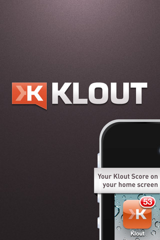
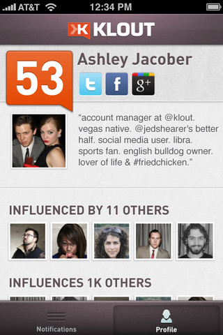
I talk about Klout all the time and encourage marketers to integrate / leverage the service as a way to engage quality users & customers. This has implications for advertising, customer service, product experience, etc. This is an entirely unrelated point - but I think it's extremely clever and unique. Klout has released a new iPhone application and they are using iOS's "Badge" system to display your Klout Score atop the app's icon. Terrifically simple, smart idea and a way to bring users back into the application (which is the single most important and challenging aspect for most applications).

I love it and expect / encourage others to think about how this relates to their service and their users.

Dunkin Donuts Promotional Facebook Timeline Page

I've written a few times about Dunkin Donut's clever use of their Facebook fan page to spotlight fans and drive on-Facebook promotion. Dunkin Donuts would reward fans each week with a spotlight in their Facebook Profile Picture - to win, users would upload photos of themselves drinking coffee and tagging @Dunkin in the photo. Want proof that it works? Check out how many fans post to their Facebook wall.

With the introduction of Facebook's Timeline, the profile picture is less prominent and Dunkin had to rethink the Fan of the Week promotion. The result: Dunkin now includes those fans directly in the cover photo... which is a ton of visible real estate and a fun way to highlight fans, drive social activity, and keep the Timeline fresh.

Facebook's Homepage Real Estate

Ever look at Facebook's homepage and think about the ratio of content to advertisement? It's easy to overlook it because the feed itself is infinite. But the new page layout combined with the new ad formats (Sponsored posts now appear atop the feed and below the ticker) - represent a very significant portion of the visible real estate. It is even more pronounced if you include the "Apps" section on the left and the "notifications" section on the right - both of which are monetizable aspects. In this example, that ratio of content to advertisement is even more pronounced: I have one full post on the screen (a function of a photo album being displayed - takes up more space) and three posts in the ticker. You can also see the headline of a fifth feed post. If you include that: there are five posts on the page - one of which is prominent. And there are two ad-units - both of which are arguably equally or more prominent.