Farmville + Monopoly = Settlers of Catan

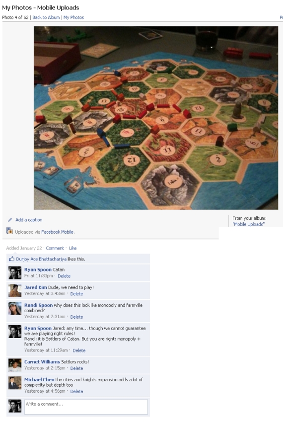
I am late the Settlers of Catan rage, which according to the Wall Street Journal, swept Silicon Valley in December. But I uploaded a photo of Catan to Facebook (shown below) and got a great comment about it: Why does this look like Monopoly and Farmville combined?

Funny how accurate this comment is and how Farmville has become a common way to describe / compare products (I recently did the same with TownMe).

MyTown Social Gaming Strategy

MyTown is best described as Zynga meets Foursquare. Take the best aspects of social gaming (Zynga) and combine them with location based networking (Foursquare, Gowalla, Yelp) and you have MyTown: a game that awards points based on live social game mechanics built atop location-based check ins. You can own real properties (akin to being the mayor) and then collect rent (similar to Mafia Wars, Farmville) based on popularity and live activity (again like Foursquare).

MyTown's point structure is particularly clever and powerful because it creates an incentive structure predicated on routine usage and social sharing. Two great examples that were perfected by Zynga:

1. Deprecation. Farmville is the master of this: because rents cap out at a specific amount, users must collect rent regularly (ie hourly) to maximize potential revenues. As a proxy, if you do not return to harvest your crops in Farmville, they actually deprecate. 2. Social Sharing. Check-ins are rewarded with points (ie 150 points). But large bounties are provided for social actions like: connecting the MyTown account to Facebook Connect, broadcasting your location via Facebook and/or Twitter, and adding commentary on the location.

Below is a strategy to MyTown from town billionaire Kirk Nguyen. Fascinating stuff:

Try to maximize your points payload with multipliers. It's a combination of using multiple multipliers, obtaining the multipliers that yield the most return, and holding out until your base check-in worth is substantial enough (think long-run diminishing returns).

Upgrade as soon as you can, but it starts to get costly after level 5 or 6. Once the upgrade cost got to $7+ million, I bought free upgrade power-ups to maintain my cash for purchasing properties padding my towns total worth.

Finally, keep an eye on trending, number of owners, and popularity - ESPECIALLY popularity: it determines the maximum property value and maximum rent cap.

And if you want to stay on top of the leaderboards for your properties (and other non-owned properties), only keep local properties in your stable. I was in SF last night and bought some high-value properties, but then realized that I couldn't buffer my leaderboard weight for them when I got back into San Jose. I'll probably sell them sometime soon. Oh well, see ya Adidas Concept Store!

All in all, I try for check-ins worth between 45k-60k points, single-ownership of long-lasting, high-popularity businesses, and I collect all 20 of my level 11 property rents with one click.

Once you start rollin', you'll see how ingenious Booyah!'s micro-transaction business is. They made it very accessible and compelling.

My town is worth $2.5 billion, but I feel I could be doing better.

Good luck and happy hunting!
2009 Internet Usage by the Numbers

Royal Pingdom has a recap of 2009 web usage by the numbers. There are several nuggets - but here are a few that really stand out:

350 million – People on Facebook. 50% – Percentage of Facebook users that log in every day. 4 billion – Photos hosted by Flickr (October 2009). 2.5 billion – Photos uploaded each month to Facebook.

1 billion – The total number of videos YouTube serves in one day. 182 – The number of online videos the average Internet user watches in a month (USA).

247 billion – Average number of email messages per day. 81% – The percentage of emails that were spam. So: ~40b non-spam emails messages per day. YouTube alone serves 1b videos per day... amazing

Facebook Connect Design Best Practices

I have been asked to share some of the presentations from the Dogpatch Labs / Facebook Connect event this week. I will try to make presentations available depending on their public availability (and most importantly, the presenters' permission and comfort!).

Here is Hiten Shah and KISSmetrics' presentation on Facebook Connect Design Best Practices. This was one of the highlights of the evening and really drove home two of the three big takeaways from the evening:

2. Think about your users, not about pageviews or actions. 3. Test. Iterate. Test. Iterate. Test. Iterate.

View more documents from Hiten Shah.

Facebook Connect: It's More Than a Sign-On Tool

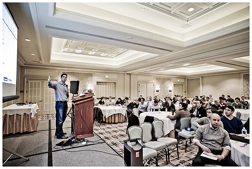
As Mike Hirshland wrote, "last night was a truly epic evening at Dogpatch Labs". Alongside Facebook, we hosted 150 people at Dogpatch Labs San Francisco to discuss Facebook Connect and demo their implementations and best practices. Over 50 companies were represented and we had teams fought the bad weather to arrive from New York, LA, DC, Montreal, Boston, etc. The event was epic in part because the demos were diverse and terrific - but it was also epic because ten minutes before the first presentation was slated to go - there was a major power outage across SOMA... leaving 150 of us standing in the dark. After maneuvering our way through the obstacles, we arrived at the Four Seasons conference room and dove right in.

Mike has several takeaways on his blog - and we will do our best to distribute attendee feedback as well, but here are my three major takeaways:

1. Facebook Connect is not a login system. It is much more.

The best Facebook Connect implementations go beyond the login. They must give the user a reason to interact and provide value after the login - and with Connect, the content and data go far beyond registration: photos, birthdays, social graph, etc. JibJab and Personera are terrific examples: by logging in through Facebook Connect, you are enabling a better, more social site experience. 2. Think about your users, not about pageviews or actions.

If you think about the value you are trying to deliver through Facebook Connect, you will construct an experience that encourages and fosters virality. If you think of Connect as a way to drive pageviews or feed posts, you can end up missing the most important factor: ongoing engagement.

3. Test. Iterate. Test. Iterate. Test. Iterate.

You would be amazed at how small tweaks in language, style, color, etc create very significant changes. KISSmetrics gave an outstanding presentation here and folks like Hollrr showed the impact of recent design changes.

Art Chang, a Dogpatch Labs resident and phenomenal photographer, has several great photos of the event. Two of which are below:

beRecruited.com: 7 Million Recruiting Connections in 2009

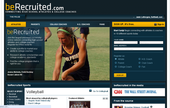
beRecruited.com had a terrific 2009 - as a recruiting platform, an athletic network and a business (covered in the Sports Business Daily here). During 2009, the beRecruited platform drove nearly 7,000,000 recruiting connections between high school athletes and NCAA coaches. Those connections resulted in beRecruited athletes reporting commitments to more than 1,500 different colleges and universities in 2009.

beRecruited is a 'freemium' business model: users can upgrade to "Deluxe Memberships" which include premium tools (like the College Tracker) and increased exposure within search results. Subscriptions are both monthly and lifetime.

Here are some of the 2009 usage numbers:

Number of Athlete Logins: 3.15 million Number of Connections: 6,984,354 Number of Photos Added: 405,632

- Males accounted for 59.63 percent of the new student-athletes that registered with the site; the females accounted for more than 40 percent of new athletes in 2009, a significantly higher percentage than in previous years

- California generated the most registered athletes, followed by Texas, Florida, New York, Illinois, Georgia, Ohio, Pennsylvania, Michigan and North Carolina

- Football athletes were the most active on the site, logging in more than 500,000 times. Other sports generating at least 200,000 athlete logins included baseball, basketball, track and field, soccer, volleyball, swimming and softball

- Volleyball college coaches were the most active on the site, leading a growth in activity for women’s college sports in 2009

Facebook's Share "Via" Functionality In the Wild

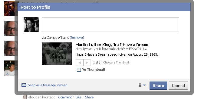
Facebook's new "via" sharing functionality (think Twitter's retweet button) has been reported for days (InsideFacebook's Eric Eldon writes here) but last night was first time that I had seen it in the wild (after much looking). Three thoughts on the functionality: 1. I like it a lot. I think it is a natural evolution of sharing and always found the lack of 'finder's attribution' slightly strange.

2. I think the UI needs to be improved. Both in the feed and during publishing, the word "via" does not stand out; in fact, it is difficult to distinguish between the bold names of the two friends. I also think that the name following the "via" is too bold annd distracting. I would probably rather see it all within a parentheses or below the post?

3. And I would also like to see who else shared that post. In the screenshots below, notice that two of my friends shared the same posts from the same person. It would powerful and interesting to see the collection of sharers from a single source.

Are Google Nexus One Ads Location Aware?

You may have noticed that ads for the Google Nexus One have been appearing all over my site... perhaps due to my fanboy-like coverage! Today I noticed a new version of the 728x90 unit that focuses on the Nexus One's navigational system. Notice that the ad includes directions that are relevant to my location (the Embarcadero in San Francisco). This could be the default image - but, knowing Google, I suspect that they feature directionally-relevant images for top DMAs (like San Francisco, New York, Los Angeles, etc):

Doodle Jump's iPhone App Warns: "Insanely Addictive"

Most iPhone apps do not come with warnings - but Doodle Jump, the #2 paid application by Lima Sky, has built an advertising campaign around the addictive gameplay: Be warned: this game is insanely addictive!" The ad unit then cycles through anonymous iTunes reviews that highlight just how addictive the game is. Once clicked, the ads take you directly into iTunes so that you can download Doodle Jump for $0.99 and spend hours draining your iPhone's battery!