Klout's Clever Use of iOS's App & Badge Icons

I talk about Klout all the time and encourage marketers to integrate / leverage the service as a way to engage quality users & customers. This has implications for advertising, customer service, product experience, etc. This is an entirely unrelated point - but I think it's extremely clever and unique. Klout has released a new iPhone application and they are using iOS's "Badge" system to display your Klout Score atop the app's icon. Terrifically simple, smart idea and a way to bring users back into the application (which is the single most important and challenging aspect for most applications).

I love it and expect / encourage others to think about how this relates to their service and their users.

Facebook Trending Articles Module

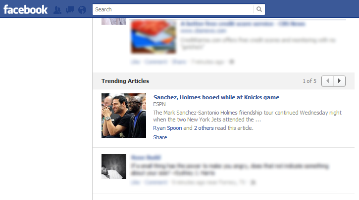
The below screenshots show a new module in Facebook newsfeed: "Trending Articles". It is a clustering of popular posts based on Open Graph actions of similar types (in this case "read" articles). The clustering by type is itself interesting (as it has implications for Open Graph and applications) - but the presentation is especially unique as we have not seen modules like this appear within the newsfeed. The clustering and the in-line scrolling are entirely new formats. If popular, it represents possibilities for other formats like photos, check-ins, etc.

It is also interesting that you cannot comment from within the module. Users can share - but not comment. This is bizarre because it differs from what appears in the Ticker. It also is potentially harmful for an article's overall visibility in the Facebook feed / ecosystem.

Dunkin Donuts Promotional Facebook Timeline Page

I've written a few times about Dunkin Donut's clever use of their Facebook fan page to spotlight fans and drive on-Facebook promotion. Dunkin Donuts would reward fans each week with a spotlight in their Facebook Profile Picture - to win, users would upload photos of themselves drinking coffee and tagging @Dunkin in the photo. Want proof that it works? Check out how many fans post to their Facebook wall.

With the introduction of Facebook's Timeline, the profile picture is less prominent and Dunkin had to rethink the Fan of the Week promotion. The result: Dunkin now includes those fans directly in the cover photo... which is a ton of visible real estate and a fun way to highlight fans, drive social activity, and keep the Timeline fresh.

Facebook's Homepage Real Estate

Ever look at Facebook's homepage and think about the ratio of content to advertisement? It's easy to overlook it because the feed itself is infinite. But the new page layout combined with the new ad formats (Sponsored posts now appear atop the feed and below the ticker) - represent a very significant portion of the visible real estate. It is even more pronounced if you include the "Apps" section on the left and the "notifications" section on the right - both of which are monetizable aspects. In this example, that ratio of content to advertisement is even more pronounced: I have one full post on the screen (a function of a photo album being displayed - takes up more space) and three posts in the ticker. You can also see the headline of a fifth feed post. If you include that: there are five posts on the page - one of which is prominent. And there are two ad-units - both of which are arguably equally or more prominent.

Amazon's New Footer a Reminder of Amazon's Focus on Verticalization & Digital Avenues

Amazon has been rolling out a redesign over the last couple months. I have discussed the homepage's new navigation and promotional units. One small, interesting note is their new footer (shown below). Notice how many properties - and how diverse they are - are part of Amazon. If the header signifies a shift from product to digital (as discussed here), the footer signifies both that (Askville, Audible, CreateSpace, DPRreview, IMDB, etc) and a focus on verticalized experiences (ie Wag, Soap, Diapers, Woot, Yo-yo, Shopbop, Zappos, etc).

Amazon's New Layout, New Merchandising

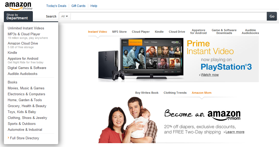
Amazon's redesign is much cleaner... and grayer than before. It also is more focused on promoting their new categories. I noted this before with their revamped navigation bar: "Amazon's Navigation bar is Revealing."

But Amazon has gone a step further here: not only does the left navigation panel promote their digital efforts ahead of physical (Instant Videos, Cloud Player, Cloud Drive, Kindle, Appstore, Games, Audiobooks, etc)... they then duplicate those categories in the center panel. Each category has it's own visual and merchandising unit.

Below the top panel is another promotional box that promotes other efforts (Amazon Mom) or curated experiences (Clothing Trends).

For what it's worth: I find the nesting of the two units a bit strange. And the units do not auto-scroll - so it's both overwhelming (and confusing) to have 10+ potential links to click.

Harrods Takes to Facebook to Promote their Pinterest Contest

This is relevant to two posts: - Yesterday's on the value of being a first mover, specifically on Pinterest; and - Porsche moving users between their Facebook and Pinterest pages

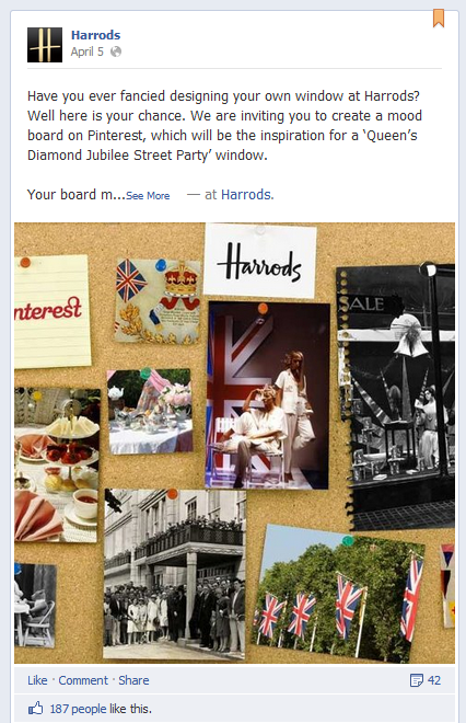
Well here's another good examples: Harrods is allowing fans to help design their retail windows using Pinterest mood boards.

Clever: It's on brand. It's effectively free marketing. It drives Pinterest activity far beyond the winner. And it blends users across Pinterest and Facebook - both from the cross-promotion and Pinterest's opengraph integration.

Amazon Begins Including Pinterest Buttons on Product Pages

First movers get rewarded... just ask Spotify on Facebook or Loopt on iOS. This of course assumes that you are a first mover on a big, impactful platform. There is little question Pinterest is both big and impactful. So Amazon is experimenting with it.

Here is a screenshot of the Pinterest button on an Amazon product page - beside email, Facebook and Twitter buttons. For e-commerce companies - Pinterest is arguably more relevant here than either Facebook or Twitter. It is probably most valuable to get a Facebook share - but users are probably far more inclined to post to Pinterest... and for many of those users, Pinterest will then post back to Facebook.

Fascinating to watch.