Titleist, Nike Golf Compete for Facebook Relevance with the Masters

Fun and interesting screenshot below from my Facebook newsfeed just a few minutes ago. These two posts appeared beside one another and were not clustered under a topic (ie 'Masters' or 'Golf') by Facebook. Titleist posted 19 minutes ago that champion Bubba Watson used their ProvV1x ball. That came 10 minutes ahead of Nike Golf, whose icon is Tiger Woods (had a very poor outing). They posted a generic comment about the tournament.

Also worth noting - Titelist's Facebook Timeline is great!

Both brands are posting about the same topic - trying to take advantage of the current interest - and both brands are doing so at the exact same time. Titelist is doing it far more effectively from an engagement number (250k fans vs. 1.1m) and are leveraging the person (Bubba) to do so.


Facebook "Use App Now" Prompt is Really Interesting, Potentially Important

When Facebook for iPad launched over a year ago, I surmised that the "Apps" section would be its most disruptive move. The Apps section essentially highlighted Facebook Connected mobile applications and allowed you to quickly access / search them. While not a prominent feature of the iPhone / iPad experience - I still believe this is a big opportunity... particularly should Facebook decide to own their own mobile experience / platform. It is worth noting that a similar experience exists - and is being promoted - on the web. Here is an example from a Facebook post I crafted about Wantful and 'tagged' it using @Wantful.

That of course hyperlinks Wantful - but Facebook allows you to choose whether you prefer to link to the page, the app or other content (ie location). I am not entirely sure why Facebook chooses to default to different formats at different times... but they do. And that alone is interesting because in this example, the @Wantful link goes directly to Wantful.com as a Facebook Connected App ("Use Now") rather than the fanpage. Big shift. The word "Use" is alone a big idea and shift.

Separately - if you have not yet tried Wantful, give it a spin. It is a better way to give gifts - it's social, fun, personal and thoughtful. I have given a couple dozen of them and, without fail, people love receiving them... the reaction and response is really enjoyable. I am excited to be involved!

Learn more here: Wantful, Gift-Giving Start-Up, Announces Funding (New York Times)

Facebook Linking to "Find More Pages" As Part of Sponsored Like Stories

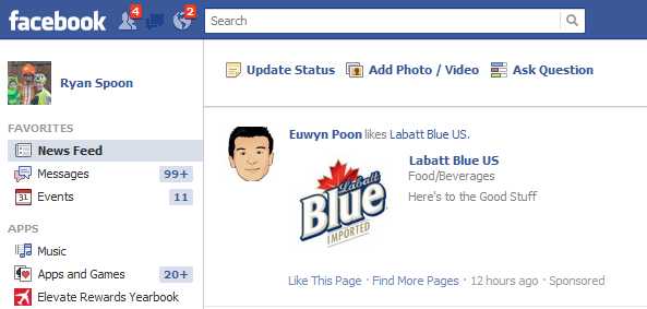
Interesting move by Facebook here. Basic Feed post about a user liking a fan page... in this example, Labatt Blue US. It is a "Sponsored" post (as you can tell in the bottom right after the timestamp).

But there is also now a "Find More Pages" link. When clicked, it takes users to a page full of other brands / pages that can be liked with a single click. Think of it has Pinterest for fanpages.

Obviously the implication here is: can Facebook drive secondary likes beyond the ad unit? Can they charge for that? And does this Find More Pages concept (which launched a year and half ago) be a more meaningful finding / search experience?

Facebook Anchoring Social Ads Atop the Ticker

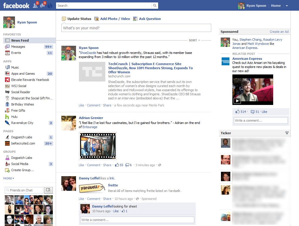
In January I noted that Facebook was experimenting with ad placements above the ticker. This is obviously prime real estate for the ad - and inversely devalues the ticker's prominence. Over the last week, I have been seeing more and more of this treatment. A couple things to note:

1. Yes, the ad unit is above the ticker.

2. As I have written before - this is much more than an ad - it's a mini Facebook page: friends, likes, comments, shares, etc.

3. When you scroll down the page, something new and interesting happens: the ad drops off the page and the ticker anchors to the top op the browser. It's a slick animation (shown in screenshot two). Ultimately, this could also anchor for the ad unit - which would make the ad unmissable.

Dream Lites & Promo Codes

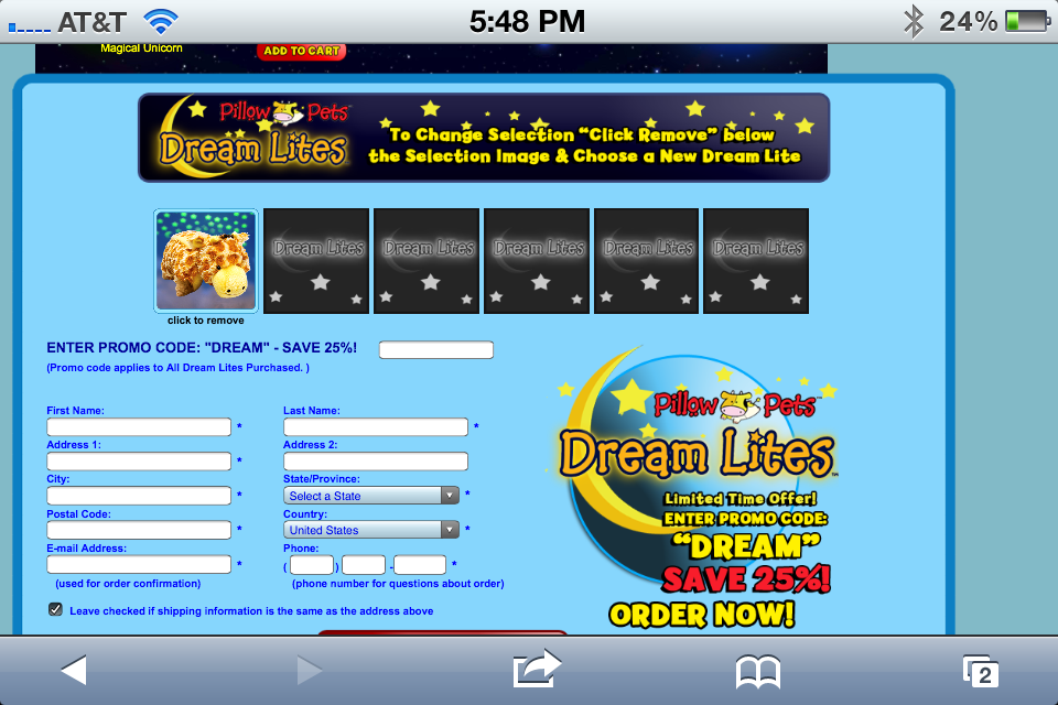
Watching the Sprout channel with our son, a mini commercial aired for Pillow Pet's new product: Dream Lites. They announced a special Promo Code ("PROMO") that would save 25% off an order. This is a common way of driving purchases and tracking efficacy / sources.

The great consumer I am, I pulled up DreamLites.com on my iPhone to find the following screenshot... which entirely negates the point of a promo code. It's a huge text promotion that says "Enter promo code DREAM to save 25%". What's the point?? If you are going to do this - might as well just say: regularly priced at $X. But now 25% off!

Strange.

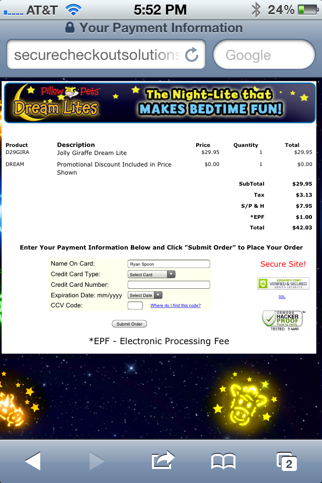
Worse yet, when tax and shipping are added up - the purchase price is actually more than the 25% off. Might as well promote free shipping with full price. Even at the same total price - and with a generous refund policy - that's more compelling because I get frustrated paying S&H (thanks to Amazon and others).

Flipboard: In the River Promotion, From iPad to iPhone?

I write a lot about targeted marketing - which means effecting messaging your users at the right moment and in the right place. I use the term "in the river marketing" to describe it. Here is a great example by Flipboard - a master at mobile design. Flipboard - which has huge distribution as an iPad app - is trying to promote their new iPhone app (which generally is a different experience and design). To do that, Flipboard gets as "in the river" as possible. The welcome screen generally displays a story from your network. In this case, it is a note directly from Flipboard's CEO Mike McCue and describes their new iPhone app. This ensures that all Flipboard users see the message and, at the very least, recognize that Flipboard now exists for iPhone. That's aggressive. But it's targeted: these are Flipboard users and iPad owners (so they likely have iPhones as well).

The major question that mobile publishers / developers struggle with: how do you then drive conversion? What next after this message? Driving downloads across device is difficult. Driving downloads from the web is even harder. Then layer on tracking to understand the efficacy of the campaign and it's unfortunately very difficult...

Google Takes to ESPN to Promote Google Plus, Group / Event Followings

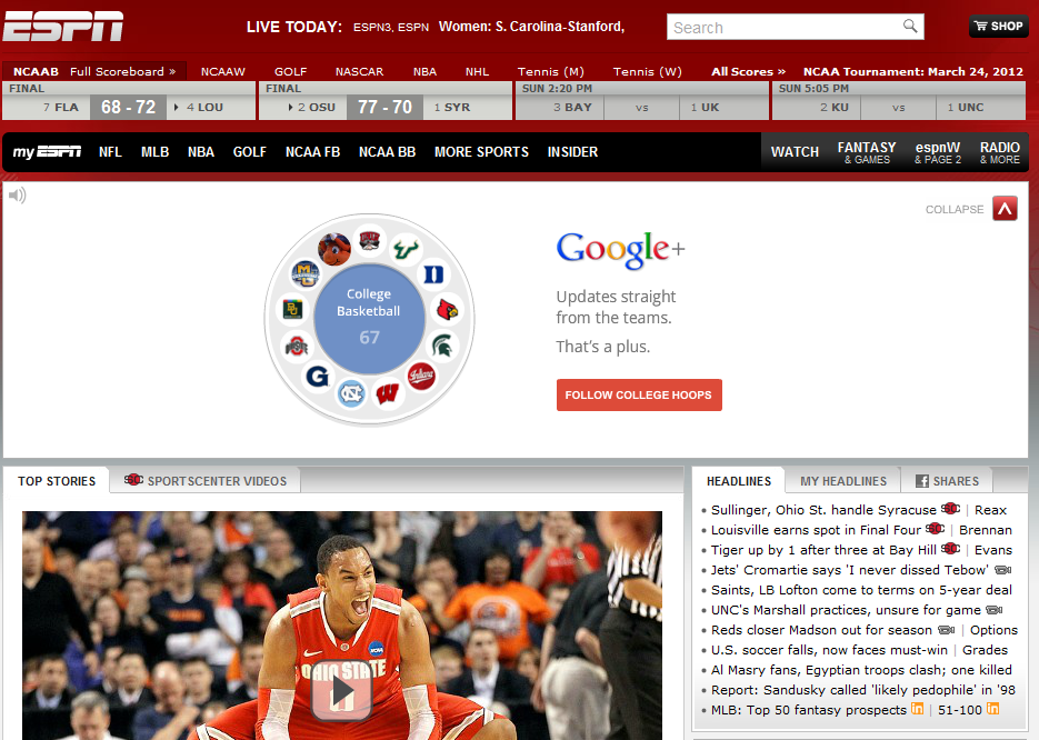
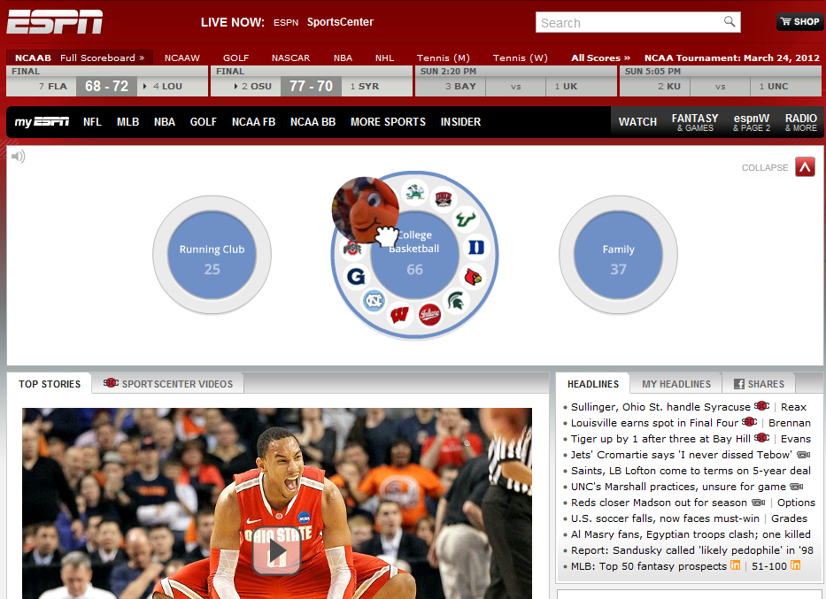
If you've been watching any television recently, you've surely seen the barrage of ad spots for Google Chrome, Google Plus, and Internet Explorer 9. I understand Google's effort but am generally confused by advertising specifically for IE9... which can't be as effective / meaningful as focusing on Windows Mobile. Anyhow... the point is that Google took to ESPN.com yesterday to cleverly promote Google Plus alongside the NCAA Tournament. It's well done because it's relevant, good looking and ties into the product very well (circles!). Most interesting is how it ties directly into the product - each NCAA team is "followable" on Google+ and there are scheduled Hangouts with analysts, teams, etc.

Really well done and an interesting twist as they try to differentiate from Facebook and Twitter... and the two areas where they can stand out:

Hangouts (the star of the product) and Media / Lists (something Twitter hasn't nailed yet)

Sparrow, Mobile: In the River Promotion

I frequently write about two ongoing themes: 1. the importance of "in the river marketing" (reaching targeted users at relevant points in the product / experience) 2. the difficult of driving mobile downloads from web, advertisement, other devices, etc

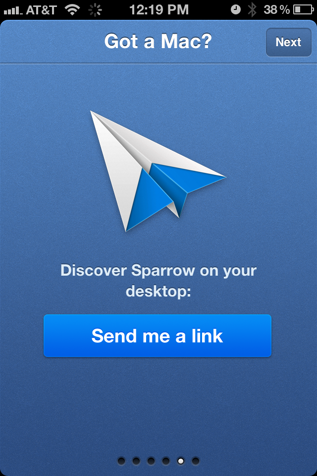
Here is a good example from Sparrow. They want to promote their popular Mac mail application to iPhone users. Within the initial product walk-through (now very popular within applications), Sparrow highlights their Mac app (Got a Mac?) and, to drive conversions, offers to send a download link. That's simple but effective (it's actionable), intelligent (captures some data / funnel measuring) and relevant (iPhone users are more likely to be Mac users than Android users).

Of course - if Sparrow were promoting their mobile product, SMS is more effective than mail. Groupon and Redbox do great work here.