Facebook Gifts, Reminiscent of Facebook Offers

Three things to note about Facebook Gifts: 1. Fascinating - and yet powerful - that the only promotion of Facebook Gifts is within the birthday alerts. It's the definition of "in the river" marketing and promotion. 2. This was the first time I noticed that the gift icon showcases friends who have sent gifts (when available). So not only is it in the river, it is socially relevant ... and therefor has some social pressure!

3. That aspect looks a lot like Facebook Deals.

Thanksgiving Day E-Commerce Traffic: Amazon, Walmart

Experian released 2012 online traffic data for Thanksgiving e-commerce compared to the prior year. Across teh board, Thanksgiving day traffic was +71% - an astounding increase. And it was 46% greater on Thanksgiving day versus the prior day (Wednesday).

Three takeaways from Experian's chart (shown above):

1. Amazon is #1, Walmart #2 (and not too far behind). #3 and #4 combined are smaller than either. Big gap.

2. Of the top 5 retailers, Amazon did not see a huge jump day-over-day. Meaning their traffic was more stable / consistent: 16% growth versus 80-104% jumps. Could also mean that Walmart, Target, etc are more reliant on marketing promotions to drive awareness / traffic.

3. The bottom line reads: "note: rankings based on weekly data that does not include mobile traffic." I will make an assumption that this impacts Amazon more than others. More importantly, as mobile and mobile commerce grow, this is a noteworthy, impactful omission.

For what its worth, Thanksgiving was the 3rd most trafficked day in 2011 behind Cyber Monday and Black Friday.


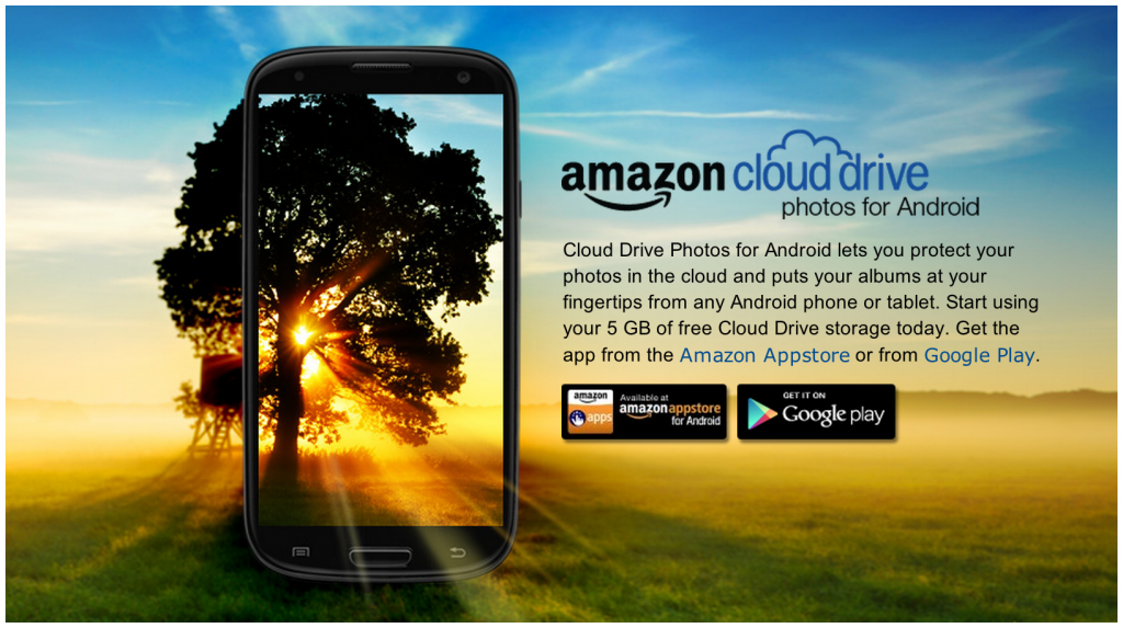
Amazon's Beautiful Cloud Drive for Android Splash Page

I love this graphic / splash page for Amazon's new Cloud Drive Photos for Android application. Beautiful and really, really well done:

"Cloud Drive Photos for Android lets you protect your photos in the cloud and puts your albums at your fingertips from any Android phone or tablet. Start using your 5 GB of free Cloud Drive storage today. Get the app from the Amazon Appstore or from Google Play."

Reaching Targeted Users with Log Out Pages: Facebook + Fab

I have written before about the value of Facebook's homepage for logged out users: both from a promotional (huge lift for Facebook; both Facebook + Twitter do it) and advertising perspective (eBay example). Last week Fab ran a great ad placement for logged out Facebook users. No doubt he got significant reach and is effective because Fab does such a great job with social shopping / Facebook integration. However, it is still a strange concept to see - and market against - "everyone who logs out of Facebook today sees our branding."

Facebook Gifts Design Treatment

Below is a screenshot from Facebook's new Gifts product. It is not yet publicly usable - but gifts are appearing in the wild from early users (see below). Two interesting points per the feed graphic: 1. It is a clever use of naming layered atop the graphic (for Dan, from Justin). It really stands out and plays to Facebook's social strength.

2. Per ongoing "in the river" theme, the unit has a very prominent "Learn More" ribbon and button beneath the graphic. Interesting to see if this persists over time, as the product ages - or if it is an onboarding treatment.

Apple's Passbook, Dunkin Donuts & Facebook Offers

An example of the potential power of Apple's new Passbook for:Brands (here Dunkin Donuts) Platforms (here Facebook / Facebook Offers) Consumers (simplicity, speed)

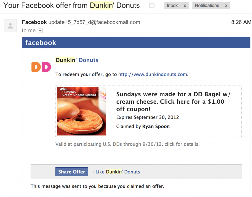
Dunkin Donuts running a week-long promotion for their holiday bagel using Facebook Offers:

Upon acceptance, Facebook shares socially and then emails users steps for redemption:

Users then have to print the coupon (per below). But this could pass through to Passbook or into a Facebook Offers Book / application. Thus keeping everything mobile, eliminating friction, and adding tracking throughout the entire process:

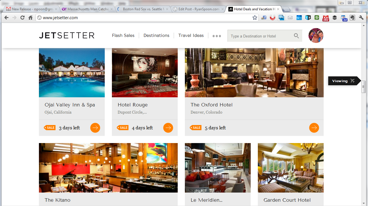
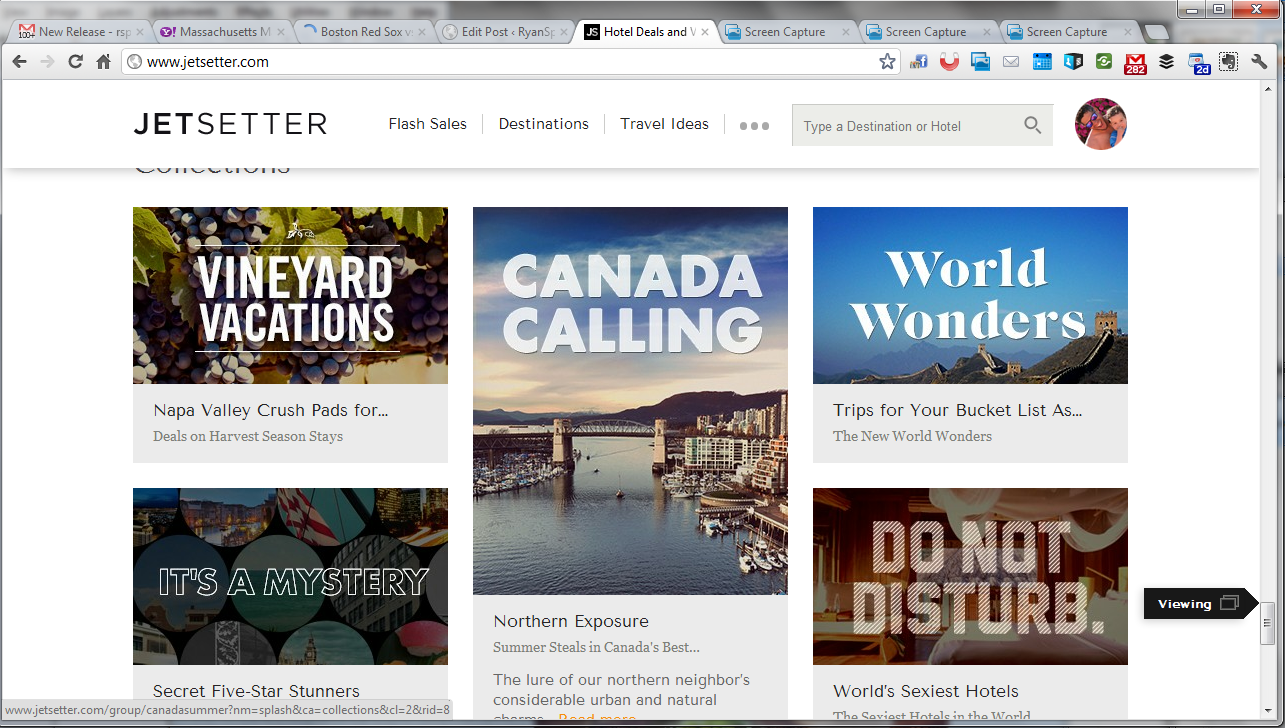
Jetsetter Navigation Panel - More UI and Design from Jetsetter.

Jetsetter is known for great design (see here) and here is a nice little UI treatment that we recently saw on The Verge (who uses it on mobile and web). As you scroll through Jetsetter's sale page, an icon scrolls alongside the right progress column. It serves two functions: 1. telling users what kind of content they are viewing, ie vacations or curated lists. 2. showcasing the depth of product / offering that Jetsetter offers. In other words: there's a lot more than what I've seen!