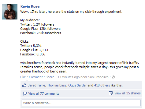
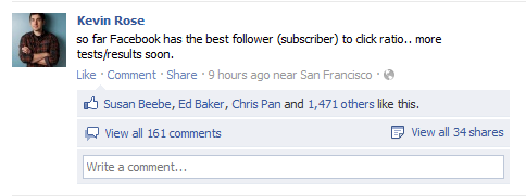
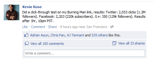
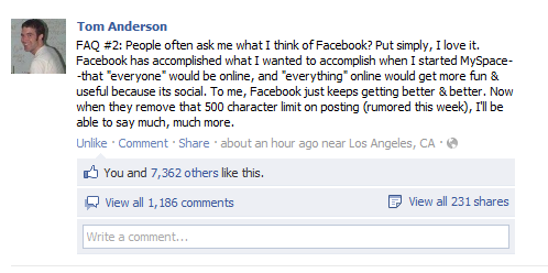
"So Far Facebook Has the Best Follower to Click Ratio", Kevin Rose

I recently touched on the potential importance of Facebook Subscribe, Facebook Subscribe: Opportunity for Publishers & Online Voices... and here is why Subscribe is important and not simply a "me too" product: - it is a natural fit for the Facebook environment - it gives personalities and big voice (subscribe is for personalities what pages is for brands) - it is driving real engagement and traffic (see below)) - which means that users are liking it - both the voice and the reader

In the River with Twitter Images & Facebook Messenger

A post I drafted a few weeks ago and never published... better late than never (I think!) Two good examples of In the River promotions for two new, relatively off-stream product launches: Facebook Messenger

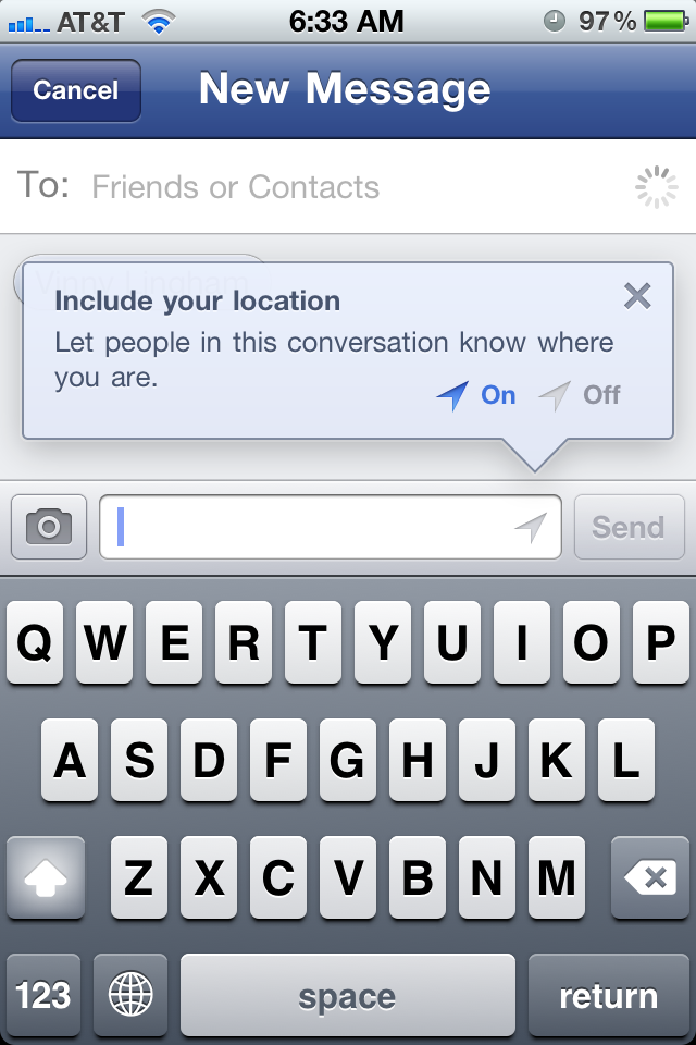
a new mobile application by Facebook focused on Facebook Messages. Location is a highlighted feature that is clearly more important on mobile than on the web. After download, Facebook walks users through the app's key functions - and here is how they alert you of the location feature. Impossible to miss (which is important considering privacy implications, a new feature and a small icon potentially unfamiliar to many):

Twitter Images

Very similar: Twitter released a new product feature (Twitter Images). The product concept is simple and familiar - but the act of sharing via Twitter will be unfamiliar. So Twitter displays a pop-up promotion on Twitter.com that shows the basics, the icon and a link for deeper information. Also similar to Facebook's location alert, Images is an important part of future strategy (see my thoughts here) - but also have privacy and partner implications.... so a clear product launch and description is important:

Redbox Delivers Rewards Through SMS Activation, Foursquare

Redbox continues its string of smart, rewarding marketing campaigns. Redbox has provided discounts and rewards for email and site activity - realizing that the value of certain acitvities (validated email address) far exceeds the cost of a free movie or two. Here's another: Redbox is running 10 days of discounts & rewards for users who active their mobile phones through SMS (Foursquare too). Again, Redbox intelligently views this as a way to acquire mobile users / activity. In that regard, it is a marketing promotion that will drive discounted short term activity but has longer term value thanks to deeper customer data / touch points.

Redbox is smart. And worth paying attention.

Different Emails for Different Users, Usage. Facebook Demonstrates

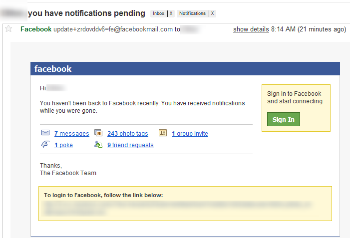
When done effectively and appropriately - email is a marketer's most powerful retention tool. Here is an example from Facebook that demonstrates both effective and appropriate email marketing. The key: deliver different emails to different users / user patterns. Conceptually, its very basic. In practice, it's actually quite hard to deliver relevant emails, at the right frequencies, and featuring the right products (why? creation and delivery can be difficult - but featuring content that is appropriate for that user is the real challenge).

Here are two emails that I have never received because I am an overly active Facebook user. The recipients here are less involved so Facebook delivers too different types of emails:

1. You Have Notifications Pending!

The goal is clearly to drive logins by demonstrating that the user's network / profile has activity. If a user logins daily, notifications are prominently featured across the header... this is an attempt to enforce that habit.

2. You Have a Birthday this Week!

Again, for users who login daily, this is prominently featured. Birthdays are important drivers of engagement - ie posts, messages, events, JibJab cards =) For early users, this is a compelling email that gives me an immediate action. For more active users, this could be overwhelming and Facebook is probably better served promoting deeper interactions like messages and/or new features.

What's this mean for you? Segmenting your communication is a powerful way to drive engagement / retention and guide users through your product. To do it effectively, you also need to determine what products and communications make most sense for each segment / class of user.
Word With Friends User Onboarding

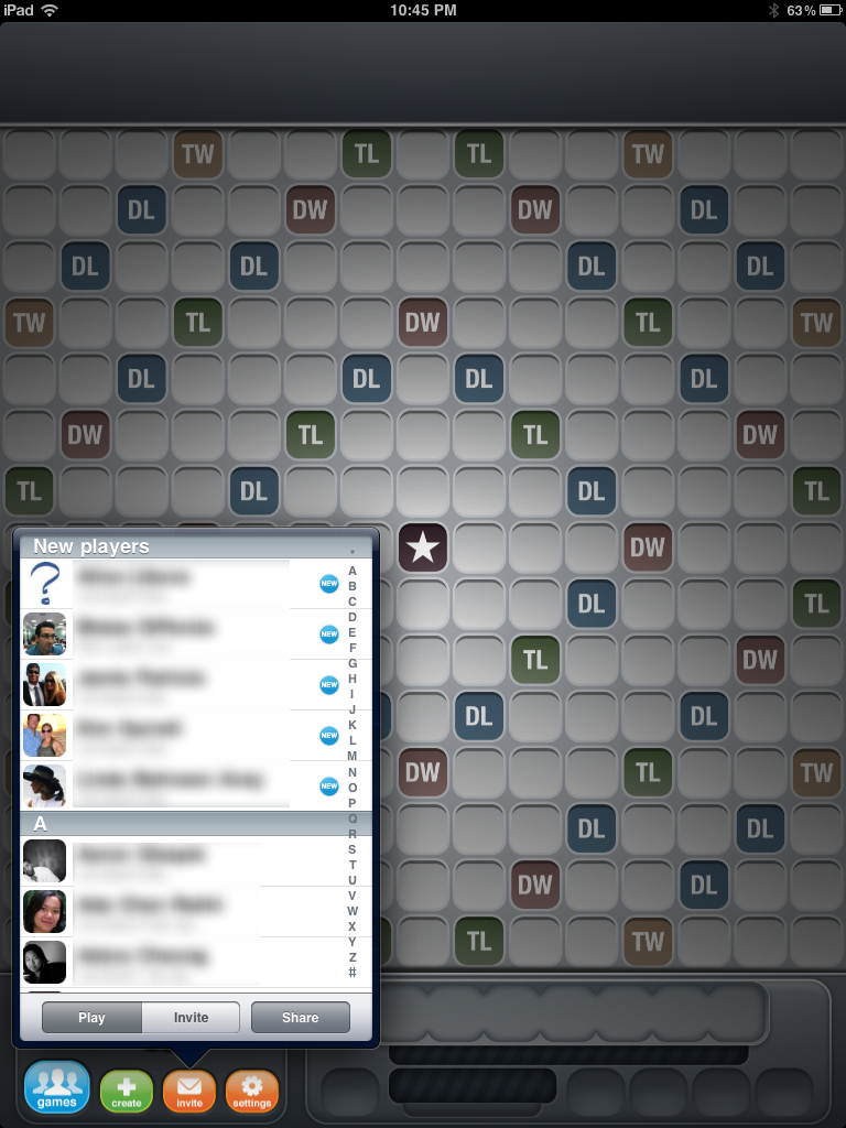
I've written about the importance of using user-segmentation to deliver unique user / site experiences and email marketing. Here's a brilliant example of Zynga's Word With Friends (the mega-popular Facebook & mobile Scrabble game).

Obviously the game is predicated on multiple users playing... and that obviously starts with an invitation process. Words With Friends users your Facebook / Twitter networks to create an address book of friends playing the game. The first people in your address book are new users (with big, prominent NEW badges next to their name). It's a super simple, basic concept - but it's brilliant because Zynga knows that:

- new users need to be prompted to play - once they play a couple games, they are hooked - current users feel a sense of goodwill / obligation to play with newly joined friends - current users likely play within the same confined network... this broadens that

Small UI placement that makes an important difference.

Hulu Gives Away a Month of Hulu Plus for Facebook Connect

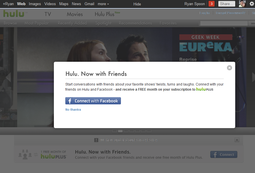
After my rather public Netflix cancellation , I was lured into Hulu Prime with their Facebook Connect promotion: a free month of Hulu Prime if you connect your Hulu account to Facebook. Smart for Hulu because it's smart for me: - Hulu Prime is a better product with Facebook Connect. Browse is better. Recommendations are better. And it is more fun.

- The value of me being socially connected is absolutely worth a free month to Hulu. Again, better data and virally shared content.

- It is an instant reward (of decent value) for a instant social share (of greater value). The moment I start my account, it is shared on Facebook and that alerts my network that I am a Hulu Prime user and that I got a free month (so they should too).

- ... And the math obviously says that the cancellation rate must be far lower than the continuation rate.

Consequently, this is a better way for Hulu to run an introductory promotion (as compared to 25% or 1st month free) and it's a more compelling experience for me (even better for Hulu).

Groupon's Post Purchase Prompts. As "In the River" as it Gets.

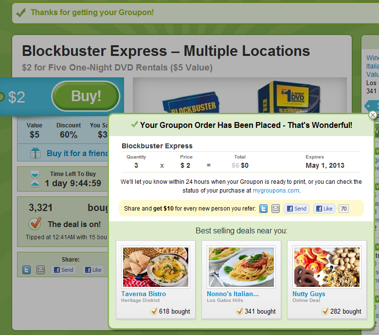
Great example of "in the river" promotion by Groupon (one of the very best at conversions and promotions). It doesn't more "in the river" than the post-purchase screen... and it doesn't distract the user during the purchase / flow. This is an obvious example but worth showing because it's clean, clear and intentionally unavoidable. Immediately post purchase:

- the screen blooms into a popup with three components

- a lightweight receipt highlighting the coupon's expiration date (important)

- a chance for users to share their purchase and receive a $10 credit (Twitter, Email, Facebook, Facebook messages). I believe it's better to promote this post purchase because you can be more aggressive (even obnoxious) about it and not interrupt the conversion

- three more deals relevant to you (as determined by sales popularity and proximity)

Also worth noting: it is far easier to A/B test and optimize these flows than it is on the purchase / check-out page. Once you've optimized this flow, you can apply those findings elsewhere.

AT&T SMS Notification. Alerts Me of Improving Service...

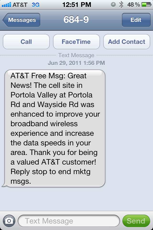
I received the following SMS from AT&T.First, they alert me that it is a free message (great!). Second, they notify me that my local cell tower has been "enhanced" so I should expect "improved" cell and data quality. One part of me admires the effort to improve quality... and the communications are also admirable.

Another part of me thinks it is a little hokey to deliver an alert via SMS, tell me its a free message, conclude with an exclamation mark, and describe the SMS as a "mktg msg".

Facebook Deals Brings Friends Into Emails

I write a lot about Facebook Deals and I start each post with something along the lines of: I am not sure what Facebook Deals will become, but I give Facebook a lot of credit for the rate of innovation and their UI / UE treatments. Facebook Deals continues to test new visual treatments (examples here and here)... and here is yet another clever, compelling one.

Facebook's stance with Deals has been to overlay your social graph with your geography and your Facebook Places activity. They have done a good job merging those in the web experience... and here they do it via email. The first thing you see in the email is *not* the deal or the deal provider. It is the list of your friends (and their Facebook profile pictures) who have either liked the deal or the deal provider. Eventually it could of course be the friends who have visited the location, purchased the deal, etc (as we have seen in their online units

As your inbox gets more crowded -and marketers / brands fight for your time - this is a powerful way to capture your attention, improve conversion and tell a unique, differentiated story: