iTunes Best of 2011 is Curated by Apple. Time for Retails to Curate with Social Data.

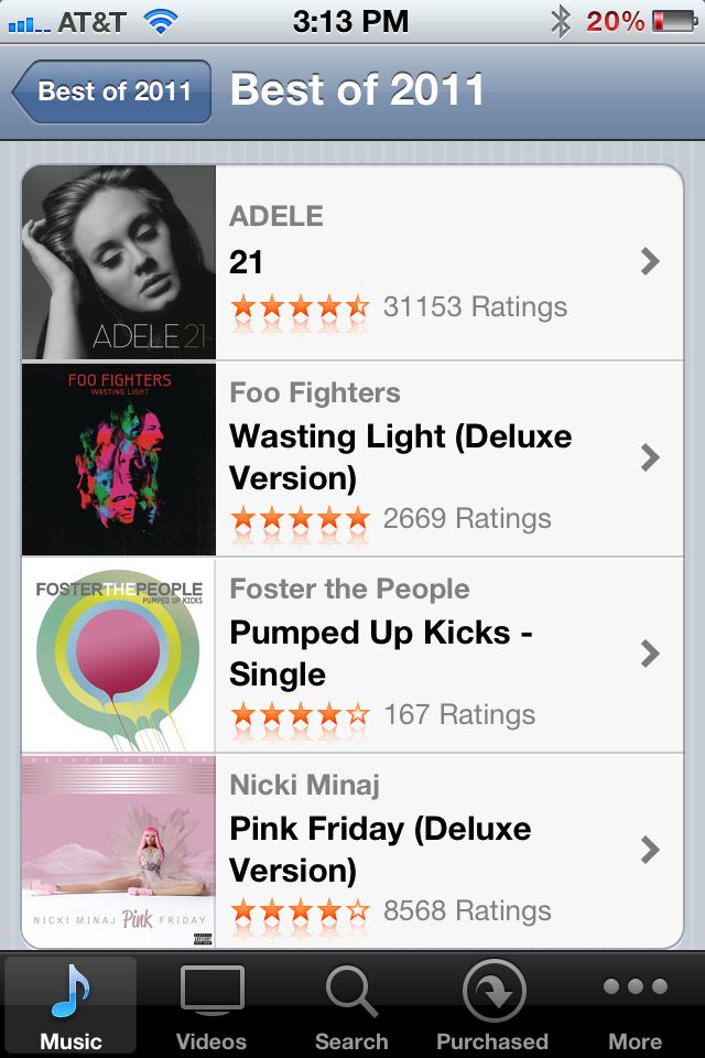
It's that time of year when iTunes - and countless other retailers / merchandisers - publish their "Best of 2011" lists. It's fun to review the lists, particularly when a great merchant / voice crafts them. But the example below of reading through iTunes "Best Music of 2011" list isn't nearly as powerful as it could be. What's missing? A list curated by the merchants I most care about: my friends. Show me what my network bought, listened to and loved. That's most interesting and would ultimately be the highest converting.

Of course that requires Apple to either integrate Facebook Connect (or even less likely, have Ping succeed).

But it's a relevant lesson to those retailers who do in fact integrate Facebook Connect and collect social data. There is great value and intelligence within.... think of it as more than social sharing: it's a merchandising and conversion lever.

Hulu's New Social Sharing Gives Visual Control

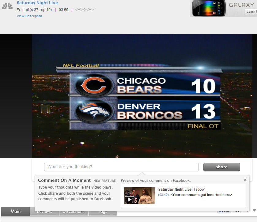
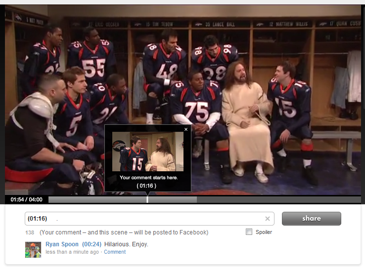
Hulu has introduced a new sharing mechanism that does two things: 1. It allows users to comment specifically on 'moments'. That then publishes the specific scene to your Facebook wall and stores your comment at the specific moment within the timeline. At scale that creates a very interesting concept: a dialogue that moves along the video's entire timeline. At scale that also poses a problem: will I want to read all of that content? Not sure... but interesting.

2. The preview UI is terrific. This is what first caught my eye: the pop-up box showcases the specific screenshot, comment and formatting that will appear on Facebook. That's really good-looking, unique and powerful.

Why is it potentially powerful: first, because I think users like to feel control over what is published and this is a visually, fully controlled experience. Second, it is different... and that means that users will drawn to it (as compared to a standard like button).

I really like this experience and don't see why it can't be applied to other visual mediums like e-commerce.

Google Currents: A Reminder about Mobile UI

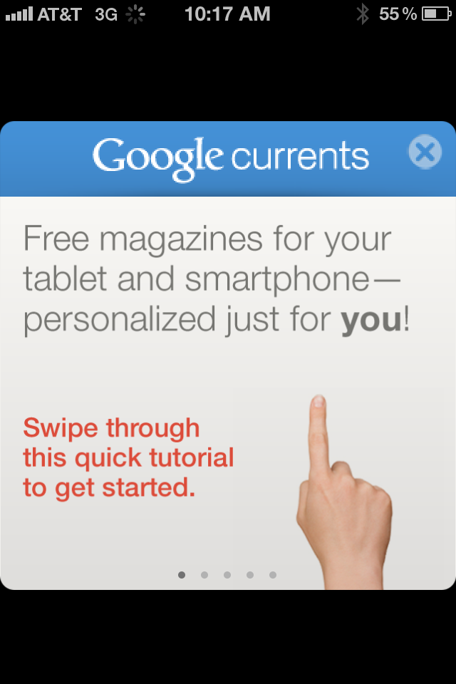
Below are three screenshots from Google Currents on the iPhone (Google's Flipboard-like product). Rather than commenting specifically on the Currents product, I wanted to share three themes I was reminded of when first using the app: 1. Mobile UI is really critical and really unique. (you've heard this before and will again & again).

2. Mobile UI is very different on iPhone vs. iPad. Different real estate and different behaviors / expectations. The below examples demonstrate why this experience just does not work on iPhone. You have to treat them differently and create unique experiences specifically tailored for each.

3A. The genius of Flipboard is not the content. That's become more of a commodity: publishers of course want their content in as many places as possible. It is the UI and the interaction. It is the magic users feel when opening, using and sharing.

3B. And it's that magic that you need to capture within your product(s) and experience(s) - of course in your own, relevant way.

Bonobos Adds a Clever Twist to Viral Contest, Sharing.

Bonobos is currently running a viral giveaway on Facebook: Win a Wardrobe. Giveaways on Facebook aren't unique - they are great ways to drive Facebook fans, sharing and awareness. But what is unique is the viral hook that Bonobos is using:

"The more you share, the more chances you have to win."

That too isn't unique - usually contests give extra weight for the number of shares, referrals, etc. Bonobos is doing it differently though - and its very clever:

If one of your friends wins, you win the same prize. That's different and very cool. If the prize is enticing enough, its a more interesting way to incent referrals and sharing.

Bonobos + Fab Looks More Like Groupon than Gilt.

I find this example so interesting: two fast-growing e-commerce brands working together to solve one another's needs: Bonobos delivers heavily discounted product to Fab, who delivers a user acquisition channel. From afar, I believe example is more similar to how merchants use Groupon / Living Social than how they use Gilt Group: it is more about attracting new buyers than it is for dumping inventory efficiently:

Even Groupon, the King of Conversions, Battles Clutter

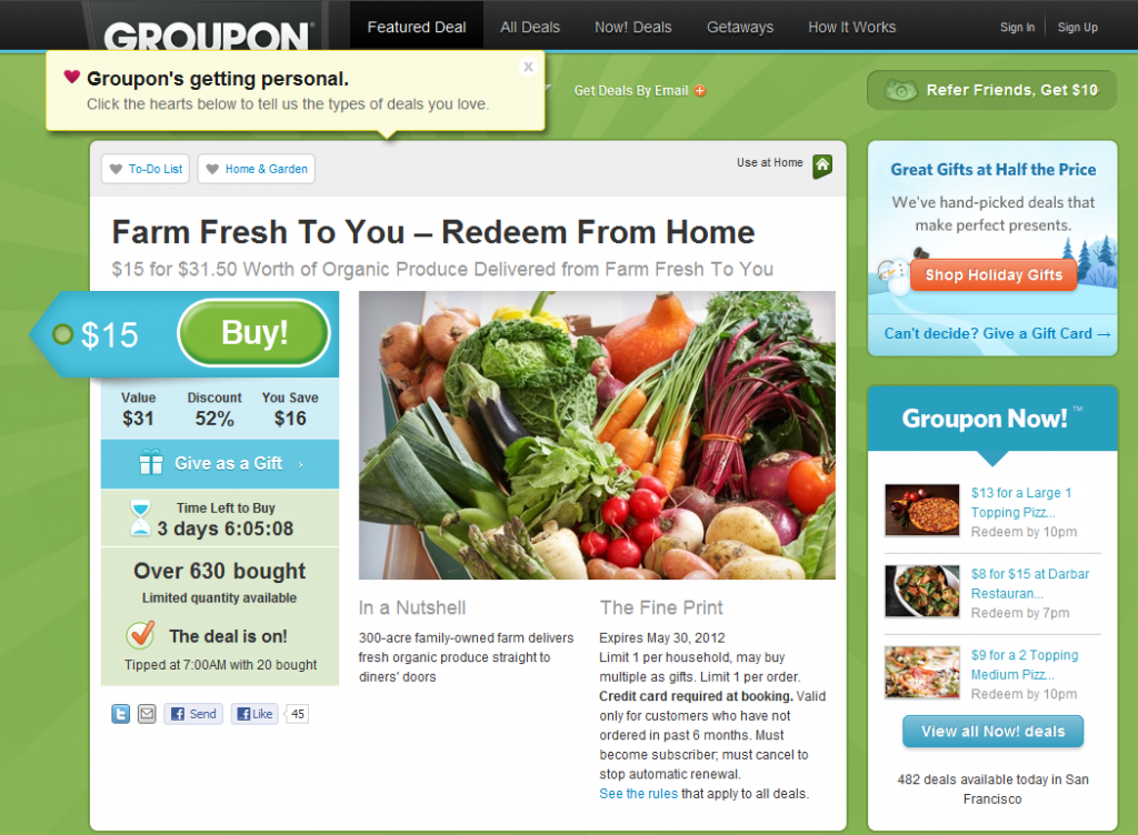
I often give the advice of studying web leaders and learning from what they are great at. For instance, Amazon is unrivaled in the ease of navigation, findability and user experience. For user acquisition, onboarding and funnel optimization - Groupon and Living Social are as good as it gets (see more here). But as Groupon tries to grow its product offering and business - it is encountering the common problem of *too much*. How do you keep the experience simple, clean and therefore optimzied with too many offerings and too much noise? It is effectively the inverse of my "In the River" concept.

Here's the example of a recent Groupon. Notice all that's going on: - the Groupon itself (the primary focus) - an expanded promotional unit for "Groupon's Getting Personal!" - Holiday Groupon Gifts - Groupon Now! - the referral program

So in addition to the primary Groupon, the user is exposed to four programs: Personal Groupon, Groupon Gifts, Groupon Now!, and the Referral Program (which has been around from the start). That's a lot!

Markers Mark Ambassador's Club & Creating a VIP Customer Program

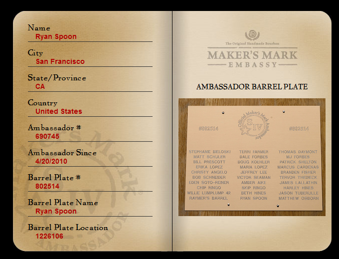
I was introduced to Maker's Mark Amabassador Club by my friend Chaz Yoon (LivingProof.com, previously a colleague at eBay). Chaz described it as one of the most unique and compelling "VIP customer" programs. VIP program is a bit of a misnomer... since anyone who registers qualifies as a VIP. But registration alone signifies user activity and allows Makers Mark to continuously engage with fans.

What do ambassadors get?

- To start, their name etched on a barrel of premium whiskey that is aging. Photos during maturation are included. The concept of buying my own personalized whiskey is strange and fun.... and effective. I will certainly buy my own whiskey!

- Access to deals, events and special products (similar to wine clubs)

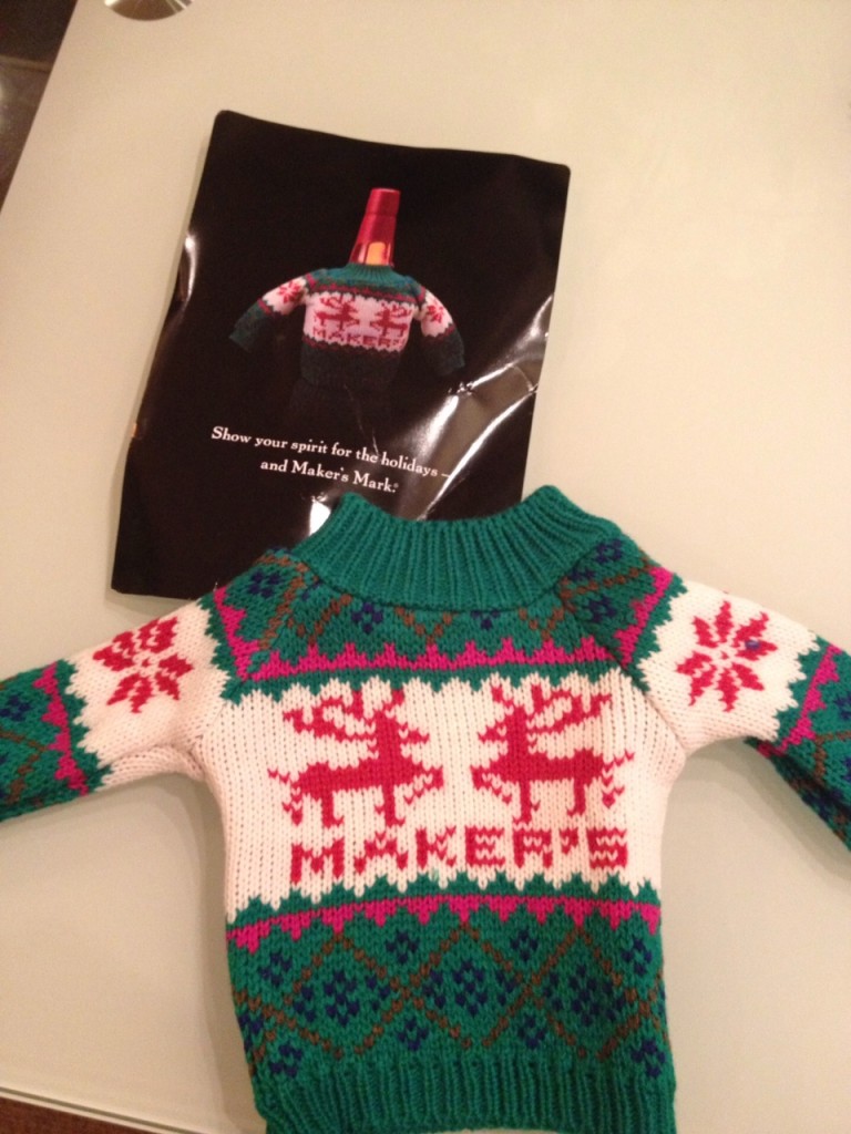
- A really unique holiday gift... which has to be relatively expensive to create and deliver. It's brilliant.

So how does this apply to you?

1. It doesn't take much to make customers feel special. Just some creativity and fun.

2. VIP programs can apply to more than just your highest spenders.

3. In a world of competition, differentiation comes from product, branding and customer relationships.

Don't Stop at Onboarding New Users. Example from Foursquare.

I rarely visit Foursquare.com (it's one of those destinations that is almost entirely mobile). Nevertheless, Foursquare is doing very interesting stuff on its .com and is clearly focused on using the web to build out deeper content, directories, etc. So I visited Foursquare.com and this was the above-the-fold module I was first presented with. There isn't much ground-breaking - or even truly unique - about it. But it is highly relevant to a theme I have been thinking & talking a lot about recently: active user experience and optimization.

What does this awkward string mean? In short: so much attention is paid to new user experience (registration, conversion, onboarding, etc) that current users are somewhat neglected. Of course active users are not neglected from the a product experience - but the same care with which newbies are onboarded should be given to active users. Conversions don't stop after the registration flow:

- vistor >> - new user >> - active user >> - highly engaged user >> - super user (top 1%)

Back to the seemingly ordinary screenshot I included. It prompted this post because of the care that is given to driving deeper engagement and networking:

1. Tailored for the destination First, Foursquare understands that the act of networking is more efficient / powerful on the web than on mobile

2. Drive to a specific action They also realize that the more friends the better: notifications, engagement, virality, etc

3. Lots of opportunity And that I have 889 Facebook friends on Foursquare (wow) - yet am only connected with a handful of them

4. High converting design So they present this to me boldly, using the Facebook Facepile and a big, bright green Find Friends button.

Again, this is a minor example - but it speaks to the care with which Foursquare is thinking about driving activity as much as they are about new user onboarding.

Facebook Brings Sponsored 'Stories', Ads to the Real-Time Ticker.

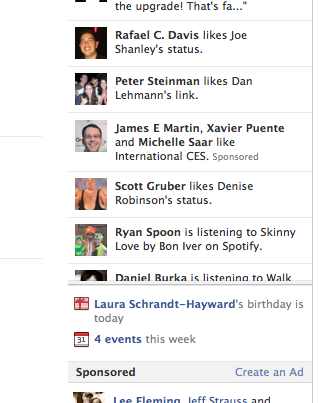
I always have to preface posts like this because Facebook is constantly testing new formats / features and it's hard to tell what I see vs. what other people see. In other words, if it's new to me it might not be new to you. So apologies! As Facebook ran out the real-time ticker, it was clearly a move to drive continuous engagement and alter the usage of the core feed. One of the consequences was that the ad units that had sat in the upper right column shifted down ... way down. Not great for advertisers paying premium (and ramping) prices. But, as shown below, that has seemed to allow for yet another ad format to emerge. This one looks a bit like Twitter's sponsored post. Sponsored stories / actions appear in the ticker and are noted as "sponsored" (ever so slightly). When expanded, those stories have standard actions (ie Like, share and comment). Obviously the goal is to drive engagement (and then charge for each interaction). Simple but very smart and effective.

And its yet another ad format - but this time, it's fully integrated into the normal usage pattern and can generate more than base CPMs. For instance, in the example below I could theoretically like the brand, comment, and/or share. Imagine a cost-per-interaction model. Advertisers would of course be excited as it leads to sharing and virality..