Amazon Applies Intelligence to the App Store. You Should Too.

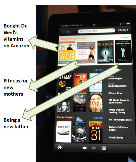
I've long argued that Apple's iTunes and the app store are woefully unintelligent. They are akin to merchandising in a storefront... when there is data available to make the store experience more compelling and better converting. Here's an example of that argument beginning in 2009 (!). After a week with the Amazon Kindle Fire (more to come - hint: I love it), they get the storefront concept and execute it well.... as we have come to expect from Amazon. Rather than using Facebook data, Amazon uses your purchase and search data. Below is an example of the Kidle Bookstore and notice that it's not just a compilation of bestsellers. Theses are items specifically tailored to me based on what I've bought, what I've searched for, and what they consequently think I like (sports, health, tech, young families, etc).

What's this mean for you? You likely won't have Amazon's breadth of data and users profiling... but platforms like Twitter and Facebook do - and you can leverage them to personalize your experience specifically for your users. It's more compelling. It's differentiated. And it's therefore converts.

How to Leverage Facebook for Startups: Part I, Off-Facebook

Note: this article originally appeared on TechCrunch: 10 Ways Your Startup Can Hook Into Facebook, Part I: On The Web Part I: Off-Facebook Strategy Part II: On-Facebook Strategy

Having already covered how startups can use search and Twitter to find customers, here’s 10 steps for finding people on another key marketing platform: Facebook Facebook has evolved from a social network into the fabric with which much of the web is constructed: identity, product, data, experience and so on. Even if you chose to no longer use it as a social destination, you would still find immense value in it through your every-day web usage: registration, personalization, sharing, interaction, etc.

This is of course a huge opportunity for consumer-focused startups. Facebook plays a core role in touching each step along the standard product / user funnel:

- Acquisition: virality, referrals, paid traffic - Activation: conversion paths from new to active users - Activity: user engagement and retention

Below is a slide presentation with five ways to think about leveraging Facebook to affect those three steps on your web experience. Tomorrow I will share five ways to find success on Facebook.com.

View more presentations from Ryan Spoon

Philz Coffee, Free Wifi and Facebook Fans

I spent time working at Philz Coffee yesterday (now in downtown Palo Alto - and if you haven't enjoyed Philz... hurry. It's amazing coffee). They provide free wifi and do something really simple and smart... and surprisingly unique. When you access the free wifi, you are prompted with a screen to acccept them terms & conditions. This is very normal:

When you accept the terms, most companies redirect to you an ad or content hub of some sort (here is an example from Starbucks).

Philz redirects you to their Facebook fan page. Simple. Clever. You are in Philz already... why not like their page? Why not check in? Post a picture of your coffee?

Why doesn't everyone do this? It is clearly a better return than some CPM ad that users are dying to get away from... it's relevant, not spammy and surprisingly welcome.

Be Actionable. Be Different. Facebook Listen & Read Buttons & Google Offers as Examples.

Before the holiday, I wrote that Facebook was testing "listen buttons" in the Ticker. I commented that it was sure to boost activity and conversions... but what happens when the 'action' graph expands and there are buttons galore? A couple thoughts / notes on that: click image for full-size

1. This is the first time I have now seen "Read" buttons. They look exactly like the listen button - but clearly focused on different actions, publishers and canvas apps. It really stands out.

Again: what happens when the entire ticker is action-oriented? Is it too noisy? Is there new column? Unsure... but I like the fact that posts are action-oriented.

click image for full-size

2. Which brings us to point #2: it is a reminder to be action-oriented and to stand out... whether you are creating content, delivering emails or crafting ad units. Great example below from Google's own search ads.

The first unit is for Google Offers. It *of course* looks great and stands out: big branding, big imagery, etc.

The second is a little further down and is by Lonely Planet. The unit stands out because it is different and integrates ratings. The copy is action-oriented.

click image for full-size

How to Grow Your Brand on Twitter. 5 Overarching Guidelines. Tons of Examples.

Note: This article originally appeared on TechCrunch ("5 Ways for Startups to Grow Their Brands on Twitter”). Last week I began an effort to answer those questions I get asked most frequently, starting with how to create an early-stage pitch deck. Today, I address the next most popular question: how best to grow your brand on Twitter? Twitter is the ultimate marketing platform. But the scale of Twitter is so extraordinary (250 million tweets / day) that it is actually quite easy to get lost in the noise.

Separating yourself from the masses really begins with the recognition that Twitter is first and foremost a platform for conversation. If you believe that, you avoid the mistake most brands make: treating Twitter as a mechanism to push content rather than create engagement.

And once your goal is to foster conversation and engagement, you can follow these five guidelines:

1. Listen. 2. Be authentic. 3. Be compelling. 4. Find the influencers. 5. Extend off-twitter and onto your site.

In the below presentation, I breakdown these core themes and provides examples of people and companies successfully using Twitter to drive engagement and grow their brands.

Klout, Perks and Packaging.

During the holiday season, why not write about great packaging? (a theme I have written about before) I am a big fan of Klout. Whether your specific number is truly accurate - it represents a general level of influence. And that's important for brands, marketers, etc. And it reminds me of Ken Blanchard's great quote, which in today's world means everyone is capable of influencing and therefore leading:

"The key to successful leadership today is influence, not authority."

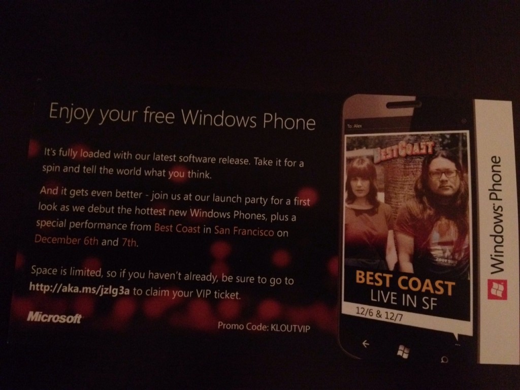
But back to packaging. I received a free Windows Phone from Klout's Perks program. It arrived in this colorful, branded box. The box itself is fun, the quotes are funny and on-brand (you got perk'd!)... and the experience of opening it and receiving a great perk is both exciting and fun. That's a win for Klout and, in this case, Microsoft.

It's also worth reading the insert from Microsoft. "Take it for a spin and tell the world what you think." That sums up the Perks experience well. Get product in front of relevant people. Provide a unique, fun experience. And encourage those 'influencers' to discuss and share.

Redbox SMS Program: Users Get Discounts; Redbox Gets Marketing Channel.

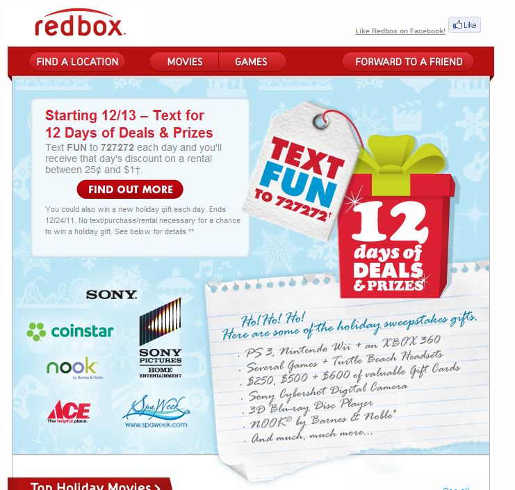
I write a lot about Redbox, in part because I am frequent users and in part because they are terrific marketers. Here's yet another example of Redbox leveraging SMS to drive promotions (and to collect user data ... and create ongoing marketing touch-points). The promotion: send Redbox an SMS and get discounted delivered via mobile. That's not entirely unique.

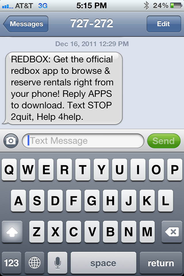
But, it's smart. As noted above, its a clever way to collect data about their users and create ongoing marketing touch-points... like the example below. Once you SMS Redbox, they follow up with an SMS that allows you download the mobile app (just reply APPS).

And that's the big takeaway here: be creative about driving engagement. Redbox uses SMS to deliver discounts and drive app downloads. The discount is the incentive for consumers and its a marketing cost for Redbox to distribute their app and drive engagement (a tactic they have used in email as well).

Both parties win. And Redbox has created a simple, low-cost marketing program that drives long-term benefits.

Differentiation exists as long as you can run faster, further.

You're probably familiar with Vibram 5 Finger Shoes that have become somewhat popular. They became popular in part because they were so different, unique and noticeable. When someone wears a pair - you visually take note.... and if you've not seen them before, you ask what they are. And now they are quite recognizable and popular.

Flipping through a magazine, I came across the below ad for Adidas' new, equivalent shoe. It's a great reminder that:

- differentiation doesn't last forever... particularly when you succeed.

- big brands with big budgets exist... and they take notice.

- consequently, differentiation exists as long as you can run faster, further.

- think forward and about your brand more than about protection & competition

- ... and when a start-up, make sure you've thought enough about whether you have a sustained chance to take a large enough lead (time, product, brand) before others arrive.

Balancing Ads, Revenue and Experience, Pageviews.

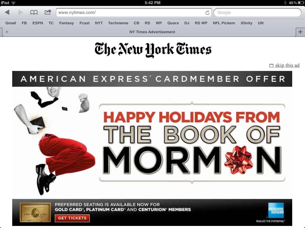
I write frequently about how mobile web requires a different design and UI than traditional. Great example here. These are two *subsequent* screenshots from the New York Times iPad-friendly website. First, the NYT homepage is taken over with an American Express ad (albeit a really good looking, custom-built ad).

I can tolerate a page takeover. It's neither unique nor inexcusable (they have to make money on a free product). But, after it disappears and I click on an article - I get another takeover.

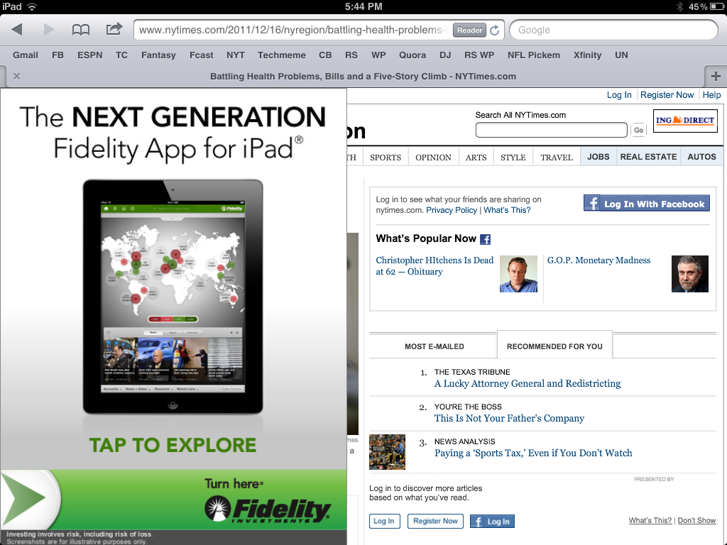
It too is custom (and I give them credit for that)... but that is two consecutive takeovers and, this last example, is remarkably annoying. It should at least appear on the right column so that I can read the article. Why preserve the social sharing screen for an article I haven't yet had the ability to read?

It's really shortsighted to sacrifice experience, reduce pageviews (both in this session and in the future) to increase eCPM for this specific visit. The eCPM will be terrific: two huge takeovers on my two pageviews... but I didn't even get to a third pageview. Is it worth it?