Google Play Store vs. Apple's iTunes: The Little Things

I have been splitting time between my iOS and Android (iPhone and Samsung Galaxy III; iPad and Google Nexus 7). Having built up years of habits with the iPhone, it is a really fascinating experience to: 1) force myself to learn a new platform: chalk that up to laziness + 'switching costs'

2) uncover the intricacies of the different platforms & brands: very noticable in some cases, very minor in others

3) figure out what I particularly like about each (device and platform). There are absolutely things that each does better than the other

Really small example of an intricate difference between the two platforms and strategies. Within iTunes (iOS and desktop), the focus on movie and television content is purchase. Makes sense as it's a higher price point and promotes cross device usage (phone, tablet, Apple TV, desktop). Finding rentals is much harder - and in some cases available weeks after the release.

Within the Google Play Store, it is the opposite. Everything defaults to rentals ($1.99 - $3.99 usually). Very different approach which seems to focus on lowering cost and sharing strategy with YouTube and other Google properties.

So many of these little things which are seemingly obvious and/or unimportant... but fascinating both individually and when you combine them all. More to come...

Pinterest's Clear Friendship Emails

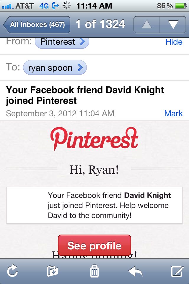
I am sure other companies do this as well... but since the email arrived from Pinterest and caught my attention, I will credit Pinterest here and realize other examples will be forwarded my way! Many socially-enabled sites (ie Facebook Connect, Twitter Oauth) send notifications when friends join the service. Sometimes those friends are not connected with you on the new service - but the notification is done to spark the connection. And in other cases, the connection is automatically forged (ie Quora - which was helpful with early virality). Depending on the relationship, language, etc - both can be confusing to new users. I give Pinterest credit with the below example because it very clearly defines a relationship: a "Facebook Friend" has joined Pinterest. That may seem like a minor point - but it is much clearer than directly creating an on-Pinterest friendship and/or only using his name.

I get daily emails from services alerting me of new friends, followers, etc. This is a very minor way to add context and clarity.

Jetsetter Mobile App: Effective App Promotion & Conversions

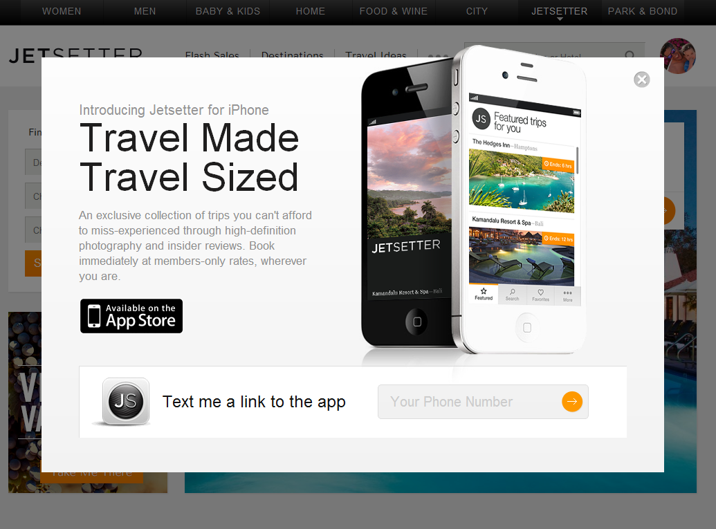
Jetsetter is known for great design (see here). Here is a good example of good design and effective mobile promotion. I have written before that promoting mobile applications via the web is challenging: for instance, conversions are weak due to web to download and data is limited (device, OS, etc). SMS and email are powerful ways to promote applications because they are consumed directly on the device. Good examples by: Sparrow, Redbox, Groupon and Gilt.

Here is another good example by Jetsetter (whose parent is Gilt). Login and you get the following promotion: - awesome slogan: "travel made, travel sized" - good looking promotion - big action item of downloading the app via SMS (enter your cell number)

Much cleaner for users and more powerful for the brand.

Facebook Homepage Ad Takeovers - eBay Example.

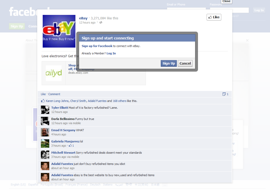
Facebook homepage ads have begun. They are effectively static full page takeovers with a Facebook module overlayed in the bottom right corner. In this example you see an ad unit for eBay's summer electronics event. On the right corner is a mini-Facebook ad unit (as you would see it on the right column of a logged-in page): it contains the copy / creative and like / share buttons. It's prime real estate and a huge unit... even if on the log-out screen. The interesting note however is that, when users are logged out, the social features are obviously not as effective... for instance, users cannot like, share or comment with a single action because they are not logged in. I suppose this is a necessary consequence of taking over the homepage. To solve this, you would need to prompt users much more intrusively: on their feed page.

Nike's Game On Facebook Campaign: Data, Nike+ and Great Photos.

Nike is so good: - terrific Facebook campaign during the NBA Playoffs

- smart experimentation on Twitter with Promoted Tweets

- innovative personalized shopping engine (which now includes licensed products)

- and that doesn't include Nike+ and their terrific / innovative integrations with Path, Facebook and Twitter

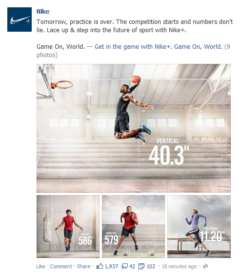
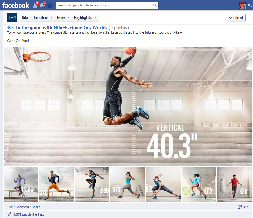
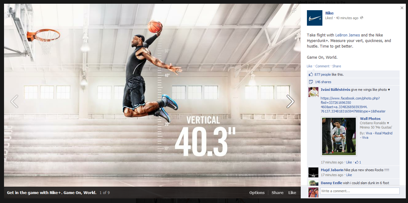
Here is yet another great campaign by Nike. In an effort to promote Nike+ ("the future of sport"), Nike took to Facebook and highlighted a barrage of athletes training and collecting data via Nike+ and/or Nike Fuel. Like most of Nike's social work, it's very visual, fun and unique. It is also on brand and tapping into the personal data / gamification theme. Notably, this was also released the day of the NBA Draft - which is driven by similar data analysis.... and many of those athletes will soon be sponsored by Nike.

On Facebook, Nike does a great job of clustering photos into albums - whereas many brands / pages, highlight individual photos.

Nike and @NikeSF Demonstrate Rich Promoted Tweets on Twitter

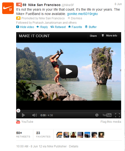
As you can tell from the screenshot's time stamp (June 8), this one has been sitting in my blog queue for quite some time. It's still worth posting though!

Here is a screenshot from a Promoted Tweet by Nike San Francisco. It's notable beyond the interesting fact that 1) Nike has a geographically driven social campaing (@NikeSF), and 2) they use these accounts to handle local customer service and promote national campaigns (interesting mix) With regard to Twitter... and more importantly... this is a great example of the power of a Promoted Tweet: - hyper targeted (in this case, local) - drives awareness and social activity: follows, replies, retweets, etc - but most importantly, its bigger than just Twitter actions (ie followers and retweets): YouTube is integrated directly and eventually this could be a registration form or purchase widget, etc.

That last point is quite powerful because advertisers do not have to value the campaign purely by Twitter-activity. That will (and should) be included - but it's potential is far bigger.

Quora & Twitter's Weekly Digests via Email. When Does Facebook's Arrive?

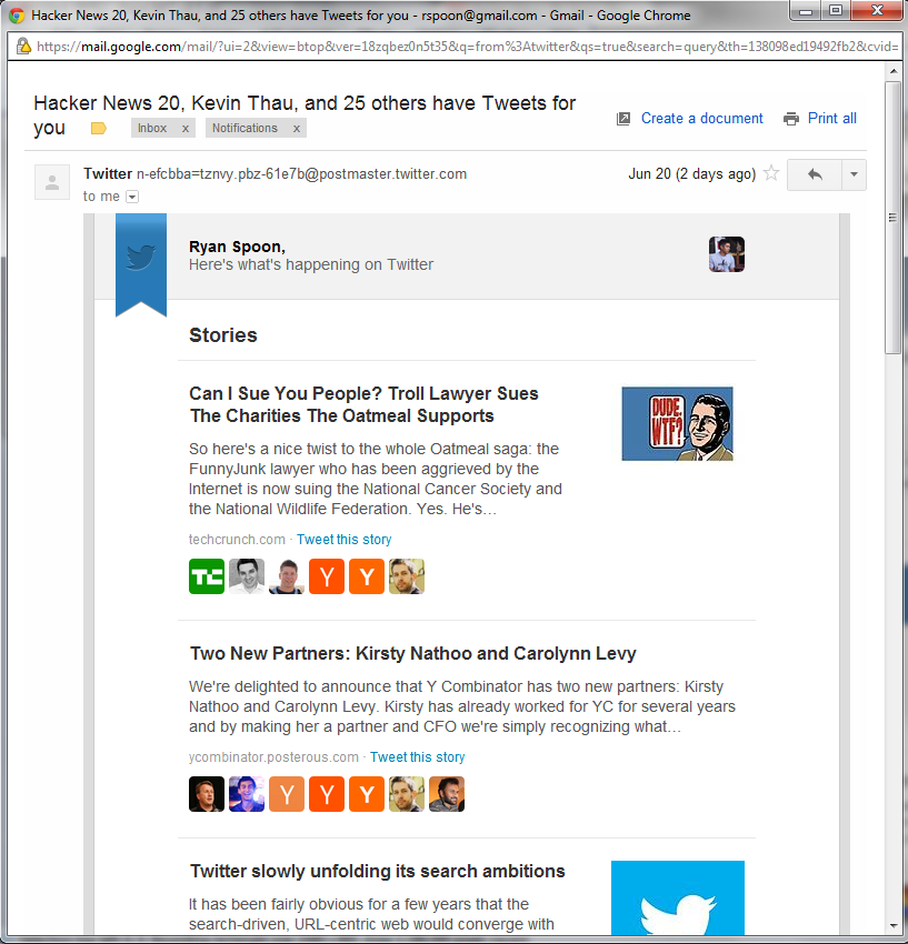
I write a fair amount the 'findability' problem that results from vast amounts of content (yes: it is a first class problem!). Curation - social, declared and algorithmic - plays a key role. Nevertheless, users still swim in oceans of available, interesting and timely content from platforms like Twitter, Facebook, Quora, Pinterest, etc... and that doesn't include media sources like the New York Times. So why am I writing an intro paragraph that looks so similar to many of my other posts? Because Twitter and Quora are attacking content overload in a simple way: terrific weekly emails (simple to the user!). That's an ordinary concept and runs the risk of getting lost in my inbox of too many messages filled with too much marketing. But the emails are:

1. really good looking - and optimized for mobile... where much of my email is read 2. rooted in social connections - notice that every article is surrounded by people I am connected with 3. really, really great content that I almost-certainly would have missed without the email... meaning: I want to read these

How long before Facebook creates a similar email? How long before Facebook verticalizes that for photographs and for links and for statuses?

Google's Evolving Search Results Pages: PGA, Tiger Woods & US Open as Example

In honor of this week's US Open - and in connection with last week's post on Google's evolving search pages - here are some interesting screen shots related to both.

The first is a results page for the query "PGA". As yo will see, there are only two search results on my visible screen: PGA.com and PGAtour.com (brand URLs). The bulk are algorithmic results (which are very useful): 2012 FedExCup standings and the three most relevant (ie popular) stars (Tiger Woods, Rory McIllroy, Phil Mickelson). Two things worth noting: 1. there are no ad units 2. there is no Google+ integration here. And this is one area that Google+ makes a lot of sense. I should be able to follow each player, learn more, etc. Today, it is entirely informational.

Change the query to one of the player names (in this case "Tiger Woods") and it looks similar: standings, information, news, and the brand link. In fact, only one natural result is above the fold: TigerWoods.com.

Again, two notes: 1. still no Google+ integration. 2. still no ads (high volume query too!) 3. related people include non-golfers: Elin Nordegren and Rachel Uchitel (both interesting and ironic)

Dig in on the right column's bio page and there is a "please report a problem" unit. This is Google's Wikipedia-like effort to control content. For several reasons, it is a very interesting approach: 1. this is such a dramatic change to search results and this unit comes at the expense of ad real estate 2. to fill it with content Google does not entirely trust is bold / scary 3. this information is far more compelling if tied to Google+ - in this setting it looks like no different than a mini-Wikipedia (or Knoll!)

Scale Requires Curation, Apple Beginning to Address in iTunes & App Store with iOS 6

I have been sitting on this post for weeks and weeks: I tend to write posts, or the skeleton of posts, ahead of time and publish them later on. In some cases enough time passes - or enough happens and changes - that it makes those posts irrelevant. This one is pretty close. I had the below screenshot surrounded by blurbs outlining three primary points: 1. We all talk about curation as the balance to search in finding. Apple does a good job with it in Movies and in app themes (Fitness: Get in Shape below). This experience is far better than searching a basic category. And they do a better job with it in Movies (actors, categories, etc).

2. Curation of some sort is necessary as content scales. Findability was a constant focus for eBay and for anyone with great inventory: Apple, iTunes, Netflix, Amazon, etc. It is probably best as a balance of editorial and algorithmic curation.

3. Curation is powerful by Apple. But it doesn't scale. Curation by friends (hello Facebook, data!) is arguably more powerful and does indeed scale.

This of course is all rather out of date (good!) with Apple's WWDC and iOS 6 announcement on Monday. Coming in iOS 6 are Facebook recommendations to the app store (terrific news - years late, but great... and it looks similar to Facebook's own App Store effort). Furthermore, they are remodeling the Appe Store, iTunes and the iBookstore. Those mock ups (small one below) look like a great effort will be placed on visuals, findability and some form of curation (again: algorithmic + editorial).

From Apple's iOS 6 intro page: