At Dogpatch Labs, we try to host at least one event a week - whether it be formal or informal, social or academic, large or small. Last week we hosted a session on search engine marketing best practices. It was led by David Rodnitzky of PPC Associates. The session was called "The 7 Habits of Highly Effective Search Engine Marketing" and David's slideshow is included below. When able and appropriate, we try to include presentations from Dogpatch Labs events and post them both on DogpatchLabs.com and on this blog (such as Facebook Connect Best Practices)
Dogpatch Labs Covered in Wall Street Journal
The Wall Street Journal's Venture Capital Dispatch blog recently covered Dogpatch Labs: At Dogpatch, Polaris Unleashes Its Inner Angel.

"Venture investors who want to get close to young Internet entrepreneurs are trying a variety of strategies, aiming to get an early look at start-ups that might one day need a significant amount of venture capital.
Polaris Venture Partners, a well-known Boston-area venture firm, entered the fray with Dogpatch Labs, which it bills as “a frat house for geeks.” Launched in San Francisco about a year and a half ago, the labs have expanded to New York and Cambridge, Mass., providing a temporary home for entrepreneurs, many of the working on social media projects.
Polaris, a multi-stage venture investor that historically has made a significant number of seed-stage investments, so far has backed six companies from the labs." ... read entire piece here...
YouTube's HTML5 Mobile Site Aims to Drive 'Home Screen' Adoption
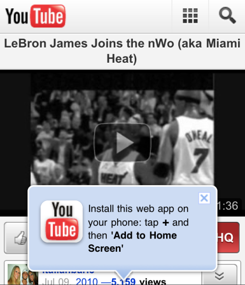
Last week YouTube Mobile adopted HTML5... it wasn't long ago that Apple touted YouTube as the iPhone's original launch partner (via a native application). Their adoption of HTML5 is yet another indication that it is fast becoming a standard for web experience and portability. This alone is newsworthy... but I wanted to quickly showcase YouTube's example of their 'pop-up' unit: - it appears immediately on load of a YouTube page - it is big, bold and interferes with the video's viewability... and is therefore noticeable - it directs users to add an icon to their iPhone's homescreen... which is an effective way to convert a pageview to an iPhone icon - it is part of an emerging trend to point directly (both visually and through language) to actionable items
Microsoft's "Office Social Connector" (aka Facebook Connect for Outlook) is Great
But tying together the web's most visited site (Facebook) with arguably the most important communication platform (email) is both natural and a long time coming. And with this week's announcement of Microsoft's 'Outlook Social Connector' , your social graph can now be connected to Outlook's email, contact and calendaring systems. The plugin is essentially Facebook Connect within Microsoft Outlook and it is a natural, powerful and simple integration. The Social Connector pulls in Facebook profile information from those email correspondents: Facebook icon, profile link, metadata and the ability to add them either as a Facebook friend and/or Outlook contact. More importantly, you can synchronize contacts with Outlook and enrich your already existing contacts.
In addition to providing data / actions around each contact, the Connector aggregates communication history for correspondent's. Its navigation pane allows you to toggle between: - aggregated / commingled communication history - meeting history - attachments - Facebook activity feeds
Lastly, Microsoft has opened the platform with "a public SDK allows anyone to build a connection to business or consumer social networks"... which means that this can become more than just Facebook (ie LinkedIn, Yelp, Crunchbase, etc). And although developers are currently enamored with Apple and Google, email - and specifically Outlook - represent significant usage, relatively light application competition, and therefore a beacon of opportunity. And despite being (supposedly) difficult to develop against, this should attract significant developer attention.


Facebooks Friend Finder Also Promoted as Sponsored Ad
Earlier, I wrote about Facebook's homepage promotion of their friend importer tool ("Friend Finder"). Those screenshots were of a module placed prominently above the Facebook newsfeed. Now I am seeing a similar unit - with similar copy and friends' faces - in the premium ad slot. The messaging is slightly different: Above newsfeed: Ryan, Who's Missing? Hunter, Justin and Anette tried the automatic Friend Finder and found out.
In ad unit: Ryan, Try the Friend Finder: Hunter and Jed found friends using the Friend Finder. Give it a try!

Facebook Asks Users "Who's Missing?" to Drive Friend Importing
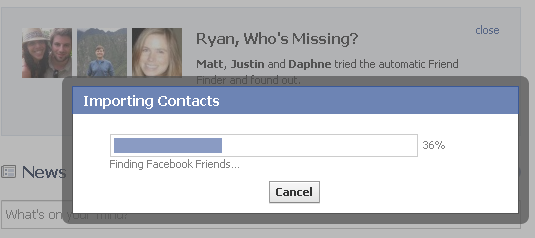
Below is a screenshot of a new homepage module showing on Facebook aimed at driving friend importation through Google / Gmail. The unit sits above the newsfeed and asks, Ryan, Who's Missing? It then shows Facebook icons from three friends who tried the "automatic Friend Finder" and encourages me to do the same (... the fact that I previously have done that is a different note!). Simple idea - but I love how Facebook continues to:
1. eat their own dogfood by promoting content via your social graph. Facebook promotional units look exactly as they should: simple messages with social context. 2. even with 500,000,000+ users - Facebook continues to focus on driving users and virality.

When clicked, Facebook authenticates through Google and then suggests friends tied to your Gmail account:
20% of McDonald's Facebook Ad is Hamburger Legalese
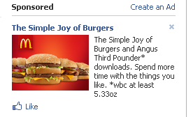
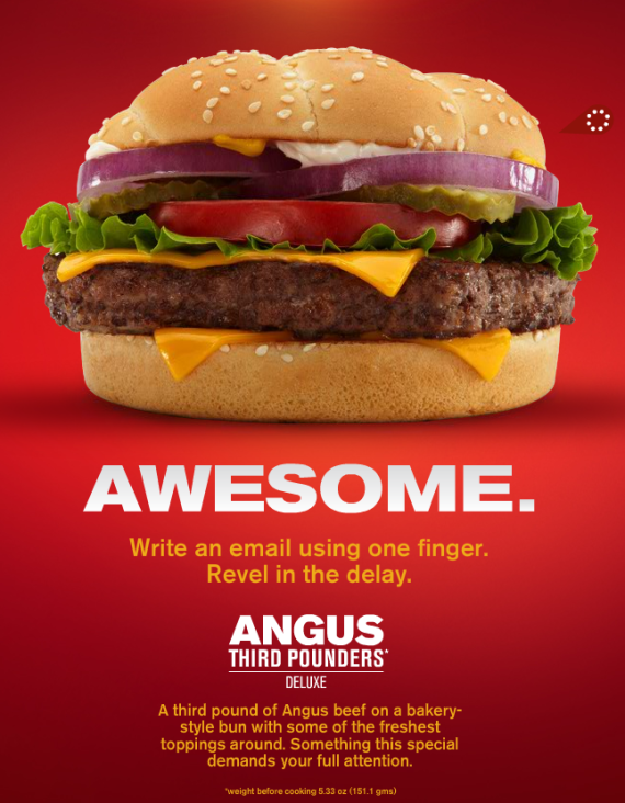
I have written much about the importance of copy in advertising... particularly Facebook ads. The below premium Facebook ad from McDonald's is the best yet. McDonald's dedicated ~20% of their allotted 135 characters to a disclaimer about the burger's pre-cooking weight... and that is after they compressed "weight before cooking": The Simple Joy of Burgers and Angus Third Pounder* downloads. Spend more time with the things you like. *wbc at least 5.33oz The fact that I knew what 'wbc' stood for reveals my unfortunate food preferences... but assume not everyone shares my tastes and the ad is even stranger:
To put this in context - take a look at the Angus Third Pounder landing page from the ad. Huge burger. Big copy. And buried at the very bottom is the same legalese: wbc before cooking 5.33oz. But in this case it doesn't interfere with the page / ad and is barely noticeable:
Nike Soccer's Interactive Campaign, Live During World Cup Finals
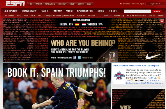
For the World Cup Finals, Nike Soccer took over ESPN.com with a big, interactive campaign asking fans "Who are you behind?" When clicked, users arrived at their Facebook application and were able to submit "headlines" for the game and their favorite players... which are of course published to Twitter (#NikeFuture) and Facebook. More interesting though is that the ad shows results of their poll: "Who are you behind?" The screenshot below was taken just after Spain's Iniesta won the game and, as such, its predictable that he led the vote 63% to 37% (over Sneijder).
It is a clever campaign that runs concurrently with a major, live event... and includes real-time results both in the unit and via the fans' Twitter / Facebook publishings. The campaign's look, messaging and action changed as the game developed and ended.
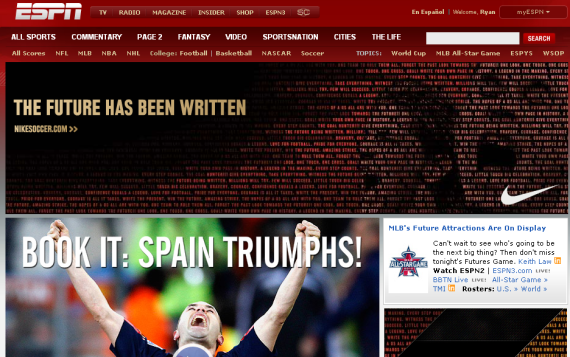
Minutes after the Spain won the World Cup, the Nike ads changed from "Who are you behind?" to "The future has been written". Rather than polling users and focusing on Facebook and Twitter (though still available - screenshot also below), the ad drives users to NikeSoccer.com:
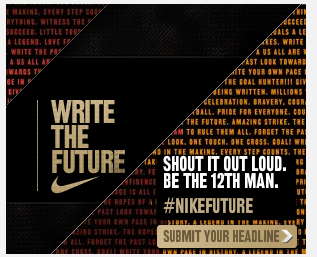
Again, after the World Cup's conclusion, the interactive component of the campaign was relegated to the sidebar square:
Dynamic, Branded Twitter Ad Units
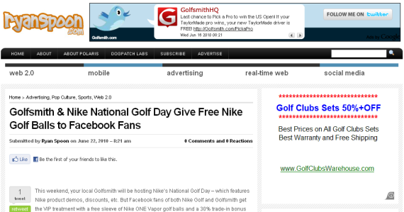
Last week I wrote about a Nike Golf / Golfsmith social media campaign that rewarded Facebook fans with special giveaways and discounts. The following ad units appeared alongside that blog post. They appeared instantly - within seconds of publishing. It is the first time I have seen units like this - but am sure they have existed beforehand (unsure how long?). The ads feature the Twitter icon and and a "follow me on Twitter" badge for Golfsmith's official Twitter account. Their latest tweets are included and cycled through the banner.
The ability to render these ads contextually and dynamically - and within seconds of publishing - is impressive. And the context and fresh content make the ads.
The only critique: the Twitter follow button should be functional within the ad unit (it currently requires users to click and then follow).
