Google's Moto X: Hardware + Software Customization

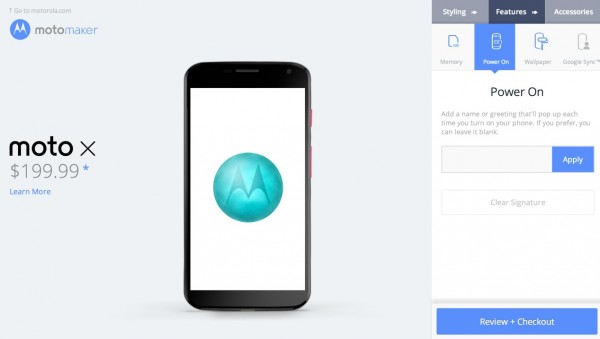
I am a big fan of personalized products like NikeID (including both my running sneakers and golf shoes) and their corresponding web / application experiences. The latest Google Android device - the Moto X - combines hardware and software customization in a way that only Google can do. It's very well done. The Moto X can be purchased online at Google's Play store (Moto Maker). There, users customize three aspects of the phone: styling (color, shell, etc), features and accessories. The hardware customizations are relatively obvious - but also fun in a way that is similar to shopping on NikeID.

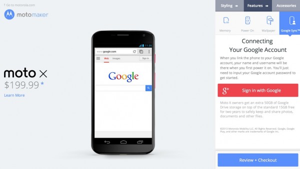
The unique part: users can attach their Google ID by authenticating their Google login. This then enables users to customize the software (ie backgrounds and welcome messages). It also enables Google to deliver an authenticated phone already connected with a user's synced apps, contacts, etc. In effect: once the user inputs his / her password, it's a fully custom phone from appearance to application / content.

motox

motox2

Apple's Mantra: A Few Great Things

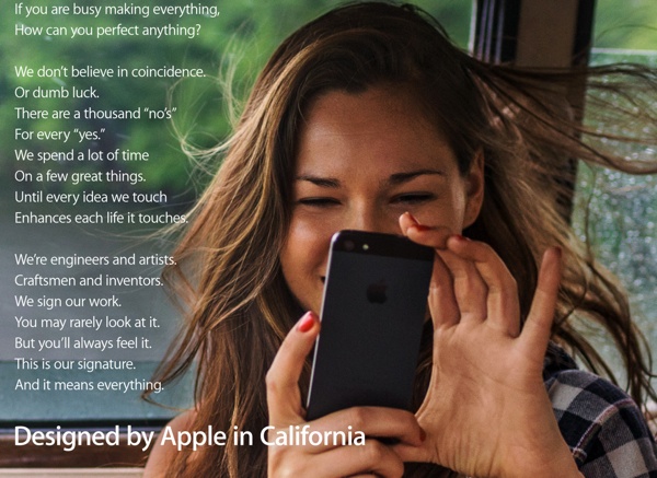
This is the marketing text from Apple's "Designed by Apple" campaign (which launched a few months ago on television). I have been seeing the print ads more and more - and the text is really powerful. It of course holds true to Apple's hardware and software worlds - but it should resonate to any creator: focus, quality, satisfaction. This is it. This is what matters. The experience of a product. How it makes someone feel. Will it make life better? Does it deserve to exist?

If you are busy making everything, How can you perfect anything? We speed a lot of time On a few great things. Until every idea we touch Enhances each life it touches.

You may rarely look at it. But you'll always feel it. This is our signature. And it means everything.

designed by apple

Facebook Premium: It's in the Product Experience

Biz Stone, co-founder of Twitter, took to Medium this week to share some thoughts on Facebook: "Now that I use Facebook more regularly, I started having some ideas for the service—here’s one... They could offer Facebook Premium. For $10 a month, people who really love Facebook (and can afford it), could see no ads. Maybe some special features too." First off, I like that he's doing this on Medium - a service / platform that I am really growing fond of... and a service / platform that encourages this kind of discussion from thinkers like Biz. (The other service I am enjoying: Branch, which enables discussion in a different, interesting way).

On Facebook Premium - it's the right idea, particularly for a service that so many users are so passionate about and dedicated to. At ESPN, we have a premium service called ESPN Insider that is sneaky-big itself and a combination of premium tools and content (ie Fantasy Football product enhancements and unique articles on recruiting, etc).

For me to pay a monthly subscription to Facebook - which I gladly would - I think it has to follow suit: it would have to be some specialized feature(s), enhancement(s), etc. My guess is that mobile and the mobile application are the biggest opportunities for those sorts of features.

And then there are single-use purchases as well: while Path is a much smaller community, my network has been gobbling up premium stickers ($1.99 each) to make conversation richer. And there are filters, etc. This is different than Facebook Gifts - which is really a one-to-one transaction rather than an enhancement that adds value to core product. Path's stickers, for example, have become mechanisms for comments / conversation... which of course has a viral loop.

The trouble with marking premium as ad-free is that it changes much of the Facebook experience. Sure there are ads that are not much different than traditional CPM advertising... but most are hybrids of advertising and social interactions. A couple questions arise including the central point that many of Facebook's units, while paid advertisements, are actually value-add to the consumer - for instance, the mobile application installer ('your friends are using xyz') is quite useful. What happens to the social and advertiser economy if certain friends pay to opt out? What happens to fans who want to follow brands onsite? Many brands are hybrids of paid and organic content, activity, etc. How does this effect Facebook's relationship with advertisers - whose network of users (and likely the most active, influential users) shrinks?

In short: if Facebook's ad strategy were solely traditional banners and units, it would be a far easier proposition to all (users, advertisers, etc). But the deep blending of advertising with social layers & interactions makes it far tougher. And that's a credit to Facebook because they are innovating on the ad experience. The premium opportunity better exists within premium features and products.


Path Stickers Facebook

The Tax of the New. From Incremental to Next

The tax of new thinking and building... I like that term set by Julie Zhuo on PandoDaily. The tax is not just the challenge of thinking and building... it's the challenge of shifting prior and current momentum (philosophically, emotionally, actually, etc). It's the challenge of placing yourself and your experiences onto unknown paths. But that is of course how any great idea occurs - not through incremental thinking but from the new.

"The tax that comes with introducing any new feature into your product is high. I cannot stress this enough. Sure, maybe the new feature isn’t hard to build, maybe it only takes a couple days and a handful of people, maybe it can be shipped and delivered by next week. And maybe the additional cognitive load for a user isn’t high — it’s just an extra icon here, after all, or an extra slot in a menu there. But once your new feature is out there, it’s out there. A real thing used by real people."

The tax of new.

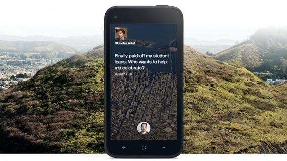
facebook home

Google Search, Inline Weather

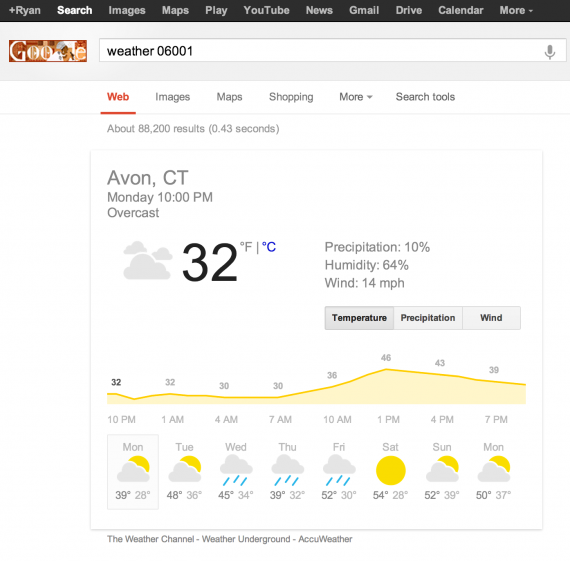
It's the first time I have searched for weather on something other than my phone... which is interesting itself. But tonight, I Googled weather 06001 (our zip code) and found the following screenshot of an entirely contained, smart weather 'widget'. It's an example of Google delivering a simple, fast experience with instantaneous satisfaction. No reason to leave the search page. No need to click organic or sponsored links. And consistent with how Google behaves on mobile web and within Google Now on Android.

Google Weather Widget

iTunes Welcome Screen, Appified

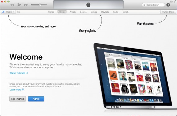
I wrote about the appification of software as a thematic takeaway of 2012. Here is a great - but very different - example. The newest iTunes might not behave like an app - but it certainly takes cues from popular app designs / trends. This starting screen for the entirely revamped iTunes product looks exactly like a starting screen for other iPad applications. Soft arrows pointing out specific changes or user behaviors.

It's a familiar way of making an unfamiliar product (after all, this is new) familiar again.

Appification of iTunes

Amazon Most Gifted Tagline, Promotion

The "most gifted" tagline and promotion is effective... particularly in the web's largest marketplace with the web's largest collection of products. And that's why it looks so similar to how they market year after year. And that's why I like it year after year!

Note: here is the original announcement in November 2009:

"Amazon.com, Inc. (NASDAQ:AMZN – News) today announced that November is already the best sales month ever for Kindle, even before Cyber Monday. Kindle continues to be the most wished for, the most gifted, and the #1 bestselling product across all product categories on Amazon."

ESPN, College Football Instant Replays & Twitter

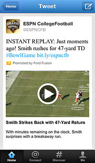
twitter-espn Video highlights and clips are an ESPN hallmark. And for college football fans, December and January represent bowl season. This year, in partnership with Ford, those fans can get embedded replays and highlights on Twitter.
You can read more on The New York Times: "ESPN to Use Twitter to Send Instant Replays of College Football". And more on TechCrunch: Ahead Of Bowl Season, ESPN Teams Up With Twitter To Provide College Football Video Highlights In Stream

For bowl season, you can also get live alerts and video highlights with the ESPN College Football App on iOS and Android / Google Play. And you can watch directly with WatchESPN on iOS and Android / Google Play.

Square's App Download Page

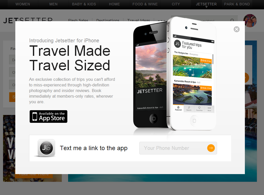
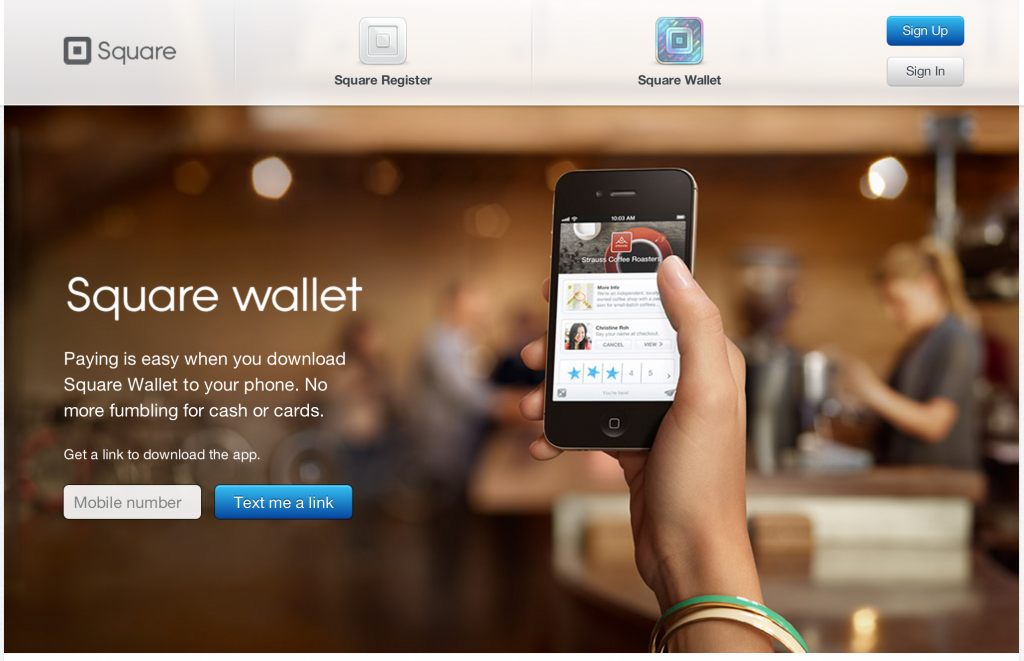
I have written in the past about designing for web-to-mobile downloads. Some treatments are effective (ie Jetsetter) despite most being ineffective. Square has built a very simple, good looking page similar to Jetsetter's. The beauty of course is that there is one call to action and then Square can do work on the backend to send the right product information for your device. And if there is breakage in the conversion funnel, they have your mobile number and can reengage.

Smart for Square. Easy for the consumer.