Redbox Delivers Rewards Through SMS Activation, Foursquare

Redbox continues its string of smart, rewarding marketing campaigns. Redbox has provided discounts and rewards for email and site activity - realizing that the value of certain acitvities (validated email address) far exceeds the cost of a free movie or two. Here's another: Redbox is running 10 days of discounts & rewards for users who active their mobile phones through SMS (Foursquare too). Again, Redbox intelligently views this as a way to acquire mobile users / activity. In that regard, it is a marketing promotion that will drive discounted short term activity but has longer term value thanks to deeper customer data / touch points.

Redbox is smart. And worth paying attention.

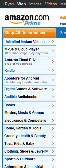
Amazon Navigation Menu Features Dynamic Promotions

In addition to Amazon's navigation menu promoting its digital properties ahead of the core business... notice anything interesting? It features dynamic taglines for three of the core properties: - MP3s & Cloud Player: 16m available songs - Cloud Drive: 5gb of storage - Appstore for Android: the free application of the day

For Amazon - the smartest online merchandiser / promoter - it is clearly an intentional decision to promote only three categories: new, growing categories in highly competitive areas. Amazon could off course feature deals of the day in other categories - but by doing so, it crowds the menu and creates too much noise / distraction in the menu... perhaps most importantly, those core categories are already successful, sturdy and well-trafficked. This is not true for the music, cloud and app businesses.

As you think about navigation across your site / experience - this is an example of less being more and the impact a few pixels and a small tagline can make.

Dogpatch Labs: Pier 38, A Look Back & A Look Ahead.

I am saddened to share the news that Pier 38, our west coast hub for the last 2.5+ years, will no longer be the home to Dogpatch Labs San Francisco. The Port Authority of San Francisco notified all Pier 38 tenants today that they must vacate the building by the end of September. Pier 38 was home to Dogpatch Labs and many others: True Ventures, 99 Designs, Automattic, etc. Pier 38 really has been a magical home to Bay Area entrepreneurship. It's a truly unique location and atmosphere that encapsulates the founders and their endless energy that called it home. When entrepreneurs, friends, partners, etc walked into Dogpatch and the Pier for the first time, they almost always were taken aback by the space and its vibe.

I am remarkably proud of what Dogpatch Labs did here at Pier 38 and am excited about its future:

- Dogpatch hosted over 250 entrepreneurs and 100+ companies like Instagram, Formspring, TaskRabbit, Recurly, Yardsellr, LOLapps, Appjet, etc.

- In total, these companies have raised over $100m in seed and venture funding.

- And we sat alongside a slew of other great companies and friends: Automattic, Twilio, 99 Designs, Jambool, Social Media, etc.

We are actively working on finding a great new Dogpatch Labs home and hope to be settled and taking applications by end of Q3. More to come!

You can read more on TechCrunch here.

And on DogpatchLabs.com: DPL SFO - Remembering Our Inspirational Home, Preparing for Next Chapter.


Facebook Login, Again a Conversions Boost

I've written about the benefits of using Facebook connect as a registration path: 1. it’s becoming universal and therefor familiar 2. users are more likely to pass information through via Facebook than to a new site 3. it expedites the flows and therefore improves conversions 4. it about more than efficiency. For instance: you can add the facepile for conversions, mobile flows can occur with a phone number (rather than an email address), etc 5. it expedites and simplifies mobile logins (both applications and mobile web)

Here is yet another example: I often stare at login screens and wonder which email / password combination is right. In this example (Groupon), I entered the wrong email / username, and it auto-corrected me based on my Facebook information:

Borders Palo Alto Closing, Offers 60% Off $45 Blu Rays (Bargain!)

The downtown Palo Alto Borders is closing and the entire store is marked at 60-80% off. Everything is on sale - from the books to the bookshelves. I walked in with the intention of buying some cheap kids movies (Yo Gabba Gabba anyone?). And this is what I came across: endless amounts of way-over priced product. $45 for the GForce Blu Ray? Even at 60% off its markedly more expensive than either iTunes, Amazon, etc. And that doesn't include streaming options, Half.com, etc.

And perhaps that's why there's a store close out and an accelerating shift in mediums... Who would have possibly spent $45 on this?!

20110903-100557.jpg

Facebook Search = Social Graph + Like Graph

Twitter search is becoming more intelligent and powerful. Google Search is becoming more social.

And here's an example of Facebook doing both:

search displaying on-and-off Facebook content organized by your friend's like's & activity. This is highly useful: using your social graph and the "like graph" to filter beyond Facebook. In a way, it's Google's +1 vision.

Search is changing. And it's happening from different perspectives (Twitter:real time; Google: applying social to core; Facebook:leveraging the social + like graph). Fascinating to watch and each has its own merits depending on the circumstances / needs.

JibJab Jr. Brings Interactive Kids Books to the iPad. And its Great!

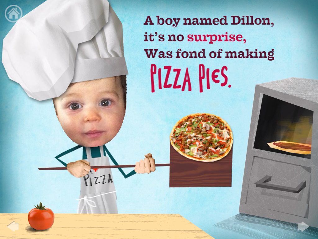
Today, JibJab launched JibJab Jr. to bring interactive children's books to the iPad. And while I am obviously biased (Polaris is an investor)... it's terrific. If you've ever seen: 1) a child play with the iPad, and 2) a JibJab Starring You Movie

You'll understand why this is fun and exciting.

Dear JibJab Members,

We're thrilled to introduce JibJab Jr. Books, an iPad app that allows you to create Starring You® storybooks with your child's face and name.

JibJab Jr. Books are not hyper-clickable toys. They are designed from the ground up to help you wind down your kids, ages 2 to 6, before bedtime with great stories and beautiful art.

You can download the app for free, which includes one free book, or learn more on our website.

Thanks for being a part of the JibJab community. As always, we appreciate the support!

Different Emails for Different Users, Usage. Facebook Demonstrates

When done effectively and appropriately - email is a marketer's most powerful retention tool. Here is an example from Facebook that demonstrates both effective and appropriate email marketing. The key: deliver different emails to different users / user patterns. Conceptually, its very basic. In practice, it's actually quite hard to deliver relevant emails, at the right frequencies, and featuring the right products (why? creation and delivery can be difficult - but featuring content that is appropriate for that user is the real challenge).

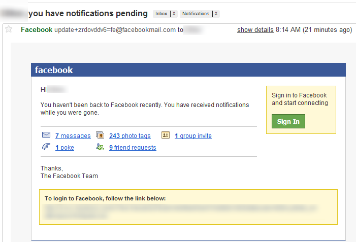
Here are two emails that I have never received because I am an overly active Facebook user. The recipients here are less involved so Facebook delivers too different types of emails:

1. You Have Notifications Pending!

The goal is clearly to drive logins by demonstrating that the user's network / profile has activity. If a user logins daily, notifications are prominently featured across the header... this is an attempt to enforce that habit.

2. You Have a Birthday this Week!

Again, for users who login daily, this is prominently featured. Birthdays are important drivers of engagement - ie posts, messages, events, JibJab cards =) For early users, this is a compelling email that gives me an immediate action. For more active users, this could be overwhelming and Facebook is probably better served promoting deeper interactions like messages and/or new features.

What's this mean for you? Segmenting your communication is a powerful way to drive engagement / retention and guide users through your product. To do it effectively, you also need to determine what products and communications make most sense for each segment / class of user.

Word With Friends User Onboarding

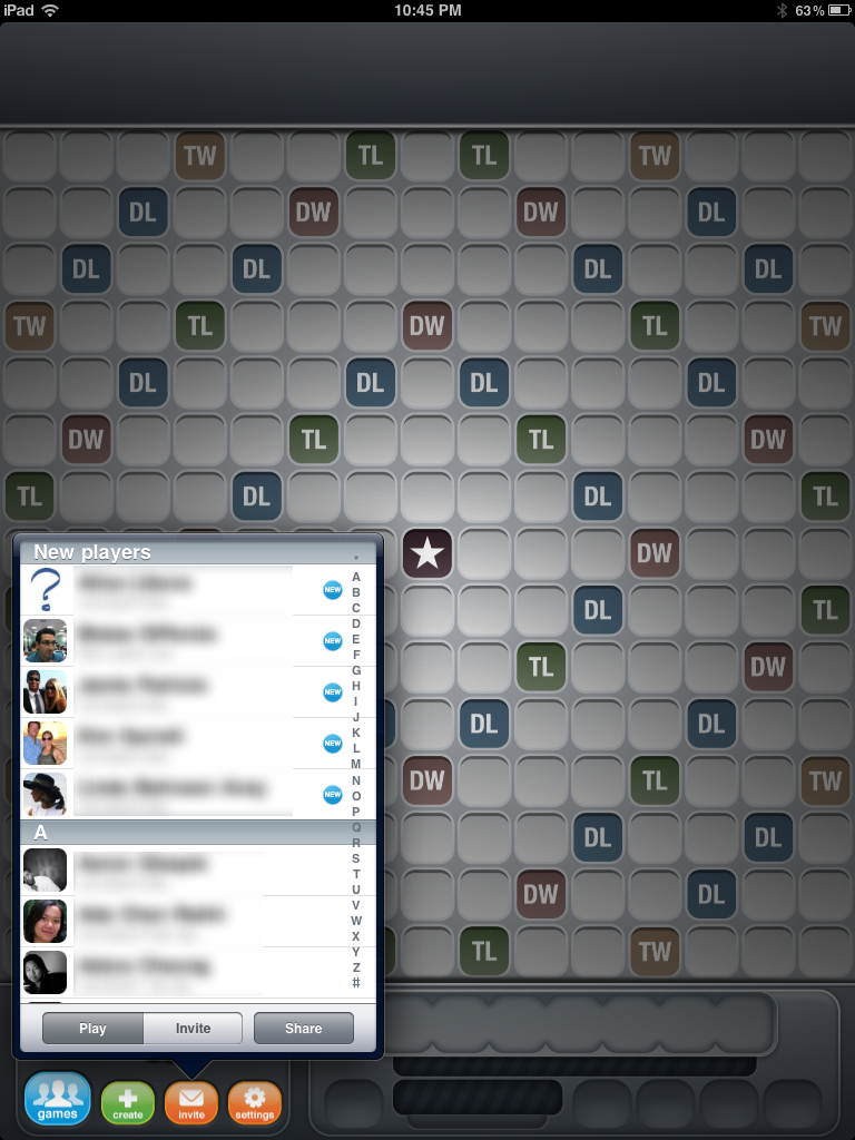
I've written about the importance of using user-segmentation to deliver unique user / site experiences and email marketing. Here's a brilliant example of Zynga's Word With Friends (the mega-popular Facebook & mobile Scrabble game).

Obviously the game is predicated on multiple users playing... and that obviously starts with an invitation process. Words With Friends users your Facebook / Twitter networks to create an address book of friends playing the game. The first people in your address book are new users (with big, prominent NEW badges next to their name). It's a super simple, basic concept - but it's brilliant because Zynga knows that:

- new users need to be prompted to play - once they play a couple games, they are hooked - current users feel a sense of goodwill / obligation to play with newly joined friends - current users likely play within the same confined network... this broadens that

Small UI placement that makes an important difference.