Hulu Gives Away a Month of Hulu Plus for Facebook Connect

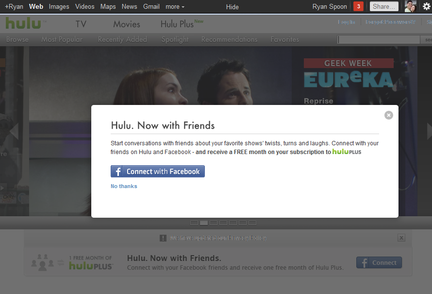
After my rather public Netflix cancellation , I was lured into Hulu Prime with their Facebook Connect promotion: a free month of Hulu Prime if you connect your Hulu account to Facebook. Smart for Hulu because it's smart for me: - Hulu Prime is a better product with Facebook Connect. Browse is better. Recommendations are better. And it is more fun.

- The value of me being socially connected is absolutely worth a free month to Hulu. Again, better data and virally shared content.

- It is an instant reward (of decent value) for a instant social share (of greater value). The moment I start my account, it is shared on Facebook and that alerts my network that I am a Hulu Prime user and that I got a free month (so they should too).

- ... And the math obviously says that the cancellation rate must be far lower than the continuation rate.

Consequently, this is a better way for Hulu to run an introductory promotion (as compared to 25% or 1st month free) and it's a more compelling experience for me (even better for Hulu).

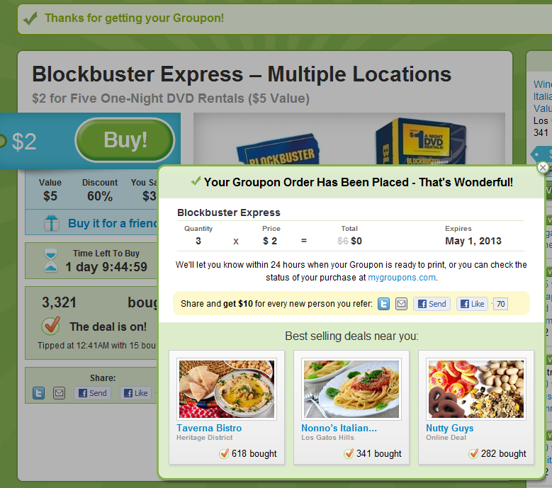
Groupon's Post Purchase Prompts. As "In the River" as it Gets.

Great example of "in the river" promotion by Groupon (one of the very best at conversions and promotions). It doesn't more "in the river" than the post-purchase screen... and it doesn't distract the user during the purchase / flow. This is an obvious example but worth showing because it's clean, clear and intentionally unavoidable. Immediately post purchase:

- the screen blooms into a popup with three components

- a lightweight receipt highlighting the coupon's expiration date (important)

- a chance for users to share their purchase and receive a $10 credit (Twitter, Email, Facebook, Facebook messages). I believe it's better to promote this post purchase because you can be more aggressive (even obnoxious) about it and not interrupt the conversion

- three more deals relevant to you (as determined by sales popularity and proximity)

Also worth noting: it is far easier to A/B test and optimize these flows than it is on the purchase / check-out page. Once you've optimized this flow, you can apply those findings elsewhere.

Twitter In Line Friend Suggestions - Chance to Expand for Brands? Charge?

Most of my Twitter usage is through mobile (as I suspect is the case for many). So excuse me if this is old news When you follow someone on Twitter, it immediately expands to reveal others "you might also want to follow". It is directly in-line, relevant and surely drives deeper usage / engagement. It makes sense both for the person following and the person tweeting (another avenue to drive attention & grow the following). It could also be another avenue to help onboard / better engage big brands. Earlier I wrote a post about ESPN's Twitter usage (My Response to Mark Cuban’s: Does ESPN.com Have a Twitter Problem?) - this seems like a big lever for ESPN, ESPN fans and consequently Twitter.

Upon following an ESPN personality / handle (either as defined by Twitter's search algorithm or a verified account), it could prompt some sort of walk-through that better connects other ESPN personalities. Right now it is very difficult to follow the right people - and that's partially ESPN's fault and partially Twitter's.

Users wouldn't find it intrusive - and in fact, they would probably appreciate it. Brands would absolutely appreciate the chance to promote related handles (right now they create background graphics to do so). And Twitter would get more deeply engaged users, with bigger follow lists and more engaged brands (with greater followings).

In fact, the brands would likely pay on a per-action / promotion basis. For instance, as Polaris Ventures, we have several people with Twitter accounts, a master account and a Dogpatch Labs account. I'd gladly work to better connect those - and if that came at a reasonable fee, I'd gladly sign up.

For a bigger brand like ESPN, it's clearly for more powerful and therefor more valuable....

Why Twitter Images Is Important (Screenshot)

Twitter recently rolled out their native image product (with other media types apparently on the way). It's a simple integration that makes a ton of sense from a product perspective... particularly for Twitter mobile. Twitter received significant attention for the launch because other services reached great scale (Twitpic, yfrog, etc).

From a user perspective, I didn't think much about it until I visited Twitter.com, conducted a search and saw the below screenshot.... and it struck me why images will / should be a core part of Twitter (beyond a clean user interface): it plays a key role in Twitter search.

Here is a search for "sportsguy33" (the Twitter handle for ESPN's Bill Simmons). Beside keyword search are now Top Images of Bill Simmons. These are arguably more relevant and timely than the text being surfaced. Ultimately, the combination of Tweeter + text + image will make for a more compelling, more powerful and more differentiated search experience:

iOS5 Wireless Update.

  • Easily the most important & impactful part of iOS5. Between the wireless sync and the cloud based content (apps, music, movies, etc) - the 'home' device no longer plays a role. And that's great news.

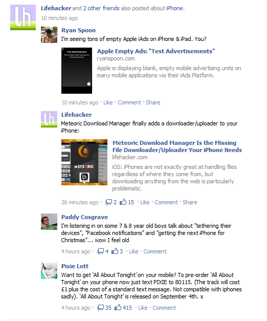
  • Facebook Clustering Feed Posts by Content. Topical Hubs, Search Logical Next Steps?

    Facebook has long clustered feed posts by type: friending people, changing profile pics, playing games, etc. Here are two examples of Facebook clustering feed posts by content... which is a bigger & more important concept as it suggests a deeper focus on search and relevance (both on and off Facebook.com). Both examples happen to be around iPhone related posts - one is on Facebook.com's web browser and the other is on the iPad's browser. Notice how it merges content from friends and pages. And obviously some of the content is highly targeted (ie the MyPad and Lifehacker posts are entirely about iPhone apps). Some is not: Pixie Lott mentions the iPhone - but it is not the focus.

    In some ways it looks like a topical newsfeed sorted by recency. Imagine this extending to a topical hubs and a deeper search platform / concept.

    Apple Empty Ads: "Test Advertisements"

    Not entirely sure what to make of it but I am seeing an significant number of empty Apple ad units: "Test Advertisement: This confirms that test ads are running correctly". It also (potentially) confirms that iAds is lacking advertiser supply? It is strange to see big, black, empty ad units across popular apps... particularly with a bold Apple logo beside each. You would think that, at a minimum, Apple would not display an ad unit or would run default ads to iTunes (and deliver a rev share). This strikes me as a bizarre user experience and a very public reflection of the iAds business:

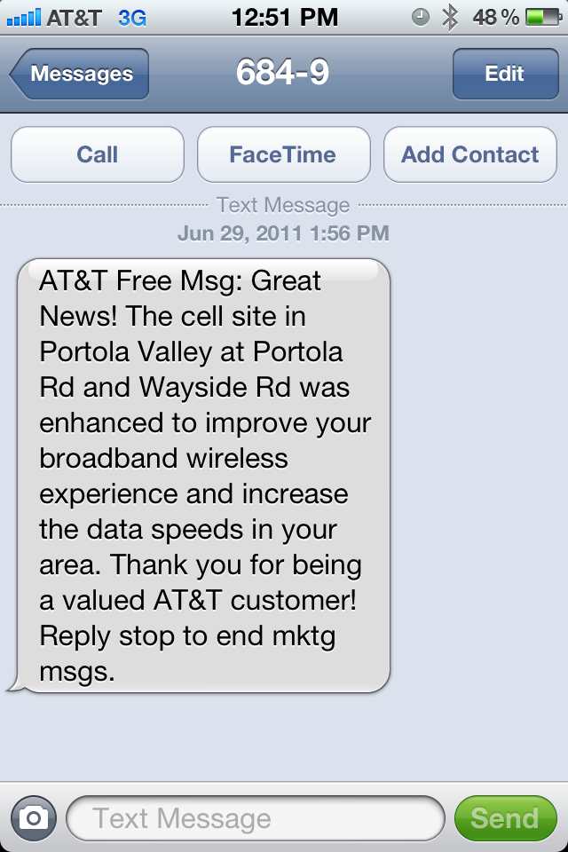
    AT&T SMS Notification. Alerts Me of Improving Service...

    I received the following SMS from AT&T.First, they alert me that it is a free message (great!). Second, they notify me that my local cell tower has been "enhanced" so I should expect "improved" cell and data quality. One part of me admires the effort to improve quality... and the communications are also admirable.

    Another part of me thinks it is a little hokey to deliver an alert via SMS, tell me its a free message, conclude with an exclamation mark, and describe the SMS as a "mktg msg".

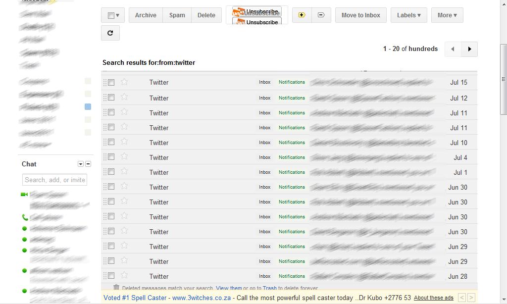
    Google Adds Persistent Header, Footer to New Gmail Theme.

    Persistent headers / footers have become common, hip design treatments. It of course makes sense: actionable links / content follow you throughout the page... so better navigation is always nearby & easy. If you're unfamiliar with persistent headers / footers (what I refer to them as) - they are 'toolbars' that stick to the page as you scroll. So when you begin moving down, the header sticks and usually has key navigational links and/or content on it. As an example, check out ESPN's scoreboards (here) - ESPN launched it early on and I raved about it.

    Google is now applying the persistent header and footer to GMail. It's an interesting way to implement it because they have moved the core functions for the inbox and the individual message to the persistent header (archive, reply, forward, etc). And they have moved a new horizontal ad unit to the persistent footer (again, both inbox and message).