NCAA Football is Here: Follow with WatchESPN & ESPN College Football App

With over 50 games today, NCAA Football has officially kicked off (and next week marks the beginning of the NFL season). Two great ways to stay atop of the action and to follow your favorite team(s): 1. The new ESPN College Football App (iOS + Android)

Built specifically for college football, the provides news, scores, video and more. Most importantly, it delivers instantaneous, in-game video alerts for major plays. Within seconds of a highlight play, you can watch it on your mobile device.

2. WatchESPN (universal. iOS and Android)

You can watch games in their entirety with WatchESPN - which works on the web and across mobile devices / platforms. New: Apple Airplay is now supported for ESPN3 (future updates will include AirPlay for ESPN, ESPN2 and ESPNU).

The new ESPN ScoreCenter for iPad

Today, we released the new ScoreCenter for iPad. I encourage you to download it, customize it and give feedback. Starting this weekend (college football!) and next (NFL!), you'll surely put it to good use! TechCrunch covered the app this evening ("After 28.5M iOS Downloads, ESPN Launches A Faster, All-New ScoreCenter For iPad"): "ESPN’s ScoreCenter — which delivers live scores, news and standings just about every sports league to your mobile devices — has been downloaded 28.5 million times on iOS devices. While popular, the user experience has been far from perfect. So, it started from scratch and is today launching a complete overhaul of ScoreCenter for the iPad, meant to improve the app’s speed, utility and personalization as the first of its apps to fully utilize its new API program."

Congrats to Joe Alicata, Andy Peterson, and team.

ScoreCenter features:

- Personalized scoreboards, news, and video highlights from your favorite teams and leagues, highlighting the games you care about. - Expanded game views, providing in-depth game coverage. - Breaking news, scores, and videos from the top live events of the day. - Live scoring alerts for your favorite teams and personalized match-ups sent directly to your phone. - Live integrated Gamecasts, plus links to WatchESPN. - Calendar navigation, allowing access to previous scores and upcoming games. - Ability to share your favorite games, videos and news with friends.

Taco Bell's Instagram Doritos Locos Tacos Commercial

I love Taco Bell's new television commercial for the Doritos Locos Taco. It features a series of user-uploaded Instagram photos of Doritos Locos Tacos: "no matter how hard you try, pictures just don't do it justice." It's fun, social, and conveys how popular and unique the product has been. The Doritos Locos campaign has been a smash success - and social promotion has been a key part. Creating a television campaign atop that activity (on Instagram no-less) is terrific. [youtube value="http://www.youtube.com/watch?v=HvgGgQ_6a6s&w=560"]

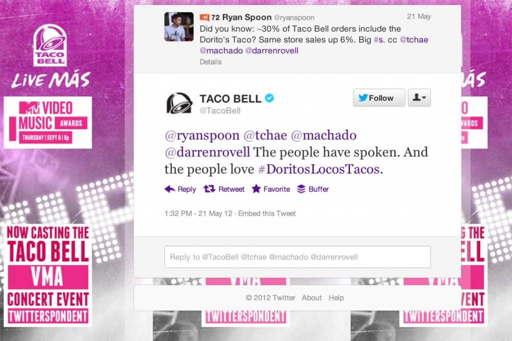
Side note: the new taco has indeed been a smash success. Roughly 30% of Taco Bell orders include the Dorito's Taco and same store sales up 6% after launch. Taco Bell even responded to my tweet: "The people have spoken. And the people love #DoritosLocosTacos." (a very, very proud moment for me)

Spotify Embeddable Widgets (Twitter & Facebook Too)

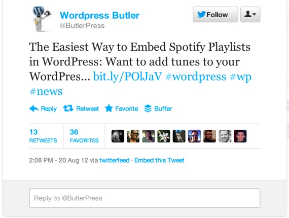
Nothing groundbreaking here but I thinks its worth showcasing visually:

Spotify yesterday promoted their embeddable play buttons and playlists via Facebook and Twitter yesterday. Those 'widgets' can appear on sites, blogs, etc and play in-line much like it works on Facebook within the newsfeed / ticker.

Those tweets are then embeddable as well - and you have started to see more and tweets appear in-line within stories, blog posts, etc. As Twitter content becomes more and more of a starting point for conversation (on and off Twitter), those embeddable widgets are terrifically useful.

And back to the Spotify post: notice the Facebook Social Plugin (right column). So the main post shows in-line playlists and play buttons - and the right column shows MY Facebook friends and their recent LISTENING activity within Spotify (on Spotify.com, on Facebook, and now through the web).

Big, virtuous cycle. And an example of Spotify, Twitter and Facebook moving beyond their .com homes.

Jiro Dreams of Sushi: A Tale of Raw Fish and Dedication

At the encouragement of Andrew Machado, I watched Jiro Dreams of Sushi this weekend - a documentary about Michelin winning sushi chef and 85-year old Jiro Ono. Absolutely fantastic movie: 1. It is focused on sushi but really about work-ethic and dedicating oneself to art, his/her craft and the chase for perfection. Even if you are repulsed by sushi, you'll find it inspiring.

2. The movie is essentially a 90-minute version of the Facebook / Twitter / Path feeds that are filled with food pictures...

"A great chef has the following five attributes: First, they take their work very seriously and consistently perform on the highest level. Second, they aspire to improve their skills. Third is cleanliness. If the restaurant doesn’t feel clean, the food isn’t going to taste good. The fourth is impatience. They are better leaders than collaborators. They’re stubborn and insist on having it their way. And, finally a great chef is passionate. Jiro has all of those attributes. He is a perfectionist.

Ive seen many chefs who are self-critical. But ive never seen a chef who is so hard on himself.

He sets the standard for self-discipline. He is always looking ahead. He is never satisfied with his work. He’s always trying to find ways to make the sushi better or to improve his skills. Even now, that’s what he thinks about all day, every day."

Jetsetter Navigation Panel - More UI and Design from Jetsetter.

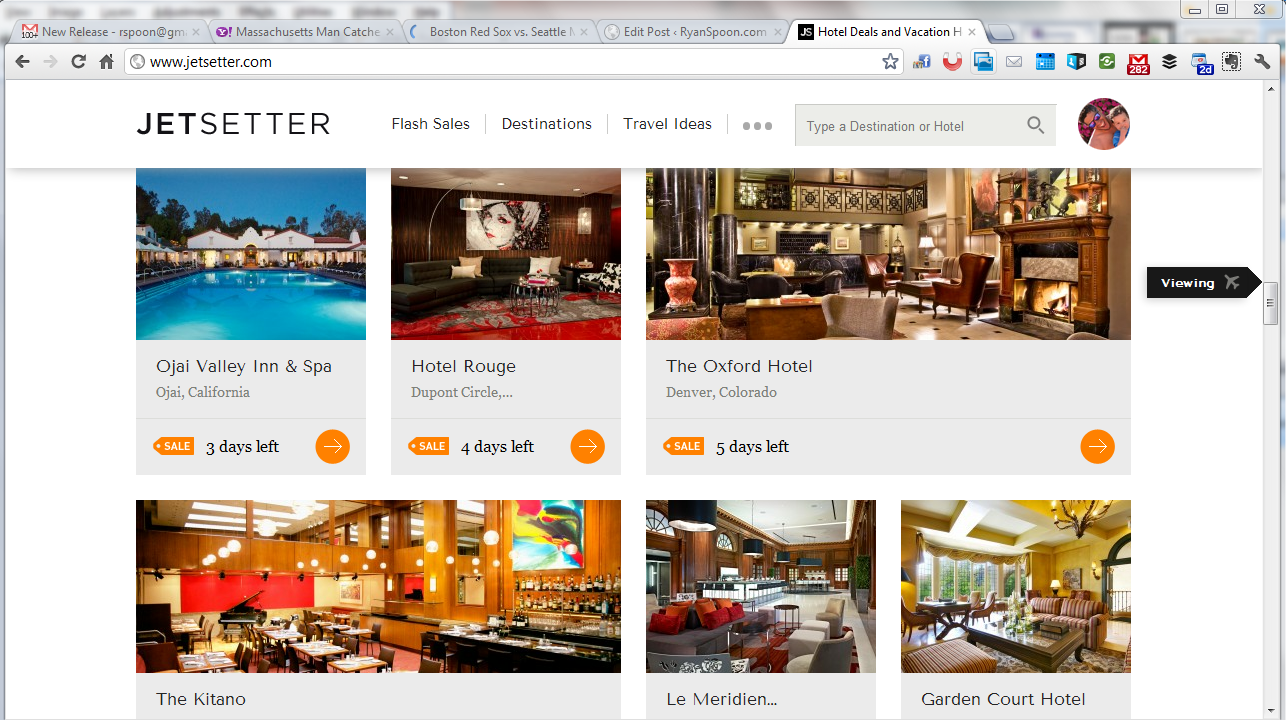
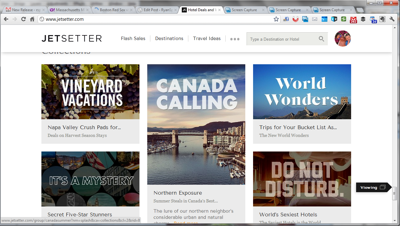
Jetsetter is known for great design (see here) and here is a nice little UI treatment that we recently saw on The Verge (who uses it on mobile and web). As you scroll through Jetsetter's sale page, an icon scrolls alongside the right progress column. It serves two functions: 1. telling users what kind of content they are viewing, ie vacations or curated lists. 2. showcasing the depth of product / offering that Jetsetter offers. In other words: there's a lot more than what I've seen!

Digg, Content Publishing, Content Consumption and Kate Middleton's Wedding Gown

Much has already been written about Digg - and two of the best pieces currently sit atop Techmeme. MG's "Requiem for a Digg" and Om's "In Memoriam: Even in losing, how Digg won." I encourage you to read both as Digg has been important - dare I say instrumental? - in how we think about aspects of tech, news, news feeds, gamification, community, algorithmic aggregation, etc. Digg can - and hopefully will - remain important. As MG wrote, "it’s hard to imagine a better steward than Betaworks to try to make that happen."

I wanted to also touch upon two themes related to Digg:

Most importantly, Digg is a fascinating paradox between aggregation and personalization. I have had blog posts hit the front page of Digg and received 75,000+ unique visits within the sixty-minutes (if my memory serves me correctly). That's a staggering amount of traffic and really, for non-major media sources, not available anywhere else. That amount of traffic and immediacy could only really occur from an aggregated, one-for-all feed (by the way, Digg's impact on the 'newsfeed' as we know it is very under appreciated). That one-for-all feed made:

- Digg such a valuable source of traffic - gave power users such power and authority - and made Digg's homepage a newspaper / Techmeme-like hub

The paradox of course is that consumers want personalization (Facebook's feed and the focus on Edgerank are an example of personalization effectively working) - but this weakens the power of the publishers and therefor the traffic generation to the top destinations. Tough to balance.

Secondly, there is a fascinating article on Slate about the imbalance of Wikipedia's power-users and what it means for content (creation, publishing, traffic): "How Kate Middleton's Wedding Gown Demonstrates Wikipedia's Woman Problem." I encourage you to also read that as it has timely parallels to Digg and its community.

Both themes are of course related: there is a difference between publishing and consuming. For those complaining that Kate Middleton's gown is not worthy of a Wikipedia entry, they don't have to read (or append) the entry. Some of that is personal choice and some of that can be affected by personalization.


Jetsetter Mobile App: Effective App Promotion & Conversions

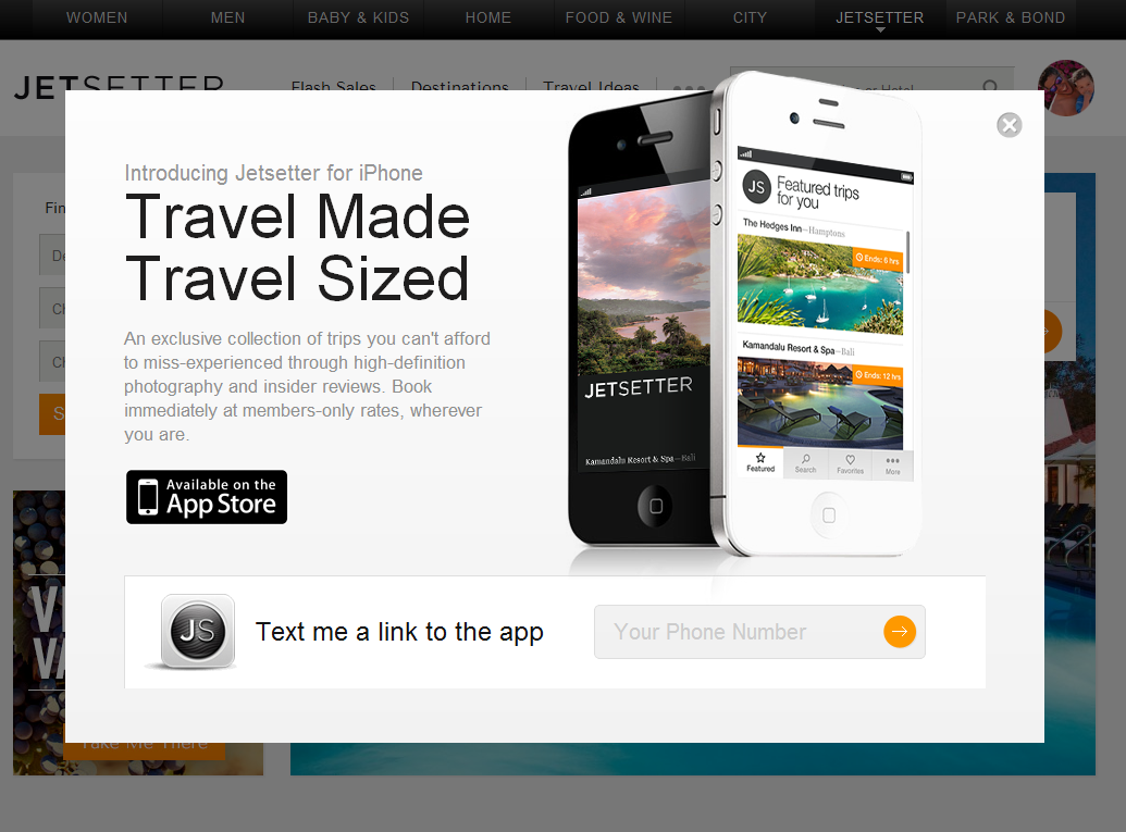
Jetsetter is known for great design (see here). Here is a good example of good design and effective mobile promotion. I have written before that promoting mobile applications via the web is challenging: for instance, conversions are weak due to web to download and data is limited (device, OS, etc). SMS and email are powerful ways to promote applications because they are consumed directly on the device. Good examples by: Sparrow, Redbox, Groupon and Gilt.

Here is another good example by Jetsetter (whose parent is Gilt). Login and you get the following promotion: - awesome slogan: "travel made, travel sized" - good looking promotion - big action item of downloading the app via SMS (enter your cell number)

Much cleaner for users and more powerful for the brand.