Google Unveils New Ad Units: Email-able Ads

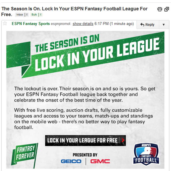
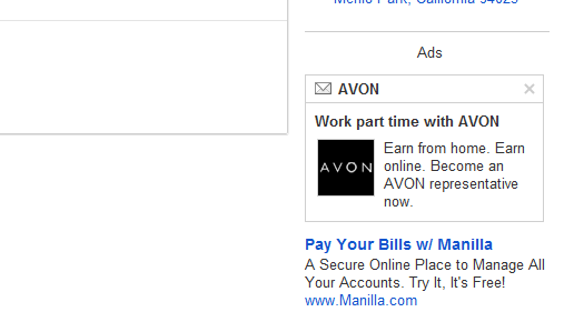
Over the past couple days, I have been seeing the following ad units in my GMail accounts:- the top sidebar ad is prominently separated from others - it is in an entirely different treatment that includes a branded image - and it has an email icon atop
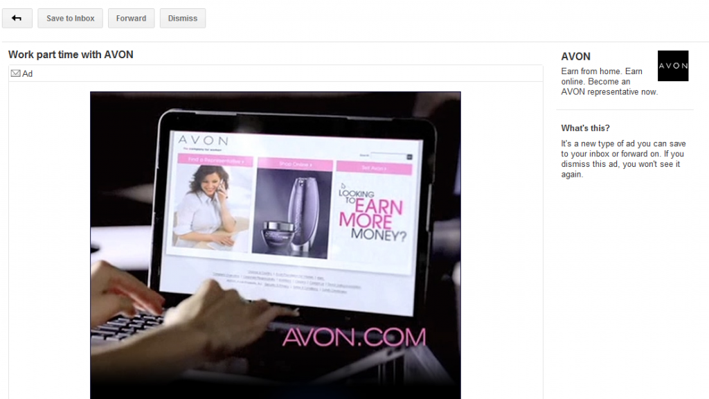
When you click the ad, it opens into a full screen unit that is essentially an email. It appears in the GMail mail format with four buttons atop the screen: Return, Save to Inbox, Forward and Dismiss.

Google describes it: "It's a new type of ad you can save to your inbox and forward on. If you dismiss the ad, you won't see it again."

It is an interesting effort because it enables the small ad unit (no different than a traditional AdWords unit) to bloom into something shareable, potentially social and much bigger (from two lines of text into an entire, rich-content experience). While that is conceptually very cool, it puts a burden on advertisers to make content that is worthwhile of sharing / keeping. I have cycled through a handful of of these email ads and have found nothing relevant to me or worthy of being shared.

Roger Ebert Reminds Us That Content Presentation is Important

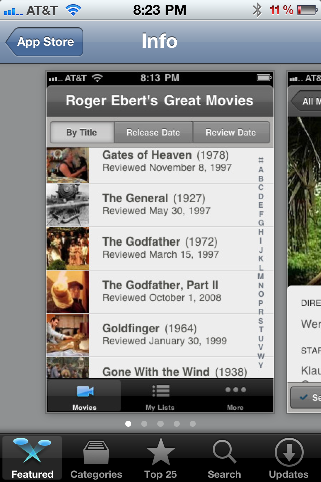
One of the top iPhone Applications at the moment is Roger Ebert's Great Movies (currently featured by Apple / iTunes). With all due respect to Roger Ebert - who has a long career of movie reviews and insights - the application is a simply a presentation layer for content that already exists and is already accessible. And yet it has become a popular application that users are willing to pay money for.... so why is this worth writing about? It is a reminder that content presentation is very important. It is also a reminder that good content is desirable and, unfortunately, often too difficult to access. And making existing content more appealing is apparently worth paying for:

- better presentation layer - augmenting with new content sources - more accessible - native to a different environment (ie mobile, tablet, browser) - etc

8/10, 15/25 Top Grossing iPhone Apps are Freemium.

I like to check in on Apple's top grossing applications - it's a good indication of mobile app and publisher trends. And from time to time, I have written about those trends. ... and here is a relatively important trend: each of the current top iPhone apps is freemium (">we've seen hints of this in the past, but never to this degree). Eight of the ten top grossing apps are free and fifteen of the top twenty-five. These come from a variety of publishers and are almost entirely games - only one app is not a game (#21 iMuscle is a health related app - $1.99).

This is a natural evolution of improved game mechanics and better in-app purchasing flows.... both lead to more effective premium upgrades / monetization while preserving iTune's distribution potential. For example: In January 2010, only three of the twenty-five top grossing apps had in-app purchasing enabled. Now, most of the top-grossing apps are distributed as free downloads and monetize in-application.

The Difference Between Marketing Emails & Notification Emails. Facebook & Twitter Demonstrate.

Groupon, Rue La La, Gilt Group, etc have built big businesses atop big email lists and great email marketing. Twitter has beefed up their email efforts by delivering notifications for retweets, mentions and favorites by your followers. It's a powerful engagement lever unlike anything else (except perhaps for mobile notifications). And Facebook is masterful at sending targeted emails about core engagements / activities: mentions, photo tags (so important, viral and underrated), deals, etc.

And here is a new, more generic email notification from Facebook: an alert that a friend likes a link. This is a less engaged action, for instance, than a mention, reply, or photo tag... but it begs to be clicked because: 1. it is a friend who took an action upon one of your actions, and 2. the email is intentionally broadly worded ... not much is revealed - so you want to see more

Whatever the size of your email list, you should think about email as a critical lever for driving engagement around relevant notifications. Of course, flooding users with emails will have negative consequences - but in general, if your users are active, they want to be alerted of activities related to actions they already took. That is a confusing statement - but it's important! So let me repeat and dig in:

- if your user explicitly took an action - such as post a link, favorite an article, etc - and something related to that action since occurred - users want to be alerted because it is tied to *their* actions / behaviors - this is very different, for instance, than getting product updates from the service... This is the different between marketing emails and activity emails... and users have a limited tolerance for marketing

JetSetter's Search Box Promotion

I like the highlight examples of effective "in the river" marketing - the concept of placing product, promotion and marketing messages in relevant, active parts of the web experience. Lots of examples here... Here is another example from Gilt Group's JetSetter (which is one of the better designed and visually appealing websites).

The fundamental JetSetter experience is browsing really compelling, great-looking travel offers. Even with no intention of planning travel, I can waste dozens of clicks browsing JetSetter's delicious offers.

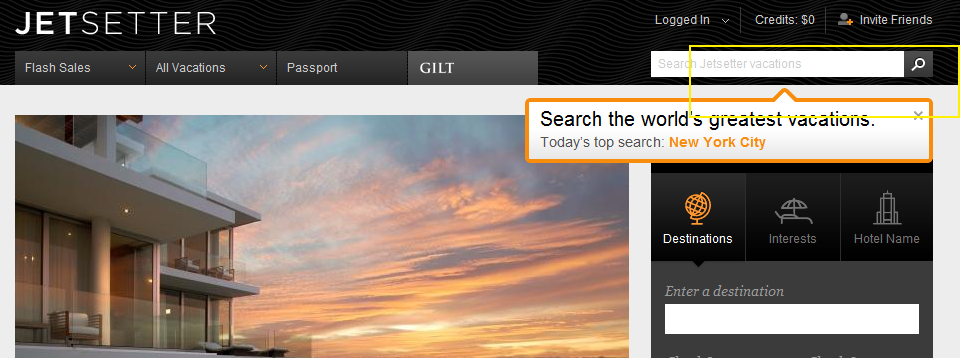
And while browse is JetSetter's primary experience, they are trying to drive search activity and have introduced both a search box and top searches. This is an obvious revelation because JetSetter overlays the message (along with today's top search) atop today's offer. It is bold, colorful and extends onto the offer and the right navigation pane. It also fades in (quickly and lightly) - in the rare case that you missed the unit.

On a side note: the "top searches" concept is interesting because it creates another browse + search experience that, in my opinion, is more shop-able. I believe that most significant travel (cost, distance, time) is *not* booked spontaneously... so the ability to search JetSetter deals for specific locations makes JetSetter more usable.... while still keeping the brand and web-experience in-tact.

Google Maps: Mobile, HTML5, "Desktop" Icons & In the River Promotions.

As Google continues to focus on HTML5 mobile experiences (and do it very well), they have to think about systematically driving usage... which, for mobile, requires 'desktop' real estate. And with core mobile applications, the app store's represent both distribution and the potential of screen real estate (ie icons / launch buttons). Google's strategy of focusing the mobile web experience is a good one... and it's shared by Facebook. But they both know that getting adoption relies on either deep OS integration or getting icons on the home screen.

So, when you visit Google Maps and their revamped web product (it too is done very well), they immediately and prominently prompt users to download the 'quick start' icon. Google has used this same tactic with YouTube (example here) - it's smart, effective and easy to integrate.

Yet another powerful example of "in the river" promotion / marketing.

The Curated Web. Three Examples: Content, E-Commerce & Social Commerce.

The web is fragmented.That fragmentation gave rise to search. And it's given rise to the role of social within finding. The 'finding' problem exacerbates as content / product grows. Great examples of the problem: eBay, Amazon and iTunes have nearly unlimited inventory and are often painful to explore (for that precise reason). One solution: curation. It is a trend that I have written much about... and it's a trend that will (and should) continue. Three examples:

- Content: my reliance on Twitter and Facebook for news is an example of content curated by my trusted social graph.

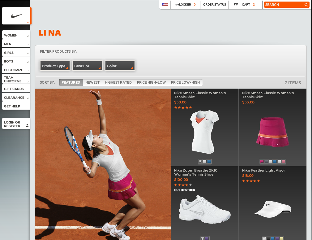
- E-commerce: Experts delivering their picks is a compelling way to drive conversions through curated expertise. Below is an example from JetSetter with "Molly Sims Inspired Travel". Each Sunday, the Golf Warehouse (TGW.com) features the clubs and products in the bag of that week's PGA winner. Of course, you can then shop his bag. And here is Nike's Li Na storefront which launched minutes after she won the French Open.

- Social Commerce: much of the movement from e-commerce to "social commerce" is predicated on experience being built atop social recommendations, sharing & findability.

As you try to distinguish yourself from the web's myriad of sites and products, think about how you can apply the concept of curation (experts, friends, taste-makers, etc) to improve findability, drive conversions, and establish marketing / viral programs.

'Real Time' Store Curation with Nike & Li Na

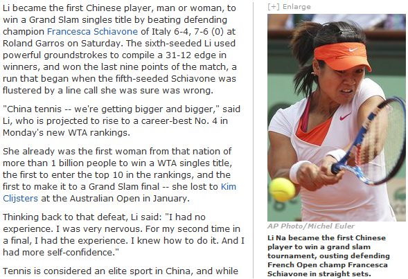
Yesterday, Li Na won the French Open and became the first Chinese tennis player to win a Grand Slam:

Li Na is a Nike-sponsored athlete - and immediately after her victory, Nike launched the "Li Na Collection" / storefront. The announcement was made on Twitter and Facebook:

Nike has long been savvy about real-time promotion and leveraging social media to drive sales, attention, discussion, etc (examples here). This is particularly noteworthy though because Nike effectively erected a real-time, curated storefront.

With pictures of what Li Na wore that morning, during here French Open Victory, Nike sold each piece of her ensemble. In effect, it is a trend that I have written about a few times: the curated web. In this case, curation comes from Nike and it's star athlete Li Na. It is a more compelling way to browse, find and buy.

And, it evolves over time. Nike can build out experiences for their athletes based on each event... and then users can explore those historically. For instance, why not showcase Nadal's outfits historically and bring them back on anniversary's of major events? And why not reveal what technology, clothing, etc are used Thursday - Sunday of each PGA event for your Nike golfers?

It worked for Michael Jordan with sneakers only... and with the online presence of today's athletes, we are seeing the rise of curated storefronts where the personality is first and the brand is second.