Shutterfly's Wink Gets Packaging Right

Wink is Shutterfly's new service that allows users to create "personalized photostrips" with pictures from Facebook, Flickr, and the iPhone (there is also an iPhone app). Photostrips are customizable, arrive in a few days and cost $2.50 each... shipped anyhwere in the world. The product and the creation experience are fun and hip - think Moo Cards meets Facebook meets photo booths. The most impressive part though is the packing - which exudes the Wink brand and experience in a very creative, efficient package.

The package arrives with Wink's big branding and the 'envelope' is heavy enough to protect the filmstrip:

When you open the envelope, you are welcomed by Wink with an overview of the service - and your filmstrip, receipt and shipping label pop right out. For protection, the filmstrip is placed in between the receipt and label. Everything is glossy, tightly packed and cleverly put together.

NBC's Chuck Season Premier Tonight, Did You RSVP on Facebook?

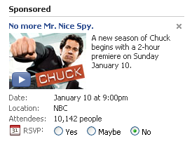
NBC has been running ads on Facebook to promote the upcoming season of Chuck - airing tonight at 9pm. The ad use Facebook's event units: you can RSVP to 'attend' the event. That RSVP then appears in your feed and, if popular enough, becomes viral. This format is not new and seems to be popular with media advertisers (used to feature new releases such as movies, DVDs, etc).

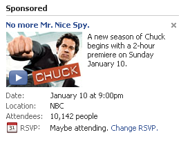
But, you will see below that, depending on your RSVP, you get the option to become a Fan on their Facebook page as well. Here is the Chuck ad:

If you RSVP "Maybe" or "No", your calendar updates accordingly:
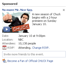
But if you RSVP "Yes", you get a confirmation spot that allows you to invite friends and become a fan. Its a small tweak but makes the units more effective and social

Dogpatch Labs Hosts Fuqua / EVCC Event

Dogpatch Labs hosted an informal Duke Fuqua School of Business gathering with their EVCC group (Entrepreneurship and Venture Club). Leaders from Poken, Trazzler and Yardseller spoke to the Fuqua students about entrepreneurship, lean start-ups, hiring and product / market fit.

You can learn more about: - Duke MBA EVCC and their "Leadership" group - Dogpatch Labs

More on the Duke EVCC:

"The Entrepreneurship and Venture Capital Club (EVCC) is focused on facilitating interactions between our members, entrepreneurs, small business owners, and venture capitalists around the world. The EVCC also acts as a liaison between students seeking opportunities in these fields and the Career Management Center. The club is one of the most highly subscribed and most active organizations at Fuqua and across Duke. We have an incredible group of dedicated individuals on our cabinet that are available to assist you."

8/12 Techmeme Headlines are Currently Mobile

I find myself talking more and more about "mobile". Entrepreneurs, friends or colleagues frequently ask what interests me; and undoubtedly, we spend a good chunk of that conversation on mobile. I find myself writing more and more about mobile. I have a mobile category on the blog - and it seems to be filling up the most quickly (thanks to my infatuation with the Google Nexus One).

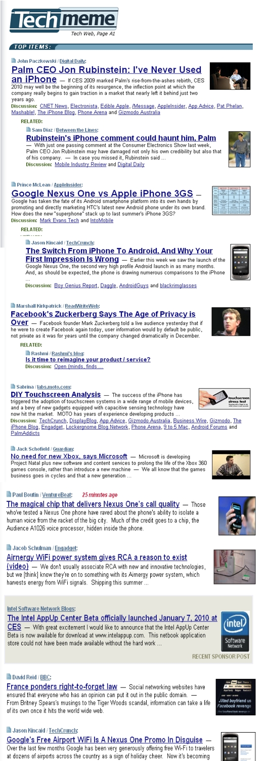
I find my web habits shifting more and more to the mobile web... as it does for so many others. And it is clearly a trend that will continue as devices get stronger, faster and sexier. Take a look at Techmeme this morning and you will notice that the majority of the headlines are mobile related. In fact, eight of twelve headlines are mobile, from Palm to Google's Nexus One to Android and iPhone and so forth. Of course, this is a skewed week due to CES and Google's announcement - but these occurrences are becoming more regular than irregular.

I was at the Crunchies on Friday evening and was struck by:

- the number of companies for which mobile is a key role (from Facebook to Dropbox to Yelp to Animoto, etc) - the number of Google Nexus One phones in the crowd (amazing considering the device is days old) - the way the audience was tweeting and Facebook-ing the *entire* event via their phones - the focus - both in presentation but social discussion - on next-generation web usage (tablets, netbooks, Chrome, etc), which can be thought of as a large extension of the mobile web

Of course, if you are working in mobile or are interested in Polaris and Dogpatch Labs - I would love to chat!

Zendough's Rich Ad Campaign Hits Gizmodo

Gizmodo continues to be a great example of cutting-edge rich advertising units. As I have written before, they do a great job of laying out the site in a way that gives advertisers large, interactive and cohesive advertising units across all of the content; furthermore, the units do a great job of interacting with the standard Gizmodo content (sitting beside and/or fading behind).

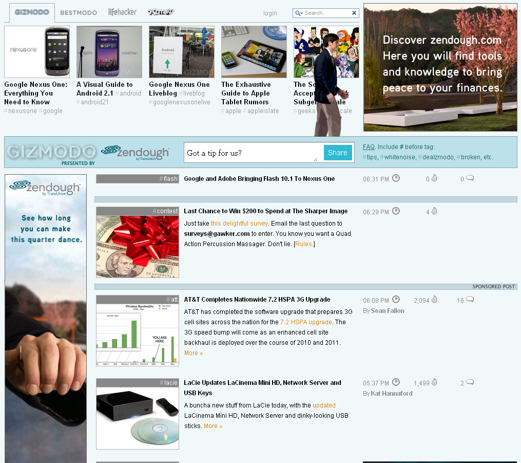
Here is another example of a rich campaign on Gizmodo. Much like the recent eBay "Come to Think of It" campaign, this comes from Zendough. The ads begin by taking over the "top stories" bar and then fade into the traditional Gizmodo layout (as the person walks across the screen). On the page, Zendough has five integrated units:

- the interactive "top stories" bar that fades out - the rich square in the upper right corner - the sponsored search bar - the rich skyscraper which parallels the activity above - the rich horizontal 'page-break' unit which is 8 stores down Clearly it is a custom campaign - much like the eBay one - but it is very nicely integrated within the Gizmodo layout and amongst itself: all of the units symmetrically speak to one another and therefore gently capture the audience's attention / interest.

Google's Nexus One Product Page & Tour Are Terrific

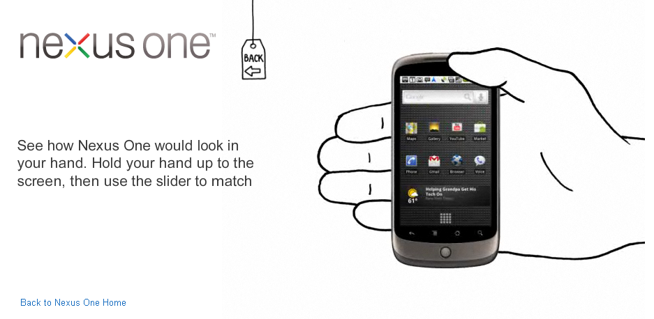
Since when did Google become such a UI / UE powerhouse? From Chrome to their Extensions to the Android branding / packaging to their holiday cards, it seems like everything coming out of Google is simple, clean and great looking. Now that the Google Nexus is available for purchase, they also have created a gorgeous product page - complete with: - checkout - product specs - 3D experience - product tour (including scale and sizing) - phone activation and shipment tracking Like Google's other recent releases, this is exceptional... particularly for a non-traditional e-commerce company. The purchase flow and the product tour are particularly powerful and clean; in fact, the only real loser of a page is the "technical specifications", which verges on too simplistic and text heavy.

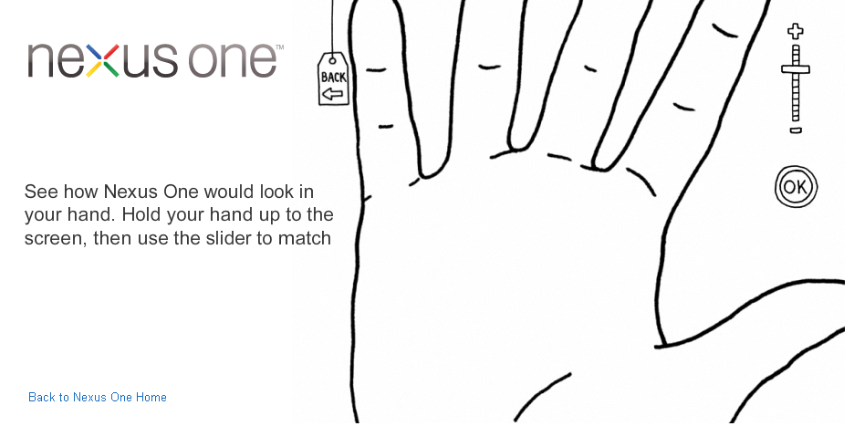
This is my favorite part of the flow. To demonstrate how small the phone is, Google shows you what it looks like within your hand... which is scaled by placing your hand against the screen and choosing the appropriate size. Clever, fun and still useful.

Google Nexus One Unboxing: Great Packaging and Branding

I have spent a lot of time thinking about packaging - particularly over the holidays as we all purchase and receive gifts. Companies like Amazon focus on speed and reliability while others like Rue La La put a lot of care into visuals, emotion and even virality (future post coming). As pictures and reviews of the forthcoming Google Nexus One make their way online, I was struck by the care and uniqueness of the packaging and branding by Google / Android. It is clever and powerful. It is also a stark contrast to the blunt and robotic messaging of Droid: - Droid is here: compromise officially deactivated. (ad here) - Jump from page to page like a caffeinated cricket in a room full of hungry lizards. (ad here)

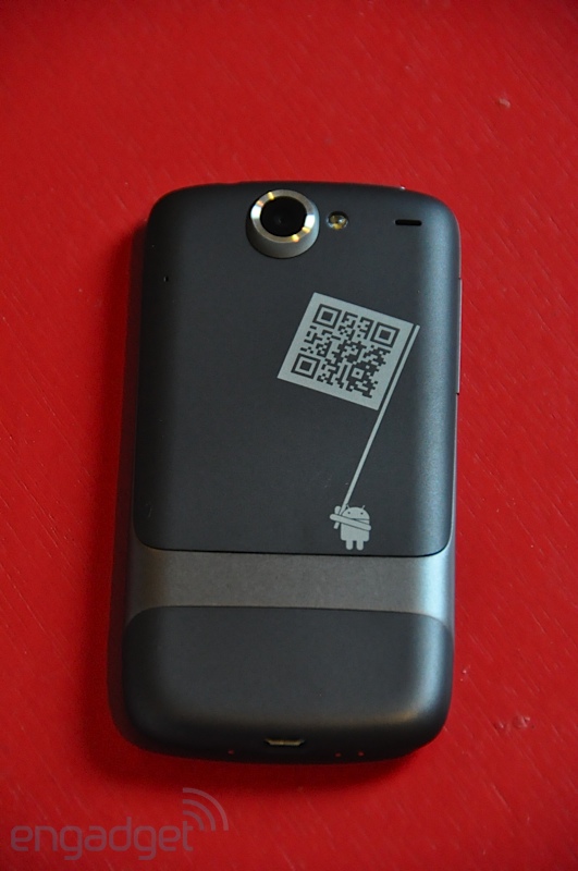
Meanwhile, the Nexus One packaging oozes Google's brand and is more fun than rigid / tough (like the Droid). From the 'get started' pamphlet to the start screen to the phone's casing, it is obvious that this is: - a Google phone - an Android device - is equipped with 10,000s of applications - has character and funkiness Engadget has a great review and photo gallery of the Nexus One. Here are a handful that highlight the above points and check out all of the photos on Engadget: