Freemium Takes Over iPhone App Store

I regularly cover trends in top grossing iPhone / iPad applications. What makes this update noteworthy is that: - the top grossing application is free (freemium if you will as revenue comes from in-app purchases) - three of the top five apps are freemium - four of the top ten - eight of the top twenty - and nine of the top twenty-five

This is the first time in my writing that 40-50% of the top applications are free. Back in January, only three of the top twenty applications were free.

Also interesting, the Smurfs' Village application offers relatively expensive in-app purchases: $4.99, $11.99, $29.99 and $59.99. This is a unique approach as most games offer cheaper purchases ($0.99-$4.99). The Smurfs' are clearly going for mass adoption and sticky gameplay... and it's working.


Facebook Messaging & The Social Inbox

Today Facebook announced Facebook Messages, which bundles together email, chat and text messages to create a single communication stream: "The New Messages: Texts, chat and email together in one simple conversation." If you haven't watched, the Facebook introductory video is below and you can request your beta invite here: 

"All your messages together

Get Facebook messages, chats and texts all in the same place. Include email by activating your optional Facebook email address. Control who can send you messages through your privacy settings."

Two More Examples of "In the River" Promotions: Google & Yelp

Have you gotten sick of my writing about getting your marketing and product promotions "in the river"? "In the river" is my terminology for making sure that messages are delivered inside the core experience and to the respective audience. We used the term frequently at eBay to make sure that products weren't fully integrated into the core experience and would reach enough users (and more importantly: enough of the right). Here are two more examples:

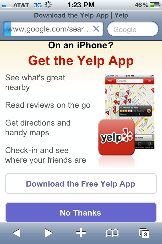
1. Visit Yelp on the iPhone's web browser and you'll be presented with an unmistakable promotion for the iPhone app. Targeted audience already interested in the brand:

2. Lots of iPhone applications try to get users to turn notifications on... Google's app goes a step further and presents a takeover unit that encourages users to turn notifications on (also explaining the benefits).

ESPN's iPad Experience: Choose Your Own Adventure

I write a lot about the importance of getting product, messaging and promotion "in the river" (in other words: making sure that messages are delivered inside the core experience and to the respective audience - good example by Facebook here). Here is a great example by ESPN. When you visit ESPN via the iPad, it presents you with three options: 1. Visit the iPad optimized site (ideal for 3G usage) 2. Visit ESPN.com's full site 3. Download the new ESPN Scorecenter App for the iPad

The first two options were always present for iPad users, but now that they have an iPad app (that is pretty good by the way), ESPN has decided to promote it to all iPad owners.... this is more effective of a marketing campaign than running site-wide banners on ESPN.com.

Gilt Groupe Gives Free Shipping for 10 Invites

Social commerce sites like Gilt, Rue La La, ShoeDazzle, Groupon and LivingSocial have been among the leaders in 'social marketing'... and they find success through relatively straightforward, sometimes simple products and promotions. Here is a great example: Gilt is running a promotion where users who invite 10 friends to the service get free shipping. Clear value proposition and very simple process to invite. Furthermore, it is an attainable result (not tied to purchases and not a crazy number of invites).

And of course the site / brand itself is 'share-worthy' - if Gilt provided a poor experience, these sorts of promotions wouldn't result in sharing or ROI.

"Got 10 Friends? Get Free Shipping" "Invite 10 friends to Gilt and enjoy free shipping on your next order. Spreading the word is always in style."

Welcome to RockMelt: Great Product Marketing Introduction

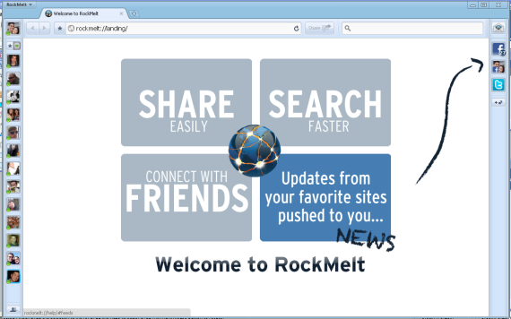
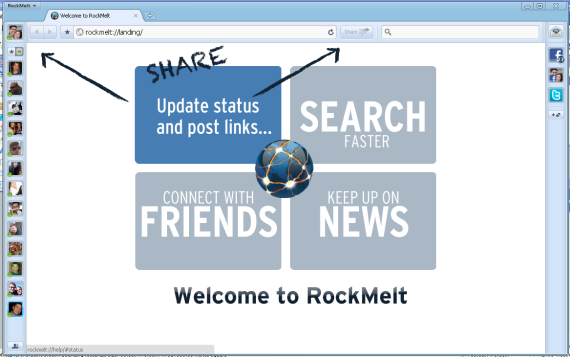
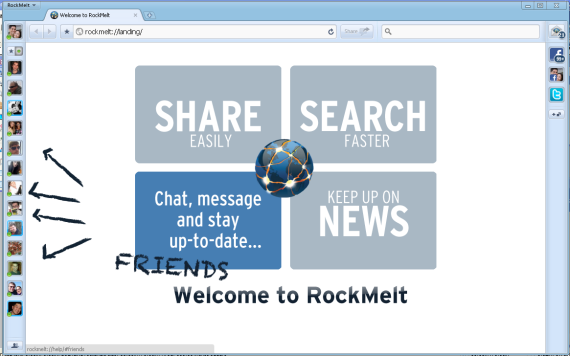
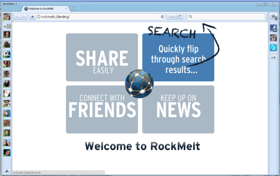
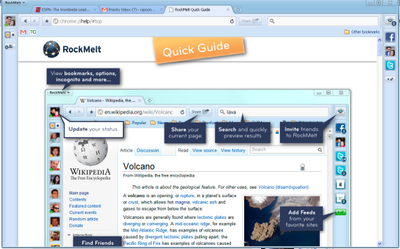
RockMelt has a rather big product marketing challenge: explain to users how their new, social web browser works. It is not overly complicated - but it is quite different from what users are accustomed to. Most products display the equivalent of a "Read Me" introduction upon installation / first use. These are usually text heavy, step-by-steps tutorials... and they are often optional. RockMelt recognizes that the browsing capability itself is explanatory ... but it is also ordinary. The social elements are what makes RockMelt compelling - so upon download, they overtake the browser with a great, visual introduction. It can't be missed and focuses only on the social elements (assuming that you are do not need help with normal browser functionality). And in addition to being useful, the intro is far more inviting and enjoyable than the normal "Welcome!" experience.

Facebook Deal Redemption in the Feed: Gap & Starbucks

Last week I wrote about two updates to Facebook Places: Deals (using Starbucks as an example) and Photo attachments. Those two somewhat combine when deals are redeemed. If you haven't seen an example yet: here is the feed post after the Starbucks deal is redeemed. It is an expanded check-in on the Facebook feed... which means two primary things: 1. the post is customizable by the deal provider. Here, Starbucks has four pieces: logo, deal title, detailed description and viral call to action. In effect, this is great branding within the newsfeed ... that branding happens to be enhances by the fact that a friend is advocating it.

2. All the viral components associated with the feed: comments, shares, likes, etc. This is important because it is a core / necessary element to the deal platform - in a way that isn't entirely integrated on other popular sites which require post-transaction publishing.

And here is Gap's promotion:

Facebook Places + Photos Makes Sense... It's Now Here

When Facebook Places first launched, I wrote that a photo integration made sense: If I could change one component of the product – and I really only have one suggestion – it would be to add photographs. Four reasons why:

1. I believe that images are becoming integral pieces of explaining location / local activity. Checking in at a restaurant, theme park, ballgame, etc are all well described by time, title & description and photograph.

2. GPS & photographs are tightly related on the mobile device. Putting them together in the Places product could still be done simply and comfortably.

3. The lack of integration makes me frequently choose between posting a newsfeed photograph and describe location via the description… OR forgo an image and post via Places.

4. Finally, if Facebook Places is to ultimately also become a directory of businesses, reviews, etc – photographs must be tightly integrated.

... Well, it's now here:

Starbucks Already Advertises Against Facebook Places Offers

Today Facebook shook up the local deals space with their Facebook Places announcement: the local deal platform which now competes directly with Foursquare, Yelp, Groupon, etc. Facebook launched with twenty premier partners who represented different industries (Gap :: retail; Palms :: hotel; Starbucks : food; Golden State Warriors :: sports; etc). The platform will quickly expand to 20,000 local businesses and then a self-serve platform. Considering Facebook's size, mobile usage and collection of brands / business owners - this is a big deal.

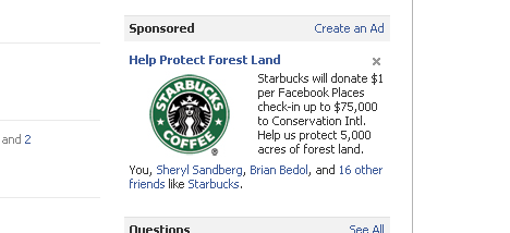
... And Starbucks seems to recognize that. Immediately after the Facebook announcement, they began advertising with premium Facebook ads - specifically promoting their places offer: "Starbucks will donate $1 per Facebook Places check-in up to $75,000 to Conservation Intl. Help us protect 5,000 acres of forest land."