Amazon's Navigation Bar Is Revealing

Have you looked at Amazon's core navigation pane recently... you know, where Amazon users start browsing through the online mega-store? ... It is fascinating. ... And it is revealing.

No longer are core categories like Books, Movies, Home, Toys, etc atop the page.

It is all about Amazon's Cloud services: - Instant Videos - MP3s & Cloud Player - Amazon Cloud Drive - Kindle (surprised this is #4 on the list!) - Android Appstore - Digital software - Audiobooks

I get that Amazon is pushing their new services and strategies... but it is a bold statement to put each of them ahead of the core experience (and where I spend 95-99% of my time / money).

Of course, for core products, homepage navigation is far less important than search and cross-product promotion. But it is a strong declaration of strategic focus.


Amazon Sells Prime Gorgeously

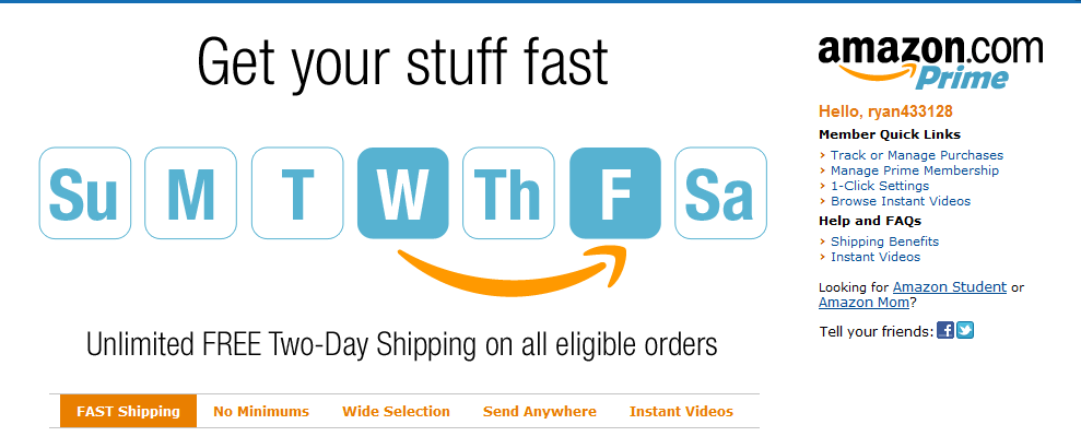
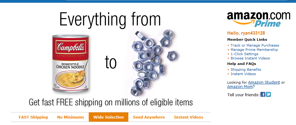
Amazon is the king of simple, effective marketing units. Here are two more that promote Amazon Prime. (Never mind the fact that I already subscribe to Prime and am not sure why I am seeing these promotions...) Amazon gives five value props: 1. FAST Shipping 2. No Minimums 3. Wide Selection 4. Send Anywhere 5. Instant Videos

Here are the two units for shipping and selection. They are brilliant: clever, on brand and compelling:

The Curated Web. Three Examples: Content, E-Commerce & Social Commerce.

The web is fragmented.That fragmentation gave rise to search. And it's given rise to the role of social within finding. The 'finding' problem exacerbates as content / product grows. Great examples of the problem: eBay, Amazon and iTunes have nearly unlimited inventory and are often painful to explore (for that precise reason). One solution: curation. It is a trend that I have written much about... and it's a trend that will (and should) continue. Three examples:

- Content: my reliance on Twitter and Facebook for news is an example of content curated by my trusted social graph.

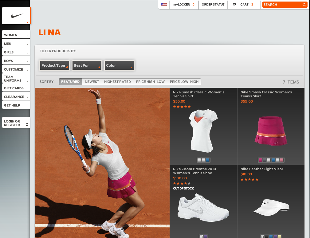
- E-commerce: Experts delivering their picks is a compelling way to drive conversions through curated expertise. Below is an example from JetSetter with "Molly Sims Inspired Travel". Each Sunday, the Golf Warehouse (TGW.com) features the clubs and products in the bag of that week's PGA winner. Of course, you can then shop his bag. And here is Nike's Li Na storefront which launched minutes after she won the French Open.

- Social Commerce: much of the movement from e-commerce to "social commerce" is predicated on experience being built atop social recommendations, sharing & findability.

As you try to distinguish yourself from the web's myriad of sites and products, think about how you can apply the concept of curation (experts, friends, taste-makers, etc) to improve findability, drive conversions, and establish marketing / viral programs.

'Real Time' Store Curation with Nike & Li Na

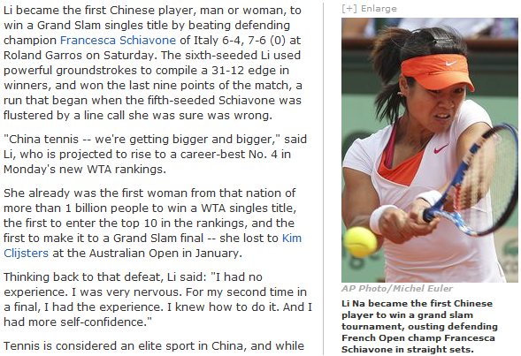
Yesterday, Li Na won the French Open and became the first Chinese tennis player to win a Grand Slam:

Li Na is a Nike-sponsored athlete - and immediately after her victory, Nike launched the "Li Na Collection" / storefront. The announcement was made on Twitter and Facebook:

Nike has long been savvy about real-time promotion and leveraging social media to drive sales, attention, discussion, etc (examples here). This is particularly noteworthy though because Nike effectively erected a real-time, curated storefront.

With pictures of what Li Na wore that morning, during here French Open Victory, Nike sold each piece of her ensemble. In effect, it is a trend that I have written about a few times: the curated web. In this case, curation comes from Nike and it's star athlete Li Na. It is a more compelling way to browse, find and buy.

And, it evolves over time. Nike can build out experiences for their athletes based on each event... and then users can explore those historically. For instance, why not showcase Nadal's outfits historically and bring them back on anniversary's of major events? And why not reveal what technology, clothing, etc are used Thursday - Sunday of each PGA event for your Nike golfers?

It worked for Michael Jordan with sneakers only... and with the online presence of today's athletes, we are seeing the rise of curated storefronts where the personality is first and the brand is second.

Utilize the Mobile App Update Section. Examples of FourSquare, Path & Square.

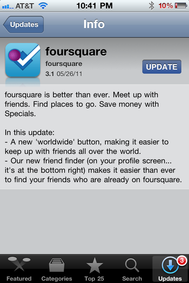
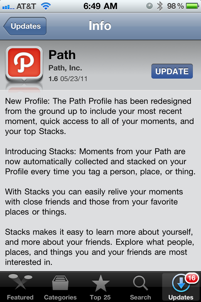
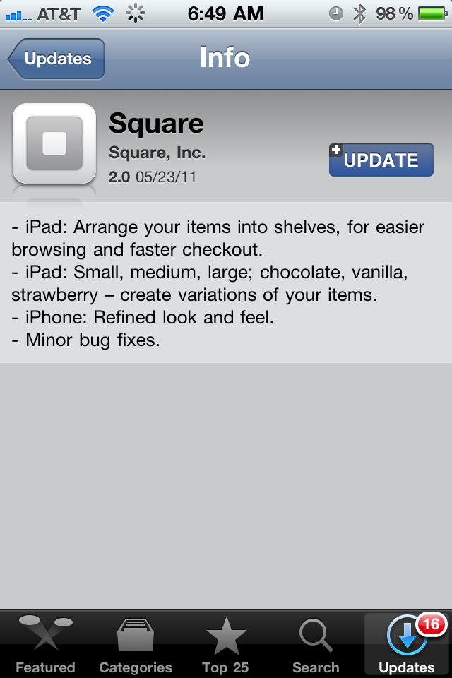
Maybe I am too much of a geek, but I actually enjoy reading application version updates. I assume most people do not read them thoroughly (many do not regularly update their apps either), but it is a really simple way to communicate with users and share what's new. It is so simple to do... and yet so often forgotten.

Most app updates read something along the lines of: - "fixed crashes" - "fixed various bugs" - "app runs faster"

In fact, I've seen many that say "the free version now has ads". Yeah, that's going to make me download the update!

Here are three great examples from three great apps: Foursquare, Path and Square. I particularly like the Path update because the app underwent a significant product change... this update is their first opportunity to introduce existing users to the changes. Of course, the app experience itself should also introduce / familiarize those changes.... but this is such an easy way to get started. And because so many developers overlook it, the mere attempt to communicate changes distinguishes these apps:

Apple's Track Shipment Hot-links.

When Apple released iOS4, I wrote that the most overlooked functionality was the automatic calendar / event creator. Despite some flaws, it is a feature I use daily and it's a natural tie between multiple applications: email, contacts and calendars. These functions have also existed for phone numbers, addresses, URLs, etc.

And, as I just found out, they also exist for UPS and FedEx tracking numbers. It's terrific because it is simple, efficient and coordinated. I'd love to see more in iOS5 - almost as if they are plugins that can be switched on/off. For key brands, applications, actions, etc - it makes sense. For instance, Facebook hot-links, photo sharing / previewing, contact creation / sharing, etc.

Sports Illustrated, Jim Tressel and Not Taking Advantage of Virality.

I write a lot about "in the river" marketing - which is all about leveraging the power of existing, engaged traffic to deliver relevant, actionable messaging / marketing / promotions. You can see lots of examples of in the river marketing done well here.

Here is an example of the contrary.

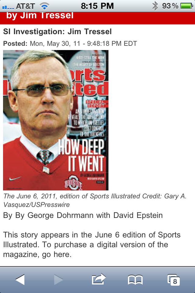
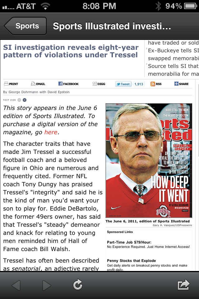
Yesterday's huge news was Sports Illustrated's investigation of Jim Tressel and his subsequent resignation. The article went viral and filled my Twitter feed, Facebook stream and email inbox. But Sports Illusrated (SI) didn't take advantage of the immense traffic - this was clearly an opportunity to facilitate sharing and drive downloads / purchases of their new paid mobile applications.

This is the mobile experience when you arrive at the article:

Notice the line: "To purchase a digital version of the magazine, go here." First, that language is unappetizing; but more importantly, "go here" isn't clickable.

For some reason, when you view the article within Twitter mobile, it looks much better and the word "here" is clickable and red:

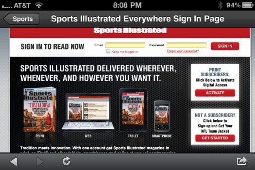
But when you click it, you arrive at a promotional screen that is not mobile aware and therefore not actionable. It should prompt you to download their application or, if you have the app, purchase the magazine version.

In summary: most sites dream of the opportunity to be flooded with traffic. Prepare in advance and make sure that your experience / funnel is primed to take advantage of the flood.... after all, they only happens once in a blue moon.

Facebook Deals New Treatment: Overlaying Friends & Places.

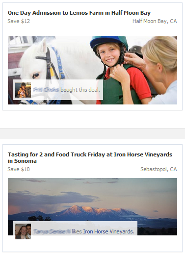
While it is a relatively minor update, I love the new UI / treatment being used on Facebook Deals. Facebook is now overlaying your friend's names / images atop deals they have either purchased or liked. It is similar to the super-effective Facebook Facepiles. The treatment is simple, good looking and effective... after all, it adds familiarity and some urgency to the deals.

Equally important, Facebook is including the Page or Location offering the deal. You can see an example of this in the lower deal (Iron Horse Vineyards).

This is important because I believe that Facebook Deals will (or should) ultimately be a uniting force between Places, Deals, Events, Groups, and Local Ads. This is a small, small step.

Google's Effective $75 AdWords Credit Campaign

I spend a lot of time talking about effective advertising and funnel optimization. Obviously, advertising often represents the top of the funnel (user acquisition) for many companies / campaigns. It is always worth watching respected brands' online campaigns because they usually undergo rigorous optimization testing and analytics. That is why I often point to ShoeDazzle, Groupon, LivingSocial, Amazon, etc - excellent, analytical marketers. And here is an example from Google that I think is well done and worth learning from.

The ad unit is simple. Bright color. Clear message. And most importantly, a reward / incentive: $75.00 credit:

Once the creative drives a click, the action is filling out a form (aka driving a lead)... and obviously the page's efficiency (call to action, form completion, lead collection, etc) is critical to making the campaign ROI effective. This what Google does well:

- Super simple, clean landing page

- Key action items and messaging: "Request a free trial" is both the message and the action button

- Only four fields are needed to get moving: name, email, URL and Country

- Two ways to get set up: Request via form or vial phone

- A big reminder of your $75 credit

- And crisp, clean language about why Google advertising works - with a < 2 minute YouTube tutorial