Facebook Favorite Places

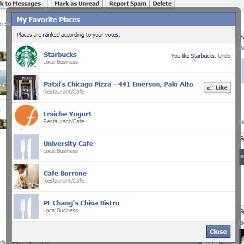
As Facebook Places ramps (via mobile, deals, etc), Facebook has started promoting Favorite Places. It is a module that asks users which Place they prefer (this or that). The two choices seems to be either Places you have checked in or have explicitly liked:

Once you vote, two new places are presented.

You have a choice to few your favorite places - which lists all of the places you voted for in an expanded window. However, it is not accessible via a webpage, tab, etc. For this to ultimately be useful, I imagine that will change - and it will effectively create some sort of social map. This seems to be a test to gather data and determine what the output can / should be.

Lots of ideas on that:

- Better page / brand recommendations - Facebook Places overlayed on a social map - Deeper mobile integration with location and notifications - Deeper Deals integration - Way to collect / share deeper data with page-owners and advertisers
Roger Ebert Reminds Us That Content Presentation is Important

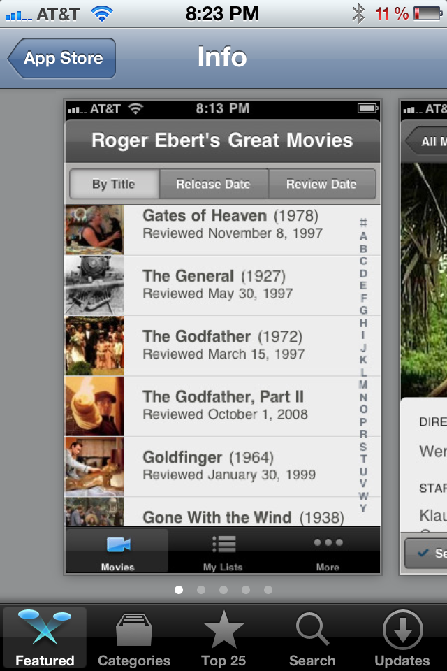
One of the top iPhone Applications at the moment is Roger Ebert's Great Movies (currently featured by Apple / iTunes). With all due respect to Roger Ebert - who has a long career of movie reviews and insights - the application is a simply a presentation layer for content that already exists and is already accessible. And yet it has become a popular application that users are willing to pay money for.... so why is this worth writing about? It is a reminder that content presentation is very important. It is also a reminder that good content is desirable and, unfortunately, often too difficult to access. And making existing content more appealing is apparently worth paying for:

- better presentation layer - augmenting with new content sources - more accessible - native to a different environment (ie mobile, tablet, browser) - etc

Five Reasons (And Screenshots) to Not Overlook Google+

The Google+ launch has been well received and, for the most part, I have been very impressed by the product (it feels more complete, usable and social than other recent Google products). But they still have a long, long way to go to earn share from the social giant, Facebook. I am not saying that Google+ will take down Facebook (far from it), but here are five reasons not overlook it just yet. I think that Google has created something that lives between Twitter's public world and Facebook's 'private' world - and they will arrive upon interesting use-cases / audiences:

Universal, new header that extends across Google properties and their enormous reach

From the header to the search results: promotion / inclusion throughout the SERPs

Ability to create a robust contact platform - between GMail, Google+, Apps, etc

Notifications are key to engagement & retention. Google has ample opportunity to deliver notifications: email, screen real estate, etc

Mobile: we know a hefty percentage of Facebook's activity is via mobile. Google has enormous reach as well (Android, iOS, search, etc).

Also worth noting the new mobile header / cross product promotion for mobile

Facebook Places Promotes User Reviews, Places Categories

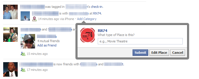
More Facebook Places experimentation (is it clear enough yet that Places is gaining strategic importance?): When friends check-in to Facebook Places and the newsfeed story is posted, friends are prompted to "Add a Category" for that Place. When clicked, it asks users "What Type of Place is This?" That categorization then appears on the Place's page. With Facebook's massive user base (now 750m+), this is a powerful way to crowd-source local classifications:

Facebook Places is also encouraging users to write reviews that are either public or shared only with your network... again, Facebook's scale and social graph should be a threat to local reviews:

The Difference Between Marketing Emails & Notification Emails. Facebook & Twitter Demonstrate.

Groupon, Rue La La, Gilt Group, etc have built big businesses atop big email lists and great email marketing. Twitter has beefed up their email efforts by delivering notifications for retweets, mentions and favorites by your followers. It's a powerful engagement lever unlike anything else (except perhaps for mobile notifications). And Facebook is masterful at sending targeted emails about core engagements / activities: mentions, photo tags (so important, viral and underrated), deals, etc.

And here is a new, more generic email notification from Facebook: an alert that a friend likes a link. This is a less engaged action, for instance, than a mention, reply, or photo tag... but it begs to be clicked because: 1. it is a friend who took an action upon one of your actions, and 2. the email is intentionally broadly worded ... not much is revealed - so you want to see more

Whatever the size of your email list, you should think about email as a critical lever for driving engagement around relevant notifications. Of course, flooding users with emails will have negative consequences - but in general, if your users are active, they want to be alerted of activities related to actions they already took. That is a confusing statement - but it's important! So let me repeat and dig in:

- if your user explicitly took an action - such as post a link, favorite an article, etc - and something related to that action since occurred - users want to be alerted because it is tied to *their* actions / behaviors - this is very different, for instance, than getting product updates from the service... This is the different between marketing emails and activity emails... and users have a limited tolerance for marketing

Apple, Twitter, iOS5 and Facebook's Phone Integration (Welcomed or Not)

The more I play with Apple's iOS5, the more impressed I am with the Twitter integration.And the more aware I am of the potential impact it has on Twitter... But why isn't Facebook integrated instead or along with?

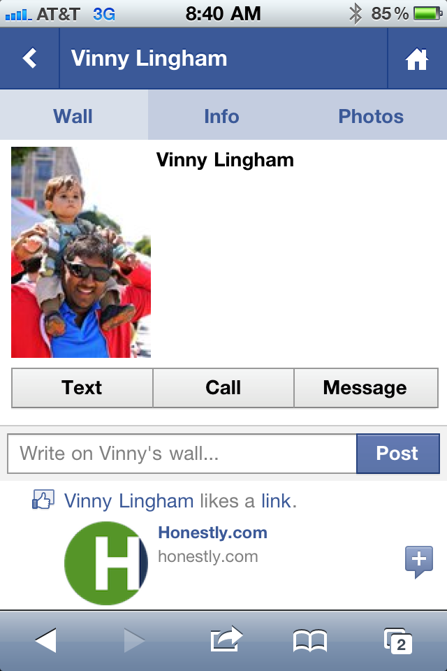
Lots of people have tried to answer this question, but perhaps the below screenshot is a partial reason.

There have been several occasions over the last week that I have misplaced a phone number and turned to the Facebook App to access the contact's number - and place the SMS / call. That's a powerful, threatening concept. And it makes sense: the majority of my contact list is now connected via my Facebook contact group. And those profiles have become complete enough that they usually include an email, phone number, etc.

Surely there is more to the conversation between Apple :: Twitter and Apple :: Facebook, but it fascinating to realize how much of your phone activity can be supplemented - or even replaced - by Facebook.

JetSetter's Search Box Promotion

I like the highlight examples of effective "in the river" marketing - the concept of placing product, promotion and marketing messages in relevant, active parts of the web experience. Lots of examples here... Here is another example from Gilt Group's JetSetter (which is one of the better designed and visually appealing websites).

The fundamental JetSetter experience is browsing really compelling, great-looking travel offers. Even with no intention of planning travel, I can waste dozens of clicks browsing JetSetter's delicious offers.

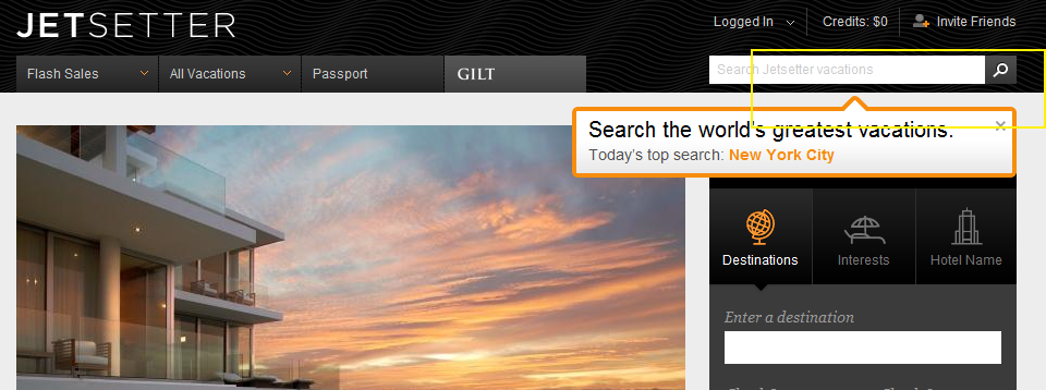
And while browse is JetSetter's primary experience, they are trying to drive search activity and have introduced both a search box and top searches. This is an obvious revelation because JetSetter overlays the message (along with today's top search) atop today's offer. It is bold, colorful and extends onto the offer and the right navigation pane. It also fades in (quickly and lightly) - in the rare case that you missed the unit.

On a side note: the "top searches" concept is interesting because it creates another browse + search experience that, in my opinion, is more shop-able. I believe that most significant travel (cost, distance, time) is *not* booked spontaneously... so the ability to search JetSetter deals for specific locations makes JetSetter more usable.... while still keeping the brand and web-experience in-tact.

Google Maps: Mobile, HTML5, "Desktop" Icons & In the River Promotions.

As Google continues to focus on HTML5 mobile experiences (and do it very well), they have to think about systematically driving usage... which, for mobile, requires 'desktop' real estate. And with core mobile applications, the app store's represent both distribution and the potential of screen real estate (ie icons / launch buttons). Google's strategy of focusing the mobile web experience is a good one... and it's shared by Facebook. But they both know that getting adoption relies on either deep OS integration or getting icons on the home screen.

So, when you visit Google Maps and their revamped web product (it too is done very well), they immediately and prominently prompt users to download the 'quick start' icon. Google has used this same tactic with YouTube (example here) - it's smart, effective and easy to integrate.

Yet another powerful example of "in the river" promotion / marketing.

Turntable.fm + Google TV is Awesome.

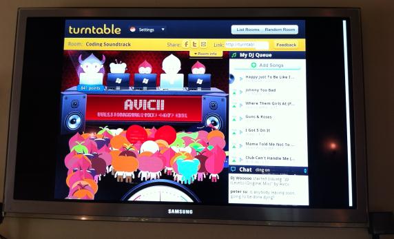
I am pretty sure that I'm the lone Google TV fanboy. I love the ability to merge the television with Google Chrome ... and to eventually lay the Android marketplace atop it (currently there are core apps like Pandora, Netflix, etc)>. And I give Google TV a better shot to amass great content and better UI than I do the hardware manufacturers (I have never used the Samsung or Sony appstores that come preinstalled on the TVs). Anyhow, here is another example of why I love Google TV: load Turntable.fm (http://www.turntable.fm) and your friends can share / DJ music throughout your home. And since:

- your TV is likely the home's largest screen - your TV is probably connected to your home's best speakers - and your TV probably sits in an open, social area

It's an excellent, optimal experience!

Haven't tried Turntable.fm yet? Here's a couple nice recaps: - TechCrunch: The New Early Adopter Addiction: Turntable - SAI: The Exclusive Music Site That Already Has Entrepreneurs Buzzing - Andrew Machado (super-fan): Turntable.fm - The Future of Music