Introducing Mixel

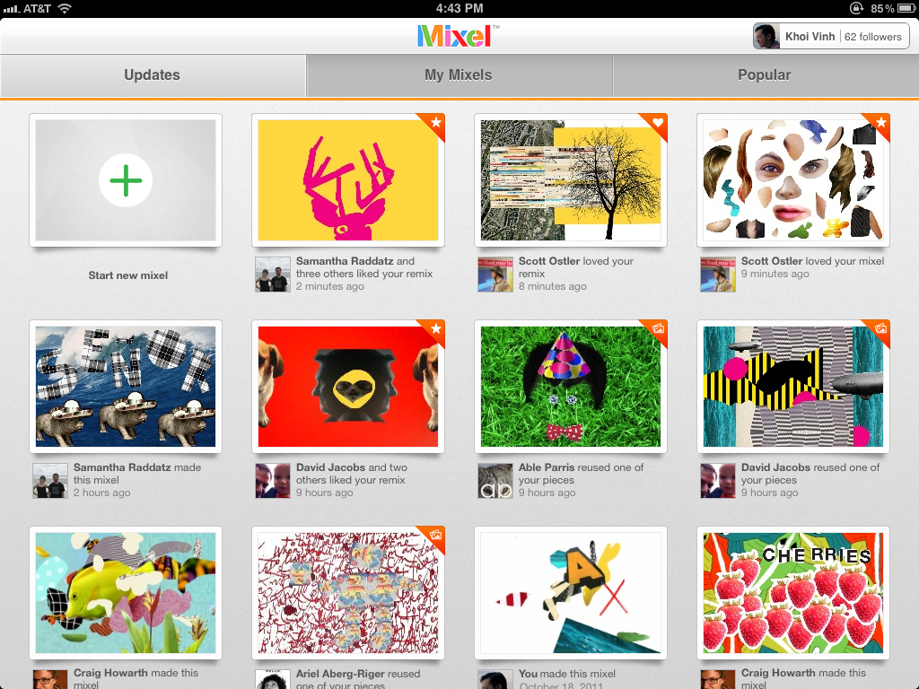
A Dogpatch Labs NYC and Polaris-backed startup, Mixel launched this morning. Using the iPad - Mixel lets you make, share and remix collages in a whole new way. You can download it in the app store here. Founded by former New York Times digital design director Khoi Vinh and Scott Ostler (dump.fm), Mixel is the first social art app for the iPad. With the free app, anyone can create and share fun digital collages, called mixels, using images from the web, Mixel’s library, or their own personal photos. Any image in Mixel can be quickly cropped, rotated, scaled or combined with other images using the simple, intuitive touch gestures familiar to iPad owners.

This excerpt from Sam Grobart's NYTimes piece ("Mixel Makes Art Social") does a great job conveying why I am excited about Mixel and the creative output that will pour from it: I watch my 1 year old son interact with the iPad the magic & delight that comes from it - Mixel has the opportunity to bring that same creativity and magic to adults who, like me, might not necessarily be artistic. That's powerful and fun:

"I tried Mixel, and it was fun and intriguing. I cannot draw to save my life, but collages? That I can do. You feel like you’re playing Art Director: Fisher-Price version. I mean that as a compliment — it’s fun to juxtapose images and text, and it’s worlds easier than, say, painting. That would’ve been enough to make a perfectly nice app, but adding the social features, where friends and others can create chains of meme-like images, turns Mixel into something more deeply compelling. It’s a conversation I’m looking forward to having."

You can read more here: - TechCrunch - NY Times - All Things D - VentureBeat - GigaOM

Introducing Mixel for iPad from Mixel App on Vimeo.

MyFace. From FX's The League.

The world's first offline social network.From FX's The League. This is terrific.

Please excuse the poor quality... home video =) And please excuse some slight profanity - but still kosher for TV!

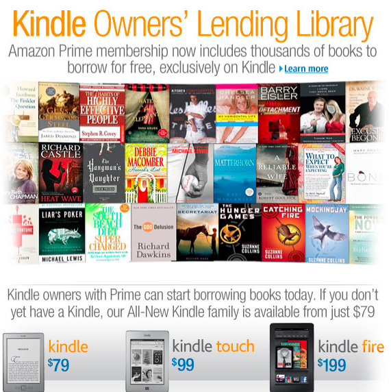
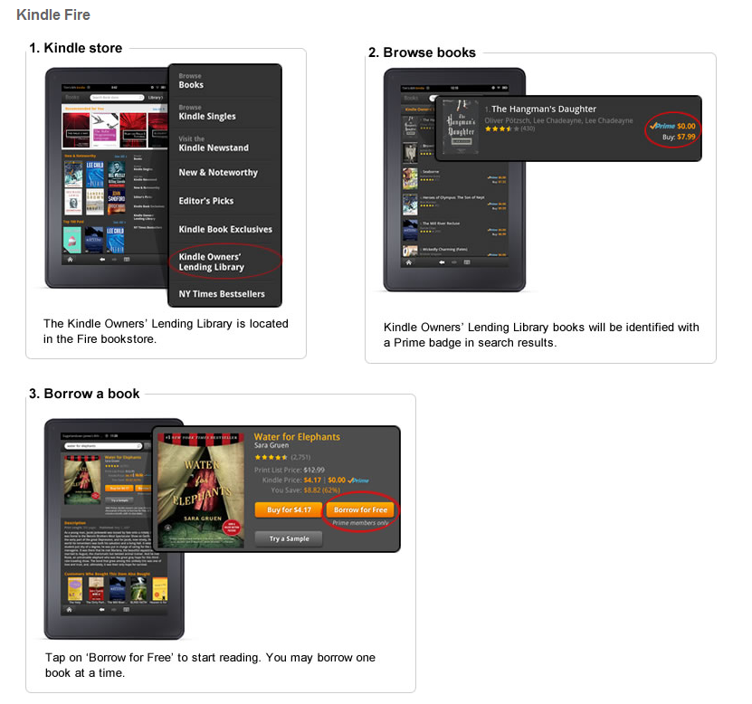
Amazon's Kindle Lending Club Makes the Already-Affordable Kindle Fire Even More Attractive

In the last month alone, I have purchased three books on the Amazon Kindle store (I use the Kindle app on the iPad)... had Amazon's new Kindle Lending Library program been live, I would have simply purchased the Kindle Fire and considered it an eventual cost-saving: - I've spent $40+ on books over the last month alone - The device itself is $199, now comes with effectively free books... and a gadget with much more

No brainer right? (big caveat: assuming content library is strong - it certainly appears to be)

And that's why Amazon is brilliant: - They changed the tablet landscape through pricing. - They used it, along with other launches, to drive Prime membership and usage. - They are now introducing a new way to deliver / consume books ... which has already happened to music (hello: Turntable.fm, Spotify, Pandora) - And yet again users have to ask if the Apple & iTunes & iBooks experience is worth paying more for than Amazon's (Kindle Fire, Kindle Store, ec)

Google Chrome Better Promoting Chrome Apps

Google has rolled out a new Chrome homepage that allows users to toggle between "most visited" websites and Chrome Applications. It also creates a navigational panel at the page's footer. Is there any question that Google and Chrome are focused on bolstering their app ecosystem?

With Chrome, Android, Google TV, etc - hopefully this becomes a consistent hub and apps are better shared & better accessed across device / environment (ala iCould). This is a start and is clearly demonstrates its a focus of Google's.

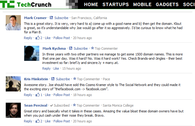
Facebook Rolls Out Subscribe to Comments. Improves Product and Promotes the Still-Hard-To-Find Subscribe Feature.

Facebook has begun integrating their new Subscribe functionality into Facebook Comments. It includes a small subscribe link next to each commenter's name / icon that allows in-line subscription. That does a few things: 1. It keep activity on the external site... so publishers love it. 2. It gives yet another incentive for users to comment... so readers love it. 3. And it provides more context for readers as Facebook helps sort content based on relationship, activity and 'following'.

And....

4. It is a great way for Facebook to promote the Subscribe feature which frankly is lost of Facebook.com.... findability, context and usefulness is better off-Facebook.com (just ask Twitter).

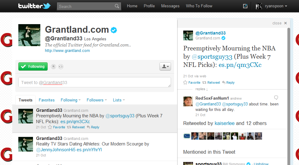
ESPN's Grantland & Bill Simmons Show How Publisher Networks Can & Should Leverage Twitter

I've written a fair amount about how publishers should be better leveraging Twitter, Facebook Subscribe, and social products... and even tailored it to verticals like sports. Here is an example of good work by ESPN and their new Grantland property. It's applicable to any publisher who is a network of content producers and/or sharers... and that is the majority of all publishers.

While this is a visual example of how to connect your content producers / sharers, it is also a reminder for brands to think of themselves as a connected network of individuals whose job is, in part, to be part to build the larger entity. This in turn drives more traffic to the overarching brand and builds the individuals beneath.

How it works:

First, Grantland is a new brand / destination (85k followers) operated by ESPN and managed by uber-popular Bill Simmons (1.5m followers). Grantland content is produced by a variety of ESPN personalities, celebrities, etc... and many pieces of content are collaborations between multiple voices.

When content goes live on Grantland (and it does several times a day), all associated personalities promote it. But they do it in more effective way than just retweeting @Grantland33's post. Someone will announce the article and include the collaborator's Twitter handles. Those users then reply in a conversational - but still promotional - manner.

The result:

- Grantland and it's contributors are actually followable... if everyone was a circular retweet, this would not be the case. - Grantland got itself off the ground by leveraging larger voices like Bill Simmons and ESPN's top-level brand - It in turn promotes its contributors - Who in turn promote their associates and their brand - Everyone wins as followings grow and content is effectively shared

HBO Go: Delightful, Albeit Inefficient, Exploration. And That's Fine By Me.

Below is a screenshot of HBO Go's iPad App. It's gorgeous, fun and highly dynamic. It represents the shift of paid content to mobile: HBO Go, ESPN Watch, Netflix, Hulu, etc. And it represents the visual opportunity presented by the touch-based device (smaller screen, different format).

And lastly, it shows the design similarities with e-commerce iPad apps like Gilt and eBay. Why do the apps look similar? Sure there could be some flattering mimicking... but more importantly: e-commerce and digital media hubs often struggle with findability within huge universes of product / content. Big visuals and touch-based exploration are a good way to conquer.

Specifically within the HBO Go app: it is interesting that 95% of the screen is dedicated to dynamic, visual tiles. Buried at the bottom is a persistent navigation footer: category, title, etc. In a world of funnels and tools to drive efficiency, HBO has made the clear choice to value exploration and engagement.

Twitter Search May Surprise You

Notice anything about the below screenshot of a Twitter search? Only two of the tweets actually contain the search query ("Peyton Hillis").... but all of the returned tweets are relevant and discuss "Peyton Hillis" on the linked landing page. This obviously means that: 1. Twitter (either directly or via partnership) is indexing landing pages and associating that content with the on-Twitter search query

2. Twitter search is far, far more valuable than it once was: a text match within 140 characters. And as 25% of all tweets include a link (thanks Quora), this is a big deal

3. I need to figure out if Peyton Hillis is starting today's game!

Groupon's IPO Slideshow

I encourage you to read through Groupon's roadshow presentation that TechCrunch posted today. I find the last two slides most interesting: the future of Groupon as a product and what it means for growth trajectory. From the chart, Groupon clearly is betting that new product (Groupon 2.0) will energize a decelerating growth plan (Groupon 1.0). Groupon 2.0 will focus on the delivering more product, more often and in more targeted ways... and, more importantly (?), driving consumer retention: - retention & rewards - merchant ROI (calculators for ROI & Earnings) - Places and Now! deals - new Deal Types - Merchant Mobile Apps