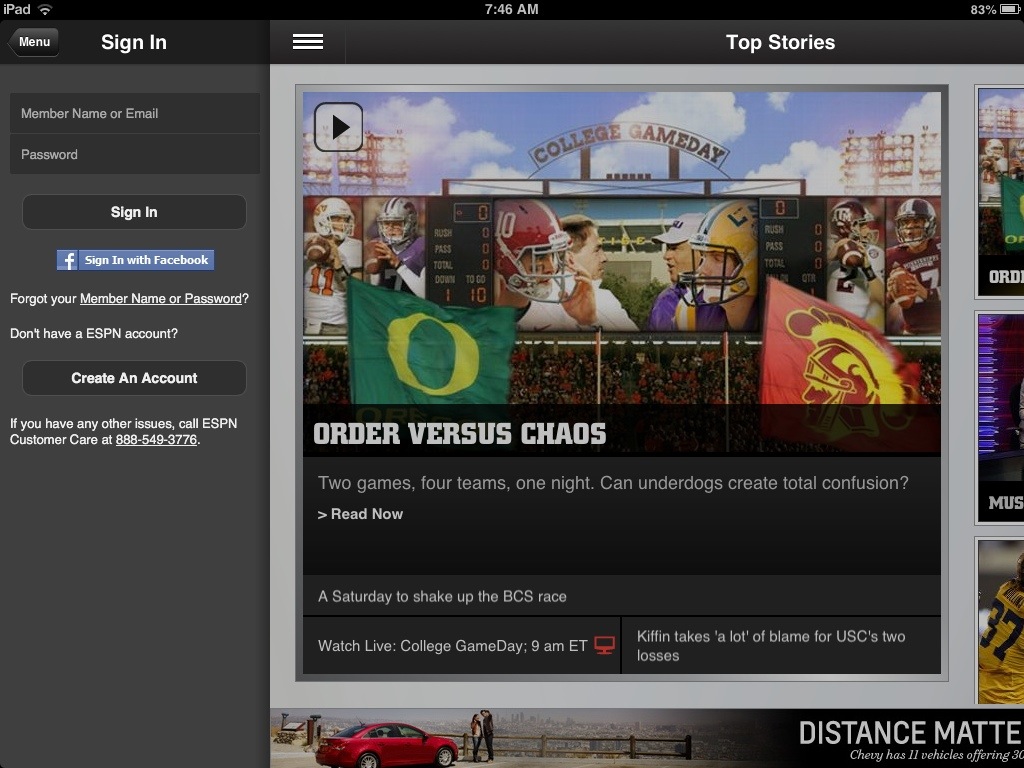
2012 - Brought to You By Facebook

Facebook's 2012 in Review 'app' is really fantastic: fun, easy, and surprisingly accurate. In one click, Facebook creates a mini-Timeline of your 2012 highlights... and it sums of the year with the 20 most socially active and visual moments. Again, it's a single click and a valuable, viral output. It brings Facebook's Timeline to life in a way that really hasn't happened since Timeline's original launch at F8. And when the year in review happens, it is both sharable to your own wall / friends - but it sparks users to create their own.

It's a reminder of the power of Facebook: identity. Conversation and the social graph are important - but Facebook's highest value is identity. It's what we have invested ourselves and it is what the web and app ecosystem has invested in such that it is our identity (and authentication, personalization, etc) to much of the world off-Facebook.

In a simple, visual way, 2012 in Review reminds us of this.
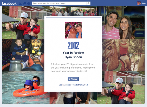
2012facebook-year-in-review

Facebook Gifts, Reminiscent of Facebook Offers

Three things to note about Facebook Gifts: 1. Fascinating - and yet powerful - that the only promotion of Facebook Gifts is within the birthday alerts. It's the definition of "in the river" marketing and promotion. 2. This was the first time I noticed that the gift icon showcases friends who have sent gifts (when available). So not only is it in the river, it is socially relevant ... and therefor has some social pressure!

3. That aspect looks a lot like Facebook Deals.

Election Day: With Some Help from Facebook, Google, Quora, etc

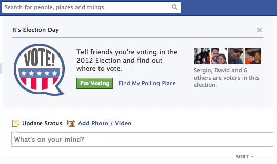
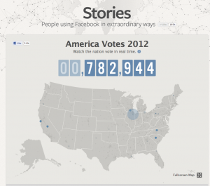
It's election day. Go vote.And Facebook, Google, Quora and others are here to help how best they can. Three screenshots from those three companies because they have put together really great, on-brand and on-experience products to assist: 1. Facebook's social vote campaign. As only Facebook can do, encouraging voting in a social way.

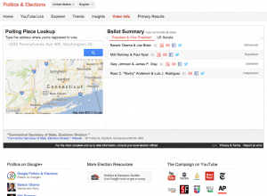
2. Google's Election hub which is outstanding. Polling info. YouTube streams. Candidates information. It is really outstanding. As only Google can do, a robust search and content hub across Google's properties and the web.

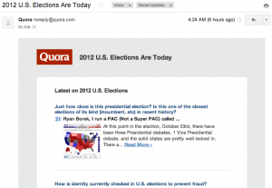
3. Quora's election themed digest - as only Quora can do, delivering great Q&A relevant to the election.

5 Quick Thoughts on the iPad Mini

After using the iPad Mini for 48 hours now, I wanted to get some quick thoughts down that answer the most common questions I have heard:

1. Is this just a shrunken iPad? Yes, it is a shrunken iPad. But what's important about the Mini is that it's more than just a smaller screen: it's a perfectly sized device: screen, weight, bezel, thickness, etc. If it was merely a differently sized screen - the Mini would not be as fantastic to use. It's hard to explain just how beautifully it is built until you hold it and play with it... with just one hand. It seems ridiculous to say: but after an hour or two with the Mini, your iPad really feels clunky.

2. How does it fit into my ilife? Simply said: I haven't had a need or desire to pick up my iPad since getting the Mini. With exception of:

3. Is the size really better? Unless you use the iPad as a movie consumption device, I believe it is a better size. Reading is easier. Typing is easier (counter intuitive but true). And the weight makes a huge difference. I have owned the Amazon Kindle Fire and Google Nexus 7 - and I have always believed that the 7" tablets were more versatile and usable than the iPad. The Mini's form factor is the icing: weight, thickness and edge-to-edge screen are as important as the 7.9" screen. It always makes the Mini more versatile in that landscape mode is instantly as usable / useful as portrait mode.

4. What will you travel with? Short travel: iPad Mini. Long travel: iPad Mini + Macbook.

5. How about the screen? This is the single biggest complaint and indeed its the single biggest flaw. However, the Retina display will surely come soon. And, the screen is really adequate because the small size relieves some of the pixelation. Furthermore, it is only acute in fonts - graphics are actually quite crisp and clear.

Amazon's Beautiful Cloud Drive for Android Splash Page

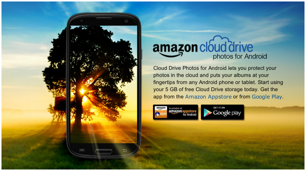
I love this graphic / splash page for Amazon's new Cloud Drive Photos for Android application. Beautiful and really, really well done:

"Cloud Drive Photos for Android lets you protect your photos in the cloud and puts your albums at your fingertips from any Android phone or tablet. Start using your 5 GB of free Cloud Drive storage today. Get the app from the Amazon Appstore or from Google Play."

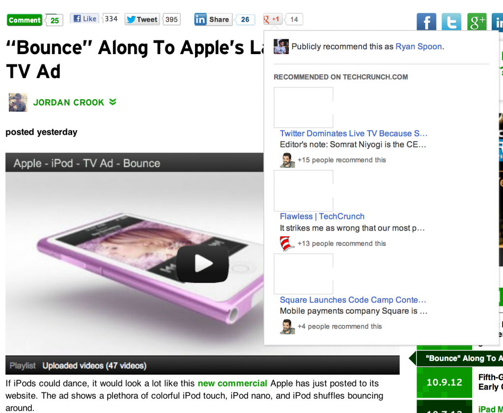
Google+'s Slick Recommend Unit

I really like this Google+ implementation. When you hover over the + button (alongside other sharing units like Facebook and Twitter), it expands to show related Google+ content. Slick UI and relatively unintrusive experience. And lots of opportunity to mix different content types within the overlay.