Netflix's Product is Bloated & Outdated... Attention iPhone App Gallery

Much has been made of Netflix's current outage and what it means for their product and business (apparently 1.8-3.6M in daily revenue). And if you aren't aware of Netflix's outage, check either Techmeme (it's covered their homepage) or login to receive this message:

IMPORTANT: Your DVD Shipments Have Likely Been Delayed

But the outage got me thinking about Netflix's greater problem: their product hasn't evolved materially and, in my opinion, it's become bloated and impossible-to-navigate.

Now when I talk about Netflix's product, I am referring to their web experience. The actual product that you receive - the DVDs and Blu Rays - come reliably, remarkably quickly, and 9/10 times they play perfectly... But the Netflix.com experience is as critical as you need to be able to find movies before you ask them to be delivered. Put another way, people expect the movies to arrive on-time and play perfectly; but people want to enjoy the next 90-120 minutes with entertaining, well-recommended movies.

Which leads me to my problem with Netflix - finding good movies and navigating recommendations has become a burdensome, unproductive experience. This is ironic because I specifically remember having discussions in 2003 about Netflix and Amazon being head-and-shoulders above the web in finding experiences and social navigation.

... But what worked in 2003 doesn't work today - despite the product being nearly identical. The trouble is that browsing loses its effectiveness as a core search experience when the inventory gets too large ... or in Netflix's case - overwhelmingly large. There are only so many ways to sort browses:

- Newest - Most Popular - By Genre - Recommendations - Etc

But each of these fail for various reasons:

- Newest: every week, 100s of movies go to DVD and 95% of them are not interesting to me. Browsing through this is impossible.

- Most Popular: The #1 movie for over a year on Netflix is "Crash" ... great movie, but how can it be the top movie week in and week out?! Because being atop Netflix's stale "Most Popular" list is self-fulfilling and only mainstream movies can reach #1 because it requires Netflix to have huge inventory of that movie.

- By Genre: This solves 5% of the issue but still leaves me way too overwhelmed (even in small categories like Blu Ray) and frankly having to choose between Action and Thrillers is overwhelming enough.

- : Recommendations are useful, but typically when deciding between products. For instance, if looking for bluetooth headset on Amazon, I use the ratings to compare / contrast. Using Amazon's ratings to start and finish my picking process is again overwhelming. Furthermore, the recommendations have left me with three outcomes:

1. A bunch of mainstream movies and generic picks. Sure - I loved 'Rambo'. Now my top picks are Rambo 1-4. Insightful. 2. For the non-obvious recommendations, more often than not they are movies that I end up really disliking. 3. A few movies that I indeed want to see - but are clearly always highly-recommended and result in a 'queue' backlog. I waited on the Wire Season 1 for two months before getting a shipment... and it took me wiping out my entire queue to force them to send it to me.

In one sentence here is my problem with Netflix:

Every time I login, I wonder what I am supposed to do next... and that is never a good sign for a product or site experience.

I think this is highly relevant for the iPhone App Gallery which is already becoming unmanageable to navigate. Outside of Featured and Top 25 lists, it is brutally difficult to find Apps that are interesting or useful. And that's only with a couple thousand applications. What happens when this hits 25,000? Hopefully it won't become another Netflix or eBay-like finding struggle.

Here is Netflix's Top 100... which is identical to what it was 6 months ago. Is this what you are paying for? Stale, previously popular titles?
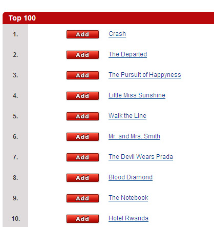
Netflix Top 100 Movies

Google Analytics New Front Door... Is Broken.

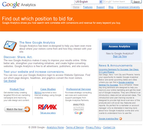
Google Analytics seems to have launched a rebranded, new front door. And it seems not to be working.

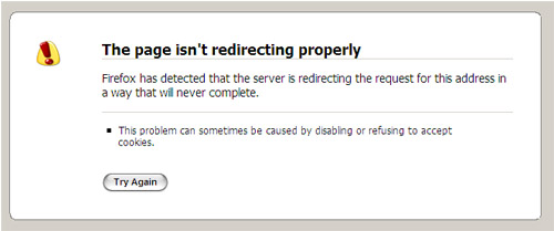
Clicking on the new "Access Analytics" button starts a several second process that results in a redirection error. Clicking on the "News" section links off to the Google Analytics Blog... which also doesn't work and results in an error: "The connection has timed out. The server at analytics.blogspot.com is taking too long to respond."

For a free product, downtime can (and should) be expected - but this going on 30 minutes now (at least). Maybe I should add to my list of 20 ways to fix Google Analytics?

Google's new homepage:

Google Analytics

... and what happens when you try to login:

Google Analytics Down

Update According to TechCrunch, GMail also is experiencing an outage... so this could very well be related and bigger than just Analytics.

Improving the iPhone's Contact Management Product

While at dinner two nights ago, the four of us around the table started talking about our new iPhones... which we had all traded in blackberries for. After some apps were showed off and the general 'cool factor' wore off - we talked about how painful it is to sort through the contact album... which really is the root of how the iPhone operates as a phone.

At the most extreme end, Vinny (of Synthasite) showed how it takes 20 seconds to load his contact list (which has 4,500 entries). Now that's absurd on a few levels... but even my album of 500 contacts takes 5-10 seconds to load. That's inexcusable and really makes it really tough to navigate as a phone.

Here's what I'd like to see:

- First, I want the ability to add contacts to the deck... just as you can clip webpages and add them as icons. I would then create a homescreen of the top 20 people I call. This seems relatively easy to do and I am amazed it's not currently offered. The Blackberry offers hot-keys for assigned / auto-calling.

- Second, I'd like to break the contact list into groups that are independent of one another so that the entire contact list doesn't have to load with each usage... after all, that's where the pain comes from.

- Third, I want universal search. I want to be able to find people by first AND last name. And I want the search function to load independently of the contact album and be the first function to load. The current search function requires you to navigate to the top of the album and then search... big pain.

- Fourth, I want to be able to place calls / add a contact from the SMS menu without scrolling to the top of the chat history. It is bizarre that contacts and interactions are treated uniquely throughout email, phone, SMS, etc.

Fantasy Football 2.0 Via My Blog - You In?

I've written a fair amount about sports and the web... and some of my most active feedback / commenting has come through those posts. So I'd like to try something: organizing a fantasy football league through this blog and its readers. The rules will be relatively straight forward

- Standard draft. Live in San Francisco for any of the techies who live here. Those not in the Bay Area can conference in. - 10-12 teams depending on interest / feedback - Each team / manager (or more likely his / her company) will be profiled on this blog - League will be managed through ESPN Fantasy League - but with some banter and recapping on the blog - Must start 1 quarterback, 2 running backs, 2 receivers, 1 tight end, 1 kicker, 1 defense and 1 offensive flex player each week

Thoughts? Who's in? Either email me or leave a comment. I'm looking for 10-12 people / teams!!

Facebook is Gunning for Twitter & FriendFeed - I Might be Converting

I love Twitter. I've come to love FriendFeed. And I really love my new iPhone 3G. And I've never been a huge Facebook user.

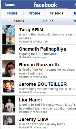
All of these come together thanks to Apple and my new iPhone. After installing the Facebook App (which now has 1,000,000+ unique users by the way), I've slowly become more attracted to the Facebook Feed updater than to the Twitterific App. I still don't fully understand why, but I do understand the three following points:

1) My network seems to be updating their stream more regularly through Facebook than through Twitter 2) I actually know all of the users of who can access my Facebook feed (though I am not sure this is a positive!) 3) I am too lazy to update both Twitter *and* Facebook

And while I love Twitter, my network seems to prefer Facebook... which by definition would drive me towards sending my content into Facebook rather than Twitter. The direct feedback and traffic through Twitter, however, is more significant than through Facebook - and that means quite a bit (selfishly) as a blogger and a networker.

I am not sure where this will lead for me - but I do know that I am consequently spending more time on Facebook (via the iPhone App) than on Twitter.... I'm also not sure if this is permanent or a temporal iPhone fascination.

Facebook iPhone App

Why Toyota's Scion Campaign Resonates with the Social Web

While watching TV, I just came across the latest Toyota Scion television campaign "United by Individuality" and it strangely tied up several of the last week's conversations for me.

While at SpaceCamp and through over various other email exchanges / phone calls, I've engaged in several discussions about what makes virtual worlds like Gaia so popular... and their business models so effective. The answer is captured very well in Toyota's campaign, which screams, "individuality!"

If the fabric of the social web is about tying personalities and communities together - the essence of the community's individual's is through unique identity. Think about:

- how many ringtones are sold - how people purchase MySpace themes and formats (Wordpress as well) - how many virtual goods / gifts people purchase

These are all purchased to stand out and individualize oneself within the larger (often commoditized) community. And Toyota is doing something similar: selling sturdy but *relatively* inexpensive cars aimed at younger audiences... but making the car customizable enough that drivers can make their models stand out from the 1,000s of other cars (and purchase Toyota equipment in the process).

Widgetbox Relaunches Widgetbox.com: Partners, Advertisers, Games & More

Tonight, Widgetbox officially relaunched its website with an entirely new navigation structure... and it's now blue!

Three important changes have occurred here:

1. We added a Partners tab to the navigation bar that promotes Widgetbox's Custom Gallery tool. Custom Galleries enable websites of all sizes to easily integrate fully-customizable widget galleries on their websites and platforms. Last week, my good friend Vinny Lingham's company, SynthaSite, integrated a full Custom Gallery with over 60,000 available widgets for their users / websites. I inserted a basic gallery on InGameNow in less than five minute's work!

2. We added an Advertisers Tab which speaks to developers and advertisers alike - offering the opportunity to craft targeted widget distribution or advertising campaigns across Widgetbox's network of 56 million unique viewers (verified by Quantcast):

3. We launched a beta 'Game Arcade' portal that features gaming widgets and works alongside two of our great partners: Husky Media (from Heavy) and Mochi Media. The product is very much in beta - but we are interested in collecting user feedback and determining how similar pages can / should be built out.

Extreme Boarder

Jump out of a helicopter for a thrilling ride through the untouched snow. Play and Grab

If you have feedback on any of these - please let me know!

The New York Times iPhone App - I Love It, But Here are 10 Suggestions

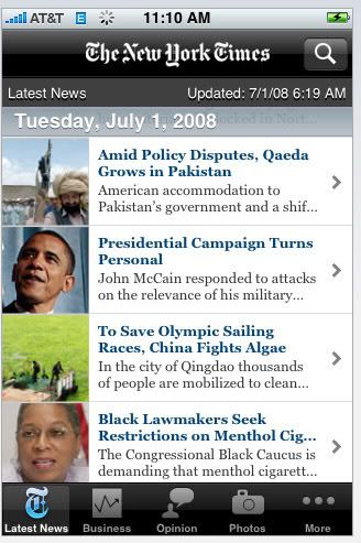
Despite getting unfairly ripped with iTunes ratings, The New York Times iPhone Application is by far and away my favorite app. Sure others are cool (MLB.com and virtually anything using the accelerometer), but the NYT app is the most useful. In fact, in just a couple weeks, it's transformed by morning ritual - I roll out of bed, thumb through the newspaper and do it without waking up Anette with the annoying Blackberry clicking noises. So we're all happy.

And while I love the NYT app and appreciate that they've made it free - I do have some suggestions... so if you're reading, how about some of these features for v2?!

1. Let me email articles directly from the app. Hugely annoying that I can't load up the contact book and/or enter an email address!

2. Use those emails to add to the 'Most Emailed' section. With the number of users actively using the app - this is a ton of useful data.

3. Let me rate articles and photos. Use my preferences and ratings to eventually build out a recommendation engine.

4. Load the app faster. The photos in particular load slower than any other app on my iPhone. I'd use it more often, if I could load pages faster.

5. Add a touch-based scroll bar to the article pages. It can take for ever to scroll through lengthy articles one thumb-touch at a time. There has to be a faster way to scroll or at least jump to the bottom of the article.

6. Get some new ads. I'm all for placing ads in the app as long as it's free... but I can only see so many Westin ads and act interested.

7. Make the author names clickable. For great articles, I'd like to read other pieces written by the author. Link the name to his / her other articles. Again - it would increase my consumption.

8. Give me a pivot point off each article page. Currently, the only option to view the next story (blindly I might add!) or pick a new category... add other options such as related articles. At the very least, add the categories that the article sits within!

9. Add a headlines / tag view I love the photos category and enjoy browsing visually. This would be equally interesting if there was a finding experience by headline or tag.

10. Allow favorite searches to be stored. There are searches that I would like to keep either as a category or (at least) within the search category. Let me store them!

Sports Illustrated Moves Fantasy Football onto Facebook; Tries to Catch Up

Like it or not, fantasy football is important. According to the New York Times, 15.5 million people play fantasy football each year - about 86% of which are are male and 63% are under age 40. It's also become a $2 billion industry.

So when Sports Illustrated (SI.com) moved their fantasy football to Facebook, two things became apparent:

1) Sports Illustrated isn't the leader in fantasy football and is trying to aggressively catch up 2) Facebook has become completely mainstream and, for the big brands, an avenue for user acquisition (important to note that fantasy football is comprised heavily of adult males as well - so SI is using Facebook to acquire users outside of high school / college)

Sports Illustrated, according to TheBigLead and Comscore, was the ninth most visited sports network on the web... and in fantasy football, Yahoo, ESPN and CBS are the clear leaders. Here are the stats from the last month:

1. Yahoo Sports: 22,752,000 uniques 2. ESPN: 20,601,000 uniques 3. Fox Sports: 15,105,000 uniques 4. MLB.com: 11,917,000 uniques 5. AOL Sports: 10,632,000 uniques 6. WWE: 6,759,000 uniques 7. NBA: 5,740,000 uniques 8. NFL Internet Group: 5,624,000 uniques 9. Sports Illustrated Sites: 4,492,000 uniques 10. NASCAR.com: 3,528,000

Fantasy sports are critical for the major sports networks because they are remarkably sticky, have high switching costs and attract clusters of users. So for Sports Illustrated to run their fantasy offering offsite is very surprising a clear sign (to me) that they are conceded the fantasy game - hoping to win a new market via Facebook's huge audience. It's an interesting effort and perhaps not overly risky considering their position in the market... But unlike CBS's smash hit with the Final Four / Facebook integration, this doesn't seem to have a clear proposition to get users back to SI.com.

Meanwhile, this seems like a big win for Facebook - just as the CBS / March Madness relationship was.

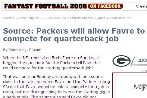
Notice the Facebook promotion atop the story headline

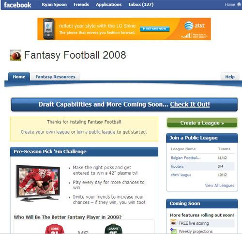
The Application's front door