Lightweight Product Progression - Facebook Events as an Example

User acquisition and customer lifecycle / progression is often measured with funnels and segmentation studies (interested in more? take a look at KissMetrics - a Polaris company). It is not a big stretch - but it is valuable to think about product similarly. A user's first interaction with a product (application, registration, form, etc) is critical... and one frequent failing is overload of information, interactions, requests, etc. There are several great examples of web products that progress as each user graduates through various steps / actions. For instance, registration commonly occurs with a big form: name, user ID, contact information, etc. Progressive registration can occur with just a user ID or Facebook Connect login. Additional information can collected as the user advances in the product's cycle.

Below is a good example from Facebook. Their events product is powerful and relatively complex as it has several fields, components of customization, friend invitations, etc. When Facebook moved event notifications to the upper right portion of the homepage, they created a mini-application and effectively created a progressive product flow:

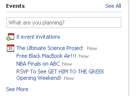
It starts with a simple box and question: "what are you planning?"
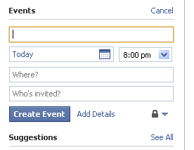
Click into the box and only the most important fields expand: name, date, friends and location. This is an important lesson for user registration or profile building - collect only the essentials up front and enable expansion later.
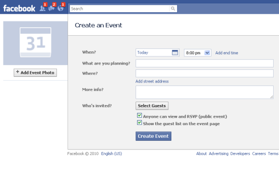
Want to further customize your event? You can supplement what you already created:
Foursquare Teams Up with NBA for Lakers / Celtics Finals

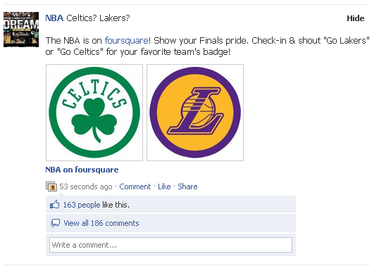
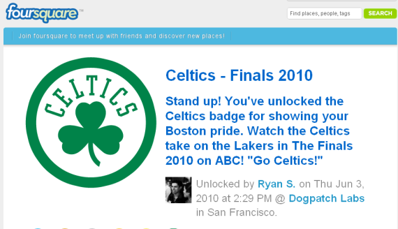
It's part Foursquare, part Fanpulse and part ESPN / vintage InGameNow: Foursquare has teamed up with the NBA to award Celtics and Lakers badges to fans who 'check in' tonight and shout either "Go Lakers" or "Go Celtics". It is different than your typical Foursquare 'check in' in that it is determined by content rather than location... but it will clearly be a big driver of traffic and usage. And clearly the NBA is getting behind the relationship: in 53 seconds, 186 Facebook users commented on the badges and 163 others liked it.

Facebook Testing New Notification Types?

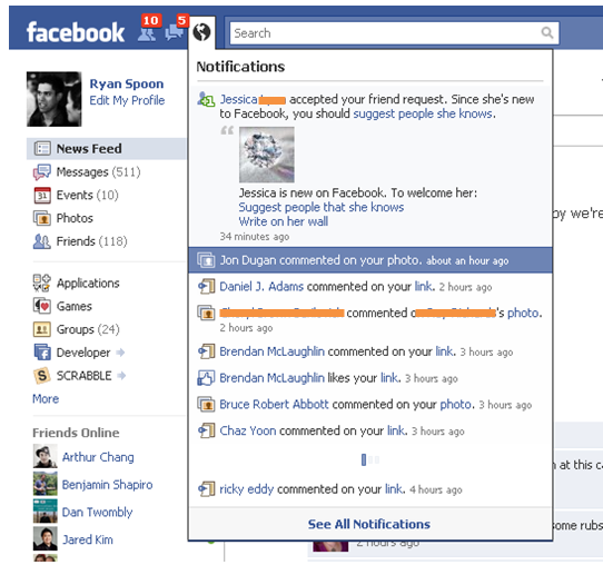
Facebook appears to be testing new notification settings and formats. As you can see in the below screenshot, the typical notification is rather straightforward: "Jon Doe likes your photo" - where the name links to the profile page and action links to the receiving item (post, note, picture, etc). The below notification is quite different though: - it is an accepted friend request who apparently is "new to Facebook" - Facebook then shows the user profile image - and then encourages me to "welcome her" by suggesting friends (twice!) - and asks me to write on her wall

It certainly stands out visually. Additionally it is the first Facebook notification that is "actionable" rather than informational (with verbs like: 'suggest' and 'write').

Facebook's Gift Ad Units Now Feature Friends' Gifts, Messages

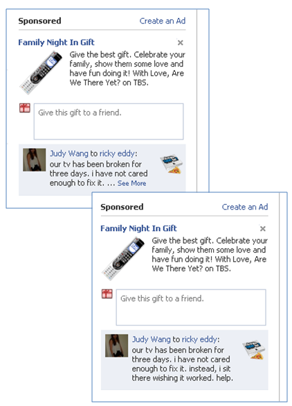
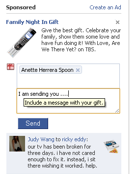
Facebook's gifting ad units have been around since the fall of 2009 - but it appears that Facebook has added functionality to the unit that displays gifts and messages shared between your friends. This change is inline with Facebook's new social 'widget' strategy and is yet another example of using friends' activity to encourage your own activity (see yesterday's Groupon example here). Below is an interesting premium Facebook ad unit labeled "Family Night In Gift" because:

1. It is actually a masked campaign for TBS's Are We There Yet (which premiers tonight) which I find confusing - but I would be interested to see how the click through / engagement rates change based on the ad creative

2. It uses Facebook's gifting unit and displays gifts shared between your friends:

Like the previous version of the units, you can share with your friends directly within the ad unit. I like how the Facebook provides a hover instruction as you type ("include a message with your gift") and you can see the message between your friends:

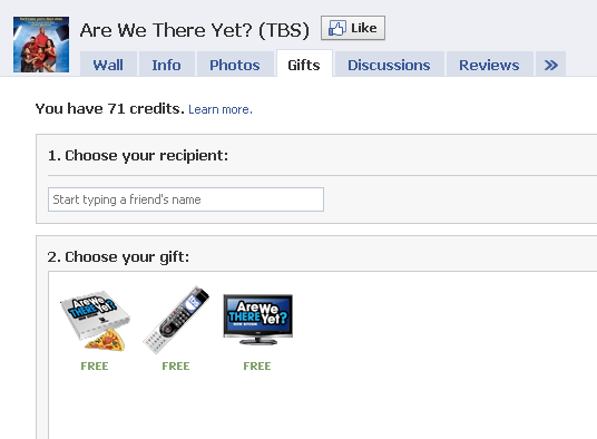
If you click on the ad unit, you arrive at the TBS "Are We There Yet" page and go directly to their gift tab. The gift tab features a richer version of the ad unit: users can choose among three different gifts to give their friends - and they can make them public or private:

Groupon's Facebook Widget Includes Referral Invitations

You could do several classes around Groupon and LivingSocial's product / product marketing expertise. Here is a very simple example of how Groupon does the little things very well.

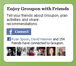
Many sites have Facebook Connect buttons across their header or footer - and when a user is logged in, their name and Facebook icon appears. Like many social features, Groupon goes a step further. In addition the large Facebook icon, the promotional module features similar content to the new Facebook widgets: the number of your friends who are also connected and the names / images of a few of them. For a popular service like Groupon (154 friends are connected!), this is a compelling way to welcome and encourage users to connect.

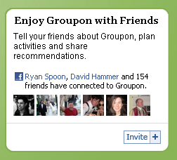
Once you are connected, an invite button appears. When clicked, it allows you to share directly on Facebook... and it automatically includes your Groupon referral link. Referrals are an important marketing / viral mechanism for sites like Groupon, Gilt Group, etc - and while they each have their own invite flows, this is a clever, streamlined integration.

Starbucks: Share on Facebook, Receive a Via Coupon

A few days ago, I highlighted the latest Carl's Jr. Facebook campaign and noted the impressive mix of product, virality, advertising and consumer benefit (aka coupons and rewards).

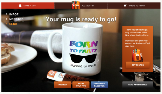
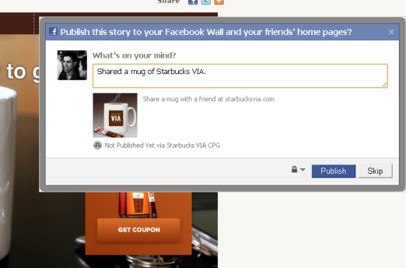
Below is a similar effort from Starbucks - who, at 7.5m fans, is one of the most prominent and innovative brands on Facebook. Users create custom mugs of coffee using Starbucks new Via product. Once the mug is created and customized, users are asked to share on Facebook - and are rewarded with Via coupons (which can also be shared). Also like Carl's Jr. - the coupon is only available for users who share their creation. In effect, it becomes an incentivized referral program.

The difference between the two campaigns is that Carl's Jr. occurs entirely on Facebook and Starbucks lives on their own website. My guess is that virality is greater for Carl's Jr. - who can advertise more effectively on Facebook and not suffer drop off between domains.

Once you have create your custom Starbucks Via mug, you can share your creation on Facebook.

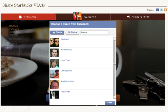
The mug can include photos from your Facebook feed or your friends' feeds.

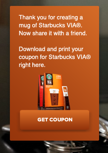
Your reward for creating and sharing is a coupon for Starbucks Via.

Carl's Jr Launches Viral Ad Campaign on Facebook. It's Great.

Remember Burger King's 2005 Subservient Chicken ad campaign? It is listed on Wikipedia as a notable example of "viral marketing campaigns" and was cited by Wired Magazine as one of the most successful viral ads to date. But while those campaigns can be very successful, they are tremendously difficult to emulate / predict / promote. Today - thanks to platforms like Facebook - viral means something different... and it is easier to create and foster. Here is Carl's Jr current viral ad campaign running on Facebook. Alongside screenshots, I will walk through the campaigns various components... which together are:

- a very compelling mix of advertising, product development and viral mechanics (feels as much 'Zynga' as it does advertisement)

- an effective mix of advertising and viral growth. Carl's Jr. is kickstarting the campaign with premium Facebook Ads and then relying on user-generated growth

- rewarding. We know from Facebook and their sampling platform that users love free stuff. Carl's Jr. provides that and rewards users for sharing.

Here is the Carl's Jr. premium ad running on Facebook. Any advertiser knows that creative is critical - particularly on Facebook. This combines a great call to action: "Fan Up for Free Food" and a racy photo.

Click and arrive at the Carl's Jr. Facebook Fan Page. It has a large Facebook Login button - as this is essentially an application within their fan page. Also notice the focus on creative again: "Click for Awesome" and the big "Spin Credits" which stand at "0".

Proof again that this is basically an application within their fan page: once you click the Facebook icon, you have to give the app permissions for profile access and graph data.

Once you allow permissions, you are granted a free spin from the Carl's Jr. wheel of free stuff. Everyone wins something - some prizes are big and others are not (like my free coffee and hash rounds with a breakfast burger purchase).

People love rewards and free stuff - and because everyone is a winner, everyone is incented to share with their friends. Here is your opportunity. Carl's Jr. does a good job with the creative here - which is a critical component for feed promotion - for instance, the image is unique to the prize.

Want more spins on the wheel of free stuff? Invite Facebook friends and, when they take a spin, you earn more credits: "every friend you get to spin the wheel of awesome wins you an extra spin!"

These invites are another opportunity for Carl's Jr. to drive awareness. So the flow and touch points are: - advertisement (where you can see which friends 'like' it) - fan page (becoming a fan appears in news feed) - promotion of your prize (via your news feed / wall post) - viral invites

AT&T Pushing Additional iPhones Between Android & Apple Announcements?

My day of short blog posts continues....

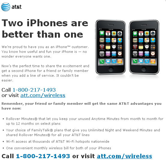
The below email from AT&T ('Add an iPhone today') is interesting because:

- it arrived in my inbox a few days ago (May 15) - is in advance of the supposed June launch of the newest iPhone ... which will also supposedly be on AT&T

- it comes just a couple days after the announcement that, for the first time, Android devices are outselling the iPhone (see here) ... and AT&T's Android offering is weaker than Verizon's or even T-Mobile's

- there is no incentive whatsoever to add an iPhone - no discount, family plan, etc

- it was sent in advance of Google's I/O conference - which would obviously focus on Android

It strikes me as an attempt to squeeze in sales between Android growth, Android news and the forthcoming iPhone. Of course you could argue it is an indication that perhaps the next generation iPhone, as many hope, is available beyond AT&T???