Dogpatch Labs SF Gets a Remodel, Taking Applications

This week Dogpatch Labs San Francisco underwent a slight remodeling. In addition to new residents joining (and a handful 'graduating'), we rearranged the layout to better accommodate teams and add some more space.

Apply to Dogpatch!

On a different note: Dogpatch Labs San Francisco currently taking 'applications' for new residents as some space will come available in the next 30-60 days. If you are interested in applying, please email me at rspoon _at_ polarisventures.com with:

- company / concept description - bio(s) and links to online activity (ie Facebook, LinkedIn, Wordpress, Quora) - interest level and number of requested desks

Thanks!

Twitter Takes Over Mobile Site to Promote Twitter for iPad (Love It)

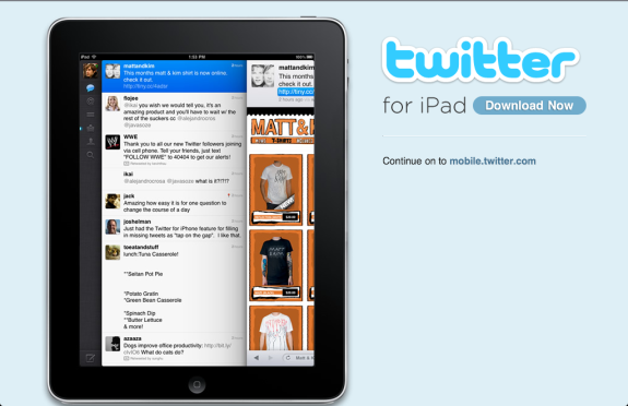
Two weeks ago, Facebook rolled out their new Places product; and, to drive user awareness and adoption, they prominently promoted it within their mobile application and web experience. This week, Twitter rolled out Twitter for iPad. It's an exceptional product and I encourage non-Twitter users to trial it as well... the user experience is that good!

To drive awareness of the new application, Twitter is delivering an interstitial to users browsing via an iPad. It's big, highly relevant and promotes the application over the web experience (just compare the size / placement of the 'download button' vs. the mobile.twitter.com link).

It's another great example of driving usage through relevant promotion (relevance defined by placements and user targeting)... and what I refer to as getting product "in the river".

Facebook Images Channels Its Inner Google Image Labeler

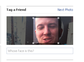
As I preface every Facebook post, it is difficult to tell how widespread a feature (or test) is because they are constantly testing new products to different segments of their massive audience. With that out of the way, I have started to see image tagging units in the advertising panel on Facebook image pages. It probably appears on <5% of impressions. It shows an answer with someones face and asks you to tag it. My guess is that it is a mechnical turk like confirmation of friend tags, or more far fetched, an experiment to confirm their facial recognition

But my first reaction was actually neither of these things. It was a recollection of Google's Image Labeler game / tool from a few years ago. Speaking od game mechanics and Mechanical Turk - Image Labeler was ahead of the curve.

Google would have you paired with another user in real time. The goal of the game is to both type the same word - any descriptive word- about a series of images. Upon user pairing, it would reveal an image synchronously and a list of obvious words that you can not use in the game. Once you both enter the same descriptive word not on the banned list - points are awarded (function of speed, accuracy) and the next image is loaded.

Its simple to play. Its synchronous. Points are awarded and leader boards are displayed throughout the experience - so its competitive. And it assists Google and their various image / algorithm / matching technologies.

A Week of Dogpatch Labs Updates

A handful of various updates from Dogpatch Labs companies across our three locations: Boston, New York and San Francisco. This is by no means a complete list - but it is includes links from TechCrunch articles within the last week:

YCombinator Demo Day Includes Dogpatch-ers

Congratulations to the 36 companies that launched at the most recent YCombinator Demo Day. Three of the companies are of Dogpatch Labs: FanVibe, Rapportive and one that is 'off the record'

Zozi Funding

Local-Activity Site Zozi Lands $3 Million Series A From 500 Startups And Zig Capital

WiseStamp Launches Its Platform

WiseStamp Signs Your Emails With Tweets, Stumbles And Plans

Facebook Places + Photos Makes Sense

I have been really impressed by Facebook Places - which I think has done a terrific job simplifying a rather complex product and making it usable / productive for a massive audience (which in turn complicates simplicity). If I could change one component of the product - and I really only have one suggestion - it would be to add photographs. Four reasons why:

1. I believe that images are becoming integral pieces of explaining location / local activity. Checking in at a restaurant, theme park, ballgame, etc are all well described by time, title & description and photograph.

2. GPS & photographs are tightly related on the mobile device. Putting them together in the Places product could still be done simply and comfortably.

3. The lack of integration makes me frequently choose between posting a newsfeed photograph and describe location via the description... OR forgo an image and post via Places.

4. Finally, if Facebook Places is to ultimately also become a directory of businesses, reviews, etc - photographs must be tightly integrated.

Check in or post a photo? Why not both...?

Can the Apple iTV Bridge Family Room & Web? I'll Bet So.

Fascinating chart on AlleyInsider this week noting that, for the first time ever, pay TV has lost subscribers. A little earlier in the week, the NYTimes argued that TV is changing (web, applications, on-demand) but paid television still rules the livingroom.

I shared the NYTimes article on Facebook with the following the note: "We will break our dependence. But - it will still likely include paywalls... but rather than for cable - it will be for content."

And that's why I believe the forthcoming Apple iTV is important to the TV / Web transition. First, it's at the right price: supposedly $99. And knowing Apple, it be designed simply enough that connecting the device to the TV and the web will be easy as 1. 2. 3. Until now, consumers had two options - both of which disqualified the above points (price and simplicity):

1. Buy a mini-computer (ie Mac Mini or Dell Zino) and connect it to the TV. Plus: full operating system and highly customizable. Con: very expensive (~$500-$1,000), complicated and techy.

2. Purchase a brand new, web-enabled TV OR a gaming device. Pro: out of the box usage. Con: expensive and limited / poor experience, content selection, etc.

If the rumors are right - Apple can change this with:

- a $99 price point (fraction of any other reasonable alternative)

- an iOS interface that tens of millions of users are familiar (iPhone, iPod Touch, iPad)

- simple integration and web browsing (try using the web on XBox or PS3 - it's *very* limited)

- and an unmatched catalog of content and applications (not to mention developers - which is more important)

Suddenly web browsing, iTunes, Pandora, Netflix streaming, MLB At Bat, etc are all imaginable. And its a more natural solution - at least in the short term - than through the television manufacturer, the gaming devices, etc.

Facebook Places Promotion on Facebook Touch

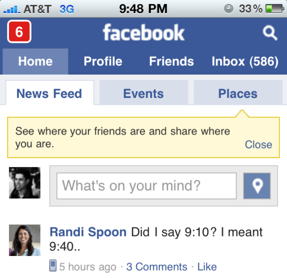
When Facebook launched Facebook Places, I wrote about how they boldly and centrally promoted their new feature. Here is a similar example from Facebook's mobile web experience - Facebook Touch. Like the YouTube HTML5 promotion, there is a spotlight box that sits between Facebook's header and the newsfeed input box... which means there is no way you can miss the unit.

In addition to the messaging, notice the Places button that offsets my profile icon and sits to the right of the input box. It is less obvious but, again, very prime real estate.

You can tell how much of a priority Places is to Facebook, a company that takes web design and each pixel very seriously:

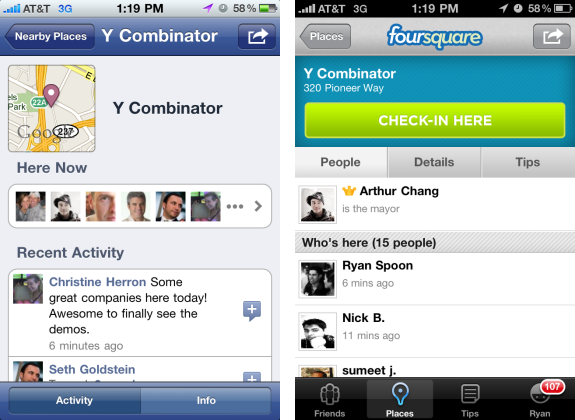
Facebook Places vs. Foursquare at YCombinator Demo Day

I had the pleasure of spending yesterday at YCombinator's Demo Day. 36 companies presented and launched - three of which were Dogpatch Labs residents: Fanvibe, Rapportive, and an off-the-record company. While there was plenty of news around the companies, spaces, etc - I found it interesting to see how the crowd of YCombinator entrepreneurs, investors and friends / family checked into the event.

The result? Totally even: while the numbers fluctuated a little bit, there were roughly 15 check-ins on Facebook Places and 15 on Foursquare.

Facebook's Top News Feed - Older Items?

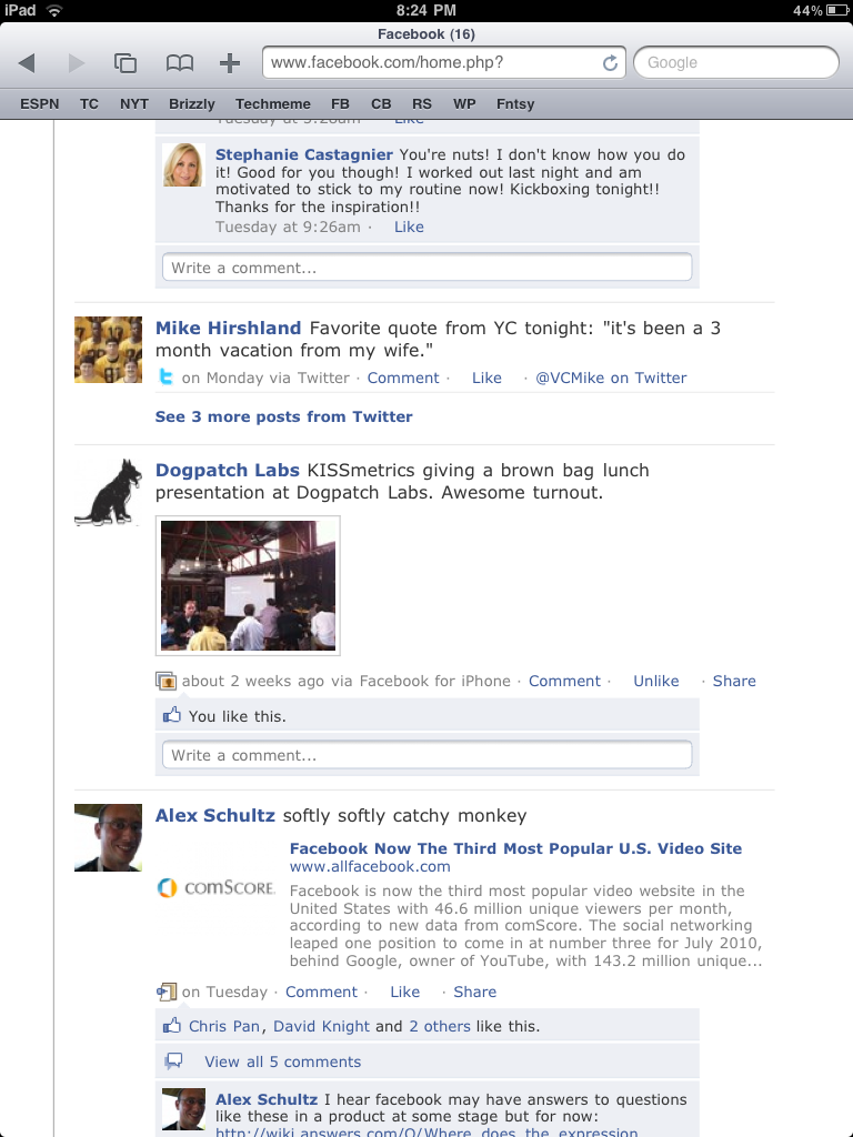
I can't tell if this is:- an algorithmic enhancement - a bug - an indication that my newsfeed is becoming less interesting - an indication that I am not liking enough current / real time activity ... But my Facebook Top News feed is beginning to display content from beyond the last 24 hours. In some cases it extends up to two weeks ago (see below screenshot). I frequently see posts from over a day ago - but have since seen posts from several days (and now weeks).

While it could be an algorithmic change, it could also be an effort to better archive feed activity (particularly if Facebook considers the more aged content as "extra top news").

I am clearly reaching - but interesting to think about how Facebook deals with backward search and archival over time. In fact, in two discussions yesterday - old Facebook posts were discussed (pointing to a newsfeeed post / link) and we gave up trying to find it as it was months old.

Whether it is Facebook or a developer (both are likely), there is clearly a business opportunity to archive ones digital life - with time, search, and filtering (whats important) being paramount.