Amazon Marketing the Kindle for Valentines Day 2011... with Same Ads as 2010

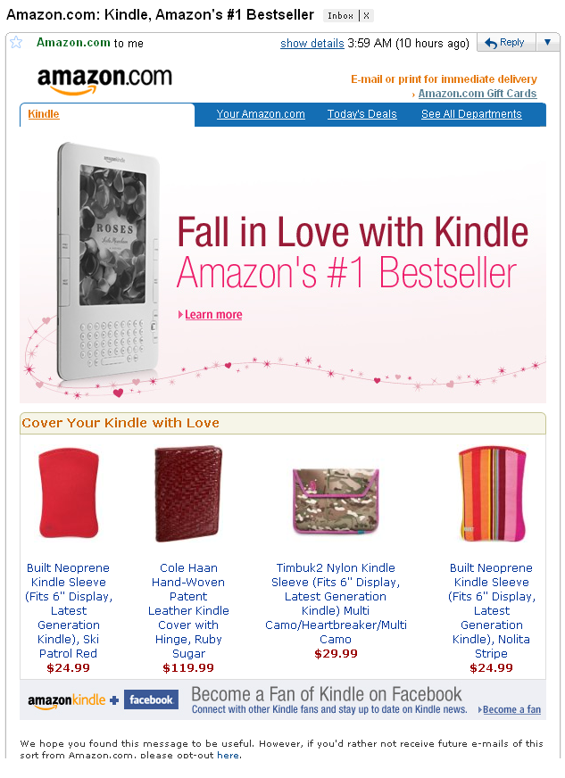
Since its launch, I have followed Amazon's Kindle ads and campaigns. Today, you will notice that Amazon is marketing the Kindle for Valentines Day... and if you look back a year ago, you will also notice that the Kindle ads are almost exactly the same. Furthermore, the language is consistent with nearly every Kindle ad to date: it's their best selling, best-reviewed and most wanted / gifted product. It seems that, even after a year, Amazon is confident in wrapping the same messaging in seasonal units.

The Kindle ads for Valentines 2011:

The Kindle ad for Valentines 2010:

Innovating Around the Check-Out Rather than the Check-In

Couponing is a hot space and companies are finding success from different angels: Groupon for local deals, Foursquare and Facebook for check-in promotions, Shopkick for in-store 'gaming', etc. But the reward / redemption remains clunky and, rather than the check-in, we need innovation around the check-out. Here is a good example. I received the below Best Buy Rewards Card via my email - I have $35 of Reward Zone credits.

So I visited Best Buy to redeem it... with only my iPhone and the email. In theory, that should be enough - after all, Best Buy sent the email and it includes my Reward Zone number, which is sitting in their system (which cashiers and employees can access by name, phone number, card, etc).

But the cashier could not access the point balance at the register and could do not apply the coupon without having a hard copy of the certificate. She pointed me towards the computer section and had me use a public machine to print the coupon (this process required manager supervision and took 5-10 minutes). With paper in hand, I went back to the cashier and restarted the check-out process.

There are several ways to imagine a crisper process for the consumer and company. Of course the trouble is integrating across various systems that, for various reasons, do not speak to each other... That's the challenge and that's why focusing on the check-in is only part of the solution.

Internet TV Summed Up

Despite being one of the few Google TV fanboys, I thought this Amazon Video On Demand screenshot summed up the space well:

The top of the page represents the good: software accessible via various devices and platforms. And content delivered on-demand, quickly and either free or cheaply.

The bottom (highlighted in green) represents the bad: hardware integration that will be problematic for manufacturers, developers and consequently consumers.

"Watch Instantly on Your TV with VIZIO: Now you can watch thousands of movies and TV shows on select VIZIO HDTVs. Order hit new releases and the latest episodes in HD, right from your couch and begin watching immediately. Learn more."

Anecdotally, this is precisely why I am bullish on Google TV: despite being hardware, it integrates outside the TV and is therefore cross-device. The Google platform allows developers to build better products, work across TV sets and manufacturers, and reach larger audiences.

Polaris Insights Google Chrome Extension - Download Now!

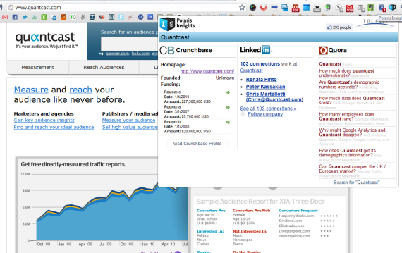
What sites and apps do I use on a daily basis? Quora, LinkedIn, Crunchbase and a slew of Google Chrome extensions (which I've written about before). So why not put all of them together and create a Chrome Extension that reveals: - Funding and company history (from Crunchbase) - Employees and your connections (from LinkedIn) - Topics, questions and answers (from Quora)

... And that's what I did. Along with Matt Basta and Rob Abbott, we built the Polaris Insights Chrome Extension.

- Read more on TechCrunch: Quora + CrunchBase + LinkedIn = Best Extension Ever?

- Read more on ReadWriteWeb: Check Out My New Favorite Browser Plug-In, Built by a Venture Capital Firm

- Download Polaris Insights

Facebook as a Conversion Tool. Registration Flows as Example.

It is common to think of Facebook as user / traffic acquisition lever (perhaps the best available considering its 600m users, its viral network, and the developer platform and tools). But thanks to a recent, enlightening conversation with good friend Alex Schultz, I have been thinking of Facebook as a conversion tool. A basic example is Facebook's Like buttons and Facepile which adorn millions of webpages. Combined, they welcome new users to otherwise impersonal webpages. This adds social and personal context to individual pieces of content and increases the likelihood of engagement (whether that be pageviews, shares, etc).

Yesterday, Facebook updated its Registration Plugin to streamline user registration:

Registration flows are obviously among the most critical part of the user funnel. Flows that are too cumbersome are overwhelming and scary...and flows that are too lightweight require progressive registration processes as the user matures. The above example is an excellent example of how Facebook can affect conversions.

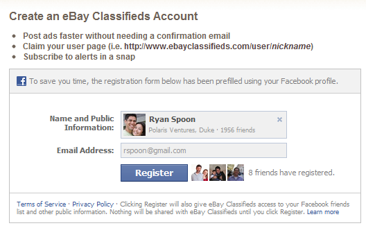
Here is a live example on eBay Classifieds:

It does a four key things well:

1. It is pre-populated with key information (name, network, photo, etc). Not only does this create efficiency - it validates quality

2. Thanks to Facebook's brand, it is familiar and unintimidating.

3. The Facepile adds social context and is welcoming. Along with point #2, this is particularly important if traffic is arriving from ad campaigns, search engines, etc.

4. It is lightweight (publishers can choose to add fields relevant to the product)

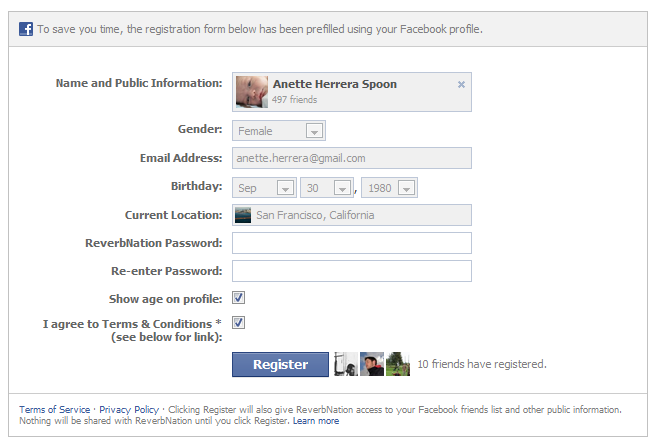
And here is another example from ReverbNation. It is a longer registration flow but you will notice that it is consistent in style and much of it is automatically populated. In fact, the only remaining step is creating a specific ReverbNation password:

Adam Sandler's Just Go For It Trailer is Facebook Themed

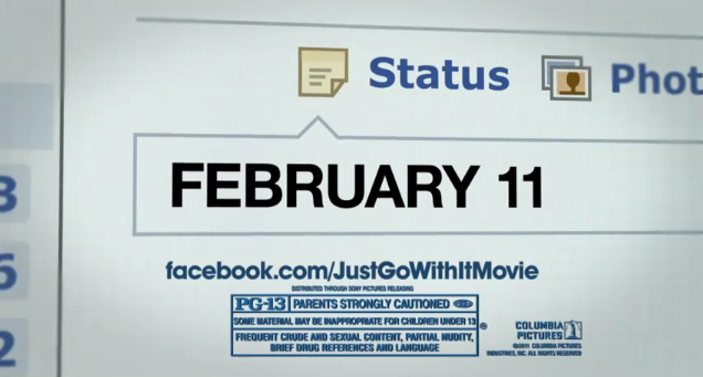
Continuing the theme of posting about TV commercials... here is the latest spot for Adam Sandler's new movie "Just Go For It." The entire spot is created around Facebook: it opens with a Like button (on Brooklyn Decker) and then narrates the story through the Facebook newsfeed and profile. Clever and it will clearly resonate with Adam Sandler's core audience.

Also, instead of promoting the movie's website (http://justgowithit-movie.com/), they promote the Facebook page (http://www.facebook.com/justgowithitmovie). In the other TV spots - including the original trailer - JustGoWithIt-Movie.com is promoted.... I give them credit for continuing the Facebook theme and promoting the movie in context.

Blackberry App Advertising Two Years Behind Apple's

During today's NFL playoffs game, you may have seen the Blackberry spot featuring Blackberry's App World and the Urbanspoon application. The advertisement is well done and features small business owners (right in Blackberry's sweet spot) who use the Urbanspoon app to find new restaurants (seems like a reach?). However, the ad comes over two years later than Apple's iPhone Urbanspoon ad (featured in November 2008) and screams 'me too'.... which is exactly what Blackberry (and iPhone competitors) should be wary of: it's been available on the iPhone for years and, for various reasons, is probably a better application on the iPhone.

Blackberry should be focusing on one of two things:

1. Content and applications that are unique to Blackberry. For cross-platform applications, chances are they were available on the iPhone first... and that they are generally better on the iPhone.

2. Content and application aimed specifically at Blackberry's core competencies: business and email. This is why the Urbanspoon ad comes off as "me too" and off-brand. It's also why I don't understand the focus on Blackberry Messenger campaigns (which, by the way, seems short-lived with apps the rise of social group apps like Groupme, Beluga, Kik, etc).

Blackberry's January 2011 TV ad:

November, 2008 Apple iPhone ad:

Starbucks Cards: Game Mechanics Done Well

Last week I wrote about the "do's and don'ts of gamification"... in other words, how to effectively add game mechanics to your site / service. Thanks to the success of leaders like Zynga and Foursquare, companies across different verticals are layering game mechanics to their product. In my last post, I wrote that the key to successful "gamification" is to make surre that game mechanics [are] natural, rewarding and straightforward.

Here is a great example from Starbucks (who generally always does a great job on the social and marketing fronts).

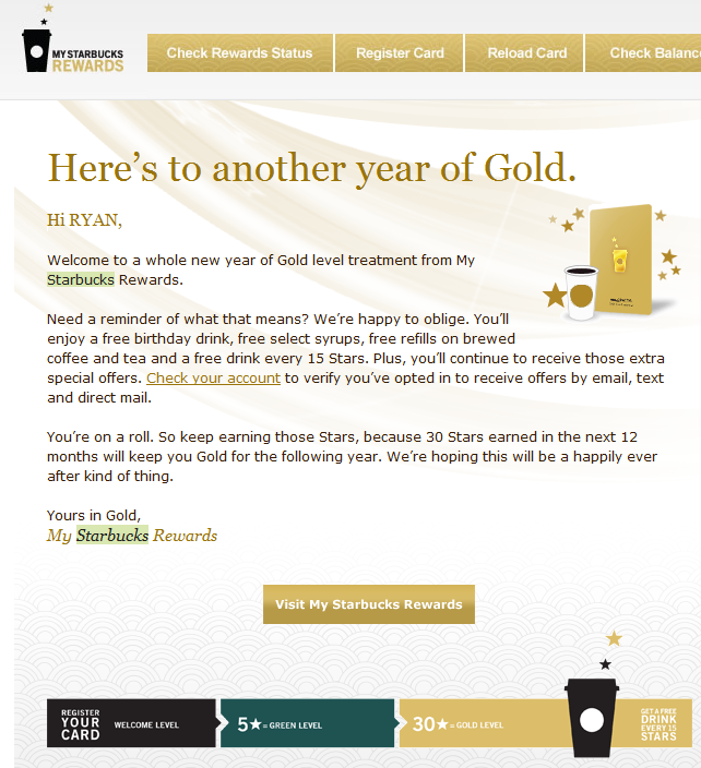
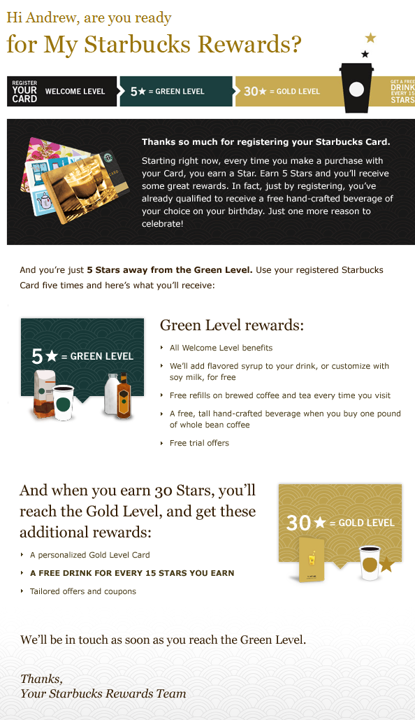
You'll notice a few things with the below screenshots:

1. It is Natural: Starbucks has not created a new program here... rather, they have tied it in to the Starbucks Card system that has been around for years. This is just an incentive to register and actively use your card.

2. It is Rewarding: In fact, the Starbucks Card program comes from the "Starbucks Rewards Team" and card-holders are notified of their status, their rewards and their goals.

3. It Progresses: As you progress through various levels are membership ("black, green, gold"), you earn different rewards. Starbucks clearly defines your 'status', your rewards and what is needed to reach the next 'level'. Again, the program is straightforward and rewarding.

4. It is Accessible Email, Starbucks.com & Mobile: The program has several reach / access points. The emails are well crafted and targeted to the specific user's 'status' (notice below an email sent to a green member and gold member).

5. It is Social: Below you will also see an example of sharing your purchase and rewards in Facebook. The image is specific to your status / balance and is tied to a check-in via Facebook Places.

Starbucks email sent to a Gold member:
Starbucks email sent to a Green member:
What the check-in looks like on the Facebook feed
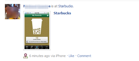
And the custom Starbucks Rewards graphic on Facebook


Streaming Netflix on your Gym's Cardio Machine? Awesome.

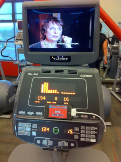
In December of 2009, I wrote about local fitness company Expresso - the maker of an interactive workout machines that I was blown away by. Here's the next wave - which should become more commonplace and eventually will be built into all sorts of machines. Our local gym (the Palo Alto JCC) has the iPod / iPhone connectors for their cardio machines. Those adapters charge your device while working out... but more importantly, they allow you to run media to the machines' individual screens (which can be attached or built in monitors - both examples are below). So, users can stream Netflix to their machine's monitor, access iTunes files, or supply a soundtrack to the native fitness application.

It's proof on just how prolific Apple devices are (this is not merely a mini-usb port).

It is also an indication of where fitness machines are moving - it is not difficult to imagine the machine being able to push content to your phone... or to a specific application.

And lastly, it is not difficult to imagine that this occurs via bluetooth in near future (just as it does in new cars and in products like the Jambox).