Where in the Bay Area should I live to be a part of the startup action?

Continuing to post select Quora answers on my blog - you can view them here.

Below is my answer to the Quora question "Where in the bay area should I live to be part of the startup action?" And below that is an interactive map put together by Garry Tan. It's terrific and has notes on each community in San Francisco, Mountain View, Palo Alto, Berkeley, etc. I hadn't seen it - but worth playing with. The two major hubs of entrepreneurial activity are: SOMA in San Francisco (5th street and north, Market street and east), and Downtown Palo Alto

If you want to be around "the startup action", find a place in either of these hubs. So many start-ups are based in these areas because the train is accessible, the areas are walkable, and it consequently helps with recruiting.

For what it's worth: I've lived in both areas. They are equally great.


View Garry's SF Guide to Where Your Startup Should Be in a larger map

LinkedIn's '2010 Wrap Up', Engagement Email

Your typical email from LinkedIn is text-based and includes some sort of notification about your network, messages, etc. They are straightforward, actionable and likely focus on conversions. A very different email arrived from LinkedIn this week though: The 2010-year-in-review email. I'd love to see the metrics as compared to their normal emails - I assume behavior is quite different... but so is LinkedIn's goal with a 'newsletter' like this. And that's why I like it: very different, very creative and yet still on-brand: - first, it's very different from what I'd expect. There is only one line of text and it is interesting (345 of my contacts started something new in 2010).

- It's highly visual and great looking. Tons of visuals and tons of familiar faces that catch my attention.

- It's clever. The targeted blue boxes draw attention to specific people and do so in a very unique, catchy way (See Paxton's new job!).

- And it's actionable... but in a very different way than the standard LinkedIn email. Simple but strong language.

Huffington Post, Google Promote Chrome Application 'In the River'

I write a lot about the importance of marketing and promoting "in the river" - my terminology for engaging users in the most specific and relevant experiences / locations. This concept is increasingly important new platforms (software and hardware) emerge and as those experiences consequently change. Just the other day I wrote about how Evernote has done a masterful job creating numerous applications for each native environment: iPhone, iPad, desktop, Outlook, browser, etc. This will become the norm... and the result is that targeted messaging becomes tougher and more challenging.

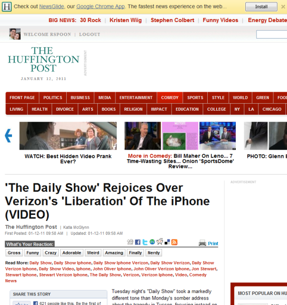
Here is a great example from Huffington Post (along with Google & Chrome) - who is always far along the marketing & experimental curve. If you visit their site in the Google Chrome browser, the header is taken over to promote their new Chrome Application: Newsglide. Simple - but brilliant. This messaging would be overlooked if it were a traditional location. And it would wasted real estate if it were a universal promotion. Furthermore, the promotion is native to the experience (a similar action in Firefox would look different).

It wasn't long ago that I commented on Huffington Post's in-experience promotion of their Google Chrome Application (see example here).

What are the do's and don'ts when introducing game mechanics in a website?

What are the do's and don'ts when introducing game mechanics in a website? Note: this is my answer to a Quora question. I post them to my blog from time to time... which you can view here.

People can chime in with specific, tactical responses to the question... but my simplest response is probably the best: Game mechanics must be natural, rewarding and straightforward.

Think about classic examples of game mechanics: - eBay's feedback rating - Twitter followers - MySpace friends - Amazing Review counts - Quora answer votes - etc.

They share the same common characteristics: the mechanics fit clearly into the site experience and are unique to that environment. Furthermore, they are integrated deeply enough into the product / experience that they are never interpreted as 'game mechanics'.

Sites struggle when game mechanics become one of two things:

1) a superficial layer - ala creating a badge strategy that is neither rewarding nor core to the web experience.

and / or

2) too complicated - for instance, badges and rewards for a myriad of activities. Simpler is easier to digest and therefore easier to incentivize. This too is exacerbated by not being core to the experience.

Write Once, Read Anywhere (Evernote Example)

Earlier in the week, I listed the productivity and work applications that I use daily. I concluded that the applications I most rely on not those that are the most robust... rather, its those that are most portable and efficient. A great example of that: Evernote.

Note taking can be done in many forms: word docs, notepad, email, competitors, etc. But what makes Evernote so appealing though is that it is available everywhere:

- Web - Chrome App - Chrome Extension - Desktop App - iPhone App - iPad App - Email - etc...

What is notable is that each of Evernote's applications / versions have specific use-cases for that environment. The Chrome extension, for instance, is focused entirely on web-clippings. And the iPad App is very different than the iPhone app. When most properties think of building for different platforms - it is often recreating an experience (which is often the web). Evernote shows the power of building for multiple environments and building tools specific to each environment.

The Key to Conversion Rates

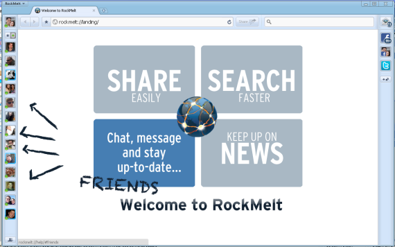
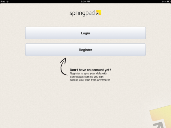
The key to strong conversion rates? Squiggly lines. That's right: squiggly lines must help with conversions... otherwise they wouldn't appear on every imaginable registration / new-user page. Right?

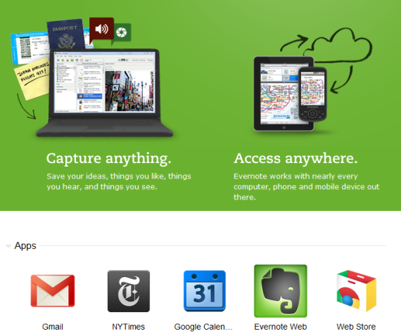
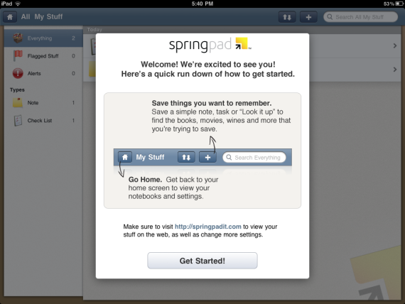
Here are examples from Evernote, Highrise, Rockmelt, and Springpad. And that too just a moment to come up with:

Entering 2011, My Daily Productivity, Work Apps

After yesterday's post (2011 as the year of The Cloud and The Mobile Office), I was moved to list the apps and tools that I use on a daily basis (... at least as of January 2011!). I am trying to capture those utilities that I use most often. This is in no way comprehensive and is not presented in no particular order. What does your's look like?

- Wordpress: ryanspoon.com and dogpatchlabs.com run on it.

- Vaultpress: backs everything up. simple, great product.

- Evernote: committing to diligently using this in 2011.

- Highrise: committed to using it in Q4 2010... and love it.

- Xobni: makes Outlook better. And I live in Outlook.

- Google Apps: Gmail, Google Calendar, Google Docs, Google Chat.

- Skype: solely on the iPhone for international calls.

- Google Chrome extensions: I live on them. These are ones I use regularly: - Evernote - Quora - Goo.gl - Gmail Checker - Google Calendar - Web Clipboard - Google Voice - Google Screen Capture

- Google TV: I might be alone, but I love it.

- Tripit: the more I travel, the more I rely on it.

This of course does not include the list of websites and apps that I use daily... like Facebook, Quora, Netflix Twitter, Pandora, etc.

iPad's 2010 Rewind: "The Cloud" & "Mobile Office"

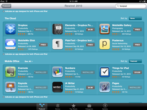
There is nothing profound about this realization or blog post... after all, it was sparked by Apple's iPad: Rewind 2010 promotion which has two categories of featured applications: 'The Cloud' and 'Mobile Office':

Again, this is not profound: but there are two major takeaways here:

1. Mobile is now ubiquitous and is both a productivity asset and a gaming device.

The suite of 'Mobile Office' applications really have changed both work and mobile behaviors - moving it well beyond email.

2. More importantly, our lives are now in the cloud.

It is interesting enough that the "Cloud" terminology is commonplace enough to make its way into mainstream promotional campaigns (from Apple to Comcast to Microsoft).

And it is interesting to think your computing behavior over the last year: what sorts of files do you save to your desktop? How do you navigate your machine and content? There is not much of my tech existence that is sitting on a device, unreachable through the cloud: email, calendars, contacts, notes, files, photos, etc. I often opt for lighter-weight solutions than robust applications - for instance, most of my 'work' is documented in Google Docs, emails and Evernote rather than in richer Word, Powerpoint and Excel files.

Of course there are times that Excel and Powerpoint in particular are necessary...and excellent products. But most of my usage is with products that more resemble "Notepad" than "Word 2010".

I guess that portability and efficiency are most important to me. And as we own numerous devices - phone, laptop(s), tablet, etc - these becomes more and more important.

The Borders eReader Counter: Too Many Options?

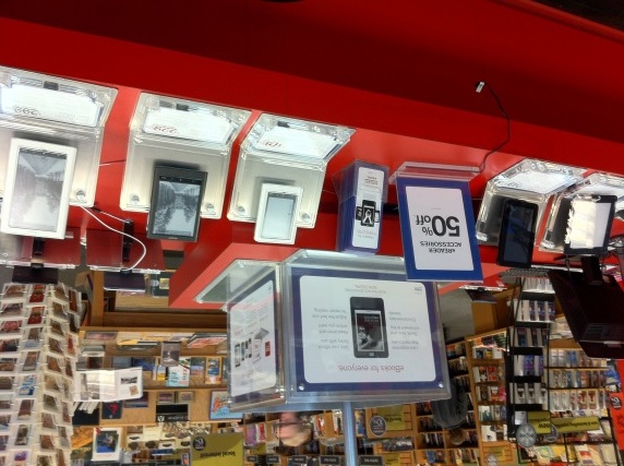
This is the counter at my local Borders for "eReaders". There are countless devices, prices, preferences, etc. If you are in the market for one of these devices, would you rather sift through all these options or pick the trusty and ultra-popular Kindle by Amazon? It's a similar situation to Android vs. iPhone. While there is absolutely an advantage in the cross device platforms (including lower prices for consumers) - it also creates headaches. There are so many Android handsets that it creates confusion... and it can create quality issues across the plethora of devices: some are great and some are sub-par.

And the same situation will occur as tablets become more prevelant / popular. Consumers will need to choose between dozens of options (hardware & software) and the iPad (a popular, trusted product that will likely come at a premium).