beRecruited Acquires Fanvibe.

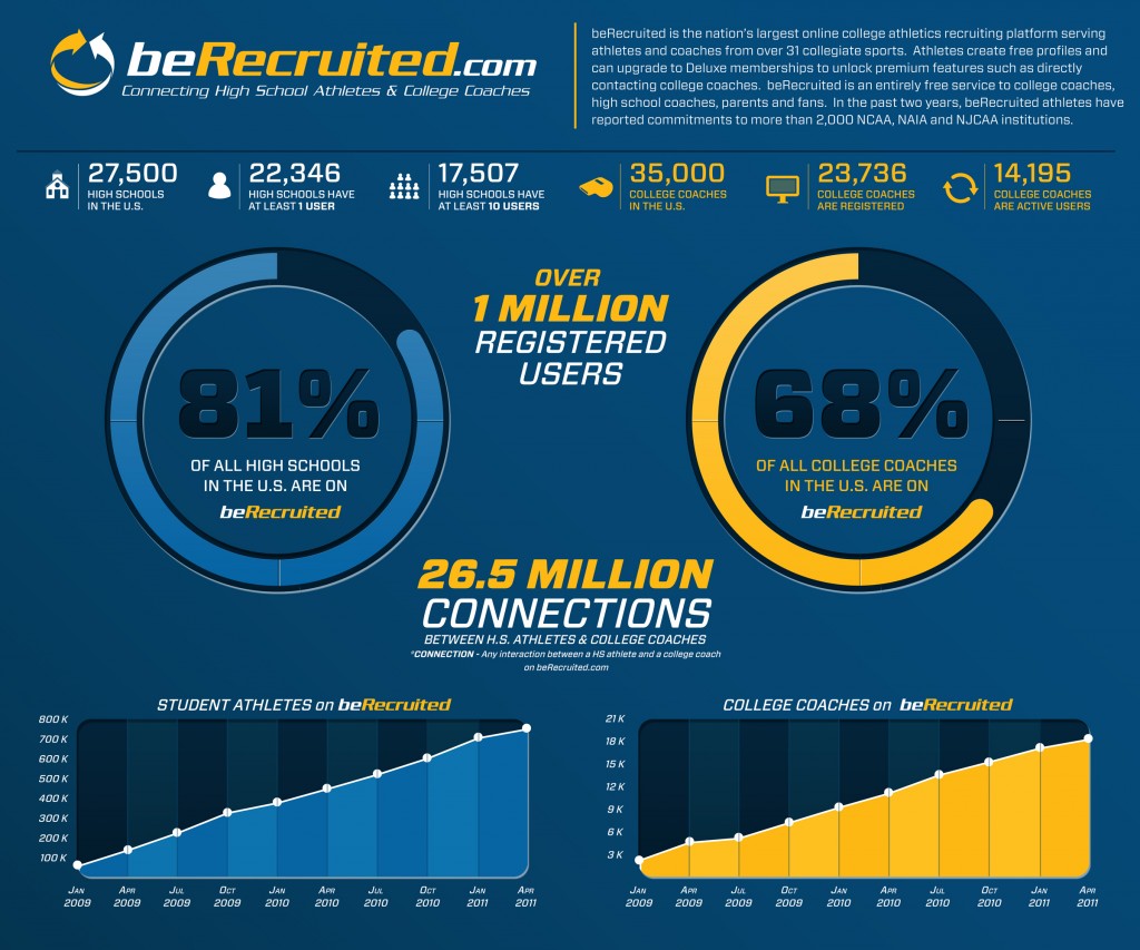
I am both excited and proud to announce that beRecruited (the sports recruiting network I founded way back in 2000) has acquired Fanvibe (a former Dogpatch Labs and YCombinator company). I have known Vishwas Prabhakara (now CEO), Art Chang and Joe Pestro for several years and am thrilled about what they bring to beRecruited and it's 1,000,000+ users:

As I mentioned to TechCrunch, “beRecruited is far and away the largest recruiting network on the web — and it has consequently become a really great business. With the Fanvibe acquisition, we are thrilled to move headquarters to San Francisco and have Vish, Art and Joe lead the business into its next phase. They are perfect fits as they all have strong backgrounds in sports, product and social web.”

The most satisfying part about being involved with beRecruited is the daily emails we get from successfully recruited athletes (and their families). With the Fanvibe team leading beRecruited's next stage, the volume of those emails should soar.... and that's exciting for everyone!

Here's a fun infographic the team put together. It does a good job outlining beRecruited's scale - we have athletes in 81% of all high schools and 68% of NCAA coaches. Between the two sides, we have now made 26.5m connections.

Apple, Twitter, iOS5 and Facebook's Phone Integration (Welcomed or Not)

The more I play with Apple's iOS5, the more impressed I am with the Twitter integration.And the more aware I am of the potential impact it has on Twitter... But why isn't Facebook integrated instead or along with?

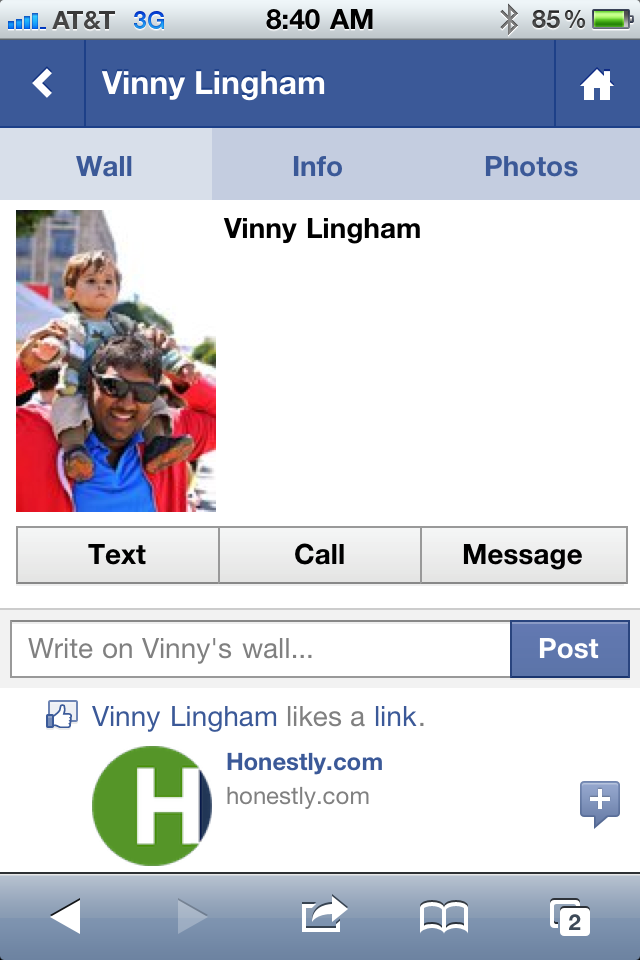
Lots of people have tried to answer this question, but perhaps the below screenshot is a partial reason.

There have been several occasions over the last week that I have misplaced a phone number and turned to the Facebook App to access the contact's number - and place the SMS / call. That's a powerful, threatening concept. And it makes sense: the majority of my contact list is now connected via my Facebook contact group. And those profiles have become complete enough that they usually include an email, phone number, etc.

Surely there is more to the conversation between Apple :: Twitter and Apple :: Facebook, but it fascinating to realize how much of your phone activity can be supplemented - or even replaced - by Facebook.

JetSetter's Search Box Promotion

I like the highlight examples of effective "in the river" marketing - the concept of placing product, promotion and marketing messages in relevant, active parts of the web experience. Lots of examples here... Here is another example from Gilt Group's JetSetter (which is one of the better designed and visually appealing websites).

The fundamental JetSetter experience is browsing really compelling, great-looking travel offers. Even with no intention of planning travel, I can waste dozens of clicks browsing JetSetter's delicious offers.

And while browse is JetSetter's primary experience, they are trying to drive search activity and have introduced both a search box and top searches. This is an obvious revelation because JetSetter overlays the message (along with today's top search) atop today's offer. It is bold, colorful and extends onto the offer and the right navigation pane. It also fades in (quickly and lightly) - in the rare case that you missed the unit.

On a side note: the "top searches" concept is interesting because it creates another browse + search experience that, in my opinion, is more shop-able. I believe that most significant travel (cost, distance, time) is *not* booked spontaneously... so the ability to search JetSetter deals for specific locations makes JetSetter more usable.... while still keeping the brand and web-experience in-tact.

Google Maps: Mobile, HTML5, "Desktop" Icons & In the River Promotions.

As Google continues to focus on HTML5 mobile experiences (and do it very well), they have to think about systematically driving usage... which, for mobile, requires 'desktop' real estate. And with core mobile applications, the app store's represent both distribution and the potential of screen real estate (ie icons / launch buttons). Google's strategy of focusing the mobile web experience is a good one... and it's shared by Facebook. But they both know that getting adoption relies on either deep OS integration or getting icons on the home screen.

So, when you visit Google Maps and their revamped web product (it too is done very well), they immediately and prominently prompt users to download the 'quick start' icon. Google has used this same tactic with YouTube (example here) - it's smart, effective and easy to integrate.

Yet another powerful example of "in the river" promotion / marketing.

Turntable.fm + Google TV is Awesome.

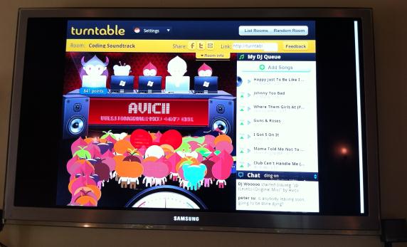
I am pretty sure that I'm the lone Google TV fanboy. I love the ability to merge the television with Google Chrome ... and to eventually lay the Android marketplace atop it (currently there are core apps like Pandora, Netflix, etc)>. And I give Google TV a better shot to amass great content and better UI than I do the hardware manufacturers (I have never used the Samsung or Sony appstores that come preinstalled on the TVs). Anyhow, here is another example of why I love Google TV: load Turntable.fm (http://www.turntable.fm) and your friends can share / DJ music throughout your home. And since:

- your TV is likely the home's largest screen - your TV is probably connected to your home's best speakers - and your TV probably sits in an open, social area

It's an excellent, optimal experience!

Haven't tried Turntable.fm yet? Here's a couple nice recaps: - TechCrunch: The New Early Adopter Addiction: Turntable - SAI: The Exclusive Music Site That Already Has Entrepreneurs Buzzing - Andrew Machado (super-fan): Turntable.fm - The Future of Music

Amazon's Navigation Bar Is Revealing

Have you looked at Amazon's core navigation pane recently... you know, where Amazon users start browsing through the online mega-store? ... It is fascinating. ... And it is revealing.

No longer are core categories like Books, Movies, Home, Toys, etc atop the page.

It is all about Amazon's Cloud services: - Instant Videos - MP3s & Cloud Player - Amazon Cloud Drive - Kindle (surprised this is #4 on the list!) - Android Appstore - Digital software - Audiobooks

I get that Amazon is pushing their new services and strategies... but it is a bold statement to put each of them ahead of the core experience (and where I spend 95-99% of my time / money).

Of course, for core products, homepage navigation is far less important than search and cross-product promotion. But it is a strong declaration of strategic focus.

Netflix's Fascinating Cancellation Questionnaire

I love Netflix. - They have revolutionized the way we think about movies and media - They have created a slew of new company ideas and models: "the Netflix for XYZ" - They have defined streaming content and challenged a traditional, massive industry - They should be credited with making new platforms and devices desirable: iPhone, Android, Google TV, Xbox, Playstation, Nintendo Wii, etc - And they are brilliant marketers with a terrific recurring model ... but after years of being a Netflix subscriber, I recently canceled my account. The reason is very simple: Netflix Instant doesn't have enough depth / inventory. We have watched the handful of documentaries that Netflix has (by far their most impressive category) and I even wrote a semi-popular Quora answer to which Instant movies are best: Exit Through the Gift Shop, Man on Wire, The Modernism of Julius Shulman, The King of Kong, The Universe of Keith Haring, Beer Wars, This Film Is Not Yet Rated, Food, Inc., Bigger, Stronger, Faster.

But the catalog hasn't expanded. Meanwhile, Comcast and Redbox have delivered great products / experiences (Redbox is a short-term business - but as a consumer it is absolutely delightful, cheap and easy). The future is clearly the Netflix Instant / streaming model - but it requires a worthy catalog to justify ~$100-$175 / year.

So I canceled my account.... with the hope that I will return as the catalog grows. Good news: Netflix keeps your queue and preferences in tact so that restarting is easy. Maybe they shouldn't do that - but I appreciate it and it certainly helps conversions for re-started memberships.

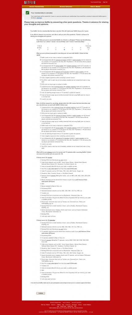
The most interesting part of the cancellation was the questionnaire (shown below in full). The attention to competition is fascinating: Comcast, Hulu, HBO, Showtime, bit torrents, piracy, etc are all mentioned. Also noteworthy are the answers to the question "why are you canceling?" One answer is "I have an Internet usage cap (or monthly download limit) and using Netflix puts me close to or over the limit." Unfortunately, over the next few years, I worry this will be an increasingly selected answer...

It is absolutely worth browsing the questions and available answers:

Quick Apple iOS5 Thoughts: Twitter & iMessage Win Big.

Having played with Apple's iOS5 for a couple days, here are two big thoughts and a few brief ones after that: 1. This is huge for Twitter. I can't understate how cool AND how meaningful the integration is. The phone is effectively hooked directly into Twitter such that your content is always shareable. As Twitter focuses on engagement - this is a remarkably powerful step forward. And - it is done beautifully. The animations are gorgeous and the sharing happens seamlessly.

Update: MG Siegler has a great write up on this topic

2. iMessage is equally impressive and important (just ask the carriers and the WSJ). I grasped the importance of iMessage from the WWDC announcement - but I didn't appreciate the user experience. When you messaging friends, it automatically / seamlessly transitions between SMS and iMessage based on their platform / phone number. The animations are great and the implications are broad (iOS product extensions, carrier monetization, SMS future, messaging landscape, etc).

3. Drag and drop calendaring is great.

4. Notifications are obviously game-changing to the consumer experience. For developers, this is a big opportunity to improve usability and engagement opportunities. For instance, ESPN Scorecenter is an entirely new application experience for me (and far more useful).

5. Small email tweaks are welcome (flagging, search, etc). Same with the mobile browser.

6. iCloud has gotten tons of attention, and rightly so - game changer for content purchasing and management.

7. There are so many new functions / enhancements that it is quite difficult to fully figure out usability. I have several Apple devices and this has been the most overwhelming transition yet. I'd go so far as to say it is mildly frustrating!

Facebook Deals Continues to Get Interesting.

I have written a fair amount about Facebook Deals and why it is interesting & worth keeping an eye on.... and it's timely as Groupon nears its IPO and Google & Amazon begin to enter the space more aggressively. On a side note: I continue to believe that Google be a leader in the space. Android + NFC + merchant / buyer market share give them several leverage points. Facebook Deals is clearly a work in progress - and it's not clear what kind of priority it is internally. However, there are signs that it could be interesting and powerful. Here is yet another reason to believe so:

1. I received the following deal via email. Remember that deals are all about email... and Facebook has the largest, most engaged email list on the web.

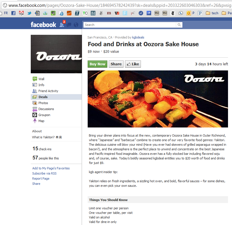
2. The deal directs me to the merchant's Facebook Page. This is really important. I am not being directed to Facebook.com/deals.... in fact, there is no link to get there. The integration between Pages & Deals takes advantage of:

A. the vast collection of merchants already on Facebook

B. further extends the importance of operating a Facebook Page

C. further extends the importance of driving Fans and rewarding engagement

D. connects Deals to Facebook Ads. Advertising on Facebook is more effective when it keeps users ON Facebook. This is yet another model for advertisers & merchants to make conversions work on Facebook.