Facebook Moving Sponsored Posts Above Ticker? Always a Balancing Act

Last week I wrote a post about the the balancing act of revenue versus user experience. These tug of wars appear all the time, for instance - while at eBay, I used to think a great deal about the trade-offs of SEO as compared to usability / design... tough decisions. And we see it now with LinkedIn (who recently became a public company) - whose web experience has shifted a bit towards revenue (suggested by my anecdotal, personal usage). This is all a set up to the following screenshot of my Facebook homepage - which seems to have shifted Sponsored Posts above the Ticker and Birthday / Events alerts. Sponsored Posts are clearly the big revenue opportunity on the the homepage - and, by being above the Ticker, CPMs, conversions, etc all improve. Of course that affects interaction rates with the ticker and therefore my friends.

It's always a balance. And it's fascinating to watch.

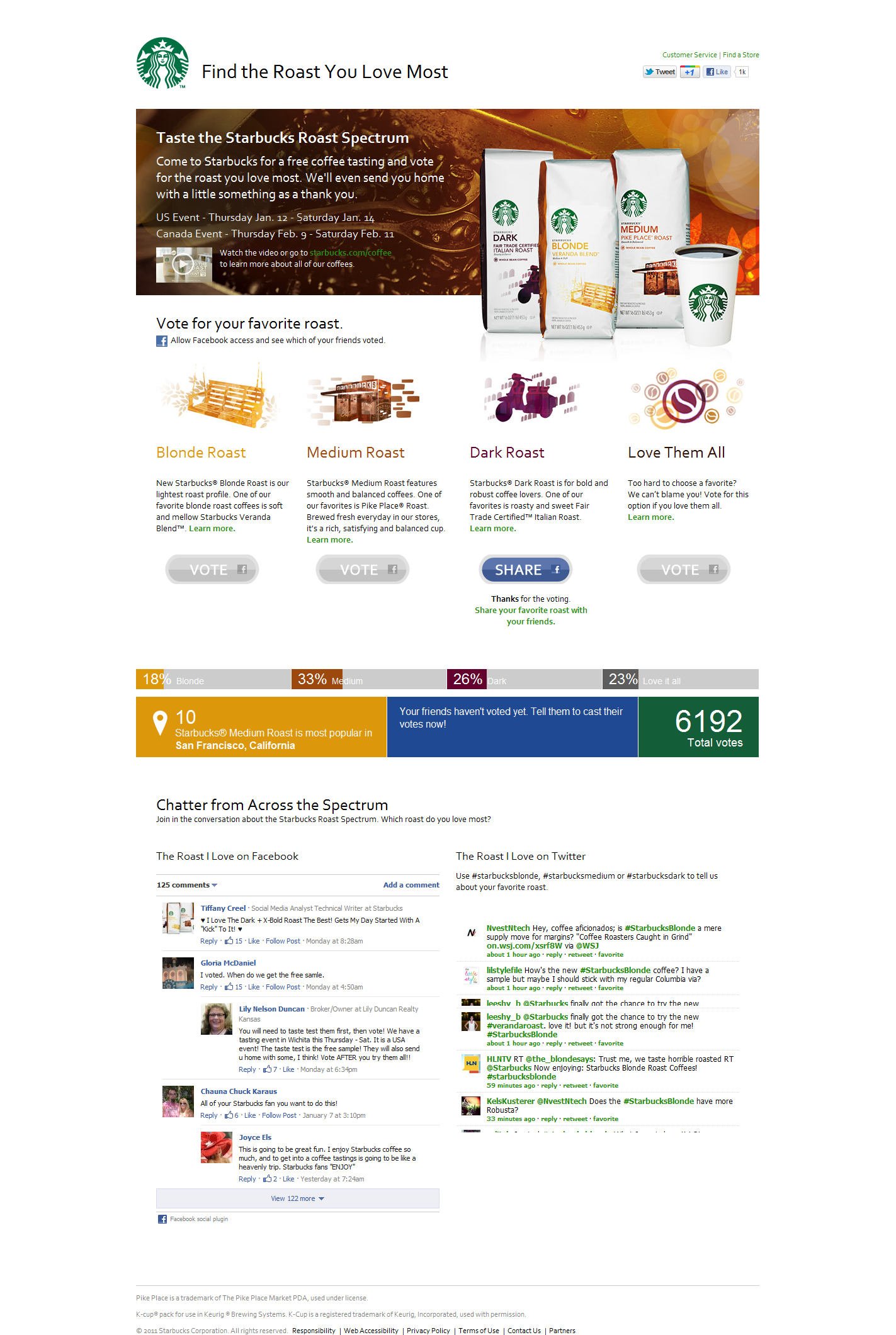
Starbucks Releases New Coffee Brew: Blonde Roast. Runs a Clever Facebook, Twitter Campaign.

This is a fun, light post from always-socially-creative Starbucks. Starbucks is unveiling a new coffee brew (the Blonde Roast) tomorrow (January 12th). In an effort to promote the new roast, they have created a social campaign on Facebook and Twitter called "The Roast I Love". It's clever because it's simple and fun... and leverages social data. In short: users vote for their brew of choice via Facebook and that creates a mini-infographic of sorts: - what your network drinks - what your geography drinks - what you gender prefers - what Facebook fans are saying - and what Twitter is saying

Clever. Relatively simple to create. And based on the activity stream - fans are engaging.

Klout, Perks and Packaging.

During the holiday season, why not write about great packaging? (a theme I have written about before) I am a big fan of Klout. Whether your specific number is truly accurate - it represents a general level of influence. And that's important for brands, marketers, etc. And it reminds me of Ken Blanchard's great quote, which in today's world means everyone is capable of influencing and therefore leading:

"The key to successful leadership today is influence, not authority."

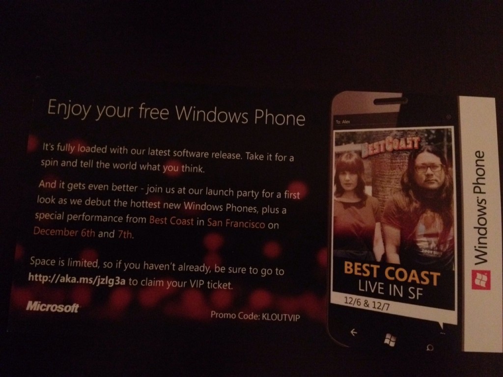
But back to packaging. I received a free Windows Phone from Klout's Perks program. It arrived in this colorful, branded box. The box itself is fun, the quotes are funny and on-brand (you got perk'd!)... and the experience of opening it and receiving a great perk is both exciting and fun. That's a win for Klout and, in this case, Microsoft.

It's also worth reading the insert from Microsoft. "Take it for a spin and tell the world what you think." That sums up the Perks experience well. Get product in front of relevant people. Provide a unique, fun experience. And encourage those 'influencers' to discuss and share.

How to Create an Early-Stage Pitch Deck

Note: This article originally appeared on TechCrunch ("How To Create An Early-Stage Pitch Deck For Investors"). It is the first in a series of posts / decks that I will be doing on those questions I get asked most commonly. Of course we will start with the question I get most: how to create a great pitch deck!

When raising capital, a combination of your company’s product, vision, team and execution are what ultimately attract investment. And while the pitch deck is ultimately less important than vision and product, it exists to convey both elements and get investors hungry for more.

Like other investors, I come across hundreds of pitches each month — some in person, others in email; some as PowerPoints, and others as full-fledged business plans. Your goal is to craft a deck that is both:

- crisp: succinct enough that it is easily digestible (in person, email, etc)

- and complete: thorough enough that it conveys the big vision and current traction

I looked back on many of the pitches I reviewed over the last couple years (good and bad) and compared it to public pitch decks of familiar, successful companies like Airbnb, Foursquare, and Mint. The output is this guide to creating an early-stage pitch deck. It’s intended for companies seeking seed and series A investments.

There are five core themes followed by a suggested structure:

1. Have a great one-liner 2. Know your audience 3. Keep it to 10-15 slides 4. Beware of the demo 5. Expect the deck to be shared

And remember: it’s the story and the conversation that is important – not the imagery and colors. If you can convey the passion that drives you (and your users / customers!), you will have created a powerful pitch deck.

Redbox SMS Program: Users Get Discounts; Redbox Gets Marketing Channel.

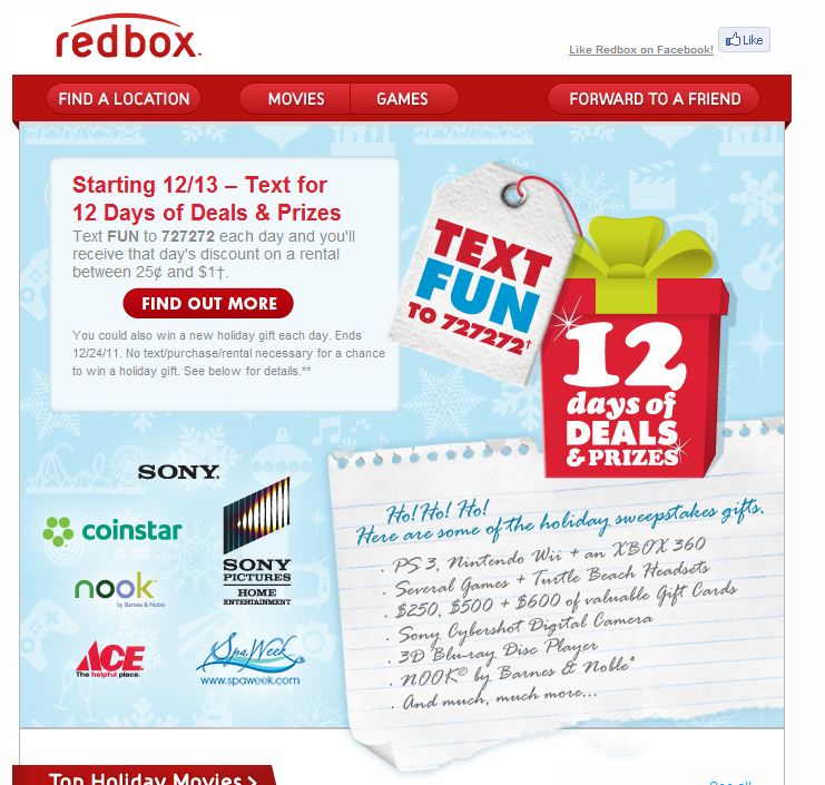
I write a lot about Redbox, in part because I am frequent users and in part because they are terrific marketers. Here's yet another example of Redbox leveraging SMS to drive promotions (and to collect user data ... and create ongoing marketing touch-points). The promotion: send Redbox an SMS and get discounted delivered via mobile. That's not entirely unique.

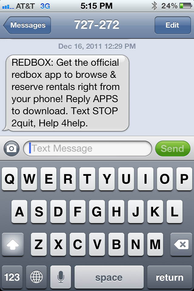
But, it's smart. As noted above, its a clever way to collect data about their users and create ongoing marketing touch-points... like the example below. Once you SMS Redbox, they follow up with an SMS that allows you download the mobile app (just reply APPS).

And that's the big takeaway here: be creative about driving engagement. Redbox uses SMS to deliver discounts and drive app downloads. The discount is the incentive for consumers and its a marketing cost for Redbox to distribute their app and drive engagement (a tactic they have used in email as well).

Both parties win. And Redbox has created a simple, low-cost marketing program that drives long-term benefits.

Perplexed by Best Buy

I'm perplexed by best buy. Terrific customer service, convenience and return policy (30 day, return anything - no questions). But high pricing (see hdmi cables and blu rays) and limited inventory (other than tvs).

Perhaps consumers are getting more savvy (thanks mobile) and more price conscious (thanks economy) and less convenience needy (thanks amazon prime).

Why Best Buy is Going Out of Business... Gradually

Consider a few key metrics. Despite the disappearance of competitors including Circuit City, the company is losing market share. Its last earnings announcement disappointed investors. In 2011, the company’s stock has lost 40% of its value. Forward P/E is a mere 6.23 (industry average is 10.20). Its market cap down to less than $9 billion. Its average analyst rating, according to The Street.com, is a B-.

Those are just some of the numbers, and they don’t look good. They bear out a prediction in March from the Wall Street Journal’s Heard on the Street column, which forecast “the worst is yet to come” for Best Buy investors. With the flop of 3D televisions and the expansion of Apple’s own retail locations, there was no killer product on the horizon that would lift it from the doldrums. Though the company accounts for almost a third of all U.S. consumer electronics purchases, analysts noted, the company remains a ripe target for more nimble competitors.

But the numbers only scratch the surface. To discover the real reasons behind the company’s decline, just take this simple test. Walk into one of the company’s retail locations or shop online. And try, really try, not to lose your temper.

20120103-215429.jpg

Differentiation exists as long as you can run faster, further.

You're probably familiar with Vibram 5 Finger Shoes that have become somewhat popular. They became popular in part because they were so different, unique and noticeable. When someone wears a pair - you visually take note.... and if you've not seen them before, you ask what they are. And now they are quite recognizable and popular.

Flipping through a magazine, I came across the below ad for Adidas' new, equivalent shoe. It's a great reminder that:

- differentiation doesn't last forever... particularly when you succeed.

- big brands with big budgets exist... and they take notice.

- consequently, differentiation exists as long as you can run faster, further.

- think forward and about your brand more than about protection & competition

- ... and when a start-up, make sure you've thought enough about whether you have a sustained chance to take a large enough lead (time, product, brand) before others arrive.

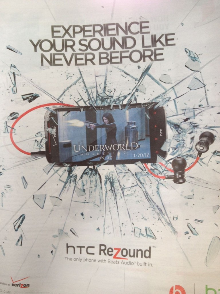
Beats Audio Exclusively in HTC Rezound. But iTunes isn't.

Beats Audio has been a tremendous story. They have done for headphones and device sound what Intel did years ago for computing. And they leveraged celebrity endorsers and users to become ultra popular: Dre, Lady Gaga, Bieber, Lebron, etc. But the below advertisement really struck me. The HTC Android phone exclusively comes with Beats audio. It's powerful marketing because those red headphones and their logo stand out - particularly as you compare other devices on a store's shelves.

However, in this example, the 'hardware' is unfortunately less important and compelling than the software. As Intel made famous: it's what's inside that counts. And in that case: iTunes wins. And iTunes made the original iPhone so popular (before the app store).

For this to be very compelling, they would need to partner with a major music source in addition to the sound. That means that Google Music would need to ramp quickly or they work with Pandora, Spotify, Turntable.fm, etc... because sound without a great library and UI is just not that useful. Apple knows that.

Balancing Ads, Revenue and Experience, Pageviews.

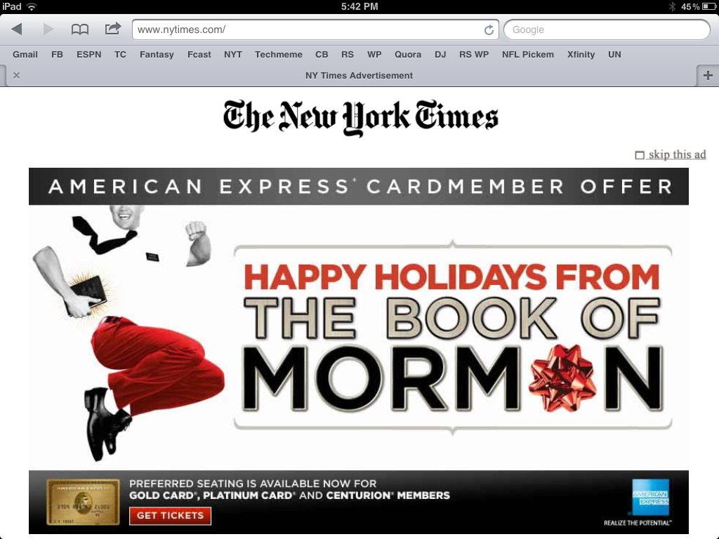
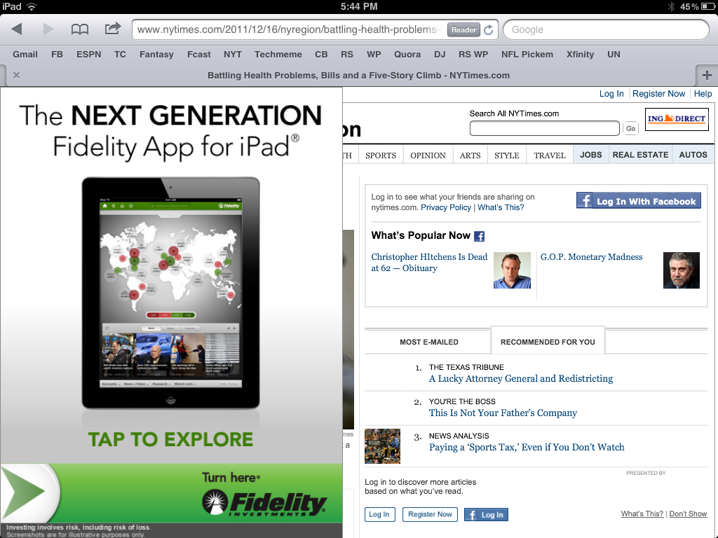
I write frequently about how mobile web requires a different design and UI than traditional. Great example here. These are two *subsequent* screenshots from the New York Times iPad-friendly website. First, the NYT homepage is taken over with an American Express ad (albeit a really good looking, custom-built ad).

I can tolerate a page takeover. It's neither unique nor inexcusable (they have to make money on a free product). But, after it disappears and I click on an article - I get another takeover.

It too is custom (and I give them credit for that)... but that is two consecutive takeovers and, this last example, is remarkably annoying. It should at least appear on the right column so that I can read the article. Why preserve the social sharing screen for an article I haven't yet had the ability to read?

It's really shortsighted to sacrifice experience, reduce pageviews (both in this session and in the future) to increase eCPM for this specific visit. The eCPM will be terrific: two huge takeovers on my two pageviews... but I didn't even get to a third pageview. Is it worth it?