iTunes Best of 2011 is Curated by Apple. Time for Retails to Curate with Social Data.

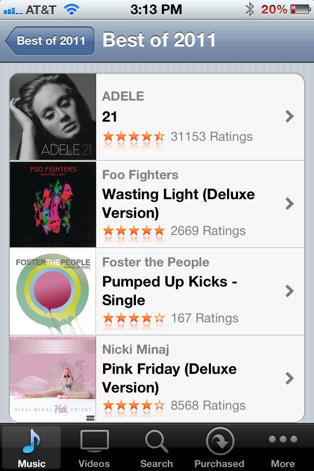
It's that time of year when iTunes - and countless other retailers / merchandisers - publish their "Best of 2011" lists. It's fun to review the lists, particularly when a great merchant / voice crafts them. But the example below of reading through iTunes "Best Music of 2011" list isn't nearly as powerful as it could be. What's missing? A list curated by the merchants I most care about: my friends. Show me what my network bought, listened to and loved. That's most interesting and would ultimately be the highest converting.

Of course that requires Apple to either integrate Facebook Connect (or even less likely, have Ping succeed).

But it's a relevant lesson to those retailers who do in fact integrate Facebook Connect and collect social data. There is great value and intelligence within.... think of it as more than social sharing: it's a merchandising and conversion lever.

Hulu's New Social Sharing Gives Visual Control

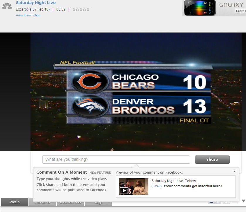
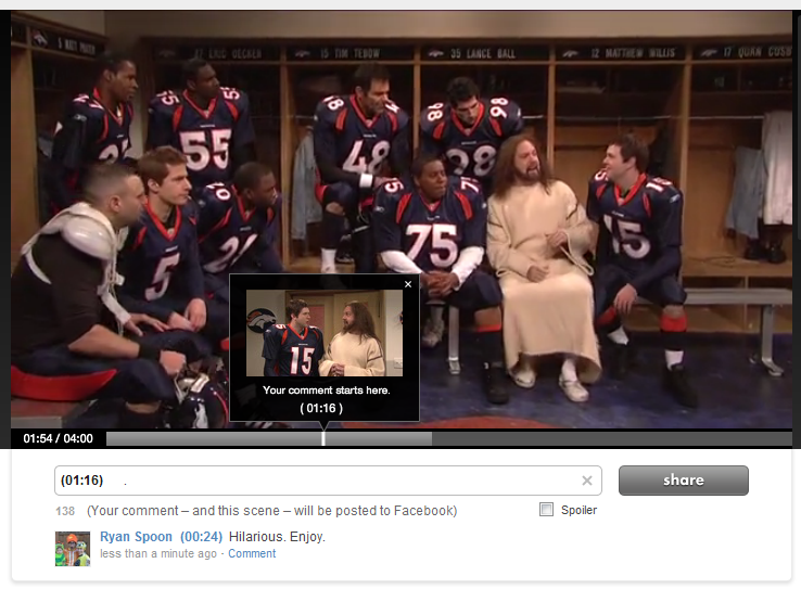
Hulu has introduced a new sharing mechanism that does two things: 1. It allows users to comment specifically on 'moments'. That then publishes the specific scene to your Facebook wall and stores your comment at the specific moment within the timeline. At scale that creates a very interesting concept: a dialogue that moves along the video's entire timeline. At scale that also poses a problem: will I want to read all of that content? Not sure... but interesting.

2. The preview UI is terrific. This is what first caught my eye: the pop-up box showcases the specific screenshot, comment and formatting that will appear on Facebook. That's really good-looking, unique and powerful.

Why is it potentially powerful: first, because I think users like to feel control over what is published and this is a visually, fully controlled experience. Second, it is different... and that means that users will drawn to it (as compared to a standard like button).

I really like this experience and don't see why it can't be applied to other visual mediums like e-commerce.

Google Currents: A Reminder about Mobile UI

Below are three screenshots from Google Currents on the iPhone (Google's Flipboard-like product). Rather than commenting specifically on the Currents product, I wanted to share three themes I was reminded of when first using the app: 1. Mobile UI is really critical and really unique. (you've heard this before and will again & again).

2. Mobile UI is very different on iPhone vs. iPad. Different real estate and different behaviors / expectations. The below examples demonstrate why this experience just does not work on iPhone. You have to treat them differently and create unique experiences specifically tailored for each.

3A. The genius of Flipboard is not the content. That's become more of a commodity: publishers of course want their content in as many places as possible. It is the UI and the interaction. It is the magic users feel when opening, using and sharing.

3B. And it's that magic that you need to capture within your product(s) and experience(s) - of course in your own, relevant way.

Facebook Testing "Listen" Buttons in the Ticker

Below is a screenshot of Facebook testing new listen buttons in the news ticker alongside music apps like Spotify. Visually, its a bold move because they are all over the feed... and it turns a good percentage of Facebook into a music network (people, songs, apps, trends, etc).

It's also a bold move because it's potentially a very slippery slope... are "read" icons coming? "Shop"? etc? Visually that could create significant clutter / confusion - but it also creates hubs of verticalized activity. Fascinating to watch.

Hat tip to Andrew Machado for the screenshot. Founder of OpenHomePro and Dogpatch Labs resident

without the new listen buttons

Bonobos Adds a Clever Twist to Viral Contest, Sharing.

Bonobos is currently running a viral giveaway on Facebook: Win a Wardrobe. Giveaways on Facebook aren't unique - they are great ways to drive Facebook fans, sharing and awareness. But what is unique is the viral hook that Bonobos is using:

"The more you share, the more chances you have to win."

That too isn't unique - usually contests give extra weight for the number of shares, referrals, etc. Bonobos is doing it differently though - and its very clever:

If one of your friends wins, you win the same prize. That's different and very cool. If the prize is enticing enough, its a more interesting way to incent referrals and sharing.

Fitness 2.0 as Demonstrated by P90X's New iPhone App.

By now you have surely heard of P90x - the ultra-popular home workout program that become famous for the never-ending infomercials. After the success of P90x, parent company Beachbody recently released P90x 2... and in conjunction with the launch, they released an iPhone application. It's interesting for a few reasons: 1. Fitness 2.0. It's at the intersection of an evolving, important and fast-moving space: fitness 2.0 (for lack of a better description). What's that mean? Applying the new web to fitness: social, gamification, mobile, etc. Note: if you're working on something in this space, I'd love to hear from you. Contact me

2. Gamification & Social Hooks: notice that this app does more than just award badges. It is part of Apple's Game Center.

3. Paid & Premium. You would think that they would package this application for free as a way to drive awareness / purchases of the workout system. Nope. I guess they don't need awareness. SO they are selling it for $4.99 and include in-app purchases that are relatively expensive (videos & clips).

4. High Ratings. Achieving high ratings in iTunes is an impossible task. 4.5 stars out of 83 reviews... for a paid app? That's impressive.

Facebook Messages: Uncomfortably Somewhere Between Chat, Messages & Email.

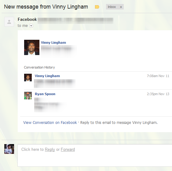
Two weeks ago I wrote that it's time for Facebook to rethink email. Facebook messages is currently a hybrid between chat and lightweight email. Considering that each of us have Facebook email addresses (ie ryanspoon@facebook.com), its could be so much more... think Google's integration of Gmail + Google Talk. Anyhow, here's another example of the confused experience between chat and email. The updates from Facebook appear less like email and more like a chat log - but they are chronologically disjointed. The top messsage is the most recent. That is followed by a randomly selected older post and that by a more recent post. Bizarre.

Bonobos + Fab Looks More Like Groupon than Gilt.

I find this example so interesting: two fast-growing e-commerce brands working together to solve one another's needs: Bonobos delivers heavily discounted product to Fab, who delivers a user acquisition channel. From afar, I believe example is more similar to how merchants use Groupon / Living Social than how they use Gilt Group: it is more about attracting new buyers than it is for dumping inventory efficiently: