Mailbox and Innovation Around the Mailbox

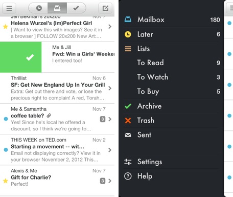
I have intentionally attempted to shift my mobile habits to take advantage of new, well-done applications. I tried to replace iOS's safari with Google's Chrome application. And now I am trying to replace the core iOS mail app with Mailbox. In trying to do so, three obvious points come along: 1. There is much innovation to be done around core experiences. Ones that come to mind: MessageMe for messaging, Mailbox for mail, Chrome for browser, Tempo for calendar, etc.

2. It is really hard to break personal habits. Regardless of whether or not I prefer Chrome to Safari - I am rooted historically and routinely in Safari. I like the Chrome browser a lot, but find the littlest things annoying - not because they are poorly designed or created, but because they are different than where I habitually expect them to be.

This of course is in conflict with point #1 above: innovation challenges habit. And habits are hard to break.

3. It is far harder (nearly impossible?) to break device habits. What I mean by this: if you really prefer Mailbox to iOS mail - you have to go out of your way to use it as a default... and it is even more challenging in the Chrome example. Being built into the core OS is such a huge hurdle to overcome - and while it may not stifle innovation, it stifles adoption.

Of course it is different from OS to OS (Android's flexibility is why apps like SwiftKey are so great and so popular) - and even more complicated with various device / hardware layers.
mailbox app

Today on ESPN3: 86 Live Events

Want a taste of what makes ESPN3 special? Head over to ESPN3 or access on your mobile app via WatchESPN and you'll find: - 86 LIVE events spanning - 10 different sports (from lacrosse to basketball to baseball, etc) - both US and international - and across high school, NCAA and professional levels

It is part of what makes ESPN and our digital efforts special: a focus on live games, exceptional delivery across any screen, and diversity + breadth of content.

ESPN3

Read more on ESPN Front Row.

Google Search, Inline Weather

It's the first time I have searched for weather on something other than my phone... which is interesting itself. But tonight, I Googled weather 06001 (our zip code) and found the following screenshot of an entirely contained, smart weather 'widget'. It's an example of Google delivering a simple, fast experience with instantaneous satisfaction. No reason to leave the search page. No need to click organic or sponsored links. And consistent with how Google behaves on mobile web and within Google Now on Android.

Google Weather Widget

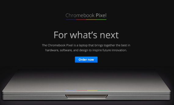
Google's High End Chromebook Pixel

Let me preface by saying that I am typing this on a Macbook (15" Retina) and love the device. And I have previously not been attracted to the Chromebook series for a variety of reasons: namely form, function and unclear ability to replace either my laptop or iPad. But the Chromebook Pixel is different - and I would argue much more important... regardless of whether you consider it attractive or compelling.

Four quick reasons I think it is important to at least learn more about the Pixel. Note: The best write up I found was on The Verge.

1) Google is getting in the high-end hardware game. You may not buy it and you may find it expensive: but it's great looking, matches the retina display, etc. And it signifies a very different move for Google: both in market placement and market entry (see Google Store rumors here).

2) It is entirely cloud based. This continues the Chromebook line and concept. And the pricing has caused debate considering the reliance on cloud. But again: it's important because it signifies a major shift: browser base, software in the cloud (my take here - even on Apple) and tie in to Google's wider world (ie google drive as the memory)

3) SIM card enabled. My biggest want in my laptop is LTE. It's coming of course and will be everywhere. The Pixel has it first.

4) It is touch enabled. And seems to do a good job with that. Like point 3 above, its coming everywhere. But again: the Pixel has it. And again, whether you want to buy a Google laptop or not, it is important in what it represents: cloud, mobility and touch.

Google Chromebook Pixel

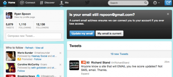
Twitter's In the River Module for User Messaging

Facebook is the king of in-the-river promotions - perhaps because they roll out so many new features, promotions, toggles, etc and it's the most effective way to alert users of changes. Here is a great example by Twitter and it's worth showcasing for three reasons:

1. It is a balance of really obvious but in-line. The promotion box sits atop the feed and therefore feels natural - as opposed to an overlay of some sort. Nevertheless, it cannot be missed.

2. It is not done to promote a new feature. It is done to message active users. Better than an email.

3. The focus is on ensuring accurate email addresses and user data. The best to do that, per point #2, message active users in line.

twitter in the river

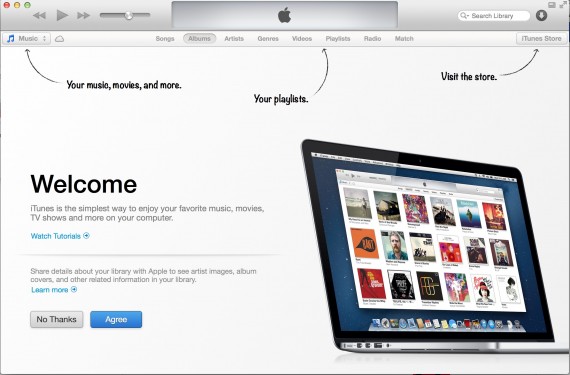
iTunes Welcome Screen, Appified

I wrote about the appification of software as a thematic takeaway of 2012. Here is a great - but very different - example. The newest iTunes might not behave like an app - but it certainly takes cues from popular app designs / trends. This starting screen for the entirely revamped iTunes product looks exactly like a starting screen for other iPad applications. Soft arrows pointing out specific changes or user behaviors.

It's a familiar way of making an unfamiliar product (after all, this is new) familiar again.

Appification of iTunes

A Reflection of 2012: The Appification of Software

As 2012 is in the books, much has been written about tech and consumer application developments over the last year - and what's coming in 2013. A good review of what happened in 2012 can be found on Techmeme's headline stack: top headlines and 'biggest' stories. In thinking about how my digital behaviors have changed over the last year - not much stood out as fundamental shifts. And it's not because I am bored per se... it's because my behaviors were mostly incremental advances on already existing trends. For instance: - yes, I use mobile far more than laptop / desktop - yes, I consider Facebook to be more important as an identity mechanism than a social environment - yes, I use Twitter and Facebook as my portal into news and content - yes, my fitness world is filled with data and synced across my mobile device - and yes, I could lose any of my devices, would financially be upset, but ultimately wouldn't care much because my life is synced in the cloud: photos, contacts, notes, files, emails, apps, etc

So what was fundamentally different for me? The appification of software... and I don't mean mobile apps - I mean traditionally boxed software that was expensive, painful to install, impossible to sync, etc. I purchase Aperture via the MacOS store while on vacation last week. It downloaded over hotel wifi (Disney World's wifi, for what it's worth, is excellent) and was available on all of machines. Thats a far better, easier experience than we used to live in.

More importantly - there is zero friction in purchase. And that pertains to expensive products (Aperture is ~$75) and to inexpensive products (apps, games, etc). I find myself purchasing more often because it is easy, fun and works across my devices.

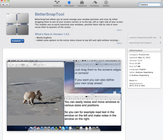
Example: the one part of Windows that I loved was the native locking of window sizes. It bugs me that Mac doesn't have something like that. Enter MacOS store - download BetterSnap Tool for $1.99 (a top 100 grossing app) and it's solved.

While we move from laptop and desktop to mobile, so does the software experience... even if we are still on laptop and desktop.

bettersnap macos

Great Rose Bowl Social Ad From Vizio

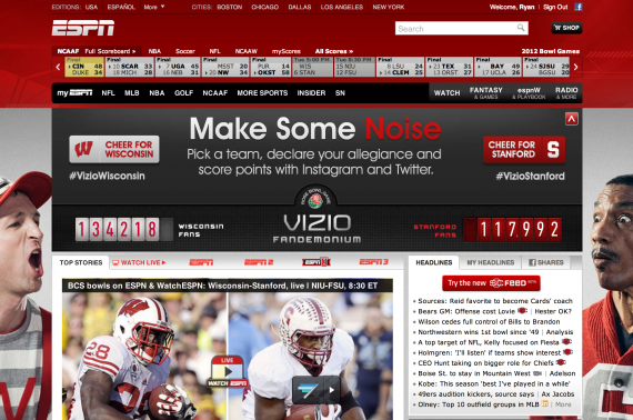
You can watch the Rose Bowl (Stanford vs. Wisconsin) on ESPN right now and on WatchESPN. You can follow on the new SportsCenter Feed and ScoreCenter. And you can cheer socially on ESPN's homepage with the current Vizio Fandemonium ad on ESPN's homepage that allows fans to support either Wisconsin or Stanford via Twitter. Very cool, fun experience and very timely given today's game and the engaged audience.

rosebowl

vizio fandimonium