9 Guiding Design Principles

Thanks to the iPad, I have been on a documentary kick: both Netflix and iTunes make it easy to access interesting content that I otherwise wouldn't think to watch. Combined with the iPad's portability, consuming documentaries like Art & Copy (highly recommended!), Food Inc (recommended), A Lawyer Walks into a Bar (mildly recommended), etc. The latest is Gary Hutwist's Objectified. Hutwist previously released Helvetica, "which looked at the worlds of typography and graphic design". Objectified is a direct relative, focusing on "industrial design and product design, and our relationship with the manufactured objects that surround us."

It is well done and focuses on a combination of analog and digital brands/products (most significantly Apple). While Objectified concentrates on physical product design, it is highly relevant to web and software design.

Below is a list of guiding principles spurted out by Dieter Rams, former designer director Braun. I am sure that he has thought long and hard about these principles previously - but it was nonetheless impressive how intuitively and calmly he spurted the following out. Again, they pertain specifically to physical creation - but each of the following are traits that exist in the best designed products as well as websites, experiences, navigations, etc. For instance, Apple's iOS and Facebook can check each of the following:

Good design should be innovative.

Good design should male a product useful.

Good design is aesthetic design.

Good design will make a product understandable.

Good design is honest.

Good design is unobtrusive.

Good design is long lived.

Good design is consistent in every detail.

Last but not least, good design is as little design as possible.

Facebook Advertising: 500m Users is Attraction for Ads, Jobs

Facebook often runs their own advertisements as sponsored units on the main newsfeed. The ads typically promote new features, job openings, their ad platform, etc. So these below promotions for Facebook jobs and Facebook's Ad Platform are nothing out of the ordinary... but what is noteworthy is how Facebook has now begun using their 500m user milestone as a marketing message:

Advertise on Facebook Promote your business to 500m+ active and enaged users on Facebook. Develop your brand online by connecting with your audience.

Wanted: Ops Engineers! Want to keep Facebook running for over 500m active users? Apply today!

Interestingly, the marketing message isn't too dissimilar to that of the upcoming Facebook movie ("The Social Network"):

Twitter Launches Tweet Button; Publishers to Allocate Pixel Real Estate

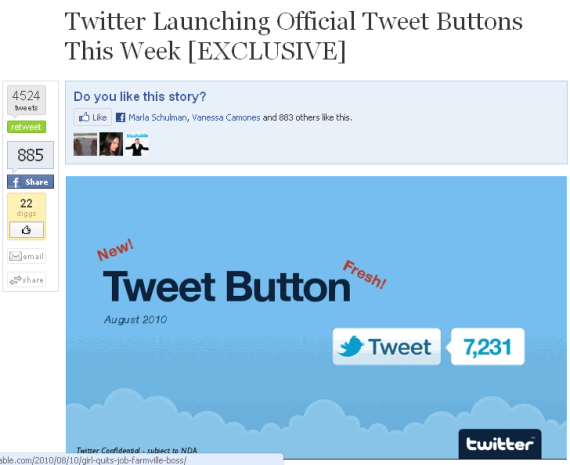
Twitter has officially launched their Tweet Button - a natural move which will place them beside Facebook's like buttons... and across millions of pages on the web (soon to be on this blog!). The question is what happens to everything else? There is only so much space on each page and ultimately publishers will only devote real estate to those buttons that deliver the most traffic / engagement. Twitter and Facebook will clearly qualify - but who else? My favorite example is this post from Mashable which leaked the Tweet Button a couple days ago. The Tweet Button screenshot sits below the Facebook Like graph and beside Tweetmeme, Digg, and Facebook Share. Of course there are others: For instance, I use Apture and Disqus. And more will come - like Facebook's long rumored social bar.

Twitter's Earlybird Launches Madden 11 for $39.99 on Buy.com; Sells Out But Doesn't Translate to Twitter Followers

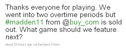
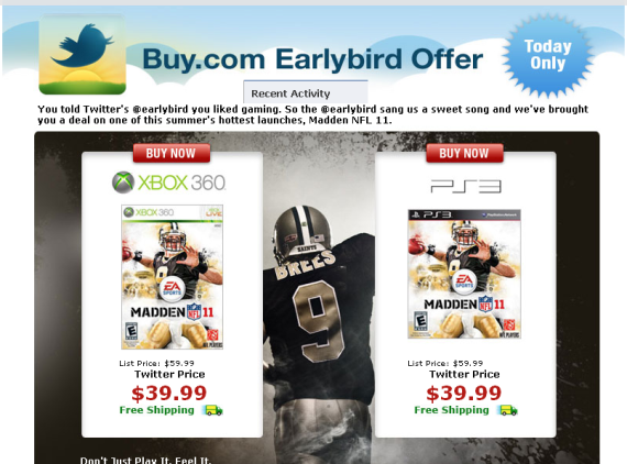
Yesterday was the launch of Madden NFL 11 (coverage here). Yesterday was also my first purchase through Twitter's Earlybird. Earlybird had a big offer on the new Madden NFL 11 video game - it normally retails for $59.99 but was sold through Buy.com (sans @Earlybird) for $39.99.

Considering the savings and the timing - it was a compelling offer... and it sold out after three offer releases over a two hour period.

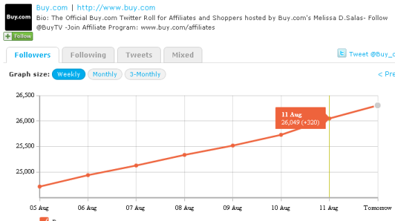
Interestingly, the promotion did not lead to a significant increase in Twitter followers for Buy.com (@buy_com). Despite the offers buzz, Buy.com only gained ~300 Twitter followers. Ultimately, I imagine that they are valuing the promotion in part to increased social buzz / presence (as I imagine most purchasers were like me: in and out with only a discounted video game).

Madden 11 Launch Campaign vs. Madden 10

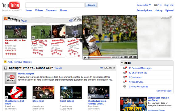
Last year I covered the Madden 10 advertising blitz that took over ESPN and YouTube's homepage with slick, expanding units that interacted with the pages' content. I have always been impressed by ad units that disrupt a page's live content - but ultimately the units are built individually for each site and thus don't scale.... so it's no wonder that the Madden 11 advertising blitz is different: Madden 10 YouTube Takeover

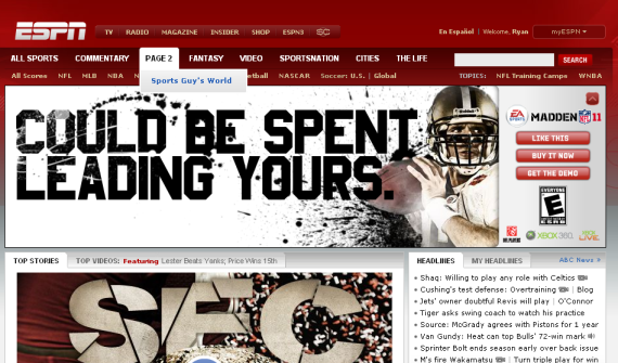
Unsurprisingly, the Madden 11 ad units are quite different. In addition to being contained within their pixel real estate... the big focus is Facebook and social sharing.

Here is the primary unit on ESPN.com's homepage. The unit itself contracts after several seconds of viewership. Most interestingly, is the order of the ad's three call to action buttons:

1. Like This (on Facebook) 2. Buy it Now 3. Get the Demo

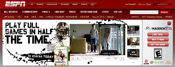
By getting the demo, you are able to view HD video content within the ad unit:

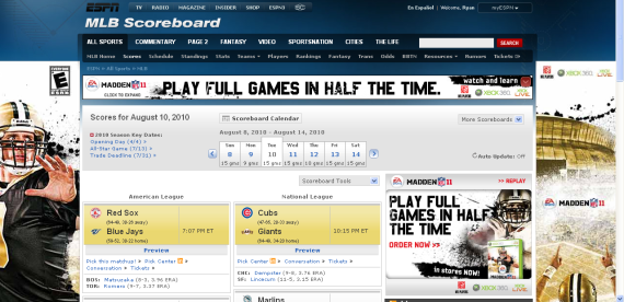
Notice that the Madden 11 campaign extended beyond ESPN's homepage... or even their NFL section. Here is a more aggressive takeover of the MLB Scores section. There is more Madden content above the fold than actual content:

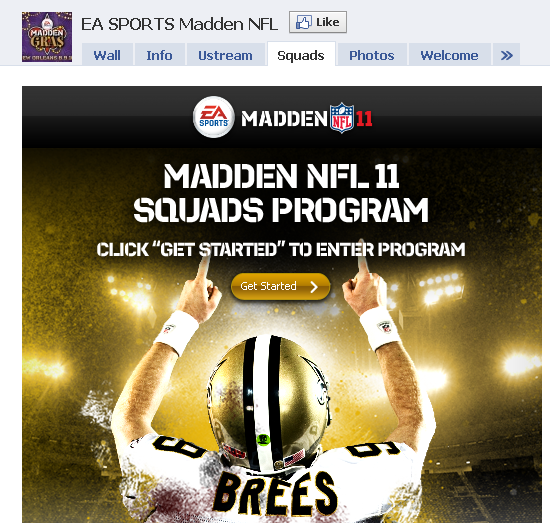
And lastly, when you visit the Madden Facebook page - the focus again is to drive "Likes". Drew Brees points towards the Like button and the 'Get Started' button begins with driving Facebook fans:

Optimizing Call to Action Buttons

Smashing Magazine has a terrific guide to designing "call to action buttons." Design and optimization can increase conversions dramatically - just ask (and study!) these conversion-focused leaders: - Social gaming: RockYou, Slide, Zynga, etc - Flash Sales: Gilt Group, Rue La La - Couponing: Groupon, LivingSocial Smashing Magazine lists dozens of examples. I boil it down to the following:

- size and location: think of visiting a grocery store and what catches your eye in the aisle - color and 'clickability': does the button stand out? does it change on hover? - call to action and copy: what are you asking users to do? is it tempting? This dictates size and location...

With so many variables, the only way to optimize is thorough A/B testing. Cycle through messaging, placement, size... collect data and optimize upon that.

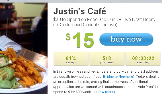
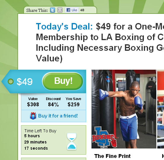
Looking for inspiration? Visit the companies listed above: they are industry leaders in funnel and conversion optimization. Here are two examples from LivingSocial & Groupon. Notice how each call to action has large & colorful buttons, clear messaging and conveys urgency:

Twitter's Who To Follow vs. Facebook's People You May Know

It was a long time coming, but Twitter released their "Who to Follow" tool... and it's terrific. It makes Twitter more navigable and more socially relevant: For me at least - this translates to richer content, more frequent usage and a deeper Twitter social graph. It is powerful because the "Who to Follow" recommendations are very, very good. I am not sure what the recommendations are based on - but they are highly relevant and have a high hit rate. Below each recommended user is a list of other Twitter users who are particularly relevant... they of course add valuable context. But perhaps the most compelling part is that Twitter includes a bio for each user. This is unique because:

1) Facebook doesn't have user bios, and 2) Twitter users work hard to craft < 140 character summaries of themselves... so they are compact, promotional and interesting

In contrast, Facebook's People You May Know tool lacks the same relevance and information (there is no user bio and you have to work to find friend's in common). More importantly, Facebook doesn't seem to have as powerful of a recommendation algorithm. Now users have plenty of ways to find other users of Facebook: their Friend Finder, the Facebook feed itself, the like graph, etc:

Promote Your Application Where, When it is Used (Huffington Post Example)

Applications now being built atop: - mobile web (html5, wap, etc) - mobile platforms (iPhone, Android, etc) - browser extensions (chrome, firefox, safari, etc) - desktop apps (ie adobe air) And with users accessing content in so many different ways, publishers must think about both development (cost, talent, scalabilty, etc) and distribution (how will users access the new products?).

Always at the cutting edge, Huffington Post has successful iPhone and iPad applications and one of the web's best Facebook integrations.

They also now have a Google Chrome extension... which they alert Chrome users to with each session. The webpage drops down a notice and allows users to install directly. It is a very targeted and powerful way for Huffington Post to alert users. It is also a proven lever for other publishers and sources - for instance, visit Yelp.com on your iPhone and you will notice a major iPhone App promotion.

"Check out our Google Chrome Extension. Get up to-the-minute reports, blogs and analysis with quick-view articles from all sections."

Dogpatch Labs' Grows: Our Newest Dogpatchers

I am excited to announce the newest members of Dogpatch Labs San Francisco. Residents are here for approximately six month rotations - so each month, folks move in and others graduate. You can see the entire roster of Dogpatchers at Dogpatchlabs.com, but here are the newest additions to San Francisco... and they join a collection of other terrific Dogpatchers (both present and past).

In total, this brings San Francisco to over 25 companies:

AllTrails is a member driven outdoor enthusiast community that gives you unlimited access to trails, maps, reviews, and photos for 22 different activities including hiking, mountain biking and rock climbing.


Bitlev is a personal search application for users to find files across different devices and services.


GroupStor is currently in stealth mode.


ChompOn is an open platform for businesses to run their own social flash sales. (TechCrunch coverage)


Health Central’s mission is to empower millions of people to improve and take control of their health and well-being.


Movity: Search geo-data, local comments, conversations, safety stats, demographics, noise … visualized on maps.


Social Times is a blog and content site featuring news and media regarding the social web.


Throwdown Hero is currently in stealth mode and coming soon.
WiseStamp empowers your email signature: easily customize Google Chrome html email signatures, Include IM & Social profiles, Automatically share your Blog posts, Quotes, News, Bookmarks and more. (Mashable coverage)