Doodle Jump Goes Retina on iPhone 4

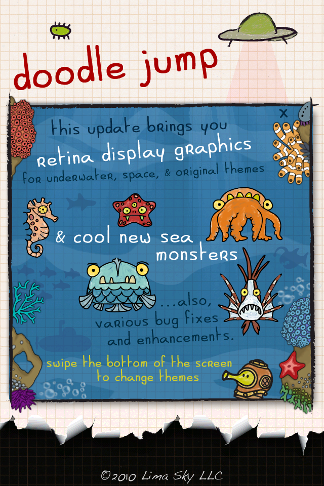
No real news here - unless you are a huge Doodle Jump fan (one of the highest selling iphone apps of all time - and one of the biggest time sinks of all time). Yesterday Doodle Jump released the newest version of their app such that it is compatible with iPhone 4 and the retina display. That's the news - which is not why I am writing this... Rather, I was struck by how crisp and clear the imagery is. For iPhone 4 users (and to a lesser extent iPad users), graphics and web browsing looks great - thanks in part to apple and in part to designers / developers.

This is the welcome screen from the new Doodle Jump game - it's gorgeous. And you're probably not viewing it on an iPhone 4 screen. Its like looking at a zoomed in adobe illustrator font vs. a non-true-type font.

It is also interesting how developers are now using retina display optimized graphics as a selling point.

9 Guiding Design Principles

Thanks to the iPad, I have been on a documentary kick: both Netflix and iTunes make it easy to access interesting content that I otherwise wouldn't think to watch. Combined with the iPad's portability, consuming documentaries like Art & Copy (highly recommended!), Food Inc (recommended), A Lawyer Walks into a Bar (mildly recommended), etc. The latest is Gary Hutwist's Objectified. Hutwist previously released Helvetica, "which looked at the worlds of typography and graphic design". Objectified is a direct relative, focusing on "industrial design and product design, and our relationship with the manufactured objects that surround us."

It is well done and focuses on a combination of analog and digital brands/products (most significantly Apple). While Objectified concentrates on physical product design, it is highly relevant to web and software design.

Below is a list of guiding principles spurted out by Dieter Rams, former designer director Braun. I am sure that he has thought long and hard about these principles previously - but it was nonetheless impressive how intuitively and calmly he spurted the following out. Again, they pertain specifically to physical creation - but each of the following are traits that exist in the best designed products as well as websites, experiences, navigations, etc. For instance, Apple's iOS and Facebook can check each of the following:

Good design should be innovative.

Good design should male a product useful.

Good design is aesthetic design.

Good design will make a product understandable.

Good design is honest.

Good design is unobtrusive.

Good design is long lived.

Good design is consistent in every detail.

Last but not least, good design is as little design as possible.

Quora Opens to Google, SEO is Rocking

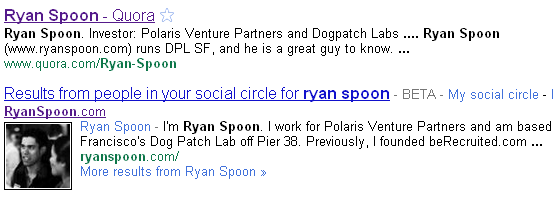
A little over a year ago, I wrote about Facebook's new vanity URLs and the immediate SEO boost that ensued. Quora recently opened up their content to Google... and it appears as though it too is the beginning of an SEO boom. It makes sense considering how deep, rich and unique Quora's content is - which to Google is a goldmine. Furthermore, the questions and answers format has always been relevant to search engine queries. Two great examples are Ask Jeeves (now Ask.com) which was built with this in mind and Yahoo Answers, which for years has ranked terrificly in Google.

SEO has emerged from a talent (usually buried within the organization) to a business. Folks like Demand Media have turned it from art to science - and for folks like Quora, it can be an important lever for traffic acquisition, findibility, etc. Ultimately, it boils down to the lasting value of the your site's content - and Quora (and others) are in a great position for that because of its community and the dynamic nature of site (content evolves over time - it is not a static, one-time piece).

Here is a simple example of just using my own name as a query. Within a week Quora has emerged on the first page... which is impressive:

Optimizing Call to Action Buttons

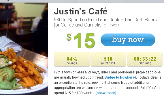
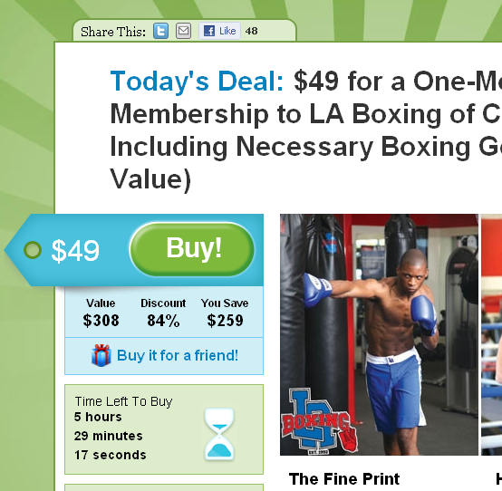
Smashing Magazine has a terrific guide to designing "call to action buttons." Design and optimization can increase conversions dramatically - just ask (and study!) these conversion-focused leaders: - Social gaming: RockYou, Slide, Zynga, etc - Flash Sales: Gilt Group, Rue La La - Couponing: Groupon, LivingSocial Smashing Magazine lists dozens of examples. I boil it down to the following:

- size and location: think of visiting a grocery store and what catches your eye in the aisle - color and 'clickability': does the button stand out? does it change on hover? - call to action and copy: what are you asking users to do? is it tempting? This dictates size and location...

With so many variables, the only way to optimize is thorough A/B testing. Cycle through messaging, placement, size... collect data and optimize upon that.

Looking for inspiration? Visit the companies listed above: they are industry leaders in funnel and conversion optimization. Here are two examples from LivingSocial & Groupon. Notice how each call to action has large & colorful buttons, clear messaging and conveys urgency:

Flipboard: The Best Way to Read Hacker News

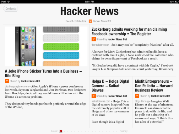
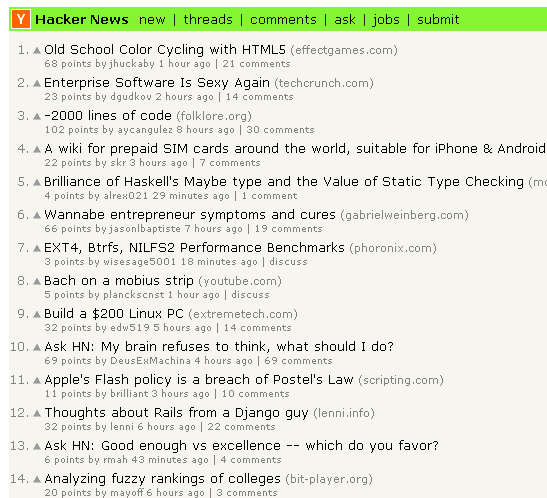
A reminder from the uber-popular Flipboard iPad App: design and UE/UI can alter an entire experience. Using Flipboard, you can read Hacker News as a magazine... and its beautiful, fun and social. It is the same content, just presented in a very different way. And just as it's a reminder - it is inspiration to (re)consider product design. Hacker News via Flipboard iPad app:

Hacker News via web:

.

Email notifications & engagement from SlideShare and Digg

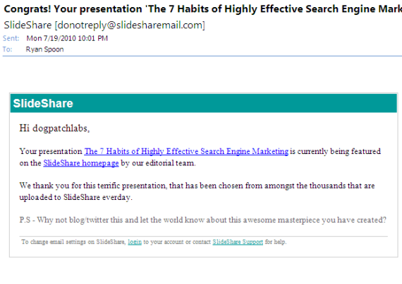
Last week I wrote about email as a vehicle to drive user engagement. Here is another good example from SlideShare. Earlier this week I posted a presentation on paid search best practices from a recent Dogpatch Labs event. That day the presentation made the front page of slideshare.com... And they immediately delivered an email notifying me of the popularity. Its not a new concept (Digg for instance is great at this) but its an example of powerfully conveying accomplishment and driving engagement via email. And in this case (and in Digg's) their content rotates so frequently that is quite compelling:

YouTube's HTML5 Mobile Site Aims to Drive 'Home Screen' Adoption

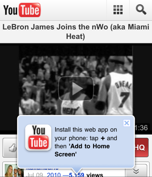
Last week YouTube Mobile adopted HTML5... it wasn't long ago that Apple touted YouTube as the iPhone's original launch partner (via a native application). Their adoption of HTML5 is yet another indication that it is fast becoming a standard for web experience and portability. This alone is newsworthy... but I wanted to quickly showcase YouTube's example of their 'pop-up' unit: - it appears immediately on load of a YouTube page - it is big, bold and interferes with the video's viewability... and is therefore noticeable - it directs users to add an icon to their iPhone's homescreen... which is an effective way to convert a pageview to an iPhone icon - it is part of an emerging trend to point directly (both visually and through language) to actionable items

Drive Engagement Through Email Reports: Apture, Yardsellr Ex.

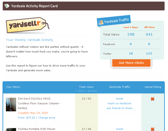
Email is a well known acquisition and activation lever - but it can be particularly powerful as an engagement driver... which in turn drives activity and potential conversions. Below are two examples of weekly emails that arrive from consumer web services Apture (a web toolbar that I have installed on this site) and Yardsellr (a social classified site and Dogpatch Labs graduate). Both emails are automatically generated, highly personal and visual. Apture's email contains weekly reports and charts for various pieces of data associated with your website's readers and their interaction with the Apture bar. It is very informative and simple to digest - but most importantly, it conveys if and how Apture improves your website (time on site, searches, etc)... and because they are confident it will, these email reports drive loyalty:

Yardsellr's "activity report card" delivers weekly and all-time statistics about your Yardsellr account and active listings. In addition to being colorful and full of useful data, these emails are actionable: users can edit / cancel listings, generate traffic virally (ie Twitter and Facebook) or upgrade listings for additional traffic.

Best Practices:

We often think about email as a way to drive new users, deliver announcements, or move products / sales. But consider your active users too. Craft personalized, visual emails that are regularly delivered and sum up users' sitewide activity. It is a powerful way to convey the value you are providing while encouraging ongoing activity (upgraded activity too!).

Learning from Quora's Mobile Site

Two of the core tenets of web design is "don't make users think" and "manage to focus users' attention" (see great list at Smashing Magazine). In short - this means that every pixel should be aimed at conveying what is most important and driving users to the right behaviors. This is a difficult task that some excel at... and it is made even more difficult by the mobile web - which provides far less real estate and different user interactions. Below is a screenshot of Quora's iPhone site (*not* an application despite looking like one). It is notable because it perfectly embodies Quora's core components and user interactions:

1. Notifications: the Quora logo dynamically displays the number of notifications you have. For a web component, this is very nifty - but it is very useful and displays the speed at which Quora's content is growing / moving.

2. Search box: Big search box with grayed out call to action. On the core web site, this is the major call to action.

3. User ID using Facebook Connect - which is the registration mechanism.

4. A series of major buttons that are the primary calls to action: ask a question, notifications and inbox. All revolve around the core question & answer premise.

5. Rather than view on your notifications, you can view Quora's entire log of changes (questions, answers, tags, edits, etc).

6. Invitations: Quora is still invite-only and invitations are an important role in user growth and virality.