Balancing Ads, Revenue and Experience, Pageviews.

I write frequently about how mobile web requires a different design and UI than traditional. Great example here. These are two *subsequent* screenshots from the New York Times iPad-friendly website. First, the NYT homepage is taken over with an American Express ad (albeit a really good looking, custom-built ad).
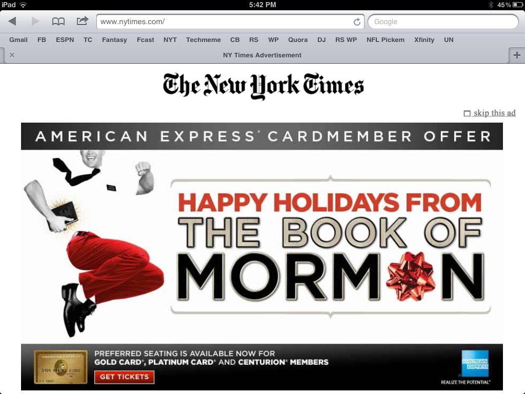
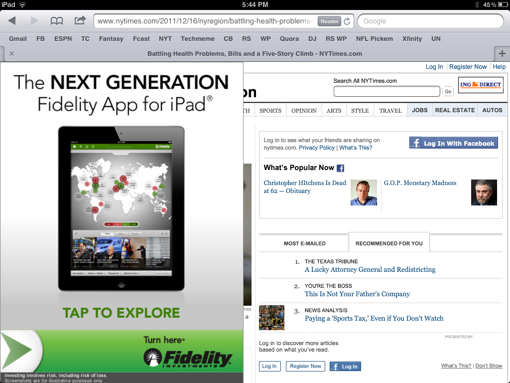
I can tolerate a page takeover. It's neither unique nor inexcusable (they have to make money on a free product). But, after it disappears and I click on an article - I get another takeover.

It too is custom (and I give them credit for that)... but that is two consecutive takeovers and, this last example, is remarkably annoying. It should at least appear on the right column so that I can read the article. Why preserve the social sharing screen for an article I haven't yet had the ability to read?

It's really shortsighted to sacrifice experience, reduce pageviews (both in this session and in the future) to increase eCPM for this specific visit. The eCPM will be terrific: two huge takeovers on my two pageviews... but I didn't even get to a third pageview. Is it worth it?

iTunes Best of 2011 is Curated by Apple. Time for Retails to Curate with Social Data.

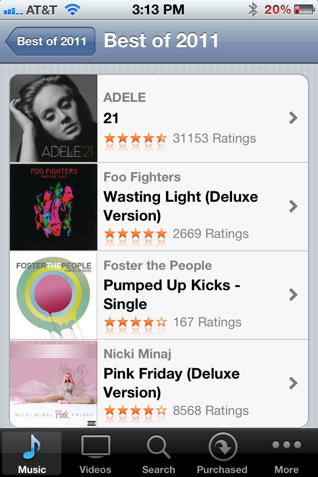
It's that time of year when iTunes - and countless other retailers / merchandisers - publish their "Best of 2011" lists. It's fun to review the lists, particularly when a great merchant / voice crafts them. But the example below of reading through iTunes "Best Music of 2011" list isn't nearly as powerful as it could be. What's missing? A list curated by the merchants I most care about: my friends. Show me what my network bought, listened to and loved. That's most interesting and would ultimately be the highest converting.

Of course that requires Apple to either integrate Facebook Connect (or even less likely, have Ping succeed).

But it's a relevant lesson to those retailers who do in fact integrate Facebook Connect and collect social data. There is great value and intelligence within.... think of it as more than social sharing: it's a merchandising and conversion lever.

Hulu's New Social Sharing Gives Visual Control

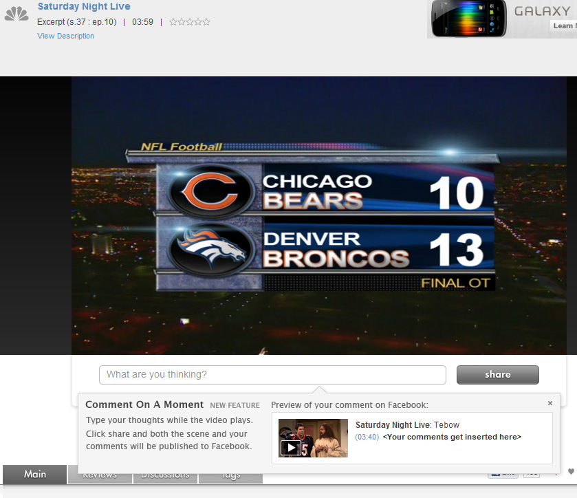
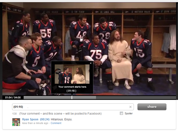
Hulu has introduced a new sharing mechanism that does two things: 1. It allows users to comment specifically on 'moments'. That then publishes the specific scene to your Facebook wall and stores your comment at the specific moment within the timeline. At scale that creates a very interesting concept: a dialogue that moves along the video's entire timeline. At scale that also poses a problem: will I want to read all of that content? Not sure... but interesting.

2. The preview UI is terrific. This is what first caught my eye: the pop-up box showcases the specific screenshot, comment and formatting that will appear on Facebook. That's really good-looking, unique and powerful.

Why is it potentially powerful: first, because I think users like to feel control over what is published and this is a visually, fully controlled experience. Second, it is different... and that means that users will drawn to it (as compared to a standard like button).

I really like this experience and don't see why it can't be applied to other visual mediums like e-commerce.

Google Currents: A Reminder about Mobile UI

Below are three screenshots from Google Currents on the iPhone (Google's Flipboard-like product). Rather than commenting specifically on the Currents product, I wanted to share three themes I was reminded of when first using the app: 1. Mobile UI is really critical and really unique. (you've heard this before and will again & again).

2. Mobile UI is very different on iPhone vs. iPad. Different real estate and different behaviors / expectations. The below examples demonstrate why this experience just does not work on iPhone. You have to treat them differently and create unique experiences specifically tailored for each.

3A. The genius of Flipboard is not the content. That's become more of a commodity: publishers of course want their content in as many places as possible. It is the UI and the interaction. It is the magic users feel when opening, using and sharing.

3B. And it's that magic that you need to capture within your product(s) and experience(s) - of course in your own, relevant way.

Facebook Testing "Listen" Buttons in the Ticker

Below is a screenshot of Facebook testing new listen buttons in the news ticker alongside music apps like Spotify. Visually, its a bold move because they are all over the feed... and it turns a good percentage of Facebook into a music network (people, songs, apps, trends, etc).

It's also a bold move because it's potentially a very slippery slope... are "read" icons coming? "Shop"? etc? Visually that could create significant clutter / confusion - but it also creates hubs of verticalized activity. Fascinating to watch.

Hat tip to Andrew Machado for the screenshot. Founder of OpenHomePro and Dogpatch Labs resident

without the new listen buttons

Facebook Messages: Uncomfortably Somewhere Between Chat, Messages & Email.

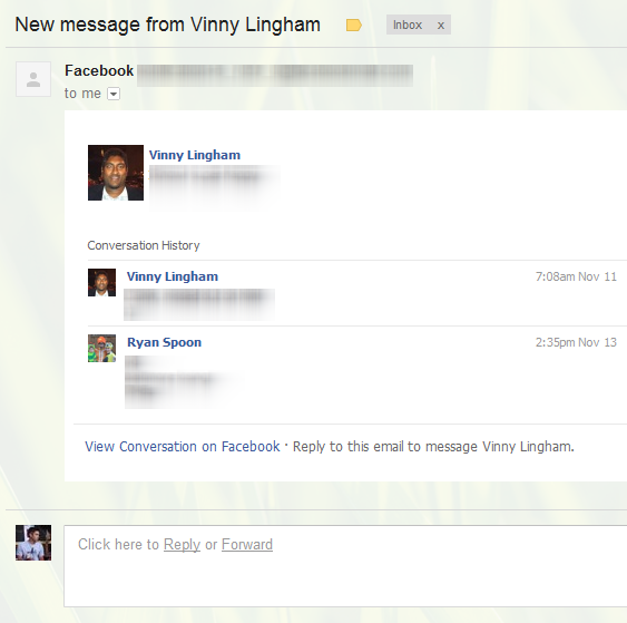
Two weeks ago I wrote that it's time for Facebook to rethink email. Facebook messages is currently a hybrid between chat and lightweight email. Considering that each of us have Facebook email addresses (ie ryanspoon@facebook.com), its could be so much more... think Google's integration of Gmail + Google Talk. Anyhow, here's another example of the confused experience between chat and email. The updates from Facebook appear less like email and more like a chat log - but they are chronologically disjointed. The top messsage is the most recent. That is followed by a randomly selected older post and that by a more recent post. Bizarre.

Even Groupon, the King of Conversions, Battles Clutter

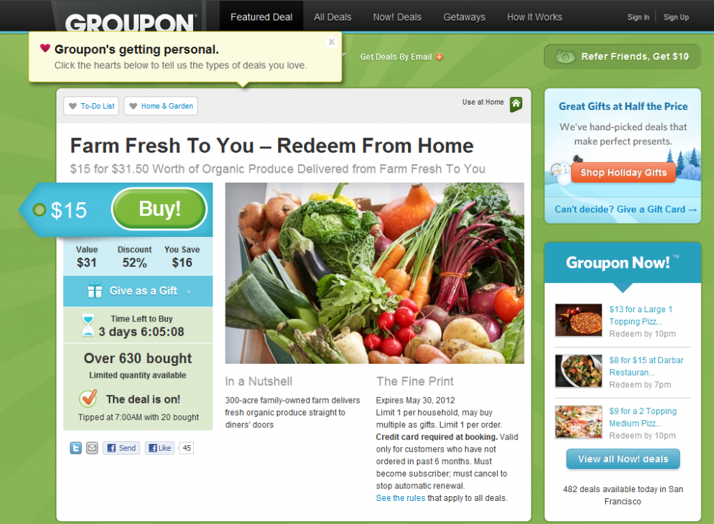
I often give the advice of studying web leaders and learning from what they are great at. For instance, Amazon is unrivaled in the ease of navigation, findability and user experience. For user acquisition, onboarding and funnel optimization - Groupon and Living Social are as good as it gets (see more here). But as Groupon tries to grow its product offering and business - it is encountering the common problem of *too much*. How do you keep the experience simple, clean and therefore optimzied with too many offerings and too much noise? It is effectively the inverse of my "In the River" concept.

Here's the example of a recent Groupon. Notice all that's going on: - the Groupon itself (the primary focus) - an expanded promotional unit for "Groupon's Getting Personal!" - Holiday Groupon Gifts - Groupon Now! - the referral program

So in addition to the primary Groupon, the user is exposed to four programs: Personal Groupon, Groupon Gifts, Groupon Now!, and the Referral Program (which has been around from the start). That's a lot!

Don't Stop at Onboarding New Users. Example from Foursquare.

I rarely visit Foursquare.com (it's one of those destinations that is almost entirely mobile). Nevertheless, Foursquare is doing very interesting stuff on its .com and is clearly focused on using the web to build out deeper content, directories, etc. So I visited Foursquare.com and this was the above-the-fold module I was first presented with. There isn't much ground-breaking - or even truly unique - about it. But it is highly relevant to a theme I have been thinking & talking a lot about recently: active user experience and optimization.

What does this awkward string mean? In short: so much attention is paid to new user experience (registration, conversion, onboarding, etc) that current users are somewhat neglected. Of course active users are not neglected from the a product experience - but the same care with which newbies are onboarded should be given to active users. Conversions don't stop after the registration flow:

- vistor >> - new user >> - active user >> - highly engaged user >> - super user (top 1%)

Back to the seemingly ordinary screenshot I included. It prompted this post because of the care that is given to driving deeper engagement and networking:

1. Tailored for the destination First, Foursquare understands that the act of networking is more efficient / powerful on the web than on mobile

2. Drive to a specific action They also realize that the more friends the better: notifications, engagement, virality, etc

3. Lots of opportunity And that I have 889 Facebook friends on Foursquare (wow) - yet am only connected with a handful of them

4. High converting design So they present this to me boldly, using the Facebook Facepile and a big, bright green Find Friends button.

Again, this is a minor example - but it speaks to the care with which Foursquare is thinking about driving activity as much as they are about new user onboarding.

Reebok's Black Friday Promotion

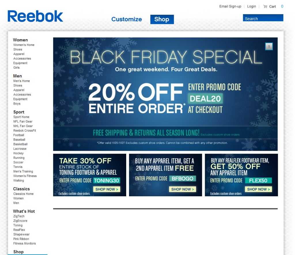
Can you tell that there is a sale?Can you tell it's Black Friday? Even though this is a screenshot from Sunday evening? Fascinating that there is no product displayed whatsoever on the page. The entire page is a promotion for various offers: 20%, 30% and 50% off. I have to imagine the promotion would convert better if product was part creative...