Three Must Have Google Plus Extensions

I have written a fair amount about Google Plus and about how Google Chrome / Chrome extensions are changing my web behaviors. Lets put those two themes together... here are three great Google Plus Chrome extensions: 1. +Photo Zoom

I have glowingly written about the Facebook Photo Zoom extension and how every website should leverage this sort of interaction. I love it. And here it is for Google Plus.

2. +Everything

Add the Google Plus header to your web experience. I wrote it about it here:

3. +Comment Toggle

One major design flaw of Google Plus is the commenting system... which can get overwhelming very quickly. This extension fixes it.

Average iPhone, iPad & iPod Has $100 of Paid Content On It

Noteworthy article on AppleInsider.com yesterday (AppleInsider | iOS 'stickiness' grows as average Apple user has $100 in content per device): the average iOS device (iPhone + iPad + iPod) has roughly $100 of paid content on it. That number represents all content downloadable through iTunes: applications, music, movies and books. More impressively, the average has risen to ~$100 from ~$80 in the last year - and that is as 75m new iOS devices came onto the network.

Not only is the average high and ramping significantly - it suggests a very high switching cost. To leave Apple, you are losing $100 of paid content and - in many cases - are unable to even replace that content on other networks / OS's because of limited inventory.

This is strengthened by Apple's new iCloud - which allows users to easily transfer content (apps, music, videos, etc) from device to device. This previously was a very painful activity... and, at times, it actually deterred me from buying some content. That is solved with iOS5 and I find myself buying more content because it is instantly accessible on all of my devices.

JetSetter's Search Box Promotion

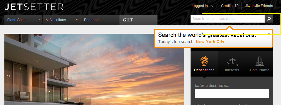
I like the highlight examples of effective "in the river" marketing - the concept of placing product, promotion and marketing messages in relevant, active parts of the web experience. Lots of examples here... Here is another example from Gilt Group's JetSetter (which is one of the better designed and visually appealing websites).

The fundamental JetSetter experience is browsing really compelling, great-looking travel offers. Even with no intention of planning travel, I can waste dozens of clicks browsing JetSetter's delicious offers.

And while browse is JetSetter's primary experience, they are trying to drive search activity and have introduced both a search box and top searches. This is an obvious revelation because JetSetter overlays the message (along with today's top search) atop today's offer. It is bold, colorful and extends onto the offer and the right navigation pane. It also fades in (quickly and lightly) - in the rare case that you missed the unit.

On a side note: the "top searches" concept is interesting because it creates another browse + search experience that, in my opinion, is more shop-able. I believe that most significant travel (cost, distance, time) is *not* booked spontaneously... so the ability to search JetSetter deals for specific locations makes JetSetter more usable.... while still keeping the brand and web-experience in-tact.

Netflix's Fascinating Cancellation Questionnaire

I love Netflix. - They have revolutionized the way we think about movies and media - They have created a slew of new company ideas and models: "the Netflix for XYZ" - They have defined streaming content and challenged a traditional, massive industry - They should be credited with making new platforms and devices desirable: iPhone, Android, Google TV, Xbox, Playstation, Nintendo Wii, etc - And they are brilliant marketers with a terrific recurring model ... but after years of being a Netflix subscriber, I recently canceled my account. The reason is very simple: Netflix Instant doesn't have enough depth / inventory. We have watched the handful of documentaries that Netflix has (by far their most impressive category) and I even wrote a semi-popular Quora answer to which Instant movies are best: Exit Through the Gift Shop, Man on Wire, The Modernism of Julius Shulman, The King of Kong, The Universe of Keith Haring, Beer Wars, This Film Is Not Yet Rated, Food, Inc., Bigger, Stronger, Faster.

But the catalog hasn't expanded. Meanwhile, Comcast and Redbox have delivered great products / experiences (Redbox is a short-term business - but as a consumer it is absolutely delightful, cheap and easy). The future is clearly the Netflix Instant / streaming model - but it requires a worthy catalog to justify ~$100-$175 / year.

So I canceled my account.... with the hope that I will return as the catalog grows. Good news: Netflix keeps your queue and preferences in tact so that restarting is easy. Maybe they shouldn't do that - but I appreciate it and it certainly helps conversions for re-started memberships.

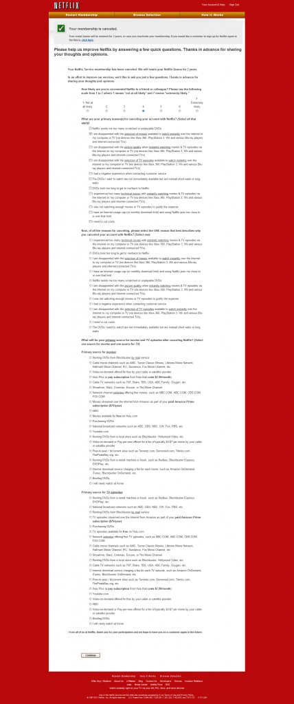
The most interesting part of the cancellation was the questionnaire (shown below in full). The attention to competition is fascinating: Comcast, Hulu, HBO, Showtime, bit torrents, piracy, etc are all mentioned. Also noteworthy are the answers to the question "why are you canceling?" One answer is "I have an Internet usage cap (or monthly download limit) and using Netflix puts me close to or over the limit." Unfortunately, over the next few years, I worry this will be an increasingly selected answer...

It is absolutely worth browsing the questions and available answers:
Apple's New Store Layout: Tangled.

Much has been made about Apple Store redesign which now features iPads beside each product. It is clever, on-brand, and interactive / educational in way that little-else could be. I really admire Apple's effort to rethink the physical store and experience according to their product line. However, it comes across as very cluttered... and it speaks to a pain any tech-geek feels: too many cords, wires, etc. The wiring detracts from the sleekness & sexiness of the devices.

Here are a couple pictures from MacStories who has dozens of images:

I applaud Apple for the effort and creativity. But the simplicity somehow creates too much complexity.

Facebook Reveals Social Commerce Stats.

In preparation for Danny Sullivan's article "Has Facebook Become The Master Key To Unlocking The Web?", Facebook shared a variety of compelling data point that tell us what we already know... when done right, social is an amazing lever for acquisition, engagement and conversion. There are great tidbits about how Facebook has helped a variety of websites / verticals, but the commerce data is particularly interesting. I've been privileged enough to see ShoeDazzle build a truly social commerce experience and the power that has on brand, marketing and engagement.

Here are a select few examples (including mentions about ShoeDazzle). You can read all examples here.

Levi’s saw a 40 times increase in referral traffic from Facebook after implementing the Like button in April 2010 and has maintained those levels since.

American Eagle added the Like button next to every product on their site and found Facebook referred visitors spent an average of 57% more money than non-Facebook referred visitors

Children’s clothing retailer Tea Collection added the Like button to sale merchandise and saw daily revenues increase 10 times.

ShoeDazzle also lets people login to its site using Facebook, and Facebook-connected users were 50% more likely to make repeat purchases every month than average shoppers.

When a Ticketmaster user posts a specific event they are attending, or may want to attend, to Facebook, it generates $5.30 of direct ticket sales

Eventbrite reports that a link shared on Facebook is worth $2.52 in ticket sales

The Like Button is a common and key component to making products social. And I have written before about the efficacy of Facebook's Facepile (see here). Here are a few tips (relatively straightforward) from Facebook to drive 3-5x the Like's:

Versions that show thumbnails of friends are used. They allow people to add comments. If they appear at both the top and bottom of articles. If they appear near visual content like videos or graphics.

Also worth mentioning, ShoeDazzle celebrated their 1,000,000th Facebook fan yesterday... quite a milestone:

Creating an Early Stage Pitch Deck

Last week I gave a presentation on creating early stage pitch decks (primarily focused on the seed round). I took a (fuzzy) picture of my white board talk (very professional on a few fronts, I know) and thought it would be valuable to post it here. And please take this for what it's worth: just one investor's opinion. As is true with everything - the best answer is "it depends". It depends on your background, your company, your raise, and your audience. And with that out of the way - here is what to think about and my proposed outline:

General themes:

- Most importantly, know your audience. It will influence your discussion, the deck and your questions.

1. 10-15 slides. Max.

2. Expect the deck to be shared. It will likely be emailed internally so it should be digestable without your voice-over. This means no big visual builds or super intricate slides.

3. Show the market and the opportunity.

4. Show the product and your traction. Product demo's are great and often the meat of a presentation... but be careful as you (and time) can get lost with the lack of structure. And for early stage startups, remember that traction does not need to be 1million users or monthly revenue. I just want to see some data that suggests this has legs.

5. What's the ask? ... and why? How it will be used? How long will it last? How can I help?

A suggested structure:

A. Vision.

B. The team. Who are you and why are suited for this opportunity / role?

C. The market. and.... D. The opportunity. How big? Who exists? What is not being served today? These two slides set up the opportunity for a new leader, which builds up to:

E. Your product. F. Your traction. Are there reasons to believe you are moving in the right direction and the product is resonating?

G. What lies ahead (including business model). Compare today vs. the big vision and describe the path there.

H1. Your ask. (this is part of that path!) H2. How will it be used.

Doodle Jump Hits Amazon's Appstore

Earlier this week, Amazon launched the Amazon Appstore by giving away Angry Birds Rio for free (the #1 paid and top-grossing app on iOS). That promotion was in conjunction with an announcement that Amazon would giveaway one paid app for free each day. Today's free app should also be familiar: the 'insanely addictive' Doodle Jump (which, behind Angry Birds, may be the next biggest game on iOS).

Amazon is clearly moving into the application and Android space by distributing great, familiar titles in a way that fits with their brand / style: by winning on price.

Also worth noting: Angry Birds Rio is still available for free on the Appstore. When it first launched, it was marketed as expiring that day...

Jibe Launches Mobile App at 'Launch' Conference

Polaris-backed company and former Dogpatch Labs resident, Jibe has had a very good couple weeks. As a reminder, Jibe uses Facebook and LinkedIn to better connect job-seekers and employees: " JIBE connects you to people you already know at companies you want to work for and increases your chances of landing a great job." First, TechCrunch announced that Jibe was seeing more than 1,000,000 monthly job views and signed up 25% of Fortune 50 companies.

And yesterday, Jibe announced their mobile application at the Launch Conference. InsideFacebook named it one of the conference's top "Top Facebook Integrations".