A New Chapter Ahead at ESPN

I have always been a sports nut. Growing up, I wouldn't go to bed without first calling the Washington Post's automated sports hotline for 'current' sports scores (delayed by 15-30 minutes); and over breakfast, I'd scour over newspaper box scores for details. Years later, the habit hasn't changed... just the routine: newspaper clippings have been replaced by ever-updated web content, apps, podcasts, shows, feeds, SMS alerts, etc. I am also a tech / product geek... which explains the existence of this blog and my investment philosophy (at the highest level: find product visionaries / leaders building truly compelling, engaging product experiences). It also explains what I have loved best about early-stage tech investing: the opportunity to work with driven entrepreneurs on evolving the business, the product and the relationship with their users.

I am excited to combine those two passions (product + sports) at ESPN. I will be joining as Senior Vice President of Product Development and focused on digital product across all screens: including ESPN.com, ESPN Mobile, WatchESPN and ESPN3, Fantasy and social media.

It is bittersweet of course: I have been with Polaris Ventures the last 3+ years and I've been part of the extended Polaris family for much longer. I helped to build Polaris' west coast office and the @dogpatchlabs community & brand. And I am grateful to have worked closely with such a great and diverse collection of founders, executives and companies. One of the unique attractions of Polaris is it's diversity in sector, stage and investor: from seeds to growth and consumer tech to life science.

Thanks to the fantastic Polaris team and family: Dave, Jon, Terry, Amir, Alan, Alan, Brian, Bryce, Jason, Peter, John, Gus, Noel, Kevin and the larger team. And thanks to the Polaris portfolio, of which I have been privileged to work with - including: Formspring, KISSmetrics, LOLapps, PostRocket, ReadyForZero, Recurly, ShoeDazzle, Sosh, Space Monkey, Spindle, Wantful, Wordpress, and many others.

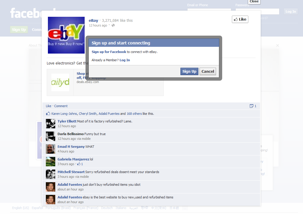
Facebook Homepage Ad Takeovers - eBay Example.

Facebook homepage ads have begun. They are effectively static full page takeovers with a Facebook module overlayed in the bottom right corner. In this example you see an ad unit for eBay's summer electronics event. On the right corner is a mini-Facebook ad unit (as you would see it on the right column of a logged-in page): it contains the copy / creative and like / share buttons. It's prime real estate and a huge unit... even if on the log-out screen. The interesting note however is that, when users are logged out, the social features are obviously not as effective... for instance, users cannot like, share or comment with a single action because they are not logged in. I suppose this is a necessary consequence of taking over the homepage. To solve this, you would need to prompt users much more intrusively: on their feed page.

Google Chrome for iOS: Two Unique, Nice UI Treatments

With the launch of Google Chrome for iOS, I committed to swapping out my iPhone and iPad's Safari browser (of course I can only do this on the dock - Safari cannot be replaced as the browser from core applications like email, etc). I did this in part because: 1. I wanted to try Chrome (as compared to Safari) 2. I was drawn to the Google account syncing and UI enhancements 3. I wanted to understand whether a browser shift is really doable (considering Safari integration, habit, etc)... no matter how great Chrome may or may not be.

The attraction to chrome is it's gloss: it's really a beautiful product and interface. Two small examples I wanted to highlight:

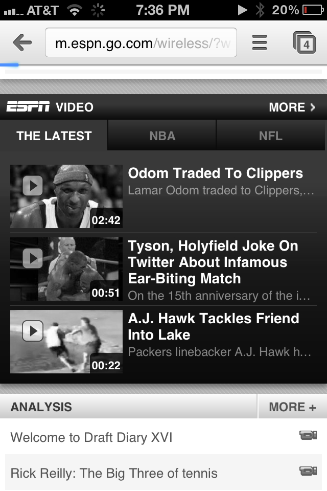
1. When you open the browser, it inherits the last-opened page and renders it in black & white while the page refreshes. I have no idea why I find this is great... but I really do. It's more 'cool' and good-looking that useful - but it there is a benefit to it: it shows that the page is out of date and reloading.

2. For whatever reason, most iOS applications (both by Apple and third parties) use horizontal sorting - in other words, you navigate by moving right or left (ala the homepage). Google Chrome's 'tabs' concepts moves vertically. Pages layer atop one another and you drag through them to access other open tabs. Based on the speed and touch, it either scrolls or highlights a particular tab. It's a very natural way to sort and is also good looking.

Keys to Boostrapping Your Startup.

Earlier this week, I spoke on a panel about the keys to bootstrapping a startup. The audience was a mix of current and soon-to-be entrepreneurs; some bootstrapping by choice and others by necessity; some who see bootstrapping as the dream and others as a means to venture financing. It's a subject near and dear to my heart since I bootstrapped beRecruited alongside Russell Cook from our Duke dorm room and our spare bedrooms (while I was at eBay and he was at Microsoft). Even in hindsight, I wouldn't have done it any other way as it proved to be the right thing for the business and for us... which is a bit ironic since I am now in the business of making investments and often challenge bootstrapped entrepreneurs to think about whether investment is what they *really* want and need (sometimes is, sometimes isn't).

I wanted to give a quick recap of the themes I discussed. And you can read more from my 2008 post "Bootstrapping Your Startup – 12 Rules of Bootstrapping", which is one of the most read / visited posts from this blog.

Be efficient. Be lean.

From my 2008 post - and it remains the most important aspect: "Sounds obvious. Sounds easy. But it’s neither. As a bootstrapper, you’re short on time and money. That means that efficiency is key. Before engaging in any single task, ask yourself (and/or your team) if this is worthwhile and priority #1."

Revenue is king. Profitability is better.

This is a key difference with venture-backed companies, who often aren't advised to focus on revenue early on - rather, they focus on growth and usage. Bootstrapped companies usually do not have that luxury and have to focus on self-sustainability. Of course, that means that revenue (and profitability) are king.

And when you get there - that buys you the ultimate luxury: optionality. You are in the luxurious position of choice: continue to operate, fund and accelerate the business, or exit the business. Profitability affords these choices.

Understand business financials, levers, potential scale.

To reach profitability, you must have a deep understanding of the business. You are likely resource constrained - so each task, priority and function comes at the expense of something else. It is a constant balancing act. Furthermore, this is how you gain an understanding of the next two points:

1) what the key business levers are and how you can accelerate growth with funding 2) how big the business can become... which is how you determine whether funding makes sense

Spend money on key business levers.

Within reason, you must open the marketing floodgates to understand: what works, whether it scales and what you might need (partnerships, people and/or investment). I commonly see pitches where entrepreneurs have very efficiently spent very small amounts of money - but they have no understanding of whether that scales (amount of efficiency).

Understand the consequence of investment / capital.

If you are in the luxurious position of considering whether to continue bootstrapping or take on investment: congratulations, optionality is your most valuable asset. There are obvious benefits to taking on investments: the two most obvious being:

1) you can accelerate growth more freely (and therefore grow your enterprise value) 2) you bring more partners and thinkers to the table

However, there will be considerations you didn't have before and you have to think through the consequences: How big is the opportunity? How big can this become? What's your long-term goal: scale, ownership, financials, etc? Are my goals in line with the investors'? How does dilution weigh against outcome and exit opportunity? Are the investors my ideal business partners? Comfort with adding partners, board members, equity holders, etc?

Most importantly: can you achieve your goals with or without investment? Ultimately that determines the answer.

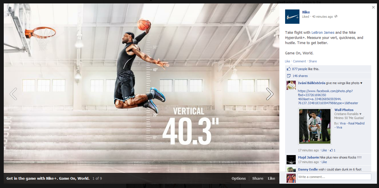
Nike's Game On Facebook Campaign: Data, Nike+ and Great Photos.

Nike is so good: - terrific Facebook campaign during the NBA Playoffs

- smart experimentation on Twitter with Promoted Tweets

- innovative personalized shopping engine (which now includes licensed products)

- and that doesn't include Nike+ and their terrific / innovative integrations with Path, Facebook and Twitter

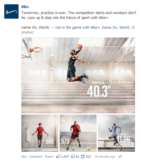
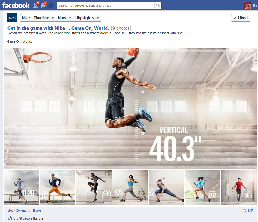
Here is yet another great campaign by Nike. In an effort to promote Nike+ ("the future of sport"), Nike took to Facebook and highlighted a barrage of athletes training and collecting data via Nike+ and/or Nike Fuel. Like most of Nike's social work, it's very visual, fun and unique. It is also on brand and tapping into the personal data / gamification theme. Notably, this was also released the day of the NBA Draft - which is driven by similar data analysis.... and many of those athletes will soon be sponsored by Nike.

On Facebook, Nike does a great job of clustering photos into albums - whereas many brands / pages, highlight individual photos.

Google I/O by the Numbers... Theme: Scale

Browsing the headlines is a pretty powerful and interesting way to digest Google I/O as they are driven by big, important numbers: - Google Drive : 10m users and coming to iOS / Chrome OS (TechCrunch)

- Gmail: 425m users (TechCrunch)

- Google Apps: 5m businesses and 66 of top 100 universities (TechCrunch)

- Google Chrome: 310m *active* users (TechCrunch)

- Google+: 250m users and 75m daily users (with the integration into search and mail, I still would love to understand what constitutes a true user / true usage). (TechCrunch)

- Google Play: 600k Apps, 1.5B installs/month (TechCrunch)

- Android: 400m activated devices, 1m more each day (TechCrunch)

- Google Nexus 7: $199. A price that makes them able to compete in the tablet market - as cool as Microsoft's new device is, it is rumored to be *more* expensive than the iPad. That won't work.

- Google Glasses: $1,500! Really?

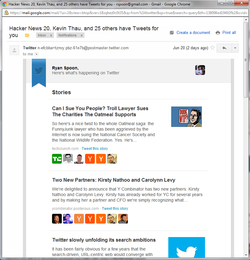
Quora & Twitter's Weekly Digests via Email. When Does Facebook's Arrive?

I write a fair amount the 'findability' problem that results from vast amounts of content (yes: it is a first class problem!). Curation - social, declared and algorithmic - plays a key role. Nevertheless, users still swim in oceans of available, interesting and timely content from platforms like Twitter, Facebook, Quora, Pinterest, etc... and that doesn't include media sources like the New York Times. So why am I writing an intro paragraph that looks so similar to many of my other posts? Because Twitter and Quora are attacking content overload in a simple way: terrific weekly emails (simple to the user!). That's an ordinary concept and runs the risk of getting lost in my inbox of too many messages filled with too much marketing. But the emails are:

1. really good looking - and optimized for mobile... where much of my email is read 2. rooted in social connections - notice that every article is surrounded by people I am connected with 3. really, really great content that I almost-certainly would have missed without the email... meaning: I want to read these

How long before Facebook creates a similar email? How long before Facebook verticalizes that for photographs and for links and for statuses?

Game of Thrones + Facebook

I saw this sponsored post atop my Facebook feed the other day: - 64 Facebook friends like Game of Thrones - 1 of those is Mark Zuckerberg - I had not yet liked Game of Thrones, despite thinking its the single best show on television

It's a reminder that: - Cocial relevance is powerful - Klout as a concept is extra powerful (Mark Zuckerberg as a Game of Thrones fan carries a little more weight!) - Content is still king. Great content will draw large, connected audiences (64 friends are fans - most within a 7 hour window) - Game of Thrones on Facebook has grown rather strongly - adding 100,000 fans / week, 250,000+ likes / day, and improving their reach ratio

Google's Evolving Search Results Pages: PGA, Tiger Woods & US Open as Example

In honor of this week's US Open - and in connection with last week's post on Google's evolving search pages - here are some interesting screen shots related to both.

The first is a results page for the query "PGA". As yo will see, there are only two search results on my visible screen: PGA.com and PGAtour.com (brand URLs). The bulk are algorithmic results (which are very useful): 2012 FedExCup standings and the three most relevant (ie popular) stars (Tiger Woods, Rory McIllroy, Phil Mickelson). Two things worth noting: 1. there are no ad units 2. there is no Google+ integration here. And this is one area that Google+ makes a lot of sense. I should be able to follow each player, learn more, etc. Today, it is entirely informational.

Change the query to one of the player names (in this case "Tiger Woods") and it looks similar: standings, information, news, and the brand link. In fact, only one natural result is above the fold: TigerWoods.com.

Again, two notes: 1. still no Google+ integration. 2. still no ads (high volume query too!) 3. related people include non-golfers: Elin Nordegren and Rachel Uchitel (both interesting and ironic)

Dig in on the right column's bio page and there is a "please report a problem" unit. This is Google's Wikipedia-like effort to control content. For several reasons, it is a very interesting approach: 1. this is such a dramatic change to search results and this unit comes at the expense of ad real estate 2. to fill it with content Google does not entirely trust is bold / scary 3. this information is far more compelling if tied to Google+ - in this setting it looks like no different than a mini-Wikipedia (or Knoll!)