More than most people, I am very tolerant of advertising... the bigger and bolder, the better! Below, USPS.com is promoting Toy Story 3. Its big and cute... but it is without context or action: - there doesn't seem to be a Toy Store 3 branded product or promotion - there is no description of the 'integration' and/or promotion... and nothing is clickable - which means that this is purely a branding play (USPS.com has 14m+ monthly uniques) ... but branding plays typically occur on content sites or portals (whereas USPS.com is more of a service) and usually have some sort of action: trailer view, click through, etc.
With Slew of Apps, Apple Emerges As Major Developer, Publisher
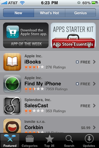
As a mobile developer / publisher, the Apple App Store is as a much a distribution floodgate as it is an enigma. Being featured within the app store guarantees massive distribution and consequently begins a virtuous cycle: featuring leads to downloads which leads to "top 25" placements which then leads to greater distribution. To date, Apple has been unclear about their editorial stance... but the results have been reasonable: they are quick to highlight branded apps (ie Facebook, eBay), innovative apps (ie Runkeeper, Evernote), and trendy apps (ie Foursquare, Gowalla, etc). Over the last few weeks - with the entrance of the iPad and iPhone 4 - Apple has itself become a publisher and have really pushed their apps: iMovie, iBooks, Apple Store App, Find My iPhone, and the iWorks suite. And then Apple uses their marketing power (primarily real estate) to promote and distribute their applications.
Because the applications are terrific (for the most part), it is hard to complain... but it is another indication that:
1) the app store is an editorial black box controlled by Apple, who itself is becoming a major developer 2) Ultimately, this is Apple's ecosystem and their incentives can certainly conflict with developers'
Below are a few screenshots... the first of which is most revealing. Apple labeled its own Apple Store App as the App of the Week and the first two featured applications are also Apple's:
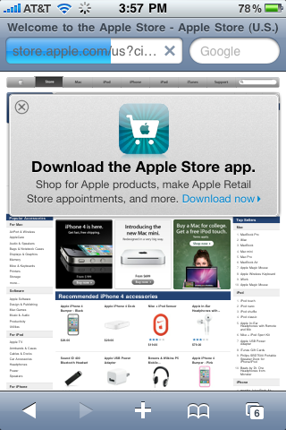
Also interesting: even if you go to the Apple Store's website via an iPhone browser, it prominently promotes the iPhone application:
Zynga's Frontierville: 0.45 DAU / MAU (50% Better than #2 Farmville)
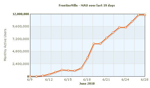
When Zynga launched Treasure Isle, I wrote about the economies of scale that enabled them to drive nearly 17,000,000 monthly active users in the game's first 18 days... staggering figures. Zynga's latest game, Frontierville, is now 19 days old, and also seeing meteoric growth. In their first 18 days, Frontierville has markedly fewer monthly actives than Treasure Isle did... but it is worth noting that virality on Facebook has gotten more challenging over the last few weeks (it is always a moving target). Whereas Treasure Isle had 17m monthly uniques, Frontierville has 12m:
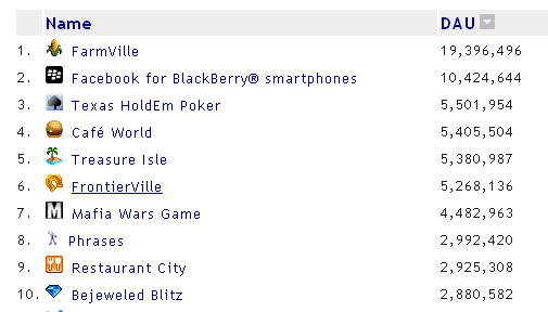
12m uniques in a partial month is large by any measure ... in fact, it puts Frontierville at #20 on the largest Facebook games list (behind other Zynga properties like: Farmville #1, Texas Holdem Poker #2, Treasure Isle #3, Cafe World #4, Mafia Wars #7, Petville #13, Fishville #17):
The most impressive aspect of Frontierville's success is their DAU (daily active users)... a metric that better indicates engagement and retention than monthly uniques. Frontierville is #6 on Facebook by their DAU count (5.3m) and just behind Texas Holdem Poker, Cafe World and Treasure Isle (Farmville and Blackberry are #1 and #2 are orders of magnitude greater: ~20m and 10m respectively):
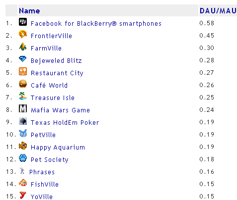
And when you compare the daily active users to the monthly active users (DAU / MAU) - you get a direct measurement of daily engagement with a game. The DAU / MAU metric is a critical factor as it defines engagement / retention ... and in turn helps drive virality (invites, feed posting, etc) and revenue (whether virtual goods, offers or ads).
And this is where Frontierville really shines: of any game, it has the highest DAU/MAU rate at 45%. To put that in perspective, Farmville is #2 and is 30%. Obviously Frontierville's rates are inflated because they are only 2/3rds through with the month - but even significant discounts over the next 10 days would result in leading rates.
Data and charts are from AppData - the best source for app metrics
Facebook's Open Graph Search Engine: The New SEO?
Strangely lost in last week’s iPhone 4 hype was Facebook's announcement of their “Open Graph Search Engine”. It is very young and therefore inelegant – but it is significant move that Google likely is worried about (at a time when Google is aiming to compete directly with Facebook) Facebook is beginning to index off-Facebook content within their search functionality… assuming it is Facebook “connected”. So just an entire industry emerged around Google SEO – publishers should undoubtedly be thinking about optimization within Facebook search.
And to Facebook, this is clearly is an effort to incent publishers to integrate Facebook on their core sites… and consequently: index the web, connect it to the Facebook social graph, and semantically AND socially unite the on / off Facebook experiences.
Powerful. Of course Facebook search is still a relatively small piece of Facebook’s experience – that will change over time. And this could be the acceleration point.
And for aggressive, forward thinking publishers – this marks a major opportunity… just like those early companies and individuals who dedicated resources to search optimization.
Apple iOS4's Auto Calendar Event Creator
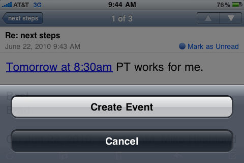
The best feature of Apple's iOS4 update that is overshadowed by background applications, folders, etc? Apple now enables calendar event creation contextually and within email exchanges. When a date and time are written in an email - iOS4 will hyperlink the text (ie Tomorrow at 8:30am) and allow you to add it to your calendar. It's a huge time saver and something I have long wanted in Outlook (where calendaring is a *massive* pain) and in GMail (where there is similar, but flaky functionality).
Apple consistently pulls off these relatively small features and integrates them seamlessly. Why Microsoft hasn't figured out a similar feature within Outlook... over its many years... signals the shift in the two companies' success in consumer products / development.
Golfsmith & Nike National Golf Day Give Free Nike Golf Balls to Facebook Fans
This weekend, your local Golfsmith will be hosting Nike's National Golf Day - which features Nike product demos, discounts, etc. But Facebook fans of both Nike Golf and Golfsmith get the VIP treatment with a free sleeve of Nike ONE Vapor golf balls and a 30% trade-in bonus on new Nike clubs: It is interesting to see Nike and Golfsmith tag-team across Facebook and provide exclusive, high value offers to fans. That's just the first step: fans have to then "check in at the store": Golfsmith will have in-store Facebook "fan check-in stations" for fans to broadcast and promote their experience.
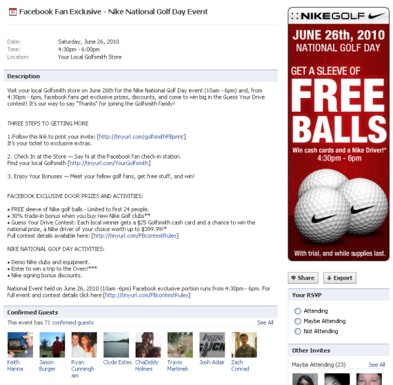
Considering the partnership, in-store program and offer (which is compelling to golfers) - there are several steps to the program. Screenshots and explanation are below:
Visit your local Golfsmith store on June 26th for the Nike National Golf Day event (10am - 6pm) and, from 4:30pm - 6pm, facebook fans get exclusive prizes, discounts, and come to win big in the Guess Your Drive contest! It's our way to say "Thanks" for joining the Golfsmith family!
THREE STEPS TO GETTING MORE
1.Follow this link to print your invite 2. Check In at the Store — Say hi at the Facebook fan check-in station. 3. Enjoy Your Bonuses — Meet your fellow golf fans, get free stuff, and win!
FACEBOOK EXCLUSIVE DOOR PRIZES AND ACTIVITIES:
• FREE sleeve of Nike golf balls - Limited to first 24 people. • 30% trade-in bonus when you buy new Nike Golf clubs** • Guess Your Drive Contest: Each local winner gets a $25 Golfsmith cash card and a chance to win the national prize, a Nike driver of your choice worth up to $399.99!*
Promotion on Nike Golf
First, Nike promotes the 'fan exclusive' to its ~200,000 fans - which in turn drives traffic to Golfsmith's page (which had ~40,000 fans going into the promotion)
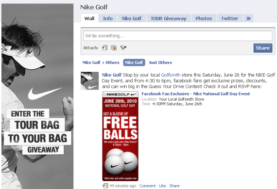
RSVP to the Facebook Fan Exclusive
The feed post on both Nike and Golfsmith is an event RSVP to the June 26th Nike National Golf Day Event at Golfsmith.
Become a Golfsmith Fan
The first requirement is becoming a fan of Golfsmith... which you can't miss:
You Now Qualify for the Facebook Fan Exclusive
Dogpatch Labs Featured in SF Chronicle Piece on 'Tech Incubators'
In their weekend article "San Francisco sees influx of tech incubators", The San Francisco Chronicle's Carlyn Said visited Pier 38 (home of Dogpatch Labs San Francisco) to study these emerging workspaces and communities. In her exploration of San Francisco workspaces and incubators, Said arrives at a premise similar to our core tenet of open source entrepreneurship: "[Entrepreneurs] do it for the cross-fertilization with other entrepreneurs."
Now with three locations (San Francisco, New York and Cambridge), Dogpatch has roughly 150 active residents (and an even larger list of graduates). We believe that 'cross fertilization' is important both within each space and across the three locations. And as we host events and have new residents join the lab, the key ingredient with search for is collaboration.
Retailers' Surprisingly Good Mobile Experience - Rubio's Example
You probably don't think of Rubio's (the fish taco fast food chain) as a leader in web / mobile innovation... but the below example is well done and really should be more widely adopted. Background: after seeing someone drink from a Rubio's cup, I asked where the closest location was? Neither of us knew... so I went to www.rubios.com on my iPhone expecting to search their standard website for the "locations" page. Rather, they automatically detected that I was on a mobile device and prompted me to provide my location - which they then used to display the nearest Rubio's restaurants. Rubios is using Know-Where Systems to run the web application. While the experience is rather simplistic - you can imagine building a more robust one aimed at mobile users. Clearly location is a key lever there... but couponing, nutrition, hours, etc are all examples of content aimed specifically at mobile users.
Learning from Quora's Mobile Site
Two of the core tenets of web design is "don't make users think" and "manage to focus users' attention" (see great list at Smashing Magazine). In short - this means that every pixel should be aimed at conveying what is most important and driving users to the right behaviors. This is a difficult task that some excel at... and it is made even more difficult by the mobile web - which provides far less real estate and different user interactions. Below is a screenshot of Quora's iPhone site (*not* an application despite looking like one). It is notable because it perfectly embodies Quora's core components and user interactions:
1. Notifications: the Quora logo dynamically displays the number of notifications you have. For a web component, this is very nifty - but it is very useful and displays the speed at which Quora's content is growing / moving.
2. Search box: Big search box with grayed out call to action. On the core web site, this is the major call to action.
3. User ID using Facebook Connect - which is the registration mechanism.
4. A series of major buttons that are the primary calls to action: ask a question, notifications and inbox. All revolve around the core question & answer premise.
5. Rather than view on your notifications, you can view Quora's entire log of changes (questions, answers, tags, edits, etc).
6. Invitations: Quora is still invite-only and invitations are an important role in user growth and virality.