This is pretty significant news out of Amazon: all seven Harry Potter books are now available in the Kindle Lending Club. It is the all-time bestselling book series and is a testament to Amazon's willingness to put marketing muscle behind Kindle and the Lending Club. And considering the reach and popularity of the Harry Potter franchise - it is a win for Kindle owners, Harry Potter fans, and Amazon users. It is also worth noting that it is a couple days from Mother's Day and Amazon's merchandising exists (upper right corner) but is far smaller than the Harry Potter announcement or the Amazon Local promotion. I would have assumed that the week would be dedicated to Mother's Day preparation - particularly highlighting one-day shipping, etc.
NYTimes Mobile Paywall
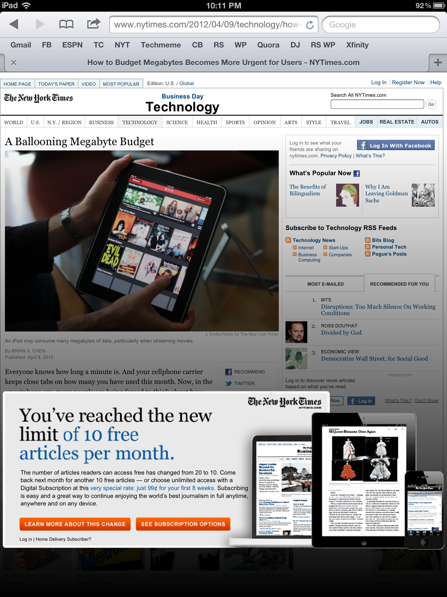
Not a ton to say here except that: - I reached the New York Times paywall - And it is visually very bold / intrusive - But while it is disruptive - and that's the goal of course - it is really not very actionable: The only part of the entire screen that is clickable are the two orange buttons.That is <5% of the screen's real estate and a wasted opportunity to users right into an upgrade flow. As it currently stands, I need to read the promotional box, click the orange button, land on an educational page and then choose an upgrade package. Too many steps and too much effort.
(Lastly, I am not entirely sure what constitutes exceeding the paywall... it says after 10 free articles but it appears intermittently)
#TrendingOnGoogle+
I haven't logged into Google Plus in a little, so I cannot tell if this is a new feature or a result of my infrequent usage - nevertheless, I was taken aback by Google's new Trending on Google+ module... which looks exactly like Twitter's. While it is interesting to see that the topics are related (ie Junior Seau, NFL), I was most interested by the use of hashtags on Google. Within my Google+ network, I have not seen hashtags used with any regularity (whereas they obviously are part of the Twitter culture) - I also would have assumed they would relied on real-time search and trends to populate the list.


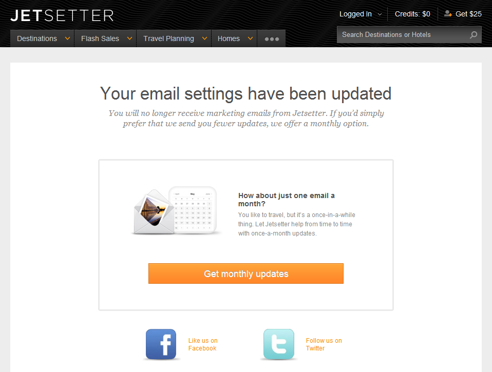
Jetsetter's Email Preference Flow
Email unsubscribe flows are typically binary: either super simple to unsubscribe (how it should be) or super convoluted (having to uncheck preferences, confirm email addresses, etc). This is a clever flow by Jetsetter because it is in fact super simple (just one click)... but it gently 'upsells' users: "How about just one email a month?" First, that's such a gentler, kinder way to ask for email access than having me check a slew of boxes.
Second, it comes after they have unsubscribed me - so there is established trust. When they say "just one email a month", I believe it.
Lastly, Jetsetter promotes their Facebook and Twitter pages. If you are going to lose an access point to your customers - might as well push other avenues to communicate and interact with them.
Microsoft Deal Strategy from 2009-2012: Yahoo, Nokia, Skype, Nook.
This is the front page of Tuesday May 1st's Wall Street Journal. It's a well done graphic overlaying Microsoft's big-dollar entrances into "markets where it lags behind rivals": - Search: Yahoo (2009): Microsoft's billion-dollar+ deal to power search and ads.
- Mobile OS: Nokia (2011): billion-dollar+ deal to push Windows Mobile OS
- Social / Video: Skype (2011): $8.5B acquisition
- Mobile / Tablets: Nook (2012): $605m investment to bolster tablet strategy
It's an expensive but necessary (?) avenue into three massive verticals that, as WSJ notes, Microsoft is far behind in: search, social, and mobile (OS + hardware). It is marks about one of these big, billion-dollar bets a year (four deals over the 2009-2012 period).
Price aside (Skype in particular feels very expensive unless deeper integrations in Office & on XBox emerge quickly), the Nook deal is is the one that strategically feels odd. Windows 7 users love the product - but the Nook is so far behind iPad and Kindle, that it feels as though Microsoft is better served entering the tablet market elsewhere OR focusing primarily on phones and then paying-up when the 3rd place tablet-provider has greater share. Of course that's my take from a very, very distant seat.

Facebook Roadshow: Advertising Revenue by Product Extension
If you haven't already, I encourage you to watch the Facebook IPO Roadshow video. It's fascinating and well done. There is a ton in there worth discussing / pointing out, but I wanted to highlight one of my favorite screens (shown below): It shows Facebook's growing advertising revenue and the four stages of advertising platform growth that have helped it grow (of course alongside monstrous user growth!): - Reach (their userbase) - Relevance (targeting) - Engagement (like, share, etc) - Social Context (sponsored, open graph, etc)
And what's missing? How about off-Facebook advertising...
More here: TechCrunch / Roadshow Video / WSJ
The Verge's Mobile Navigation Sidebar
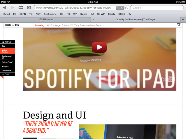
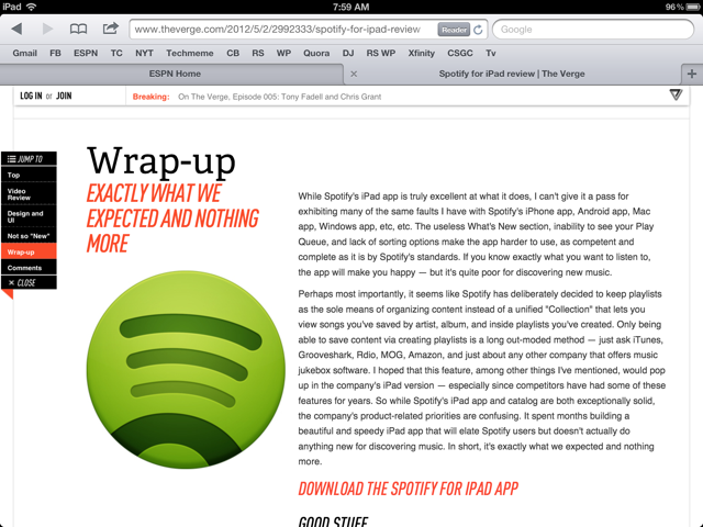
I admire how much The Verge (by Vox Media) has bushed the boundaries on content presentation / visualization. For a blog-like content hub, The Verge looks entirely unlike it's peers: TechCrunch, VentureBeat, Engadget, etc. It's one part traditional blog, one part Pinterest, and one part Flipboard. Where it really shines is mobile - specifically iPad. The screenshots below show my favorite treatment - which I personally have not seen elsewhere:
- There is a navigation bar on the left column (actually more like a table of contents) - As you scroll through the page, the corresponding section highlights (ie Video Review) - But the bar is also clickable - so that you can easily jump from section to section - I imagine over time, you also include small Facebook and Twitter buttons
Of course this is in addition to the persistent header that sits atop the browser. The Verge uses that real estate to promote breaking news, hot articles and membership (Login / Join).
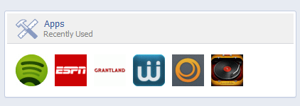
Facebook's Recently Used Apps Module & The Larger Relationship with App Ecosystem
Last week I wrote about Facebook's newsfeed clustering of posts published by the same applications. While it is interesting as a signal of the newsfeed's evolution - it is represents the larger theme of Facebook relationship, promotion, and integration of applications (and the larger application ecosystem). Obviously Facebook has always been supportive of the ecosystem - from Zynga & LOLapps (gaming) to Spotify & Pinterest (content) to Wantful & ShoeDazzle (off-Facebook commerce), etc. In fact, yesterday's news was that "visitors from Facebook accounted for 1.1 billion visits to iOS and HTML5 apps, meaning an average of more than 6 visits per user."
The emergence of Facebook's Timeline, Open Graph and the proliferation of applications atop the platform (mobile, newsfeed, ticker, etc) - Facebook relationship with applications is evolving:
- How do they cluster by type and by shared users? (example here)
- How do they cluster by recency (example below with "Recent Used Apps")
- How do they cluster by popularity (example of trending here)
- How do they prevent the Ticker and newsfeed from being overwhelmed by content? (more here)
- What role does Timeline and off-Facebook play here?
- And ultimately, what does this mean for Facebook's off-Facebook.com strategy: promotion, monetization, mobile, etc?
Jetsetter + Pinterest: "Pin It to Win It" Contest Drives Travel Curation
With the rise of Pinterest, I have enjoyed tracking the brands and campaigns racing to leverage the platform and be early movers. For instance, a couple weeks ago, I highlighted Harrod's Pinterest / curator contest. Here is relatively similar program from Jetsetter. Like Harrods, Jetsetter is using Pinterest to drive curation:
"Our fans ask us all the time how they can become Jetsetter curators. Now's your chance to show us you have what it takes. Using Pinterest, create the ultimate destination pinboard..."
It is effectively a way to:
1. drive best-of-lists (ala early Yelp and eBay efforts) 2. understand data and users preference 3. and drive viral traffic by rewarding social sharing on Pinterest ("Pin it to win it in our Pinterest Giveaway")
It's simple, clever and amazingly low-cost. Furthermore, it seeds usage and drives followers on a growing platform where most brands are still slow to adopt.
